A nonprofit organization may not be looking to make sales and get customers, but it’s still a business that needs a website to reach its goals. The donor’s journey follows the same basic outline as the buyer’s journey, except the final outcome is a donation and not a purchase. Take inspiration from some of the most successful nonprofits in the world to maximize your online fundraising and awareness of your cause.
What Should a Nonprofit Website Accomplish?
- Establish a good brand image
- Showcase past work and success stories
- Encourage donations and support
- Build a community among supporters
- Reach the group they aid
Ingredients of a Successful Nonprofit Website
Inclusive and accessible user experience
Your web design should strive to include everyone. This means taking steps to make your website fully accessible for website visitors with disabilities. It’s not just the right thing to do, it’s the law in the United States and many other countries.
Easy and intuitive navigation
Similarly, the path from any web page to the donation page should be as clear and simple as possible. You’re asking people to give their money because they care. If you don’t make it easy, you’ll miss out on those funds. Simple navigation menus and user-friendly sidebars that are consistent across the site are an effective place to start.
Attractive and functional web design
Though functionality is the main focus, that doesn’t mean it should be ugly. A sleek design with an eye-catching color palette, readable typography, and effective use of white space will keep people looking at your website’s content longer.
Engaging and informational copy
The copy on your website should draw people in and make them want to get involved with your cause.
Eye-catching images and infographics
Images of your volunteers and people you’ve helped give your website a human connection. Infographics display relevant data about your organization more effectively than words alone.
Responsive design
Responsive design means the website display adapts to the size of the screen displaying it. It’s much easier than creating one version of your website for desktop and another version for mobile. All Sav website builder templates are responsive. Designing with users of mobile devices in mind creates a better user experience for everyone and can also gain you some SEO points.
Compelling call to action buttons
A call to action, often shortened to CTA, is a word or phrase that drives a website visitor to a landing page to complete a final action. For nonprofit organizations, this is typically to make a donation. However, signing up to volunteer may be a secondary call to action. A clearly visible donate button on every page that leads to a donation form is a must-have call to action button.
Best Nonprofit Websites from Medical Organizations
Here are the top nonprofit websites for organizations dedicated to medical research and fundraising for healthcare.
Alzheimer’s Association
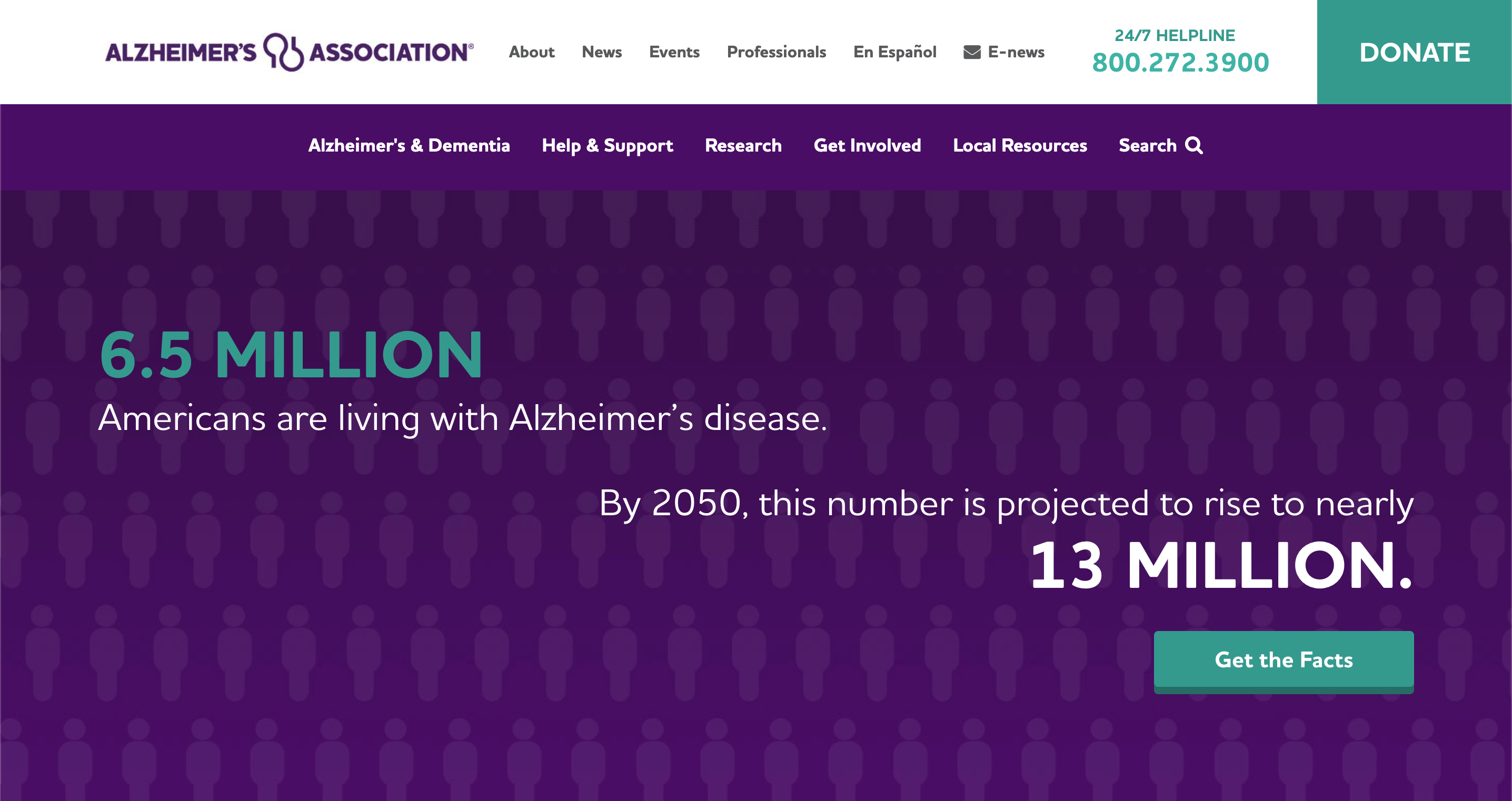
When you visit alz.org, which is an A+ domain, you’re greeted by a pop-up with a donate button. Then, the first thing you see is a hard hitting fact about the prevalence of the disease in the United states. The color scheme is simple and high contrast. Basically, this website wants your attention and succeeds at getting it.
American Heart Association
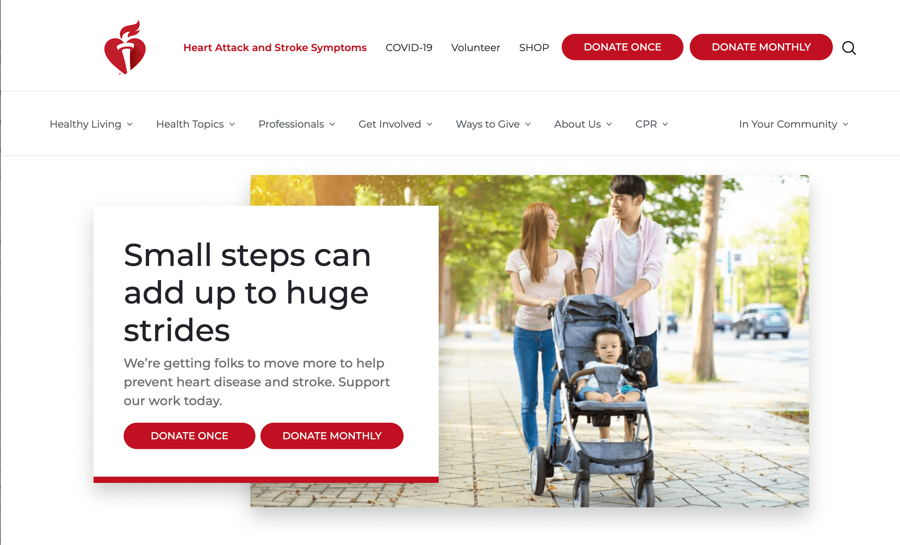
Heart.org is another excellent domain name. Once you scroll past the prominent “Donate Once” and “Donate Monthly” you can find informational videos about heart health. The design is simple: white space, red buttons, and black text, but since red is the official color of heart health, it’s appropriate.
Arthritis Foundation
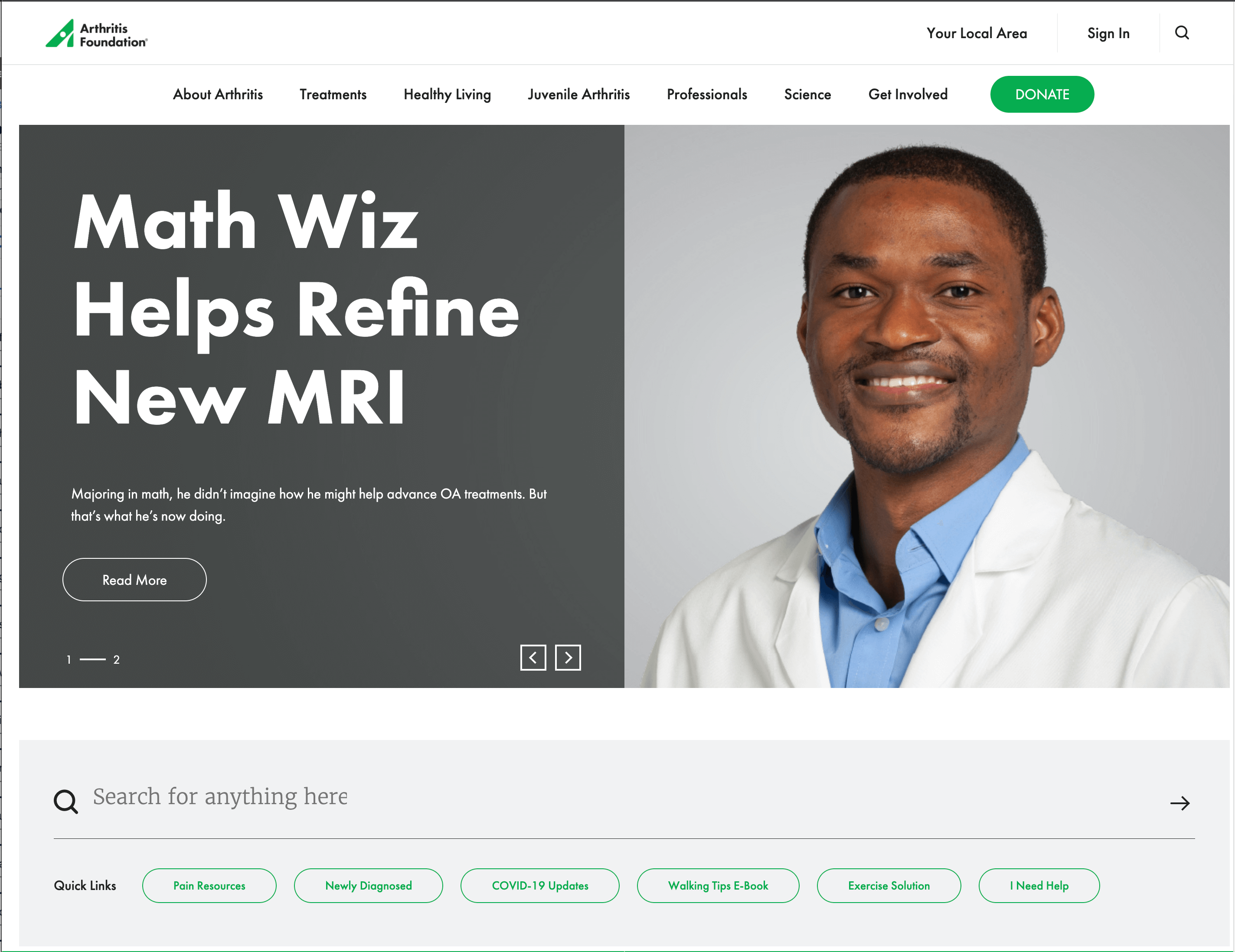
The straightforward navigation bar and search bar with popular suggestions make this site easy to navigate for new visitors. The animated slide shows with a lot of photos of people break up the information and add a human tough.
Cystic Fibrosis Foundation
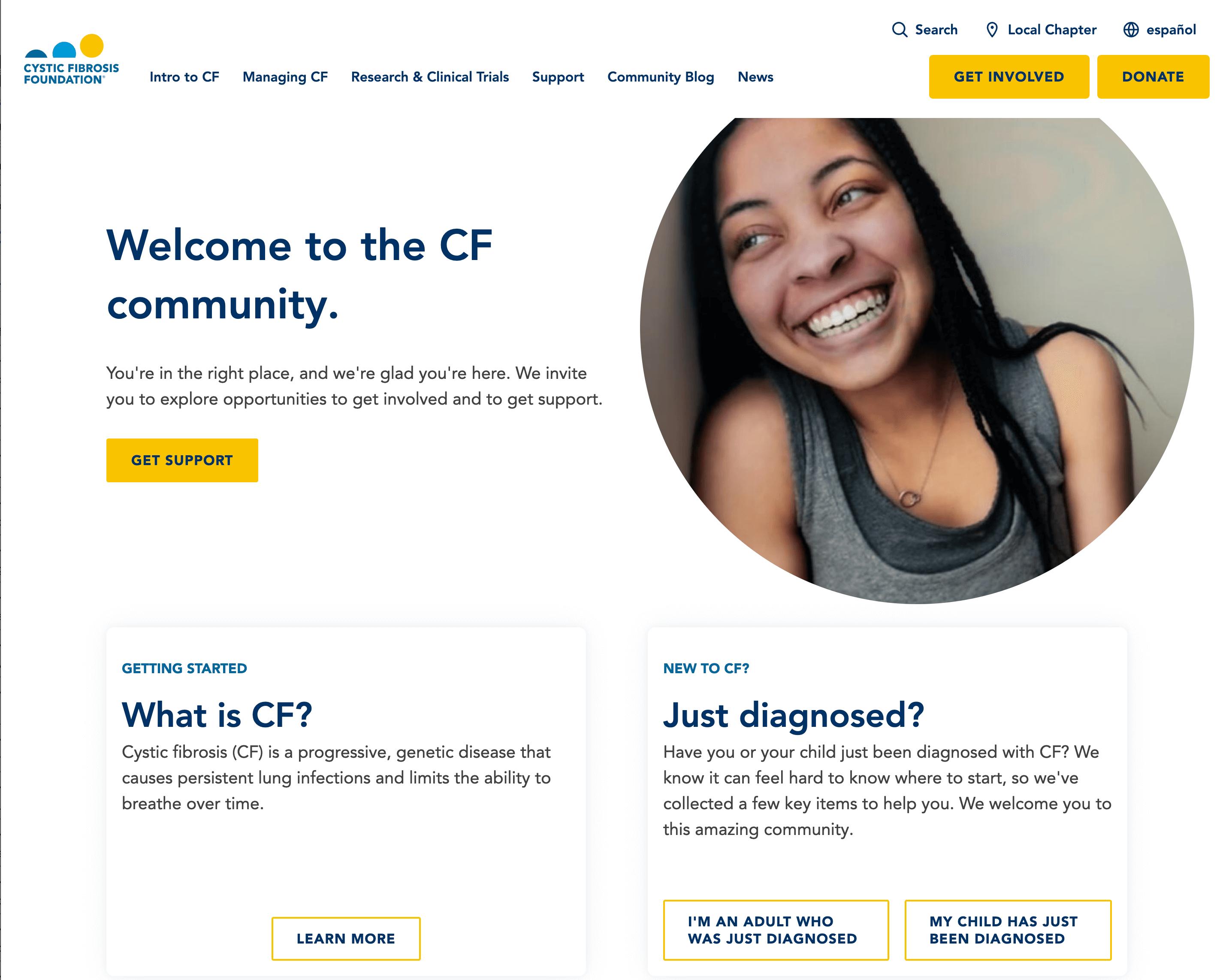
Though the buttons in the header read “get involved” and “donate,” the first thing visitors see on the body of the homepage is support for people with the disease. The heading “Welcome to the CF Community” exudes warmth and comfort to people who have received an often scary diagnosis.
Mental Health America
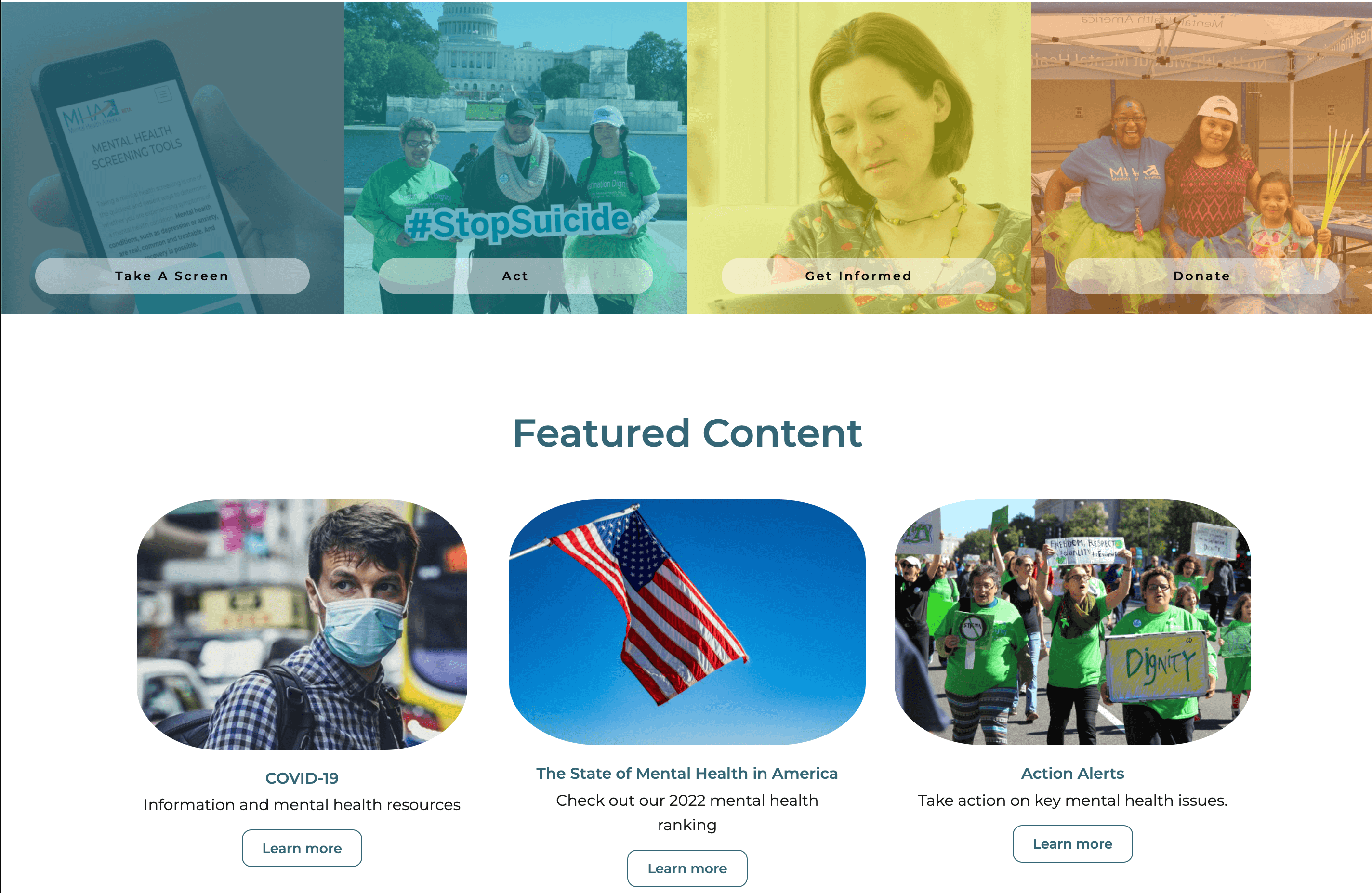
MHA’s website is very image-focused featuring people that reflect the diversity of Americans who are affected by mental illnesses.
St. Jude’s Children’s Research Hospital
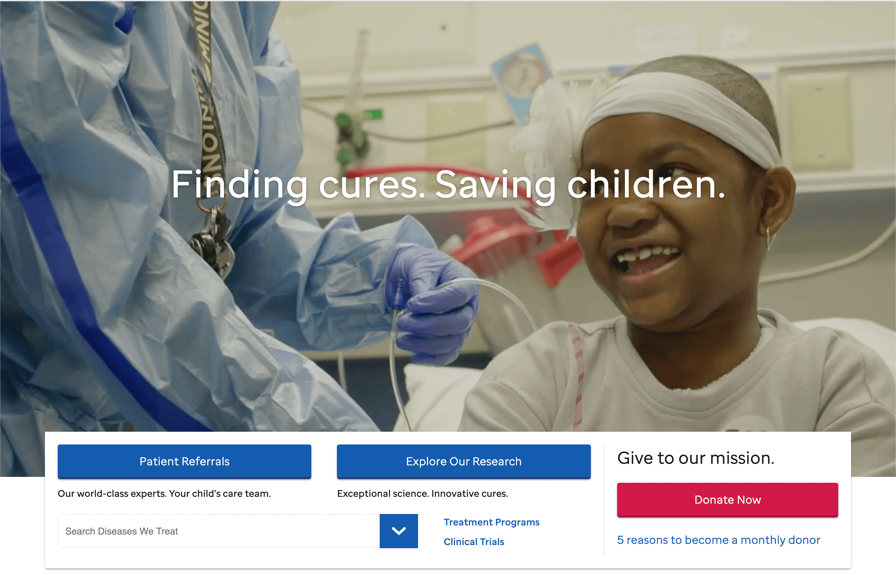
St. Jude’s home page opens with a video slideshow featuring their patients, staff, and facilities. Though the children are visibly ill, the footage makes a point of showing them in moments of joy rather than suffering.
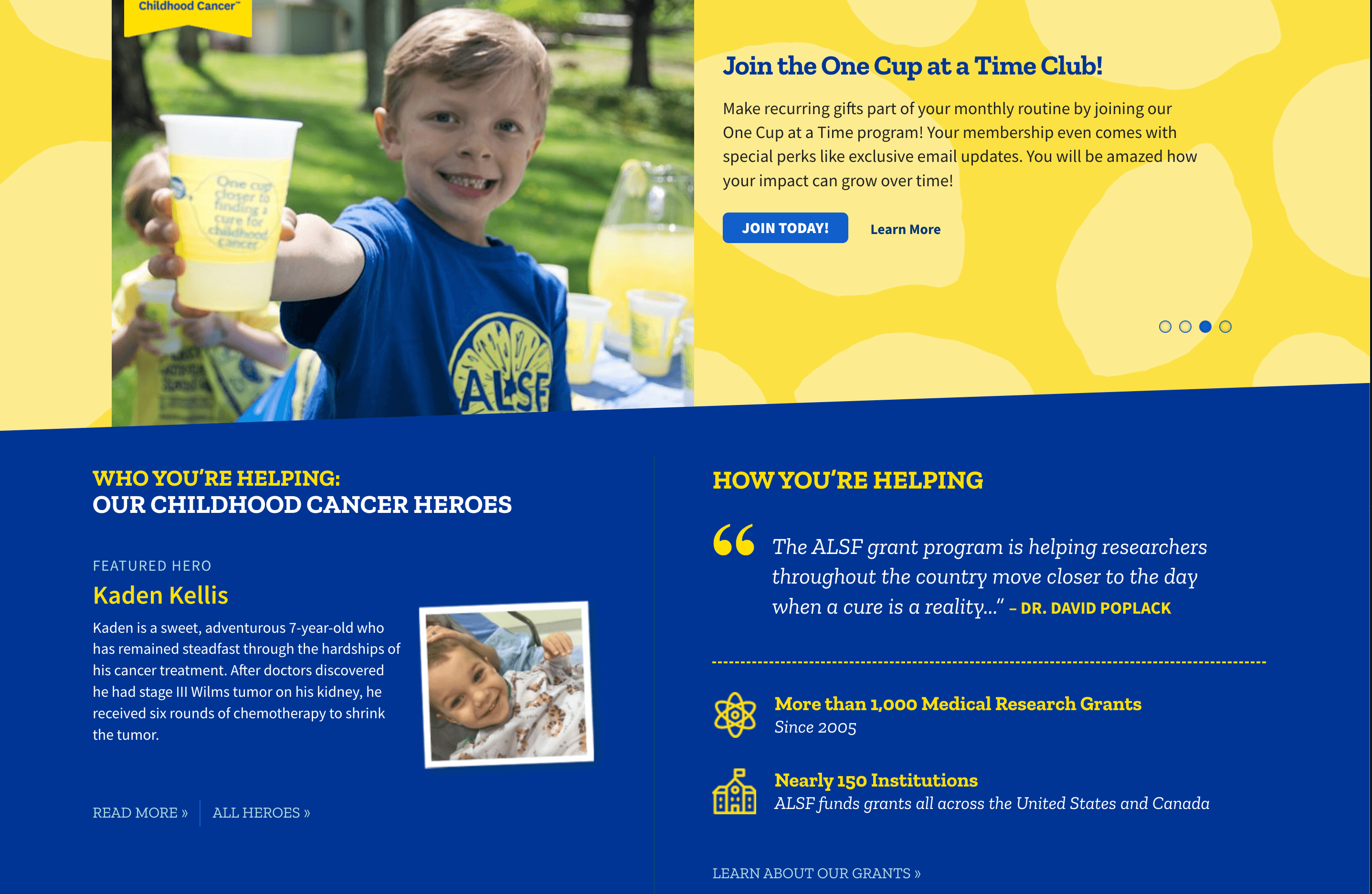
Alex’s Lemonade Stand Foundation
Alex’s Lemonade Stand’s website revolves around its story. The yellow and blue color scheme is appropriate for the name and the focus on children. The “featured hero” section highlights a specific child who has been helped by the organization.
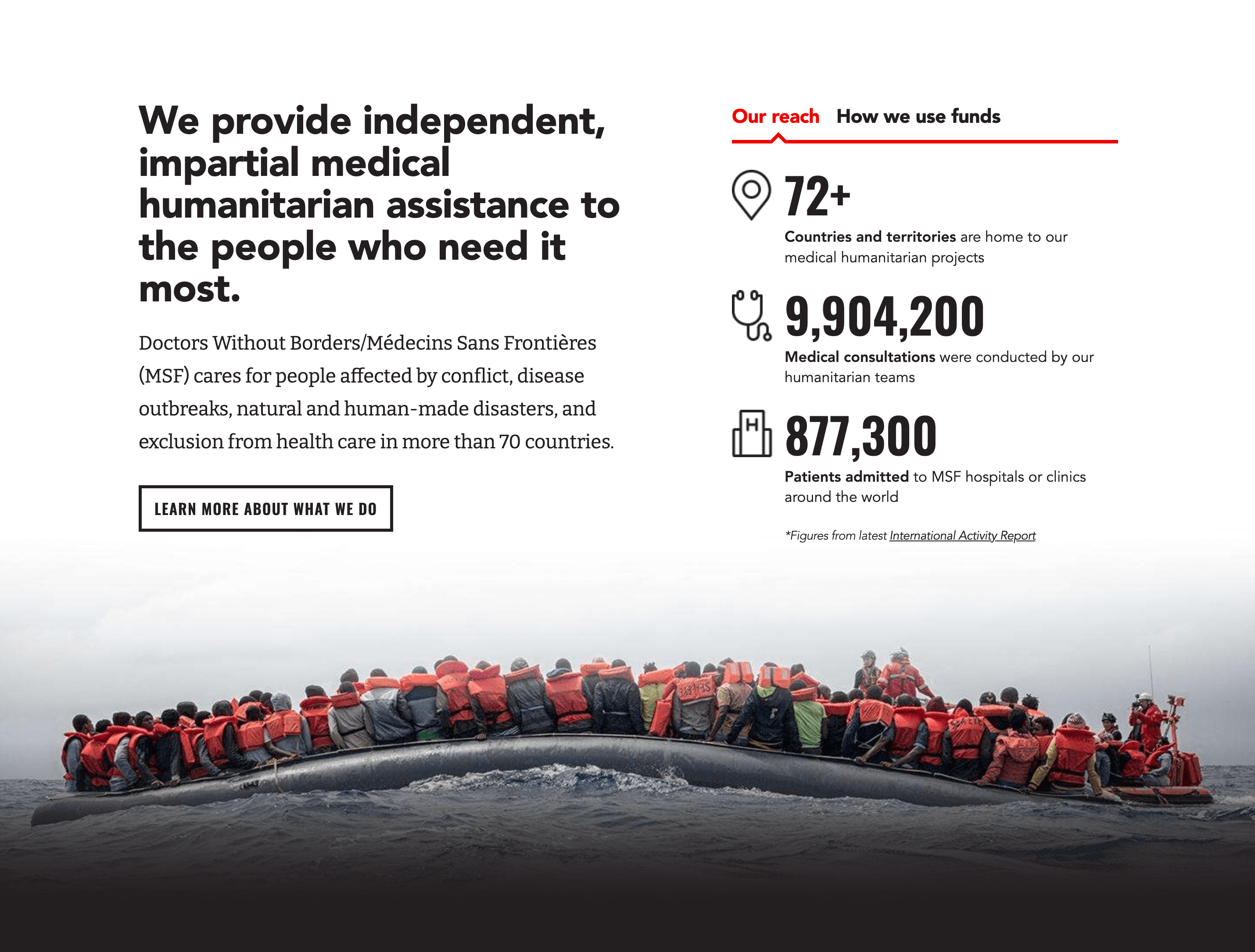
Doctors Without Borders
An iconic organization doesn’t need a lot of pomp and circumstance on their website. The colors and layout are simple to let their work do the talking. And talk it does!
Best Nonprofit Websites from Arts and Culture Organizations
Arts and culture make life more
Art Institute of Chicago
It only makes sense that a famous art museum’s website would have a lot of art on their homepage.

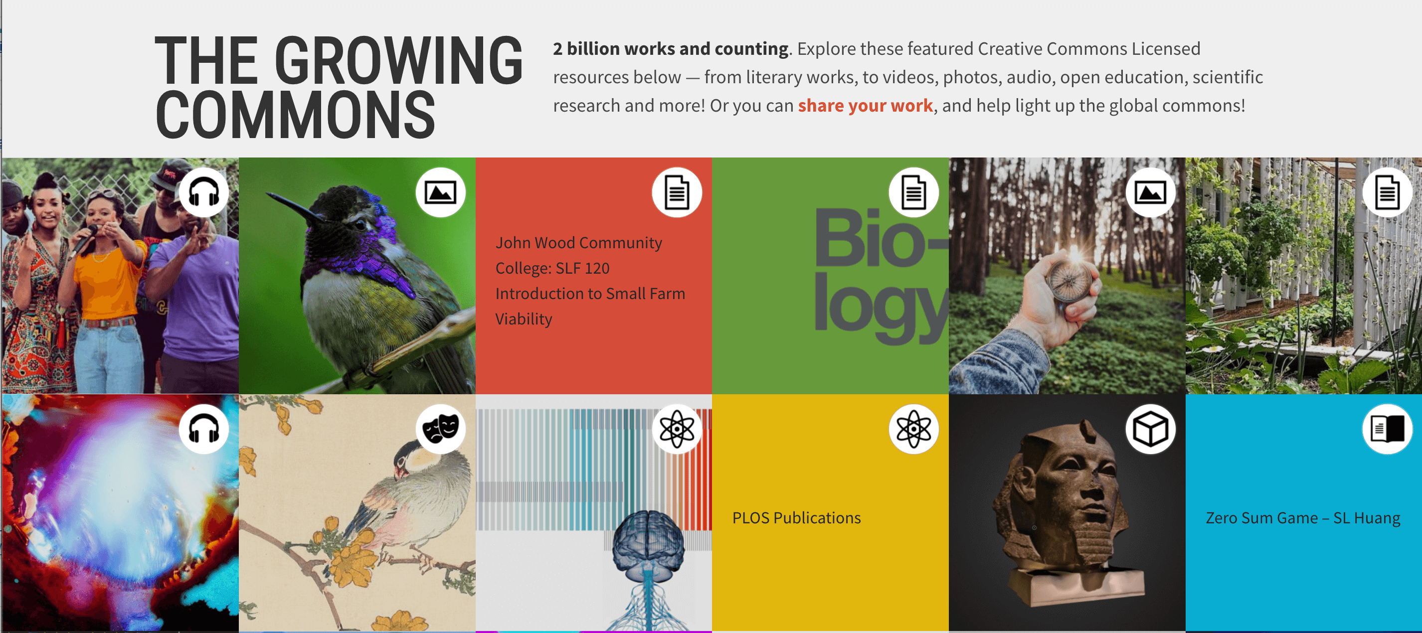
Creative Commons
Creative Commons is a nonprofit art licensing provider. The coolest part of their website is the featured work gallery, where you can see just how diverse their clientele is.
New York City Ballet
Like the ballet itself, this website is all about movement with black and white video footage at the top of the homepage.

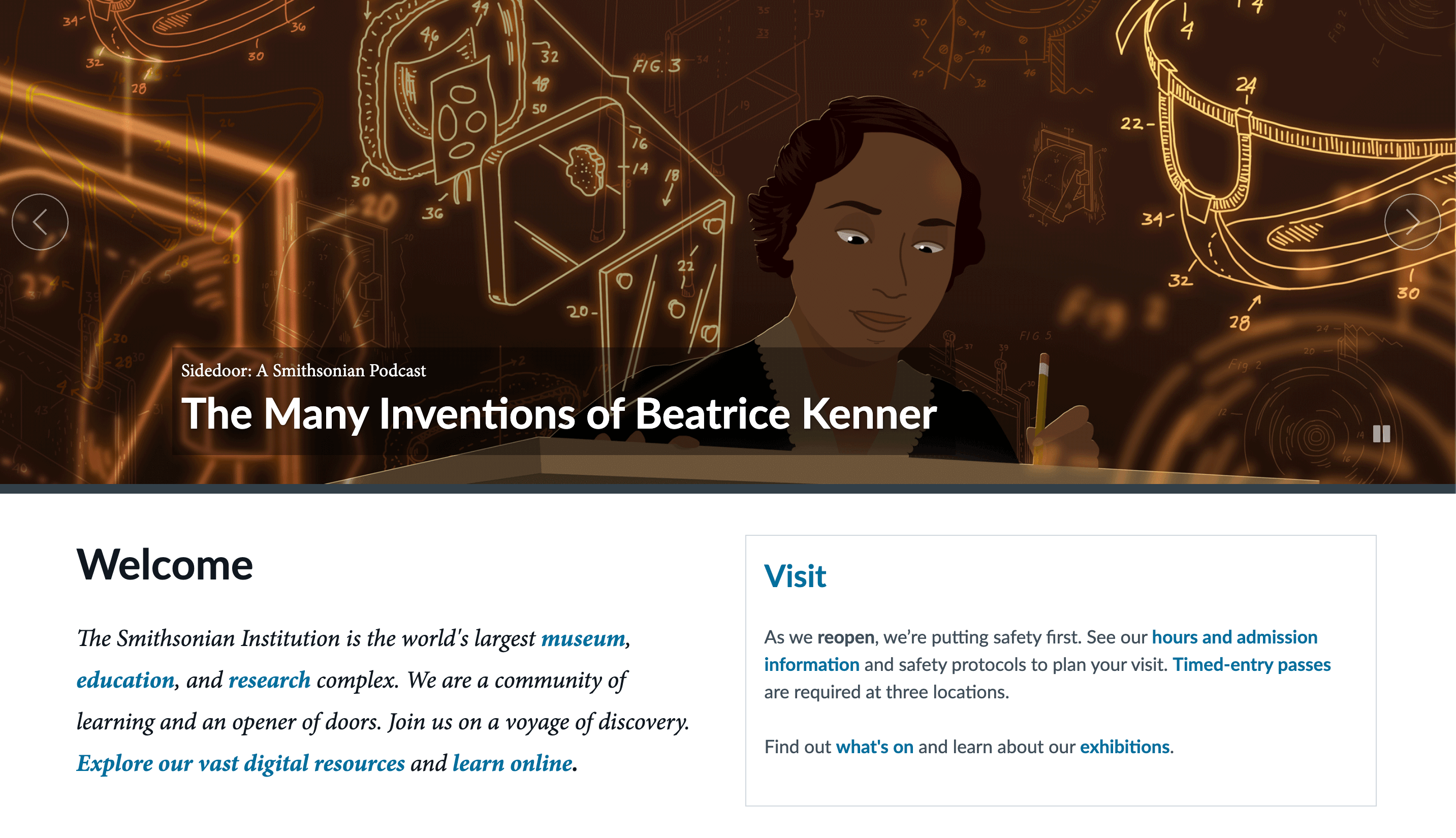
Smithsonian Institution
The Smithsonian website is all about information and education.
Best Nonprofit Websites from Environmental and Animal Rights Organizations
These organizations are dedicated to saving the planet and the creatures that live on it.
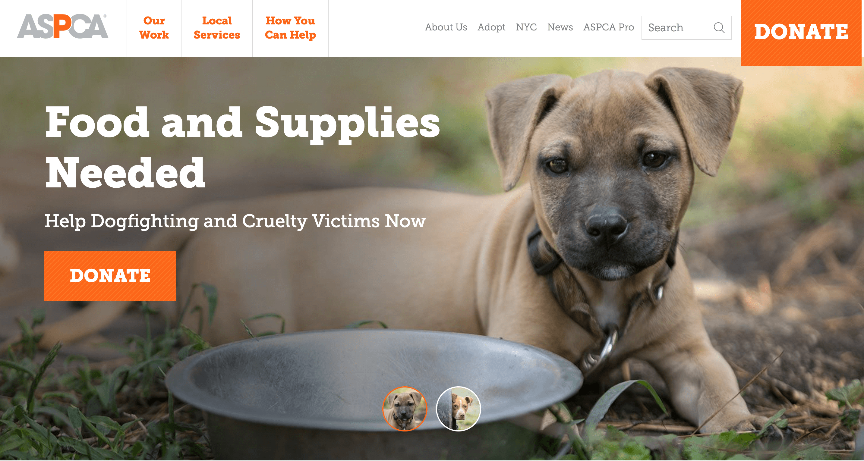
American Society for the Prevention of Cruelty to Animals (ASPCA)
The ASPCA is more than those sad commercials. You will find plenty of photos of cats and dogs on their website, but you’ll also find information on their initiatives, informational content on pet safety, and more.
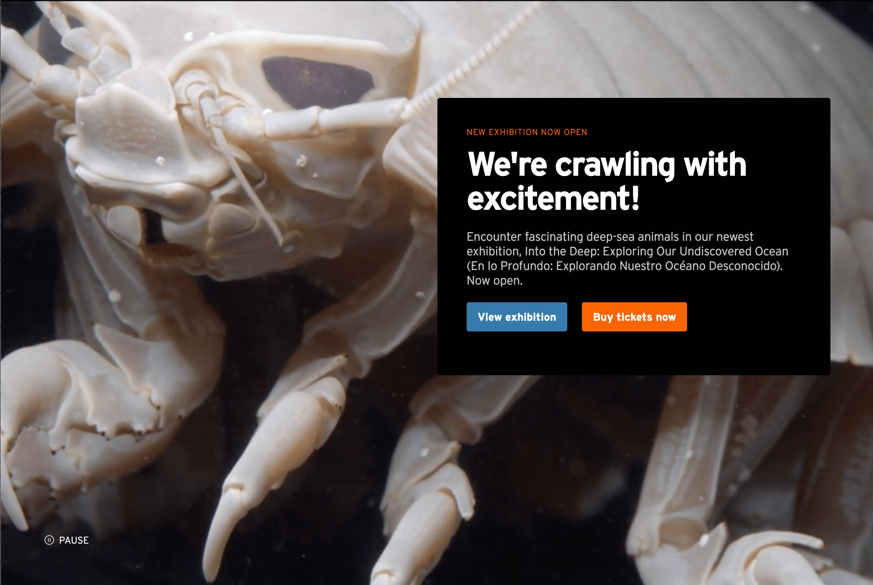
Monterey Bay Aquarium
The Monterey Bay Aquarium is one of the biggest names in marine animal conservation. As you scroll through their website, you’ll be greeted by animated images of animals in their exhibits.
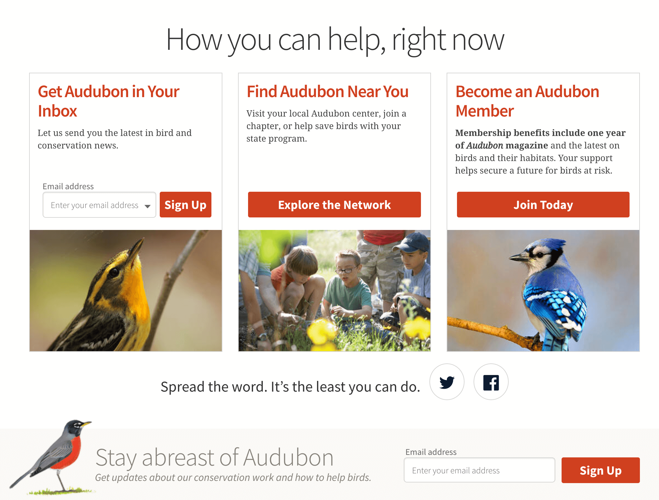
National Audubon Society
Of course, a bird conservation society has a lot of pictures of birds, but their copy is the real star with headlines like “Stay abreast of Audubon” and “Birds in the News.”
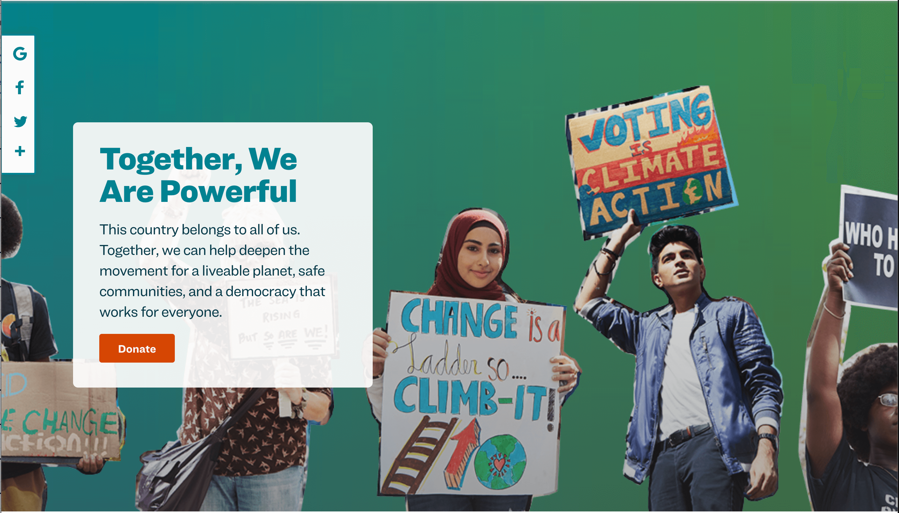
Sierra Club
Visitors to the Sierra Club’s website are greeted with a pop-up requesting an online donation, followed by one asking for their email address. You can also contribute to individual initiatives, sign petitions, and join your local chapter.
World Wildlife Fund
You know their panda logo, but do you know that WWF is about more than animals? Their website divides their advocacy into six categories:
- Food
- Climate
- Freshwater
- Wildlife
- Forests
- Oceans
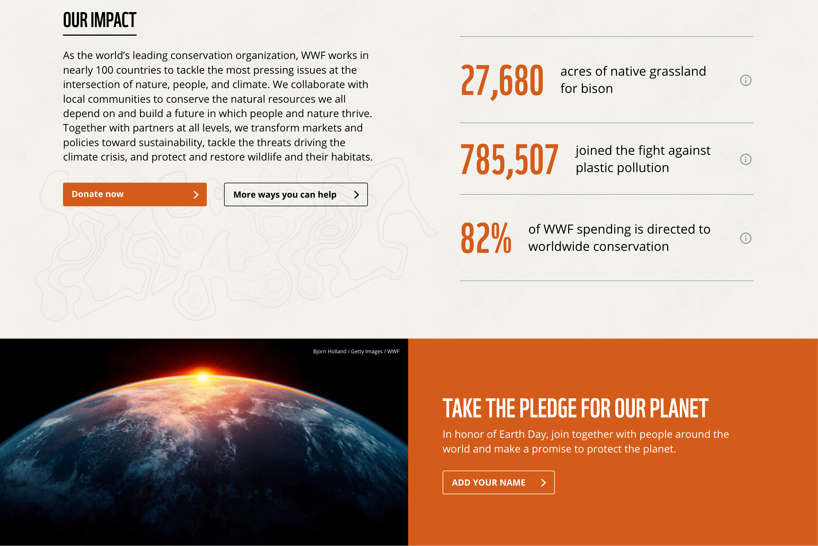
The Nature Conservancy
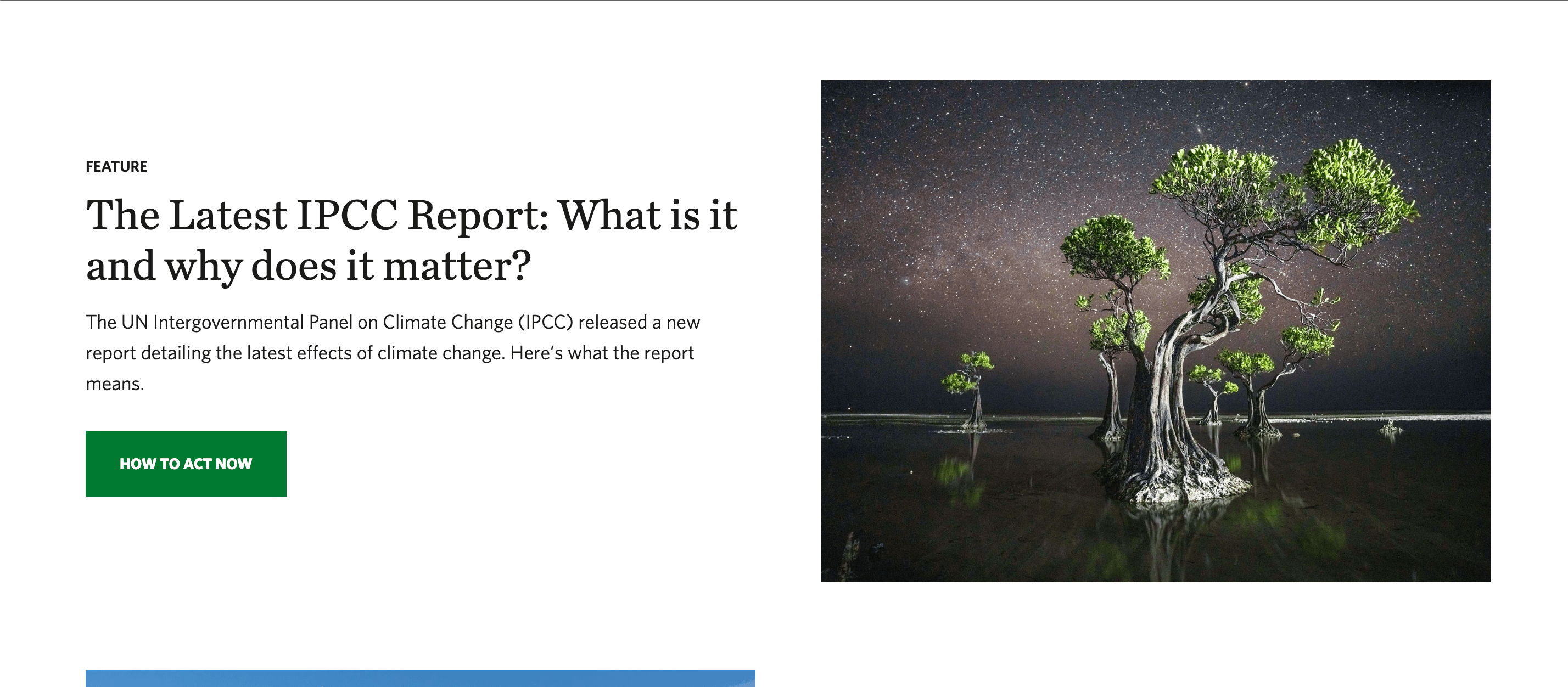
The beautiful photography on the Nature Conservancy’s website creates a drive to protect the subjects of the photos.
Best Nonprofit Websites from Human Rights Groups
These organizations fight for a variety of social and humanitarian issues from hunger to water access to immigrants’ rights.
charity: water
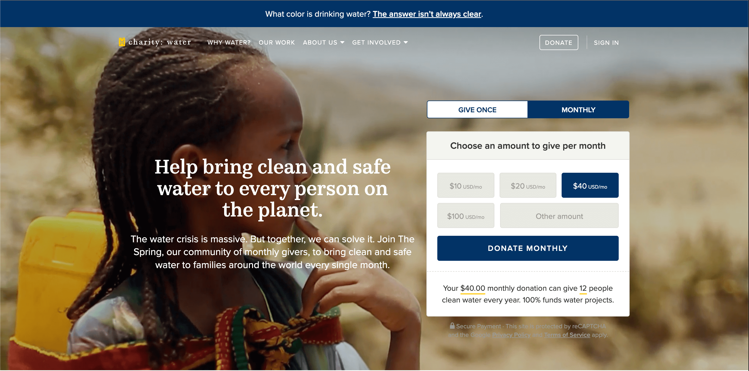
Charity: water cuts right to the chase with their website. Start with video footage related to their work with their mission statement and a short donation form overlaying it. Then scroll down for stats on how much water access they’ve provided.
Feeding America
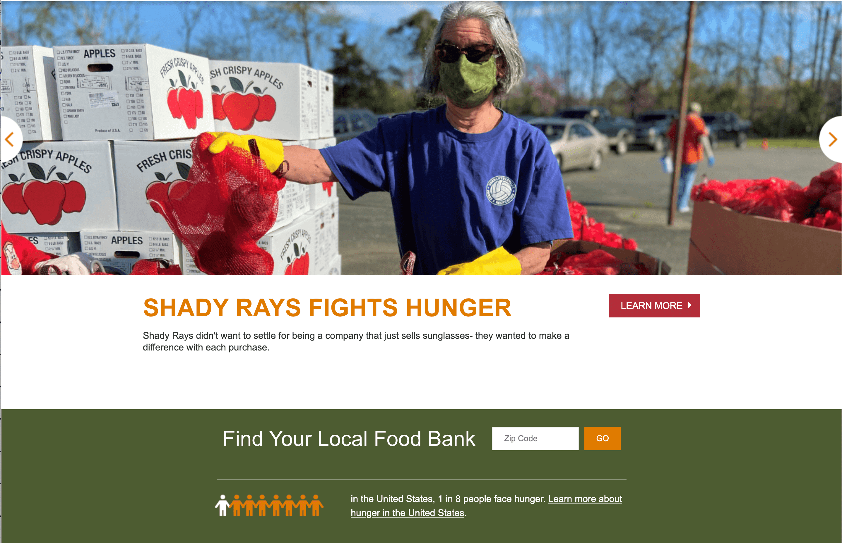
The imagery on Feeding America’s website focuses on photos of volunteers and donated food. The next thing you see is the 1 in 8 statistic with a graphic illustrating it and a search bar to find your local food bank.
Save the Children
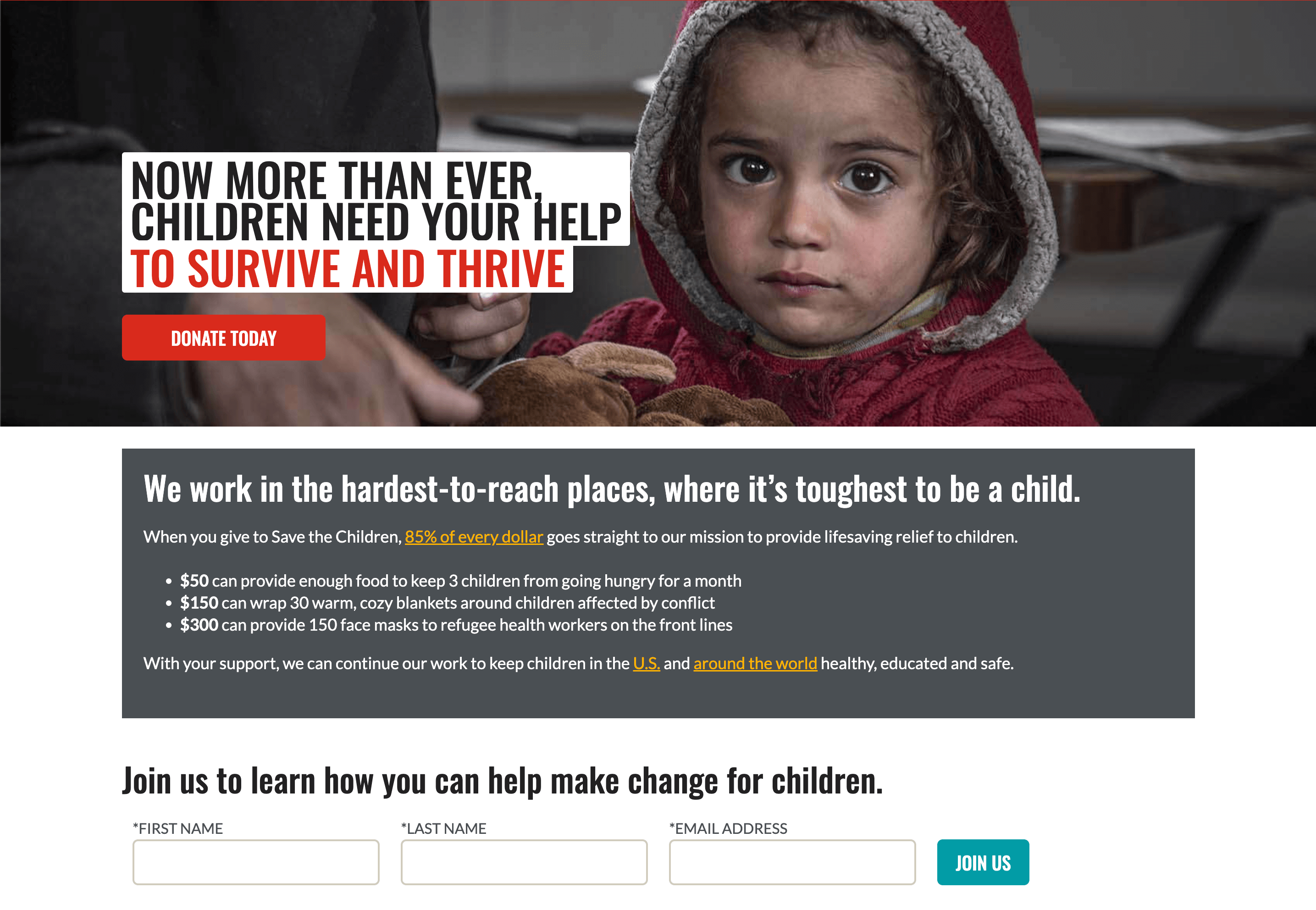
Save the Children is known for their Sponsor a Child program. On their homepage, they effectively create a sense of urgency and how far your donation can go.
The Malala Fund
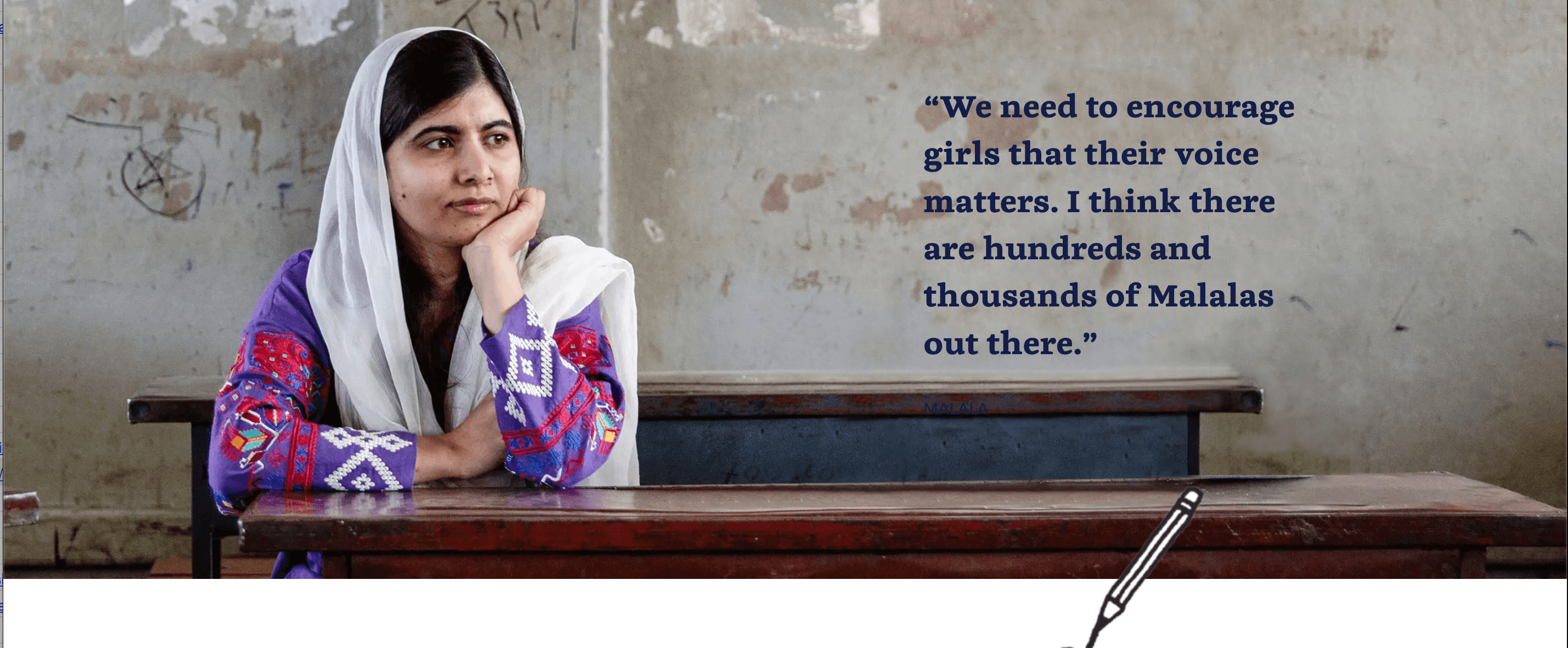
Between the images of young girls who look happy to learn and empowering language, the Malala Fund’s website effectively captures the organization’s ethos.
The Refugee and Immigrant Center For Education and Legal Services (RAICES)
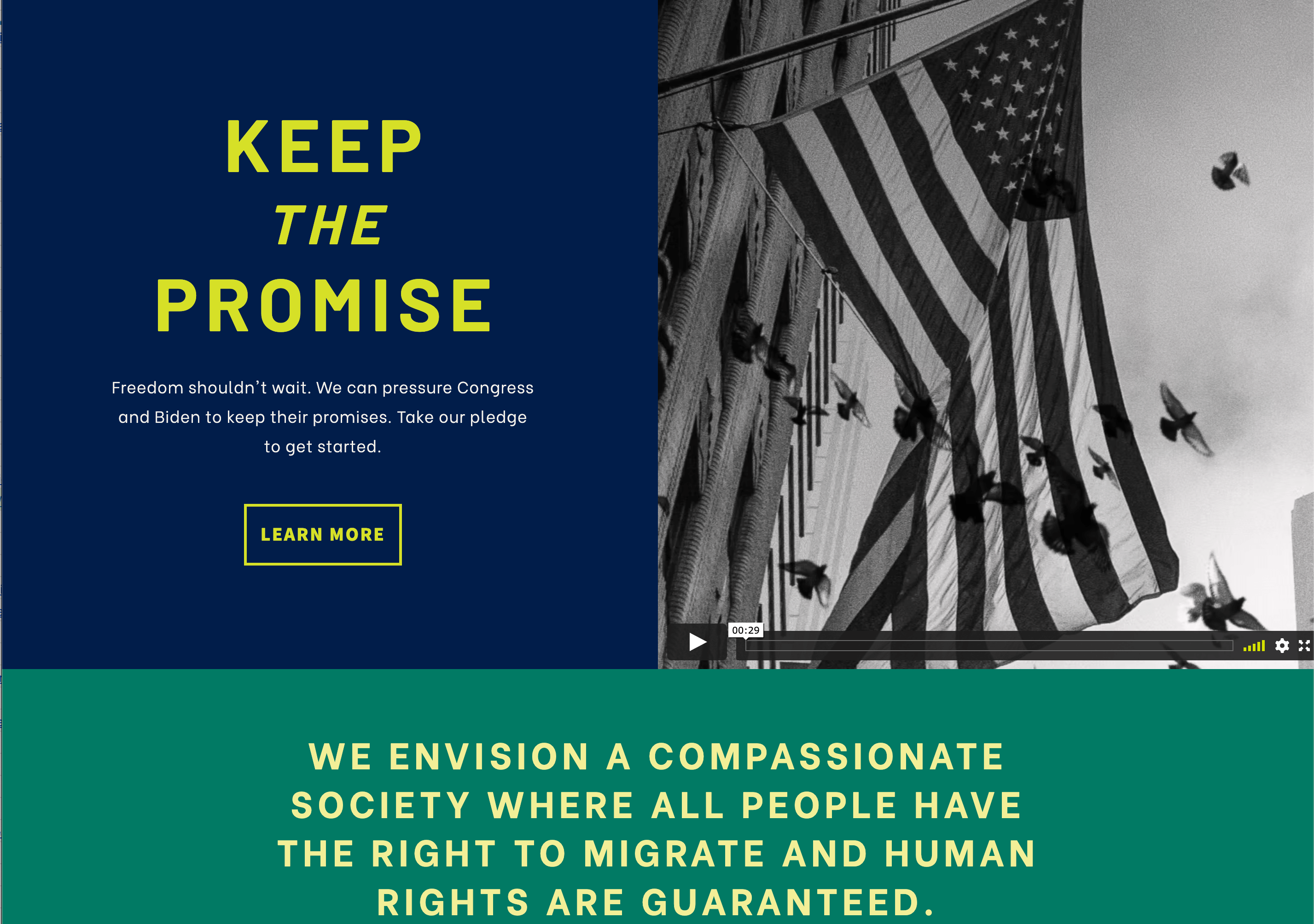
RAICES effectively uses bold colors and concise copy to make their immigrants’ rights services stand out.
Best Nonprofit Websites from Child Development and Youth Programs
If you believe the children are the future, take inspiration from these youth-centered organizations.
Boys & Girls Club
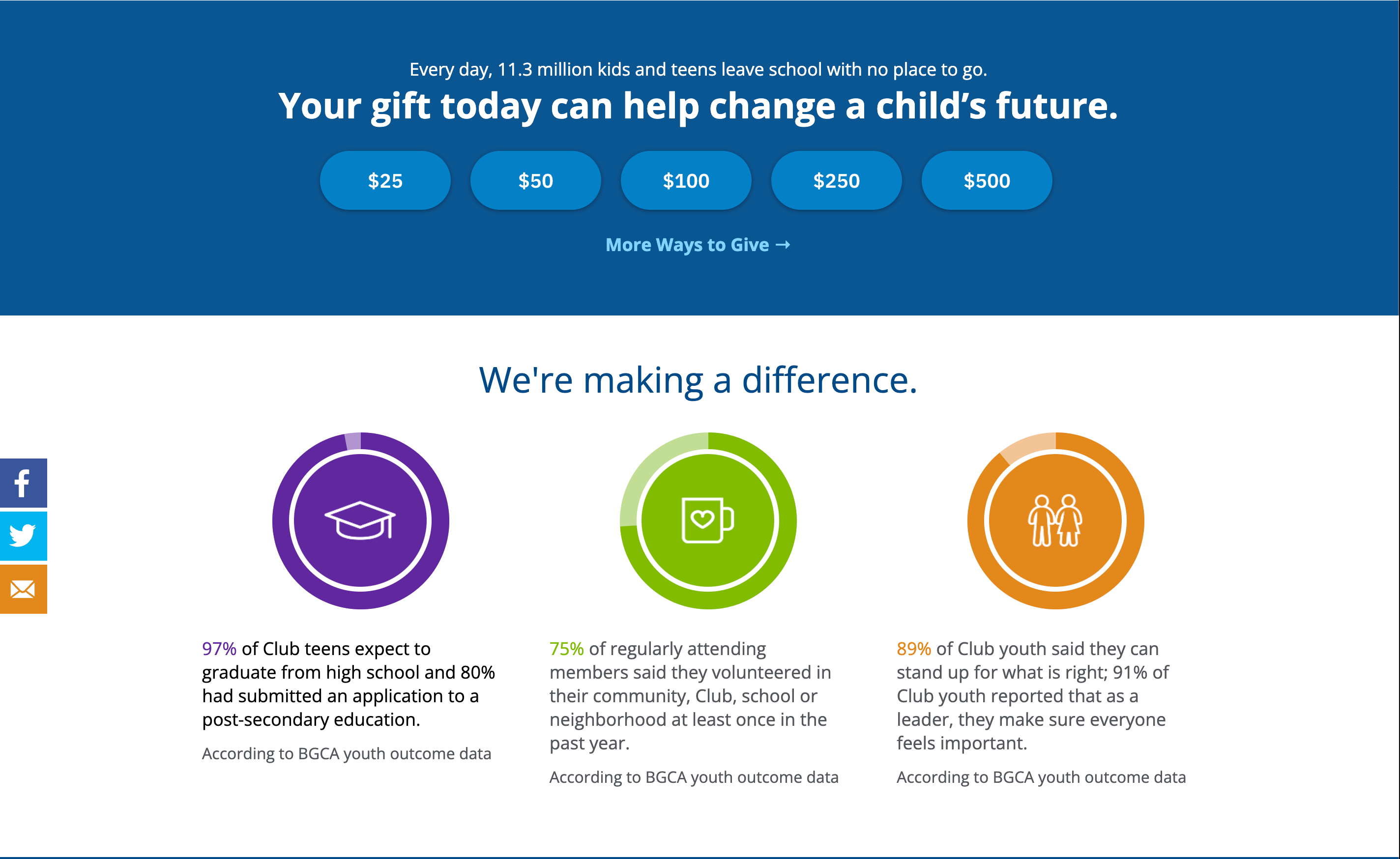
The cool thing about the Boys & Girls Club website is what they choose to highlight to demonstrate the ways they make a difference.
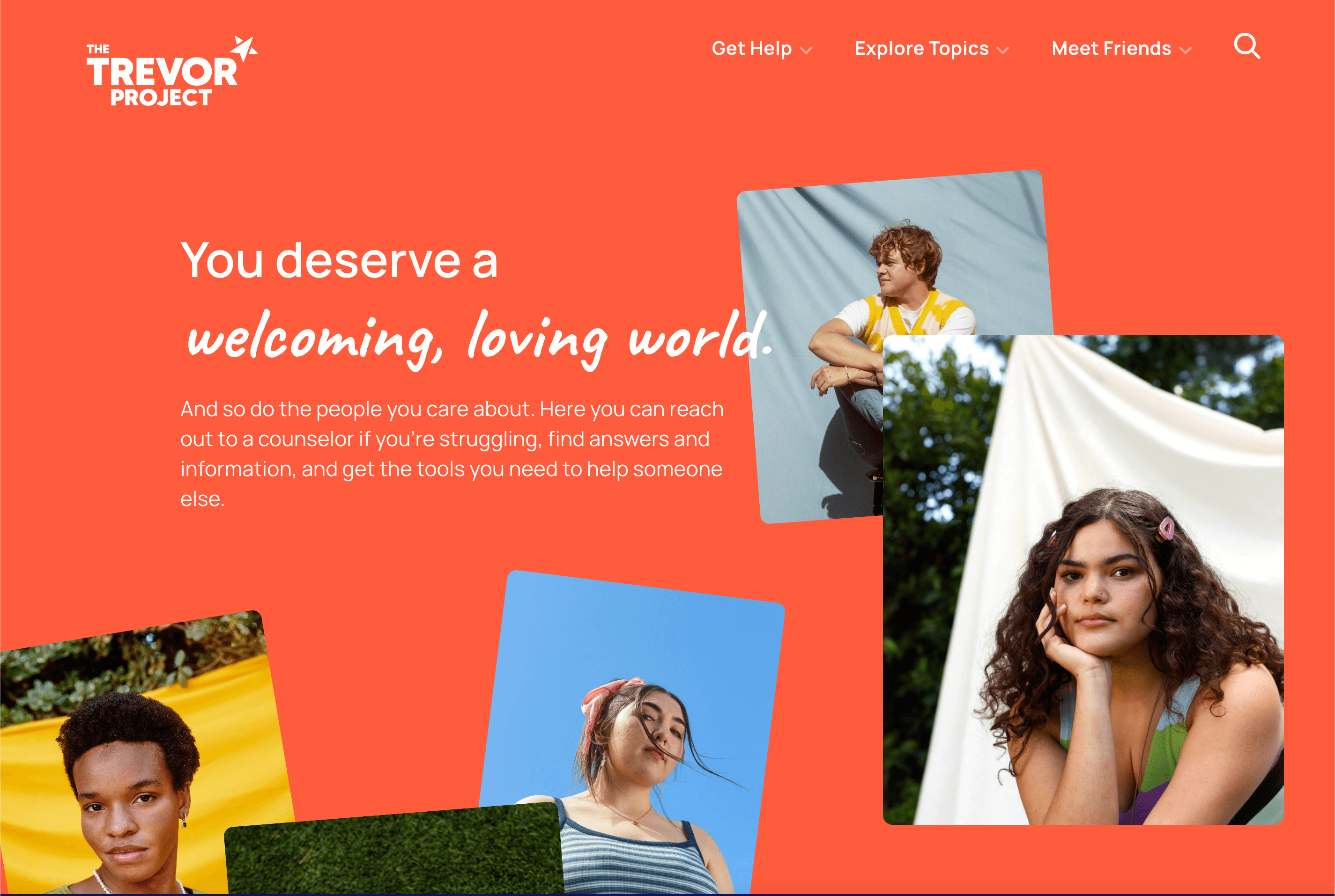
The Trevor Project
The Trevor Project, an organization that prevents LGBTQ youth suicide conveys warmth, acceptance, and community on their website with the words and visuals they use.
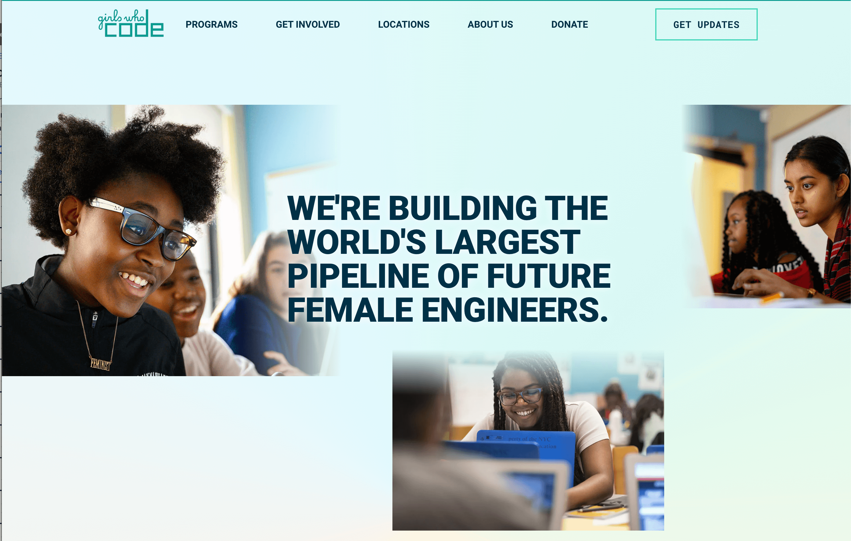
Girls Who Code
The mood of the Girls Who Code website is one of energy and excitement, just like the feelings they aim to inspire in girls interested in tech.
How Sav Can Help
Sav wants to help you help the world by offering the tools to make your organization’s website the best it can be. Not only do we provide features you need at prices you can afford, but all Sav website builder users can get a free SSL certificate, responsive templates, SEO optimization, Google Analytics integration, and unlimited storage. Start your free trial to get started.
Newsletter
Popular
Top Articles
Recommended articles
How to Make a Media Kit
What is a Media Kit? A media kit, also known as a press kit, is a document that businesses give to journalists and media outlets before an...
Read moreWhat is Brand Voice? [And How to Create One]
What is Brand Voice? A brand voice is the unique personality a brand takes on in all of its communication channels. And it’s not just about...
Read moreA Beginner's Guide to the Product Development Process
What is Product Development? Product development is the process of creating a new product or updating an existing product from idea to...
Read more

