
Color has the power to make your web design pop, establish your brand identity, improve user experience, and even influence consumer behavior. These hot and cool tips will help you choose the right colors to accomplish your website’s goals.
What is a Website Color Scheme?
A website color scheme refers to every color that appears anywhere on your website. This includes everything from the logo to the background to the text, buttons, and even photos. Together, they shape the look and feel of your website.
Why Website Color Schemes are Important
The color palette your website is about more than aesthetic taste. Here are some of the reasons why it’s worth it to carefully and thoughtfully plan your color scheme.
Aesthetic
Choosing the right color scheme for your website is a great way to give viewers a good first impression.
People like pretty websites better than ugly ones.
Not only do visitors not want to spend time looking at a website that doesn’t look good, but a poorly designed website can make you look like a scammer. A unified color scheme not only looks good, but shows that you put time and effort into your website.
Brand Perception
Colors can send a message about your brand beyond “this one is pretty” and “this one is ugly.” Color psychology studies have determined what traits US consumers associate with colors. Here are some common examples:
Red |
|
Orange |
|
Yellow |
|
Green |
|
Blue |
|
Purple (Violet) |
|
Pink |
|
Brown |
|
Black |
|
White |
|
Grey |
|
You can choose colors based on how you want visitors to perceive your website. Blue is typically considered the safest choice since it’s associated with trust and security and because it’s a lot of people’s favorite color. This is why a lot of tech companies and banks use blue for their logos.
That doesn’t always make it the best choice though. If your brand centers around health and wellness of nature, green is the best choice for that association. If you want to appeal to impulse shoppers, red or orange could serve you well.
Functionality
Design and color choices also affect the user experience of your website. Buttons, links, and other interactive elements should be easy to spot. Color is one of the most effective ways to accomplish that. You can’t miss an orange CTA button on a white background.
However, for the sake of accessibility make sure color isn’t the only way you’re communicating information. Colorblind people need to be able to use your website just as easily as people with typical color vision. Effectively labeling your infographics and choosing contrasting colors can make that happen. If you have any doubts, try printing out your pages in black and white to make sure you can clearly understand them.
Conversion
The principles of color psychology also mean that colors can influence consumer behavior. Using red or orange for CTA buttons leads to more sales than blue or purple.
Simplify Design-Related Choices
Creating a color scheme may seem tedious now, but it will save you time down the road when you need to choose the color for something new, whether it’s for your website or something else related to your business.
Brand Recognition
Who can think of McDonald’s without picturing their red and yellow logo and packaging? Or Facebook without their signature blue and white? UPS even mentions their dominant color in their slogan. Though your company may not reach this kind of international fame, the same principle can apply to you.
Examples of Website Color Schemes to Inspire You
Before you get started on your own website color scheme, take a look at these examples from the pros and see just how varied good color schemes can be.
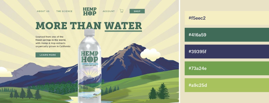
Hemp Hop’s color scheme is a great example of using greens and earthy tones to communicate health and wellness.

Some people think neutral colors are boring. This color scheme for Fay uses them to convey sophistication, fashion, and class.
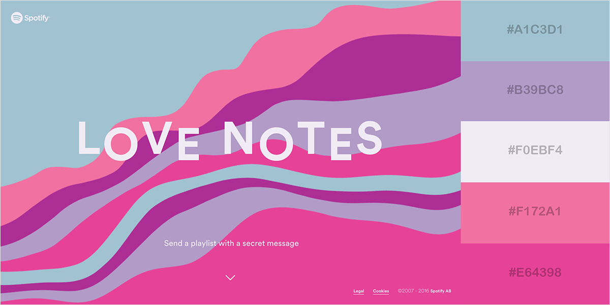
This campaign from Spotify doesn’t shy away from bright pastel colors to grab the viewer’s attention. As you can tell by the title text, the theme is love, so choosing shades of pink makes sense.
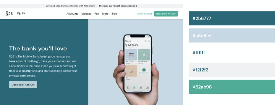
N26 uses a color scheme that makes perfect sense for a bank. The main color is teal, which combines blue for security and green for wealth. The lighter green is bold, yet easy on the eyes. The white space creates a clean, organized look.
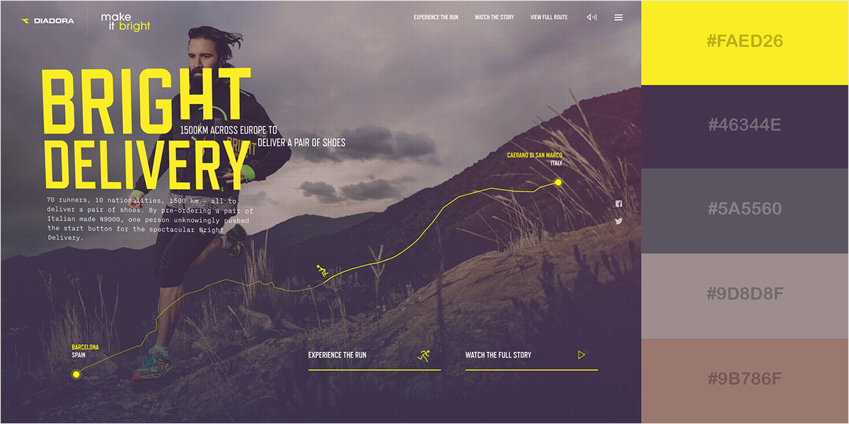
Diadora uses bright yellow to create a striking contrast against the dark, earthy tones to let you know that they’re nature-y but they’re also exciting. The yellow draws the viewer’s eyes exactly where the designer wants them to be.
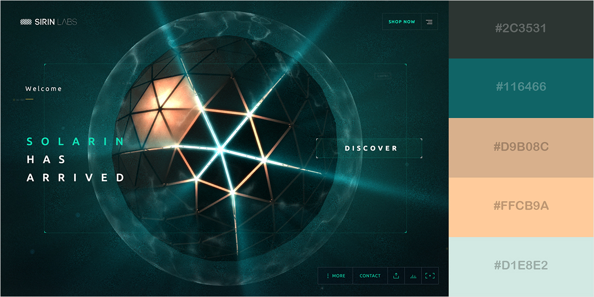
Sirin Labs is clearly going for a futuristic look with the dark background and light foreground and text.
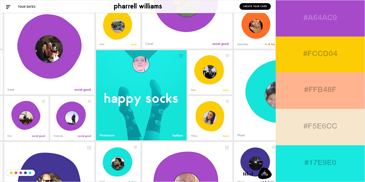
Pharrell Williams is a whimsical entertainer. It only makes sense that the colors on his website would also be fun, bright, and whimsical. This is also a website that isn’t afraid of white space.
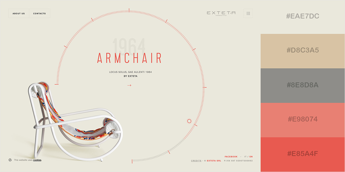
This product page from Exteta showcases their elegant, minimalistic aesthetic. The contrast between the neutral background color and the pops of red are understated, but appealing. Not putting any other objects in the background also makes sure viewers are paying attention to the chair.
Color Theory vs. Color Psychology
Color theory tells us where on the color wheel colors that go well together are located relative to each other. It standardizes something that many people think is simply a matter of taste and eyeballing it. When you learned about primary colors and mixing them together in childhood, you were learning the most basic elements of color theory.
Color Psychology concerns associations that the brain draws between colors and how they are influenced by cultural factors. Both of these concepts combined can help you pick colors that will appeal the most to viewers. Though yes, beauty is in the eye of the beholder, appealing to the most popular preferences for colors and putting your own twist on the design is the way to go for designing a website when the goal is to convert as many visitors to customers as possible.
Create Your Own Website Color Scheme
Creating your own color scheme for your website and business may sound tedious, but it doesn’t have to be hard. Here are some practical steps to get you started.
Consider Your Target Audience
Color associations are not universal. Culture, age, and life experiences all affect how people perceive colors. Here are some notable examples of colors that carry different symbolism in other countries than in the United States
- Red represents good fortune in China, but mourning in South Africa
- Orange represents spirituality in Buddhist-majority countries
- Green is the sacred color in Islam
- Purple signifies wealth and nobility in many cultures, but represents death and mourning in Brazil
- Pink signifies trust in Korean culture
- White is the mourning color in many East Asian cultures
Blue is associated with trust and serenity in almost every culture, which makes it the safest color choice for companies with international audiences.
Creating a Color Palette
Find Your Primary Color
The first step is to choose the main color that will dominate your brand’s design. This will typically be the color of your logo. Choose it based on the traits you want people to associate with your company.
Decide On The Number of Colors
Next, decide on a number of colors. Most common color schemes use two, three, or four colors.
Choose Your Secondary Colors
Next, choose the rest of your colors. Secondary colors are a mix of two primary colors. Think purple, orange and green. Tertiary colors are a mix of a primary color and a secondary color like red-orange, yellow-orange, yellow-green, blue-green, blue-violet, and red-violet.
Here are a few common methods for choosing color combinations that go together:
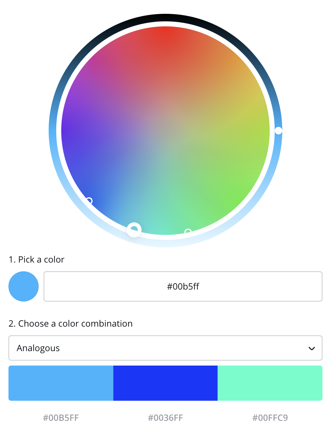
Analogous
An analogous color scheme uses colors that are next to each other on the color wheel. This can be difficult to do for beginners, as similar colors can easily overpower each other and color contrast between the background and text is important on websites for readability purposes. But if you find the right balance by changing the tints, the results could be vibrant and eye-catching.
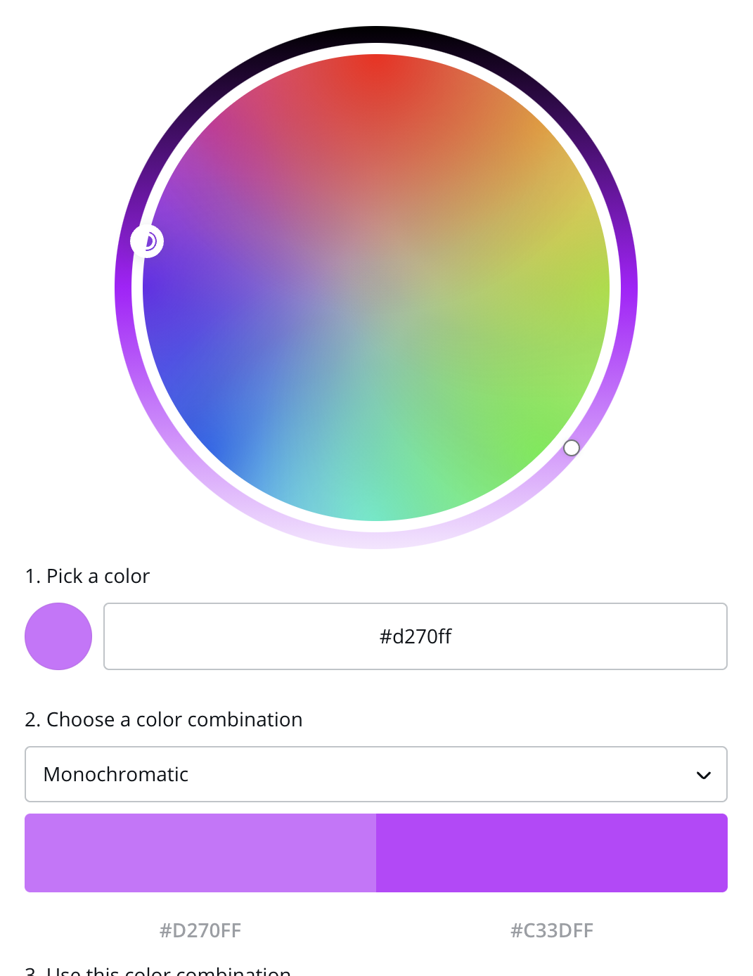
Monochromatic
A monochromatic color scheme has one main color in different shades. This is the easiest type of color scheme to create and results in a simple, understated look. However, it’s not the best idea for every website.
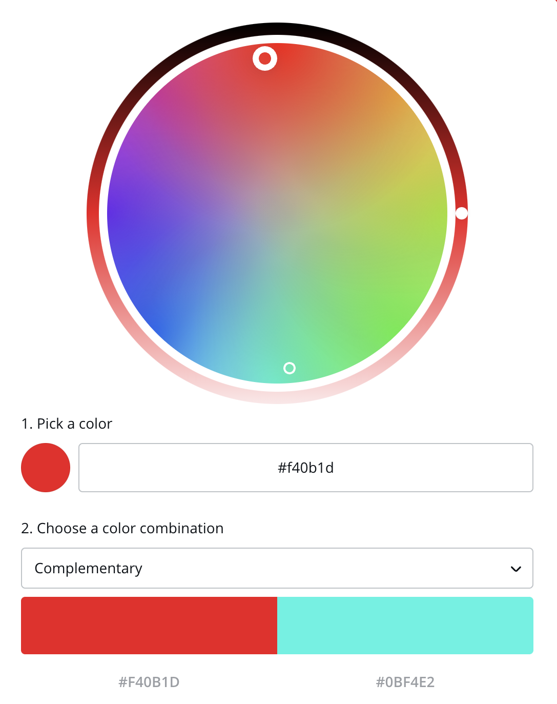
Complementary
A complementary color scheme includes colors that are directly opposite of each other on the color wheel. Complementary colors create a high contrast look, which makes them a great choice for websites and brand colors.
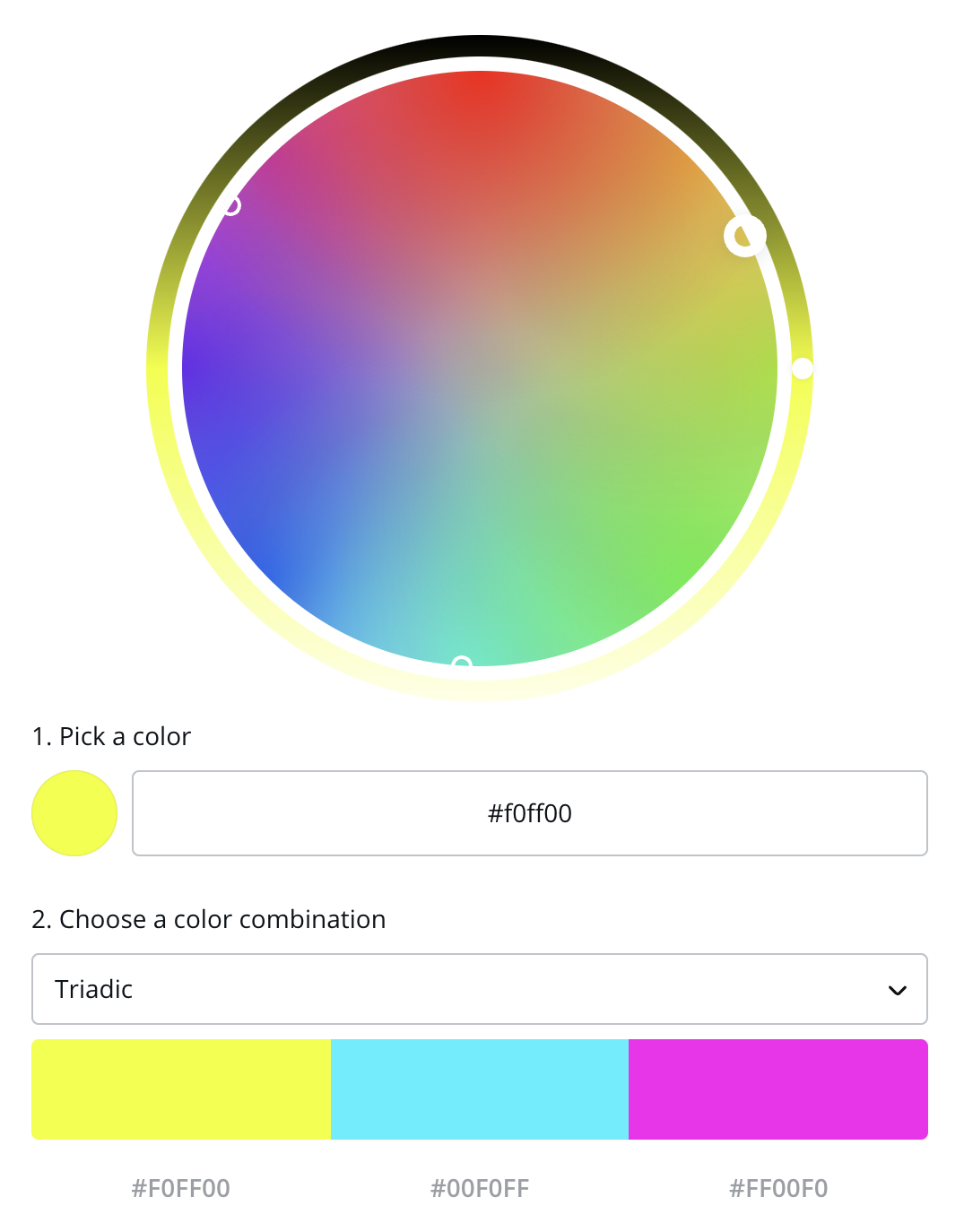
Triadic
A triadic color scheme uses three colors that are 120 degrees apart on the color wheel, making a triangle. Triadic color schemes are balanced and harmonious.
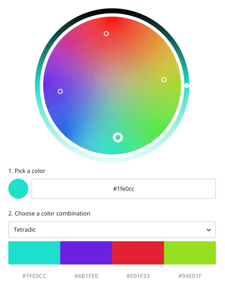
Rectangle/Tetradic
A rectangle or tetradic color scheme uses two pairs of complementary colors that are separated by at least one color. It will look like a rectangle on a color wheel.
Achromatic
An achromatic color scheme uses exclusively black, white, and grey. An all black and white website may not be a good idea, but throwing in a bright accent color against an otherwise achromatic scheme can have a cool effect.
Don’t Forget Your Neutral Colors
Neutral colors are greys, browns, blacks, and whites. They may not be as exciting, but they’re a crucial part of any color scheme. They’re the colors for the body text. Sometimes they’re for the backgrounds.
Neutral colors are great for text and backgrounds. Logos should be primary or secondary colors.
Applying Your Scheme to Your Web Design
If you’re using three colors, aim for a 60-30-10 breakdown. One color should take up 60% of the design, another should take up 30%, and the last color should take up 10%.
Your primary colors should go on the sports on your website where you want to draw the viewers’ attention such as:
- Calls to action
- Headings
- Benefit icons
- Download forms
- Important information
Secondary colors should highlight less important information including:
- Secondary buttons
- Subheadings
- Menu items
- Backgrounds
- FAQ and Testimonial pages
That leaves your neutral colors for:
- Text
- Backgrounds
- Alongside other colors in designs
Document Your Color Palette in a Brand Kit
After you’ve chosen the color scheme for your website and brand colors, make sure the work continues to pay off as you grow your brand presence. To ensure that the exact colors in your scheme are easily available to every member of your team, make it part of a brand kit. For web design, that includes the RGB and HEX codes for each color.
Color Tools
If you’re stuck on choosing the perfect colors, try some of these tools to get your creative juices flowing.
ColorZilla can find the HEX code for any color.
Color Space automatically generates color schemes. Great if you get stuck.
Dribbble is a great place to find inspiration from other designs.
Palleton makes it easy to choose colors on a color wheel from different types of color schemes.
Coolors randomly generates color schemes.
If you have design needs but don’t have the skills to meet them yourself, Canva is wonderful. Their color wheel tool is a great starting point.
Many website builders, including Sav's, have their own color picker tools.
Now It’s Your Turn
Picking the perfect colors for your website is at your fingertips. Whatever colors fit your tastes and your brand, our professionally made, customizable templates take the guesswork out of website design. Start designing today.

Recommended articles

How to Come up With Ecommerce Product Ideas
Whether you’re starting a new ecommerce business or expanding a pre-existing one, what products to sell online is an important decision....
Read more
How to Create a Modeling Portfolio
What is a Modeling Portfolio? A modeling portfolio is a demonstration of your skills and talent you can show to potential employers and...
Read more
The Best Side Hustles From Home to Try
Why Start a Side Hustle from Home? Earn Extra Money Being alive is expensive right now. Whether your financial goals are to pay off your...
Read more