
What is Website Accessibility?
Website accessibility is the practice of designing a website that is accessible to users with disabilities. An accessible website:
- Presents information through multiple sensory channels to reach users with visual and hearing impairments
- Is compatible with common assistive technologies
- Is generally easy to use and understand
Many people assume that accommodating disabled web users is difficult or expensive. If you follow this guide and make an effort to understand experiences that are different from yours, you will see that this couldn’t be further from the truth.
Why is Website Accessibility Important?
As the internet becomes more and more central to everyday life, it’s more important than ever to make sure no one is left out of any given website’s experience. An accessible website ensures that anyone can easily become your customers. It’s the right thing to do, it’s good for your bottom line, and is required by law in several countries.
Social Responsibility
Making your website accessible for all is the right thing to do. The internet can be a powerful equalizer, but unless people who design websites make an effort to include everyone it falls short of that potential.
Good for Business
If you think people with disabilities are a small minority not worth considering, think again. The Center for Disease Control (CDC) estimates that 26% of all adults in the United States have a disability:
- 13.7% of US adults have a mobility impairment
- 10.8% of US adults have a cognitive impairment
- 5.9% of US adults are deaf or hard of hearing
- 4.6% of US adults are blind or have low vision
The World Health Organization (WHO) estimates that 15% of the global population has a disability.
An accessible website means a larger pool of potential customers. And there’s a reason advocacy groups often refer to non-disabled people as “temporarily able-bodied.” It’s the one minority group that you could join at any time.
Legal Compliance
Even if none of that was true, several countries, including the United States, have laws that require equal access to public spaces and services for people with disabilities. Websites are included in these requirements. If your website is not ADA compliant, you could be liable for legal fees.
How Accessible is Your Website?
To get a baseline idea of where your website is now and how you can improve it, run an accessibility audit. Services like Siteimprove can run an audit that compares your website to the accessibility standards that apply to your country and make suggestions for improvements.
How to Make Your Website More Accessible
Web accessibility has a lot of components because there are a wide range of conditions that fall under the umbrella. Accommodating all of them may sound overwhelming, but following these steps will go a long way to make sure that your website meets all accessibility needs.
1. Add Enough Color Contrast
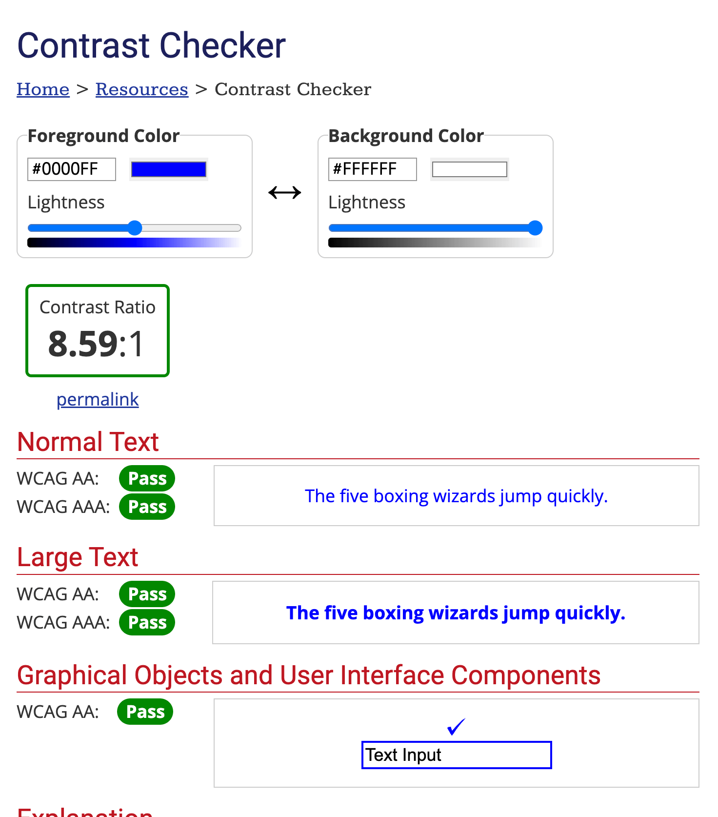
Contrasting colors aren’t just good design sense. They make the website more usable for colorblind visitors and people with low vision. The ideal contrast ratio is at least 4.5 to 1. You can check contrast levels with the Contrast app for Mac, the WebAIM color contrast checker, and other similar tools.
Here is an example of a color pair that meets the standard:
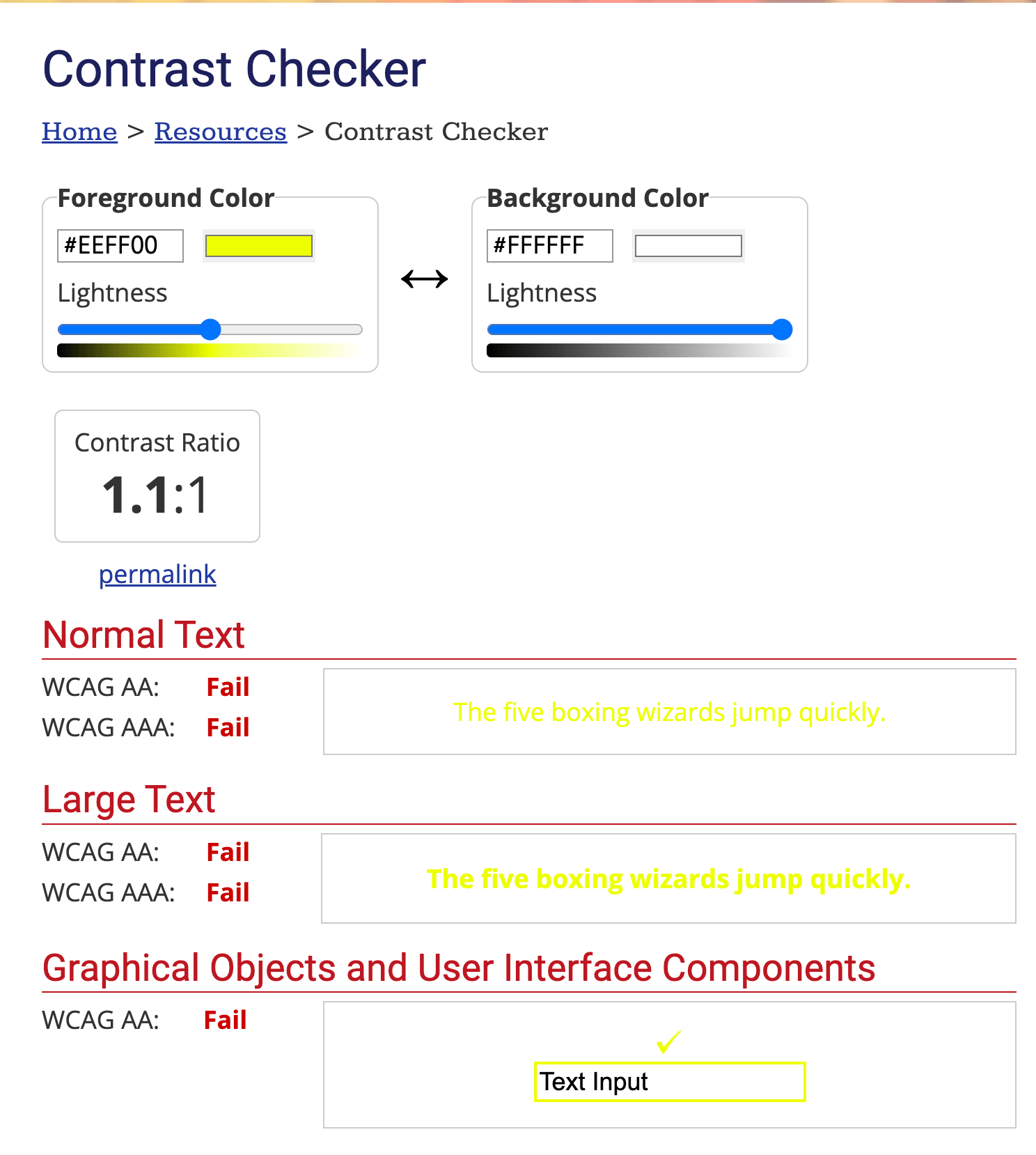
Here is an example of a color pair that does not meet the standard:
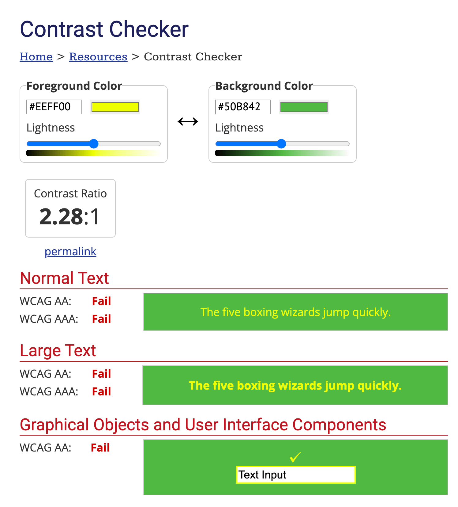
And here’s an example of a color pair that people with typical color vision may be able to read but does not meet the standard:
When in doubt, check the ratio.
2. Don’t Use Color Alone for Navigation and Differentiation
Similarly, don’t use color as the only visual cue for communicating information, showing an action, or prompting a response. Use text labels or patterns as well if possible. For onscreen errors, add an icon or include a title instead of relying on colored text alone. For hyperlinks, either bold or underline the text so visitors who can’t see the blue text can still tell that it’s a link. When in doubt, print out your content in black and white or use an app like Color Oracle to see if your content still makes sense.

The graph on the left would be unclear to a colorblind person. The graph on the right would be much clearer.
3. Keep Navigation Consistent
User-friendly design is a vital aspect of web accessibility. All pages of your site should be consistent and have an intuitive, predictable layout to make navigation as easy as possible. Consistent, predictable navigation allows people with learning disabilities and people who rely on assistive technologies for vision impairments or motor disabilities to use your website just as easily as abled and sighted users.
Using a premade website template is the easiest way to ensure that your site is consistent. Including a search feature and a sitemap on every page will also ensure that any user, regardless of ability, can find what they’re looking for.
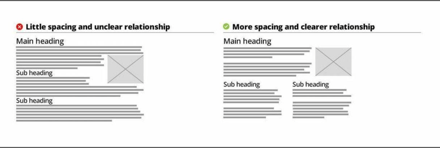
4. Simple Headings and Spacing
Users should be able to recognize the hierarchy of information easily. They should be able to tell what text goes with what headings and images. Information that isn’t presented clearly and directly can be a pain for people with ADHD and other cognitive disabilities. Here are some ways to keep your site design usable for these demographics.
- Avoid big blocks of text
- Add white space between paragraphs
- Make headlines bigger and bolder than the body text
 5. Design for Various Devices
SEO isn’t the only set of best practices that overlaps with accessibility standards. There’s also a lot of overlap between best practices for web accessibility and mobile friendly web design. These features include:
- Using a responsive website template
- Avoiding large blocks of text
- Using alt text for images
- Simplifying forms and menus
- Keeping navigation as simple as possible
- Using large, readable fonts
The same web design elements that ensure a user-friendly experience for mobile users help ensure the same for disabled users, particularly those who rely on assistive devices to use the internet.
 6. Include Alt Text on all Images
Alternative text, often shortened to alt text, refers to descriptive text that accompanies images so screen readers, a device that assists blind people by reading the contents of electronic screens out loud, can process the images.
They also have an SEO benefit since search engine bots can’t see images either and Google ranks websites with alt text on their images higher than ones without it.
There are two ways to present alt text:
- Within the <alt> attribute of the image element
- Within context or surroundings of the image
Whichever you use, describe what’s happening in the picture and what purpose it serves for the broader context of the site. If the image is purely decorative or the surrounding context already explains the content, you can add an empty <alt> attribute. This will let the user know that there is a picture there, but it doesn’t communicate any information. It’s better than no alt text at all because some screen readers read the file name to the user if they can’t find any alt text.

This is an example of the purpose alt text serves. It is short and concise, but describes what the picture shows.
7. Avoid Photosensitive Seizure Triggers
Rapidly flashing lights can trigger seizures in some people with epilepsy. This variety is called photosensitive epilepsy.
Here are a few examples of known triggers of photosensitive seizures:
- Rapid flashes
- Alternating patterns of different colors
- Intense strobe lights
These factors affect the likelihood of photosensitive seizures:
- Frequency of the flash
- Brightness
- Contrast with background lighting
- Distance between the viewer and the light source
- Wavelength of the light
- Whether the viewer’s eyes are opened or closed
Photosensitive seizures are more common in children and teenagers than adults. Some non-epileptic people can also experience symptoms like headaches, nausea, and dizziness when exposed to these light patterns.
To keep your website safe for people who experience photosensitivity, avoid using these potential triggers on your site. If your video content includes them, make sure you have autoplay turned off and include a photosensitive warning.
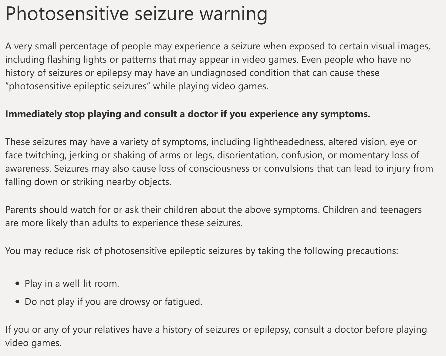
For example, This is XBox's photosensitive seizure warning:
8. Use Plain Language
Using the most straightforward language possible will help people with learning disabilities and who are not proficient in your language use your site without assistance.
Here are some guidelines for using plain language:
- Write for your reader, not yourself.
- Use pronouns when you can.
- Use short paragraphs.
- Be concise.
- State major points before going into details.
- Write in the active voice.
- Use everyday words whenever possible. Explain any technical terms after the first reference.
- Omit unnecessary words.
- Keep the subject and verb close together.
- Use headings, lists, and tables for easier reading.
- Proofread your work and have a colleague proofread it to make sure others can understand it.
9. Design Usable Focus Indicators
The outlines that sometimes show up around links, inputs, and buttons are called focus indicators. The default CSS outline isn’t particularly attractive, so you may want to hide them. If you do that, be sure to replace them with something else.
Focus indicators are important for screen reader users and other people who rely on keyboard navigation so they know where the tab key is focused on the page.
Links, form fields, widgets, buttons, and menu items need to be focusable. You can design custom focus indicators that match the style of your website. For example, some websites use a colored, thicker line.

10. Support Keyboard Navigation
Several groups of disabled people rely on keyboard navigation instead of a mouse. These include blind people who use screen readers, people with motor disabilities, and people who lack precise muscle control. This makes keyboard accessibility one of the most vital components of web accessibility.
Keyboard navigation users use the tab key to navigate between interactive elements. The focus state provides a visual cue so these users know what is highlighted.
It’s important to keep the navigation logical and intuitive. The tab order should follow the visual flow of the page, whether it’s left to right or top to bottom. You should also keep your navigation decluttered by limiting the number of links and length of the text.
Tabbing through a long page is cumbersome for people who rely on keyboard navigation. You can test the keyboard usability of your website by trying to navigate it with the tab key alone yourself.

11. Caption Videos
Captioning video content makes it accessible to Deaf and hard of hearing people and people with auditory processing disabilities. Many platforms offer automatic captioning, but the results are often inaccurate, especially when people in the videos aren’t speaking clearly.
Services like Rev and GoTranscript can accurately caption your video content for you for low prices. If your website includes any audio-only informational content like podcasts or audio work samples, you should also include downloadable transcripts.
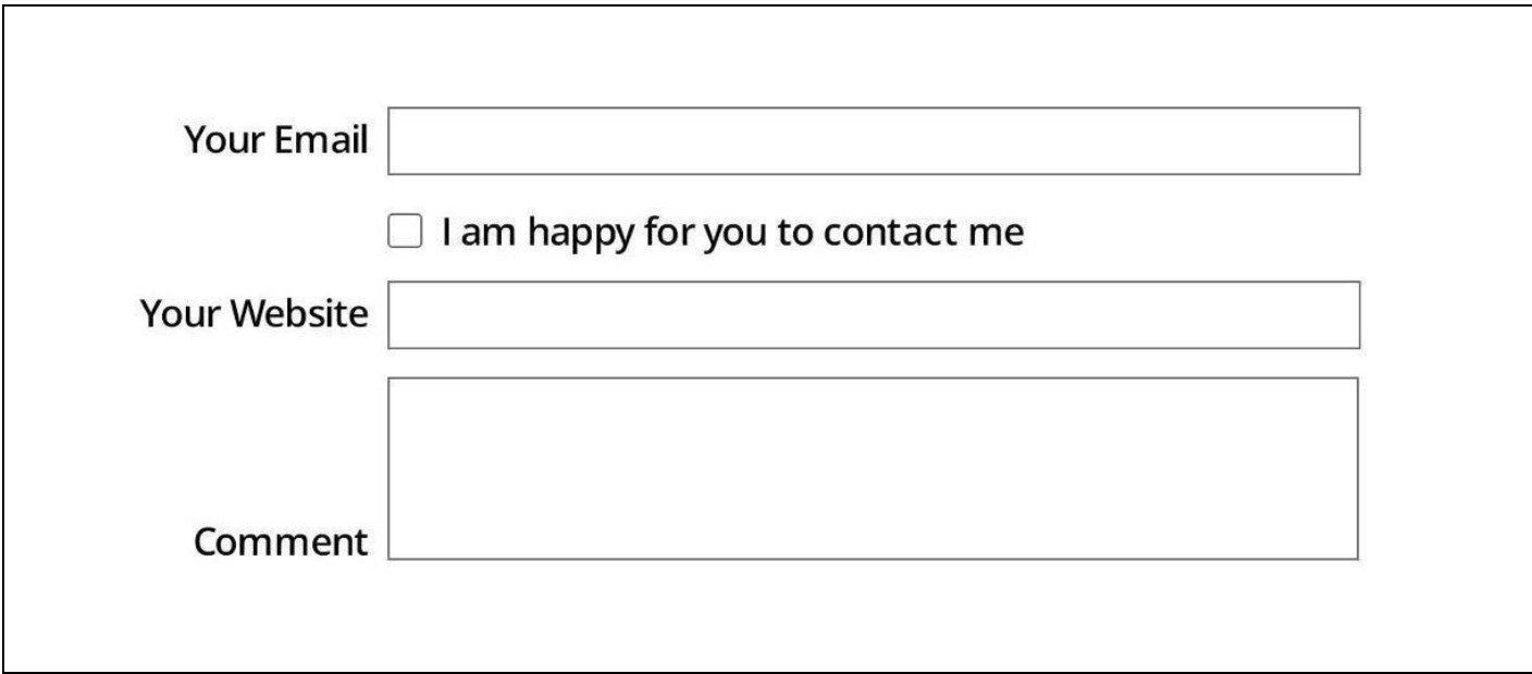
12. Clearly Label Form Fields
When space is limited in a form, some designers forgo labeling the fields and replace the labels with placeholder text. This can cause problems for visually impaired users. First of all, replacement text is typically lower contrast than labels above the field.
Secondly, screen reader users typically navigate forms with the tab key, directing the software to read the <label> elements. Using placeholder text as the only label can cause the reader to skip the text. Not to mention, everyone forgets what they’re doing in the middle of tasks sometimes. Even people who don’t have memory issues.
If the only label for the field disappears when the user starts typing, that’s not a very user-friendly design. Instead, give every field a clear, concise label above every field. Just tell the user the essential information they need to fill out the form.
So don’t do this:
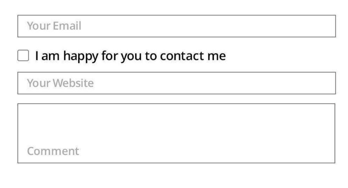 Do this instead:
13. Provide Feedback for Errors and Omissions
Everyone screws up submissions sometimes. When a submission error occurs, don’t just have a vague error message pop up. An error message should include text, an error symbol, and text describing the nature of the error. For example, “email address invalid” or “phone number is required” are much more helpful than something vague like “submission error.”
Mailchimp does a good job with this:
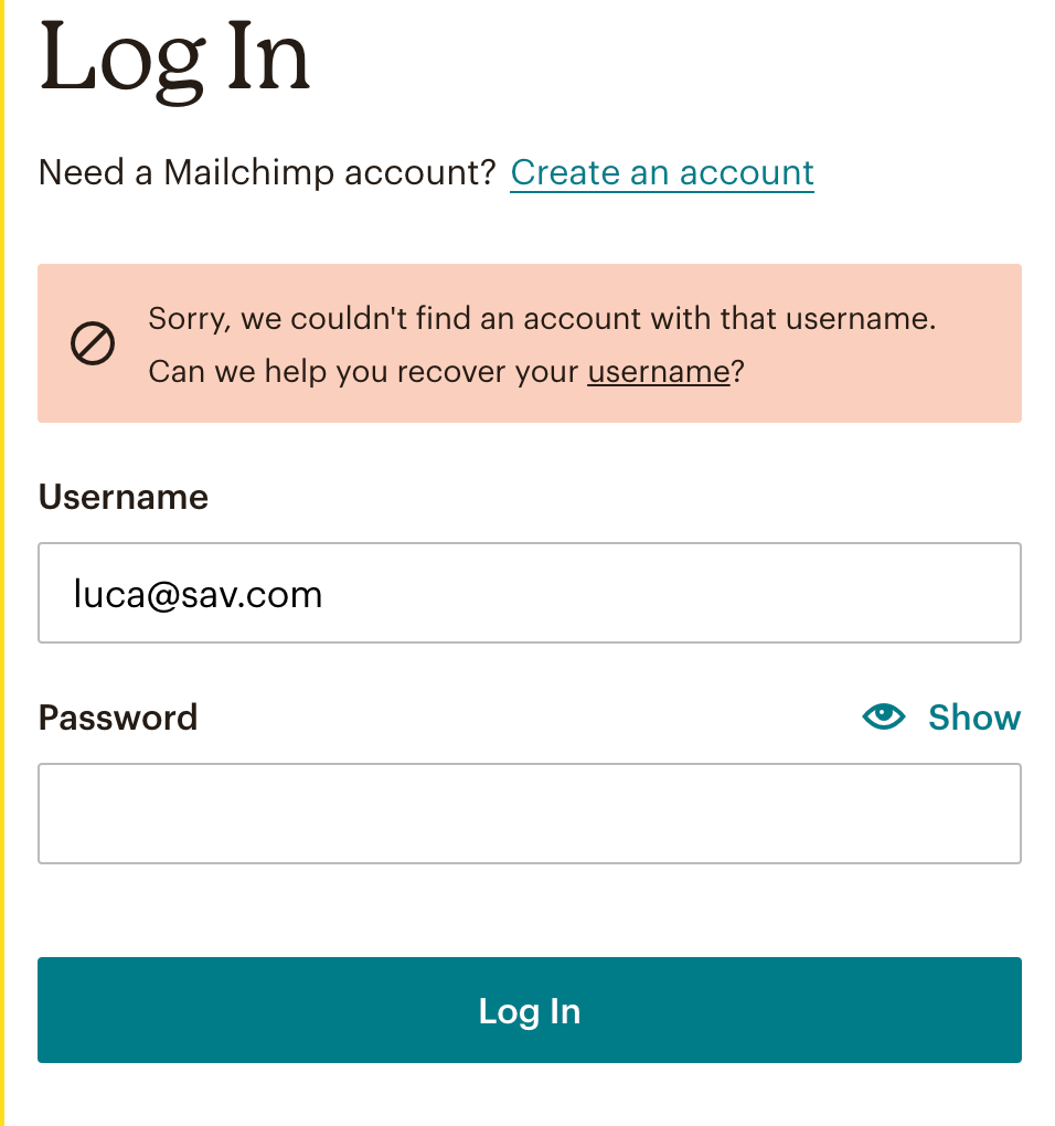 The error message includes a red banner, a X sign, and a clear explanation of the error. This error message doesn’t rely on one element alone, which makes sure that as many people as possible can understand it.
Accessibility Features with SEO Benefits
A nice additional way an accessible website can benefit you is through SEO priority.
Google and other search engine algorithms give higher priority to websites that have the following accessibility features than ones that do not:
- Responsive Templates
- Alt Text in images
- Sitemaps
- Consistency that makes it easy for search engine bots to read
- Clear headings and body text
So basically, there’s no reason not to prioritize accessibility in your web design. It truly is a win for everyone.
Make It Possible for Everybody to Use Your Website
An accessible website will open up your business to a whole range of customers that would have been locked out if you didn’t make an effort. The Sav website builder has everything you need to build a website that is beautiful, functional, and accessible for all.
All of our templates are professionally designed and mobile friendly. All you have to do to create a smooth user experience is plug in your content and customize it how you see fit. Our SEO features make it easy to ensure that your website is set up for SEO bots and screen readers alike to read it. Build your accessible website with us today.

Recommended articles

How to Come up With Ecommerce Product Ideas
Whether you’re starting a new ecommerce business or expanding a pre-existing one, what products to sell online is an important decision....
Read more
How to Create a Modeling Portfolio
What is a Modeling Portfolio? A modeling portfolio is a demonstration of your skills and talent you can show to potential employers and...
Read more
The Best Side Hustles From Home to Try
Why Start a Side Hustle from Home? Earn Extra Money Being alive is expensive right now. Whether your financial goals are to pay off your...
Read more