
What is a Mobile Friendly Site?
The desktop version of your website is only the beginning. A mobile-friendly website is a website that is easy to read, navigate, and consume on a smartphone or tablet.
Since mobile devices have different screen sizes, slower loading times, and typically use touch screens, a website that works great for a laptop or desktop computer won’t necessarily offer the same user experience on a mobile device.
Creating a mobile-friendly website is a matter of web design, SEO, and site functionality. It may sound like a lot of work, but these hot tips will help you make it happen.
Why Make Your Website Mobile-Friendly?
You may be asking yourself, “Is a mobile-friendly website really necessary?” Here are a few reasons why it is:
- Over 90% of the global internet population use a mobile device to go online.
- In 2021, mobile users account for more than half of the global traffic.
- According to Google, 70% of websites have already shifted to serving mobile experience.
- Its SEO benefits mean mobile-friendly websites rank higher in Search Engine Results Pages.
So basically that means if you don’t consider mobile users when you build your website, you’re missing out on valuable traffic.
How to Optimize Your Site For Mobile
1. Perform a Mobile-Friendly Audit
If you already have a website and want to find out how mobile-friendly it is, your first step is to perform an audit using Google’s mobile-friendly test. This tool will measure how well your website performs on mobile and give you helpful tips on how to improve your performance.
2. Start With Mobile Users in Mind
When you create a new website there are two options to make it mobile-friendly from the beginning: Dynamic Serving and a Responsive Site.
Dynamic Serving is creating one version of the website for desktop users and another version for mobile users. It ensures that each group of users has the content and user experience that benefits them, but it’s also time consuming. Managing two versions of your website can be more effort than it’s worth.
Responsive Site themes adapt the same content to the device that’s displaying it. This is the option recommended by Google and it’s as easy as choosing a responsive template from your preferred website builder and making content choices that translate well between the two mediums.
 Photo by Domenico Loia via Unsplash
3. Focus On Simple Designs
Complex web design may look cool on a desktop screen, but it may not translate well onto a mobile screen. Detailed, complex designs also take longer to load, which will only be compounded with smartphones’ slower loading speeds. With sleek, minimalistic visuals you can create a simple design without sacrificing aesthetics.

Apartment Therapy’s mobile website keeps the design minimalist, but it still looks high-quality.
4. Use Readable Fonts
When choosing a font for your website, mobile-friendly design prioritizes readability over experimental, cool looks. You can do that by using a standard font in a larger size. Custom fonts are not only less readable, but may take longer to load than standard fonts. This can become a problem for mobile users, especially if they are in an area where signal is weak.
Similarly, you don’t want your visitors to have to zoom in to read the text from their phones. Large text is a must for mobile-friendly design. Size 12 or 14 is typically sufficient for the desktop version of a site, but depending on the font it may be too small for mobile. If your text looks big enough on your desktop, see how it looks on your phone.

Squaredot uses big letters on a small screen to make sure you can’t miss their headline.
5. Avoid large chunks of text
On a small screen, every pixel of space is valuable. Large paragraphs of text that readers have to scroll through aren’t the most efficient use of that real estate. When you’re writing the copy for your site, keep it as short and efficient as possible.
6. Space Out Links
It’s always irritating when you accidentally click the wrong thing on a touch screen. If your responsive website has several links or buttons, it’s important to space them out to prevent that from happening.
7. Optimize Button Size and Placement
Have you ever been using the internet on your phone and struggled to click a button because it was too small or in an inconvenient location? Frustrating, isn’t it? You can stop your users from experiencing this frustration by making mobile buttons bigger than desktop buttons and placing them near the center of the screen.

Lean Labs’ mobile website is a great example of effective button placement. The “show me how” button is big, close to the center of the screen, and a color that contrasts with the background.
8. Use Mobile-Simplified Menus
Keeping your site menus as simplified as possible is a good idea anyway, but it’s especially helpful for mobile users. Scrolling through a long menu to find what you’re looking for is even more obnoxious on a smartphone than it is on a desktop. A mobile menu should have as few options as possible, give each option a clear destination, and fit on the screen without scrolling. If your site has a sidebar, consider removing it for mobile users. Many website builders make this easier by offering mobile menu plugins.

Etsy’s mobile menu is easy to navigate and visually appealing with its big icons spaced just right.
9. Optimize image files
Images are an important part of any website, but they can also be a hindrance on mobile sites. They take up a lot of space and can take a long time to load. Fight those problems with these options:
- Resize images: Don’t upload images that are bigger than you need them to be.
- Hide big images: If you absolutely must have a big image, you can hide them for mobile users.
- Compress images: Lower image quality will improve loading time.
10. Host Videos on a Third Party
Uploading videos to a third party like YouTube or Wistia and then embedding them into your site makes them easier and faster to load than uploading them to your site directly. Just make sure to disable autoplay and unlist the video if you don’t want people to see it without visiting your site first.
11. Choose a Reliable Web Host
When you choose a web hosting provider, it’s important to use one that has the speed and capacity you need to run an efficient website. Your hosting provider has much more control over these factors than you do as the business owner behind the website.
12. Include a Search Function
Mobile users are often looking for something specific and want to find it as soon as possible. Whether that’s a product on your ecommerce store or the answer to a question, make it easier for the people to find what they’re looking for with a search function.
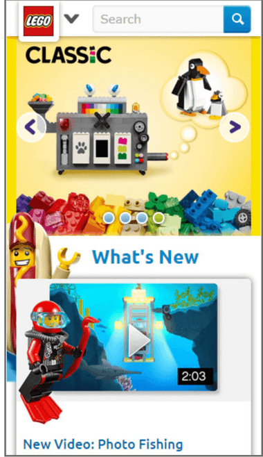
The search bar on Lego’s mobile site is located at the top of the screen. The blue icon draws attention to it and is consistent with the look of the rest of the site.
13. Prioritize Speed
People use smartphones on the go and are often trying to look up information quickly. This is why speed should take priority over pretty much everything else when it comes to mobile user experience. Though you cannot ultimately control the load speed of your website, here are some ways to make it load as fast as it can.
- Use AMP (Accelerated Mobile Pages)
- Compress your images and CSS
- Check your web hosting plan
14. Simplify Forms
There are many great reasons for a website to ask visitors to fill out forms. You may have a form to opt-in to your newsletter, contact your business for a collaboration, express interest in a service that is not yet available, or any other niche relevant to your business.
However, if your form is long and asks for a lot of information, users on mobile devices in particular may find it off-putting. To combat this, keep any forms as short as possible. Only ask for information that is directly relevant to the reason the form exists. Turning off autocorrect for all forms will also make the user experience easier for users filling them out from mobile.
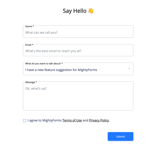
Here is an example of a simple contact form that would work well for desktop and mobile users alike.
15. Create a Sitemap With URLs
There are two kinds of sitemaps. XML sitemaps help search engines discover and understand your content. HTML sitemaps help human users navigate your site. Both are bare bones index pages for your site. An HTML sitemap includes links to all pages of your site and is located in the footer of every page.
A sitemap is a bare bones index page for your site, typically located at the footer of every page. Sitemaps have two benefits: easier navigation for users and SEO. A mobile-friendly sitemap will include the URL of every page listed on it.
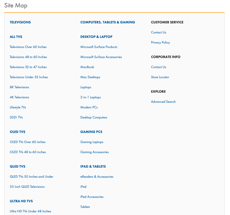
This is what a sitemap with URLs looks like to users.
16. Provide jump links
Jump links minimize scrolling by allowing users to navigate elsewhere on the page with one click. Having them reasonably spaced throughout the page is especially beneficial for mobile devices.
17. Clearly Display Your CTAs
Calls to action are an important part of converting visitors to customers.
Ideally, all web pages should have one. Some people bury them deep at the bottom of the page. While this may work on desktop and provide subtlety in a world where people are always getting bashed on the head with ads, it’s not a great practice for responsive web design.
What’s subtle on desktop could be nearly invisible on mobile. When you place CTAs on a responsive website make them noticeable, keep them relevant to the goal of the page, and don’t put more than one on a page.

Design blog Abduzeedo keeps its website simple and sleek, but you can’t miss those buttons.
18. Use Image Alt Tags
Image alt tags are text descriptions of images that are embedded into the sitemap. They allow screen readers, a device that allows blind people to use screened devices by reading the contents out loud, to parse images. Image alt tags also benefit mobile users who turn off images to save loading time and serve an SEO purpose.

19. Make Customer Service Easily Accessible
You could have the most user-friendly website and the best products in the world, but people will still have questions.
Mobile visitors deserve to access customer service as easily as desktop visitors can. With contact information clearly visible from the menu, they can without having to find the relevant web pages.
Adding a “call now” button for the mobile version of the site also makes it easier for customers to call your business and takes advantage of all a smartphone can offer.
20. Eliminate pop-ups
Pop-ups are annoying anyway. On a mobile device, they can ruin the experience altogether. They take up far too much of the screen and users are more likely to give up than click the little x. This is why it’s important to eliminate all pop-ups that don’t contain essential user information from your mobile-friendly website.
21. Track Your Core Web Vitals
Google’s Core Web Vitals are three statistics that are essential to running a website efficiently.
- Loading performance: How long does it take for the largest element (usually the homepage) of your website to load?
- Responsiveness: How long does it take for your website to respond to the first user interaction?
- Visual Stability: Do components of your website stay in place while loading?
You can track these and other website performance statistics on the Google Search Console by entering the URL, navigating to the performance tab, and clicking “core web vitals.”
22. Avoid Flash
Using flash animation slows down a website’s load time and isn’t supported on many mobile devices. Flash has fallen out of vogue for website designers, but this matters if you’re updating an older site that uses it.
23. Link to Socials
Social media is a huge part of smartphone use. An active social media presence for your business makes it easier for people to share your content with others. Including social media share buttons on your website is a great way to facilitate these interactions.

Oxford Dictionary doesn’t just let you look up words from your phone. You can also follow them on social media. These big icons against a blue background make it easy and noticeable to users.
24. Enable Automatic Sign-in
Automatic sign-in saves users the time and effort of inputting data and allows them to find what they’re looking for faster.
25. Keep Testing Using A Mobile-Friendly Tool
Keeping your website mobile friendly is an ongoing project. The way smartphones work is always changing. Once you get the infrastructure in place, it’s important to keep frequently running mobile tests and tweaking the content as you go.
Google’s Mobile-Friendly Tool is a great resource for testing your site’s friendliness to mobile users and suggesting improvements.
26. Ask for Customer Feedback
Customer feedback can unearth problems that you didn’t know existed before. Give customers an easy-to-find place to write reviews and you’ll be surprised what they might point out. Reviews, whether positive or negative, also provide social proof of your business to other potential customers.
Conclusion
If you’re not thinking about the users who visit your website on mobile devices, your site isn’t reaching its full potential. With these tips, you can take the guesswork out of mobile-friendly web design and get back to running your business.
At Sav, we’re committed to empowering creators to succeed online through a simple, affordable, user-friendly website building experience. Whether you’re building your first website or are an online business veteran, we have the tools for your online success. Get started today!

Recommended articles

How to Come up With Ecommerce Product Ideas
Whether you’re starting a new ecommerce business or expanding a pre-existing one, what products to sell online is an important decision....
Read more
How to Create a Modeling Portfolio
What is a Modeling Portfolio? A modeling portfolio is a demonstration of your skills and talent you can show to potential employers and...
Read more
The Best Side Hustles From Home to Try
Why Start a Side Hustle from Home? Earn Extra Money Being alive is expensive right now. Whether your financial goals are to pay off your...
Read more