A call to action is the words on a button or hyperlink directing website visitors to take an action. If you’ve seen a button on a website that says “buy now”, “learn more”, or “add to cart”, you’ve seen a call to action. In marketing talk, call to action is often shortened to CTA, not to be confused with the Chicago Transit Authority. These hot tips and examples of some of the best CTAs around the internet will help you create calls to action that scream “click me!”
Why Are Strong Calls to Action Important?
CTAs are short, but they make a strong impact. As people have more and more things competing for their attention, especially online, a CTA needs to grab their attention and drag them through the sales funnel.
Where Do Calls to Action Go?
Calls to action belong on your website, in your marketing campaigns, and anywhere else where a visitor can become a customer. The first and arguably most important place for calls to action is the homepage of your website. The primary CTA button should lead to the main purpose of your website like “shop now” or “book now.” A secondary call to action like “contact us” or “learn more” also wouldn’t hurt, but the primary one should be bigger and bolder. After that, put at least one call to action on every page of your website.
Content marketing pieces should also include at least one call to action each. On landing pages they can prompt people to sign up for your email list, join a webinar, download an ebook, or whatever else the page is for. Blog posts should have CTAs to lead readers to the action you’d like them to take once they’re done reading. Use calls to action in your next email campaign to take subscribers from their inbox to your website. Calls to action even have a place on social media and not just on Facebook ads. Inviting followers to comment, share, and like is calling them to take an action.
Effective Call to Action Best Practices
Place it Above the Fold
People are more likely to click on a call to action if they see it before they start scrolling. It doesn’t necessarily have to be the first thing they see, but if it’s not above the fold, you’ve already lost the visitor.
Use Action Words
In call to action copywriting, strong verbs and action phrases are far more clickable than passive phrasing. 
Use First-Person
Writing in second person (you, your) is good for some CTAs, but other times it can come off too much like a command. In those cases, using first person is a better choice to grab the viewer’s attention.
Create a Sense of Urgency
You don’t want visitors to click on your call to action whenever they feel like it, you want them to click on it now! CTA copy like “Limited time offer” or “X tickets left” will create a fear of missing out if they don’t act now.
Strike a Balance Between Creativity and Simplicity
Simple doesn’t have to mean boring. The key to a compelling call to action is hitting the sweet spot where it’s creative, but not complicated. That witty wordplay may make you feel smart, but it’s not necessary for something as short as a CTA.
Adjust to Different Devices
Now that more than half of all global web traffic comes from mobile devices, keeping mobile users in mind from the beginning of your website design process is crucial. Big buttons close to the center of the screen are the easiest for smartphone touchscreen users to tap. Using a responsive template, which adjusts the same content for different screens, is the easiest way to design for mobile-friendliness.
Use Social Proof
Social proof near the CTA tells potential customers that clicking on the button will be in their best interest.
Keep it Short
There’s no hard and fast rule about how long calls to action should be, but no one wants a whole paragraph on a button. Once you think of a call to action, keep shortening it until you can’t anymore.
Test Everything
You can A/B test almost any aspect of a call to action. The copy, placement, button size, and color are all aspects that can affect the performance of your CTA.

Stand Out
The button color matters more than you may think in creating effective CTAs. Using contrasting colors between the button and the background is the most effective design choice. Orange is a frequently used color for CTAs because it grabs attention and implies urgency.
Emphasize Low Risk
Making it clear that visitors have nothing to lose by taking the action you’re calling them to leads to less hesitation and higher conversion rates. This is why a lot of subscription services emphasize the free trial instead of simply inviting users to sign up. People like free stuff and are hesitant to commit to things that will cost money later on.
Strive For Clarity
Your visitors shouldn’t have follow-up questions about where that CTA button is taking them.
Highlight Immediate Benefits
A great call to action communicates how clicking will benefit the user right away.
Know Your Target Audience
With all that said, remember that best practices aren’t universal laws. A good CTA is also consistent with your brand voice and aesthetic and appeals to your potential customer base. Don’t feel like you need a bright orange button the size of your hand if that’s not the experience you’re going for.

CTA Examples to Inspire You
A great call to action doesn’t just have one look. No matter what type of CTA you’re creating, take inspiration from this wide range of examples.
Ecommerce CTAs
Earth Hero
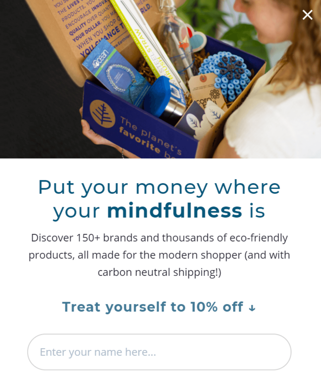
CTA Location: Pop-up
Button Copy: Treat Yourself to 10% Off
Why It Works: Highlighting the discount makes the benefits to the customer clear. And who doesn’t love to treat themself?
Lifestraw
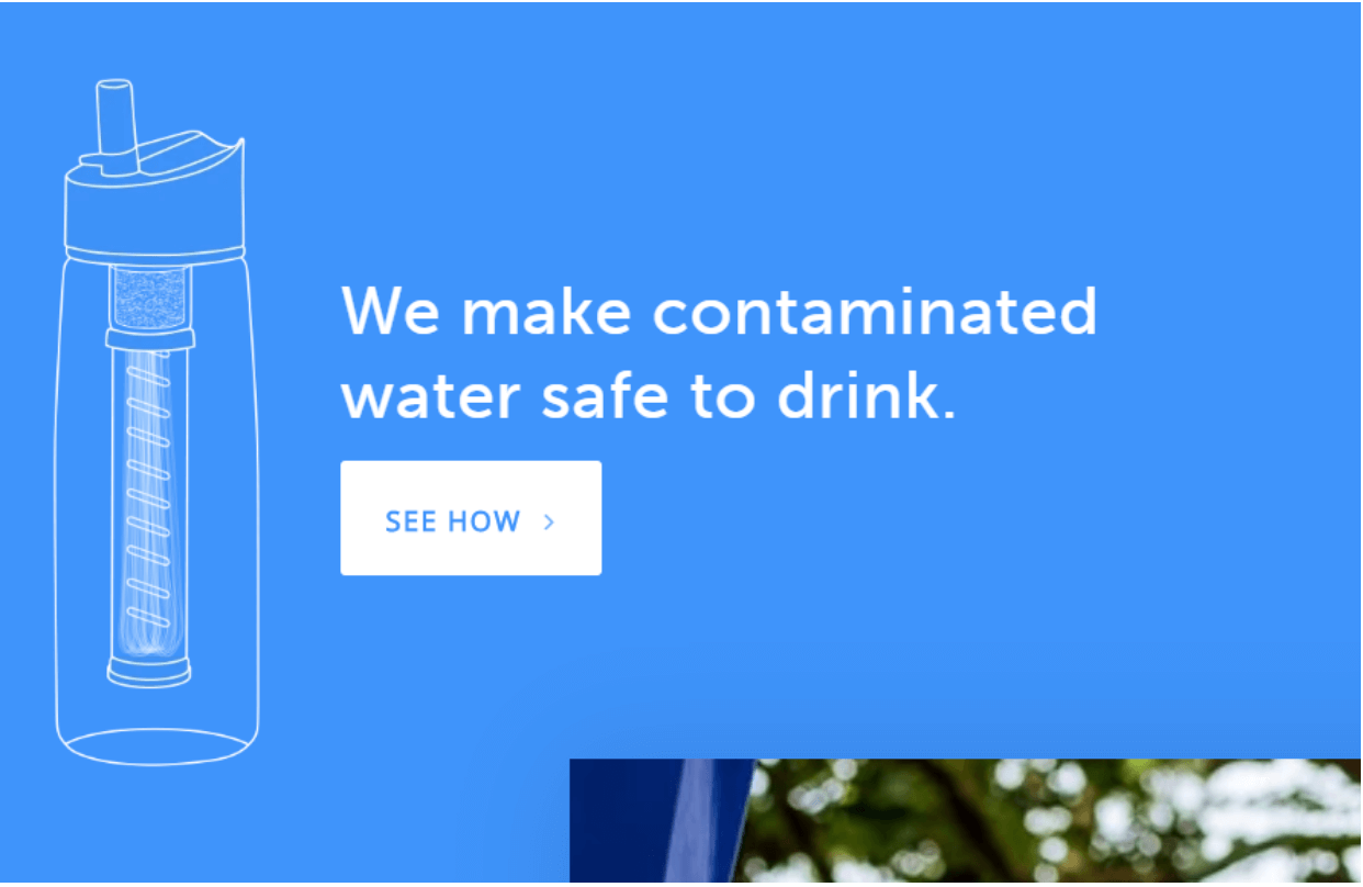
Location: Homepage
Button Copy: See How
Why It Works: This CTA fosters curiosity in potential customers.
Bamboo Underwear

Location: Homepage
Button Copy: Join the Movement
Why It Works: Referring to your product as a “movement” implies that it’s unique and will improve the world. It also encourages viewers to click through to find out what you mean by that.
Referral Program CTAs
Everlane
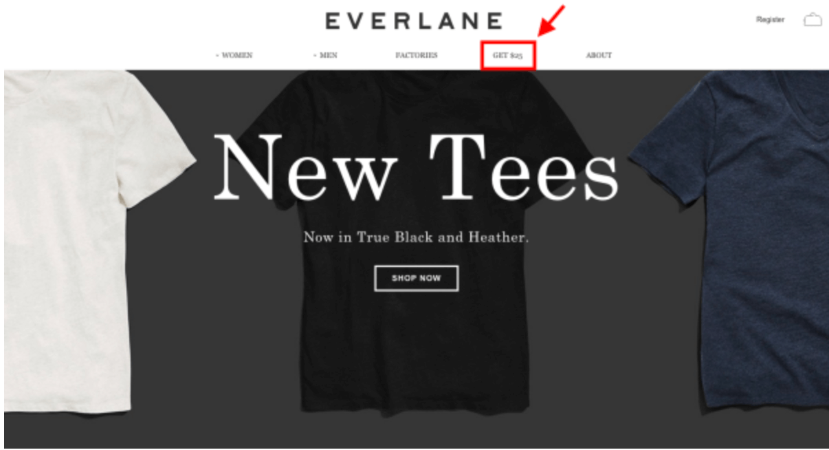
Location: Header Navigation Bar
Button Copy: Get $25
Why It Works: There’s no clearer highlight of the immediate benefits than stating that there’s a money reward. Once the customer clicks it, they’ll find out how.
Biome

Location: Homepage
Button Copy: Join the Be.Club
Why It Works: “Join the club” implies exclusivity and evokes a fear of missing out in visitors.
Koala
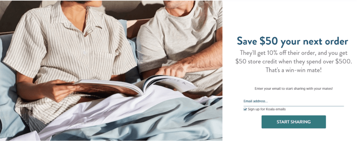
Location: Hero Image
Button Copy: Start Sharing
Why It Works: The copy above the button highlights the benefits of referring a friend to Koala and framing it as “sharing” makes it sound low-pressure and like a nice thing to do.
Vivo Barefoot

Location: Footer Menu
Button Copy: Refer a Friend
Why It Works: It tells the visitor exactly what clicking the button leads to. The copy above it highlights the benefits: you and your friend getting a $30 discount.
Simple And Effective CTAs
Netflix
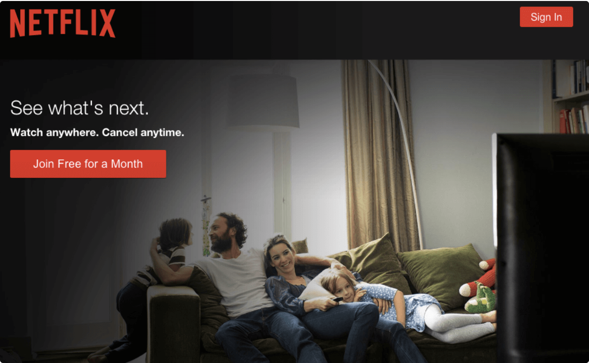
Location: Homepage
Button Copy: Join Free for a Month
Why It Works: This CTA emphasizes immediate benefits and low risk.
International Rescue Committee
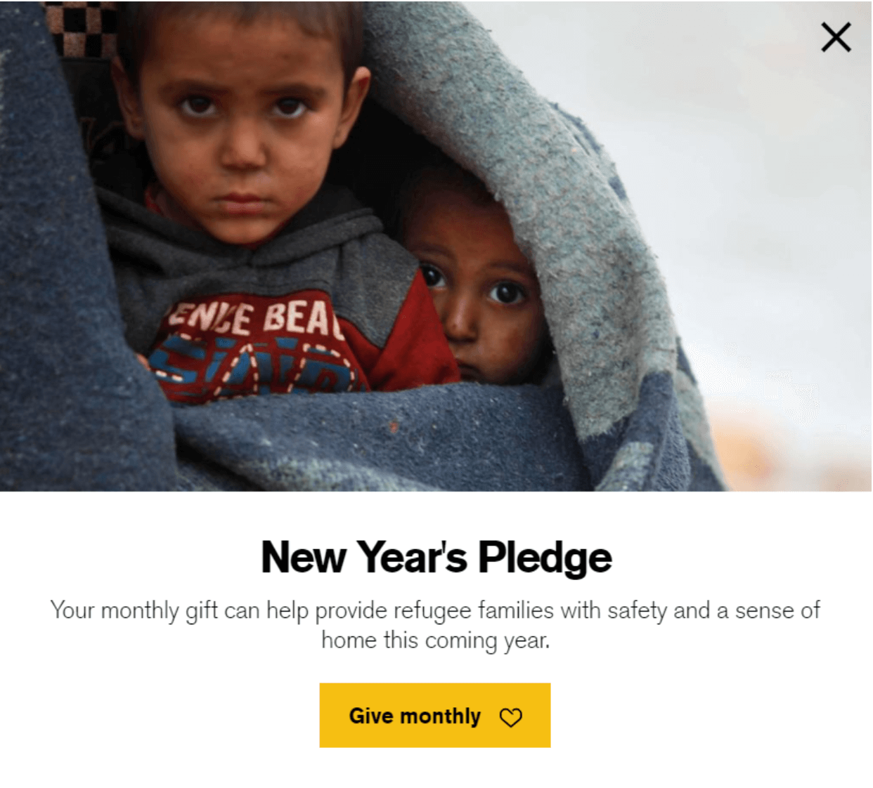
Location: Homepage
Button Copy: Give Monthly
Why It Works: This simple CTA encourages people to donate on a schedule with as few words as possible.
Quickbooks
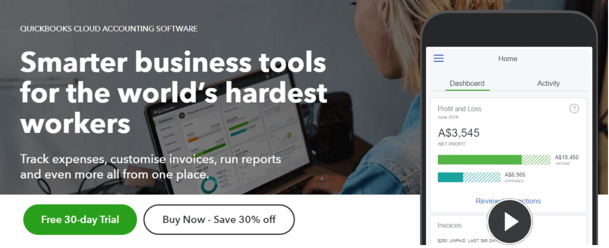
Location: Homepage
Button Copy: Free 30-day Trial, Buy Now – Save 30% off
Why It Works: The Free Trial button may be the main CTA, but the secondary CTA also concisely communicates a sense of urgency and a reward with the discount.
Vimeo
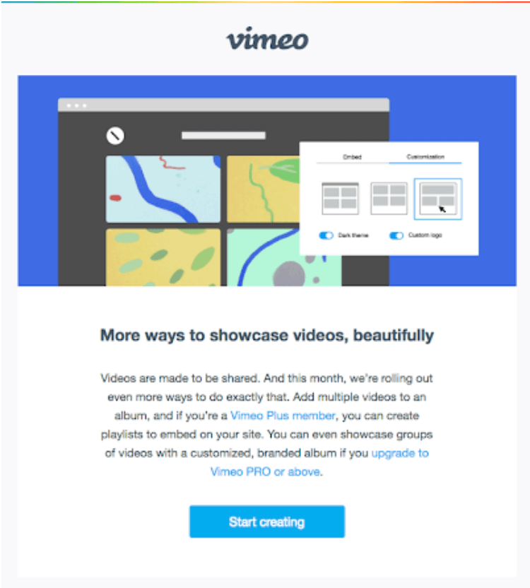
Location: Homepage
Button Copy: Start Creating
Why It Works: It’s short and just in the sweet spot between vague and specific.
Powerful Call To Action Phrases
Treehouse
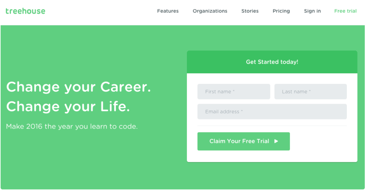
Location: Homepage
Button Copy: Claim Your Free Trial
Why It Works: “Claim” is a strong action verb compared to “sign up” or “join.”
Thinx

Location: Homepage banner
Button Copy: Period Better
Why It Works: Thinx underwear is one of the leading brands in the alternative menstrual product industry. That's why "period better" is an unexpected phrase, but perfectly on-brand for them.
Ahref’s
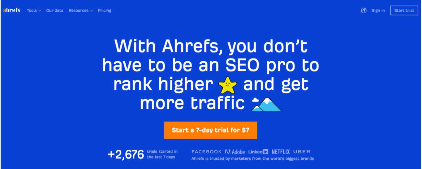
Location: Homepage
Button Copy: Start Your 7 Day Trial for $7
Why It Works: 7 for 7 is catchy and lets viewers know the exact benefits of clicking through.
Click a Tree
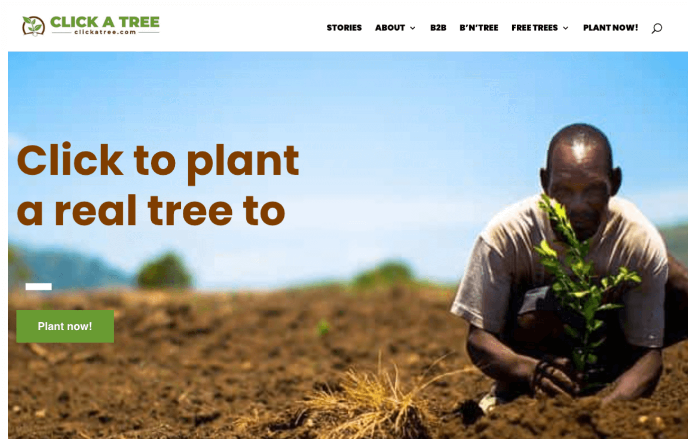
Location: Homepage
Button Copy: Plant Now!
Why It Works: This CTA simple, concise, and urgent. The green button is appropriate for a green organization.
Metafy
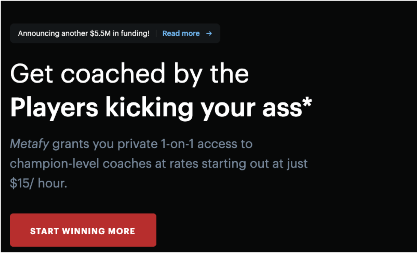
Location: Homepage
Button Copy: Start Winning More
Why It Works: This CTA opts for highlighting the long-term benefits over the immediate short-term benefits, but the mention of winning is a strong appeal to the target audience.
MakeMyPersona
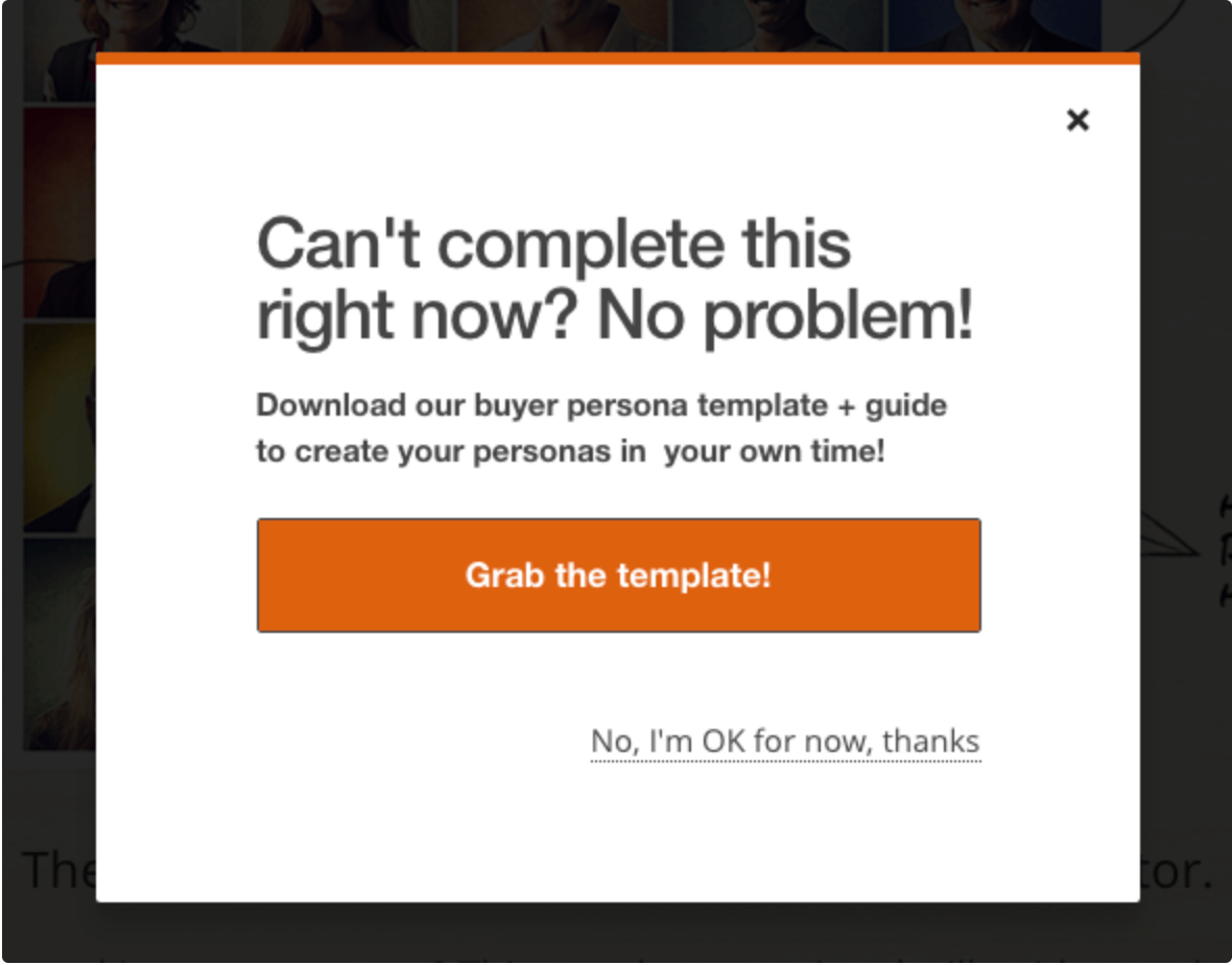
Location: Pop-up
Button Copy: Grab the Template!
Why It Works: This pop-up does the opposite of what most people expect a good CTA to do, but it works for them. If you do this now, it will help you out later. That and grab is a strong action verb.
Amazon Music

Location: Homepage banner
Button Copy: 3 Months FREE
Why It Works: Three month free trials are unusual in the subscription world, so that’s likely to be an incentive for people who are curious to click through and give it a try.
Enticing Call To Action Buttons
Spotify
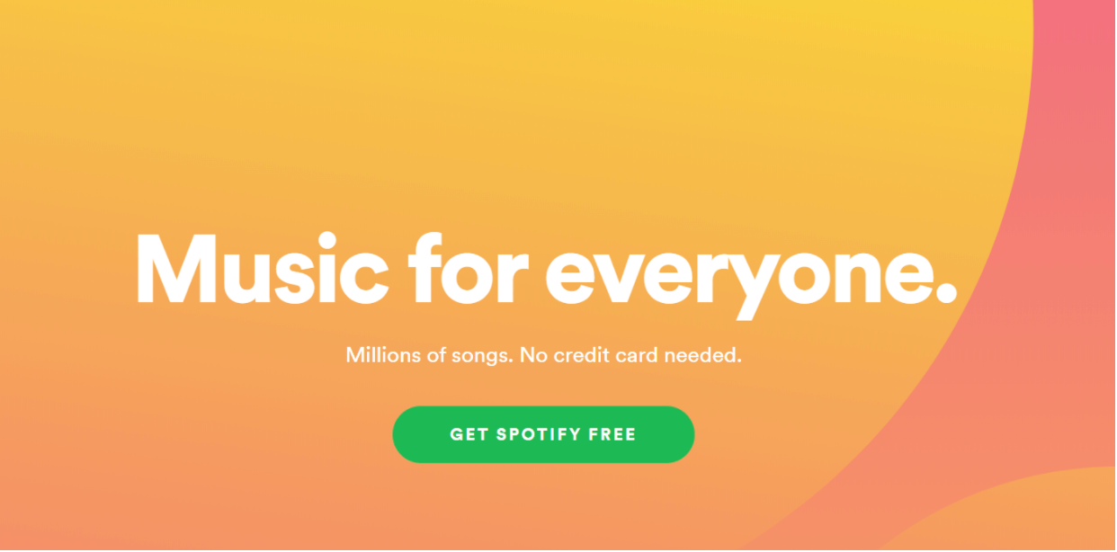
Location: Homepage
Button Copy: Get Spotify Free
Why It Works: The contrast of the green against the light orange background screams “click me!”
Leaf Shave
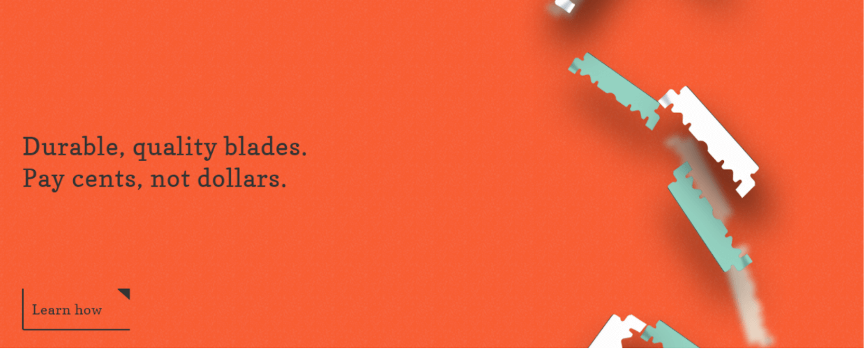
Location: Homepage
Button Copy: Learn How
Why It Works: The placement and the little arrow make the button noticeable while sticking to the aesthetic of the page. “Learn how” is low-pressure copy without being toothless.
EPIC
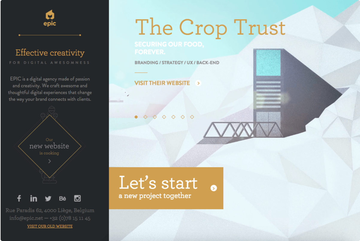
Location: Homepage
Button Copy: Let’s Start a Project Together
Why It Works: The gold button is eye-catching against the white background. The copy is an invitation, not a command.
Grey Goose
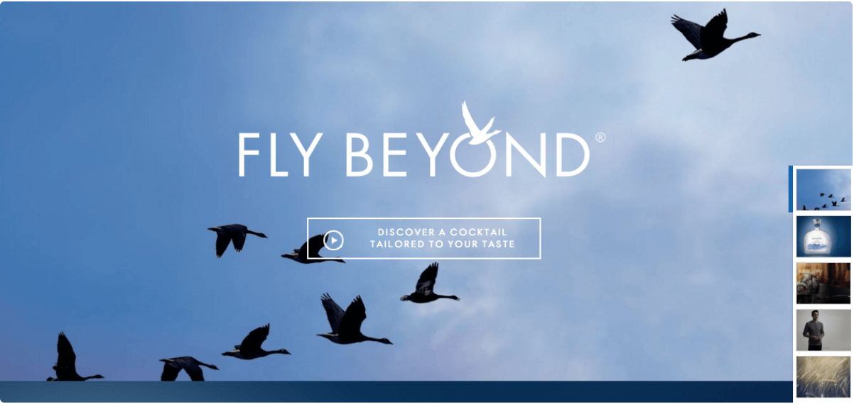
Location: Homepage
Button Copy: Discover a Cocktail Catered to Your Taste
Why It Works: This CTA takes a subtler approach. While a bright orange button that says “BUY OUR BOOZE” might scare off the classy customer Grey Goose wants, but an invitation to a bespoke experience
Blogging.org
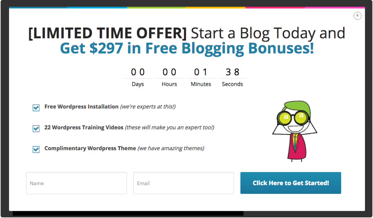
Location: Pop-up countdown clock
Button Copy: Click Here to Get Started
Why It Works: Nothing creates a sense of urgency like a countdown clock! The blue button against the white background draws the eyes to what the visitor can do about it.
Huemor
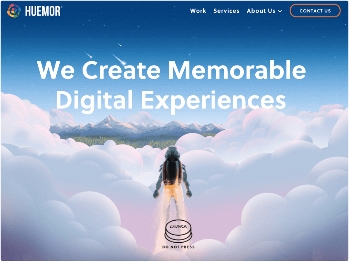
Location: Homepage
Button Copy: Launch (Do Not Press)
Why It Works: The launch button is visually clever on its own, but the addition of the “do not press” caption is funny and encourages viewers to click through without being pushy.
Humboldt County
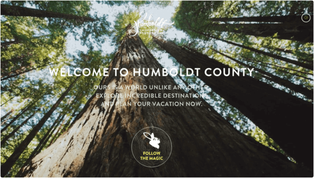
Location: Homepage
Button Copy: Follow the Magic
Why It Works: The rabbit icon and whimsical copy use nostalgia to draw viewers in.
Barkbox
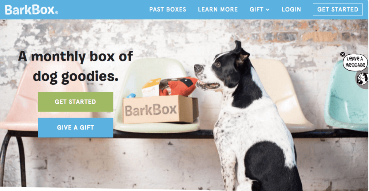
Location: Homepage
Button Copy: Get Started, Give a Gift
Why It Works: These two different CTAs create clear paths for Bark Box’s two main types of customers: those who want a subscription for their own pets, and ones who want to buy for loved ones’ pets.
Here at Sav we want small business owners to grow and succeed online. From buying a domain to building your website to digital marketing, we make it easy and affordable to get your small business online so you can focus on the work you love. There’s low risk, immediate benefits, and you’re missing out if you don’t, so what are you waiting for? Get one month free today!
Newsletter
Topics

