

Landing pages are essential to digital marketing campaigns. If you use a website builder with a Dynamic Pages feature, it's easy to create your own landing pages, but it's up to you to make them appealing. Let us help you up your conversion rates by taking inspiration from great landing pages from big and small companies.
What is a Landing Page?
A landing page offers potential customers a resource like an ebook, a special offer, a free course, or a webinar signup in exchange for the visitor’s email address or phone number. This exchange facilitates lead generation and helps to build trust between potential customers and your company. Landing pages can accomplish different goals including, but not limited to:
- Enticing users to opt-in to communications
- Directly selling ebooks and courses
- Offering free trials
What Should Be on a Landing Page?
These are the ingredients that every landing page should have.
|
Attention-grabbing headline |
Descriptive subheadings |
Engaging body copy |
|
Images and videos |
Social proof |
At least one CTA button |
|
Value proposition |
Short sign-up form |
Navigation bar |
What Makes a Landing Page Effective?
Eye-Catching Visuals
Like a homepage, landing pages need to make a good first impression. The fastest way to make that happen is good landing page design. Bold, high contrast colors look sharp and are easy to use.
.jpg?width=4032&name=john-schaidler-9V3Q2W_mRLE-unsplash%20(1).jpg)
Social Proof
Social proof, usually in the form of reviews, testimonials, and case studies, is proof of other people’s opinion of your company. It means website visitors don’t have to take your word for it when you say that you’re what they need.
Understanding Your Target Audience
Any marketing strategy requires knowledge of your target audience. Do some research on the demographics of your current customer base to determine:
|
Age |
Location |
Job Title |
|
Income |
Pain Points |
Preferred Communication Methods |
From that information, create buyer personas. Buyer personas are a tool marketers use to help visualize their target audience by distilling it down to one person. It’s easier to think about what Business Owner Brad or Student Stacy would buy than the entire swath of people that would have use for your product.
Minimal Scrolling
A great landing page requires as little scrolling as possible so people can see the benefits quickly and don't have to do anything extra to click through.
Simple Navigation
Landing pages take users from an ad to the part of your website you want them to visit. That’s why they need to be as easy to navigate as possible.
.jpg?width=5272&name=jantine-doornbos-3rqcdqHPUFo-unsplash%20(1).jpg)
Mobile-Friendly Optimization
Landing pages should follow the basics of mobile-friendly web design. That means
|
Using responsive templates |
Choosing readable fonts |
Using simple design |
|
Avoiding large chunks of text |
Making CTA buttons big |
Optimizing image files |
|
Prioritizing load speed |
Using Image Alt Tags |
Avoiding pop-ups |
Concise Messaging
Your approach to landing page copywriting should aim for short, clear, and concise. Assume that potential customers won’t spend a lot of time reading the page. Give them the information they need and hope they click.
An Enticing Offer
The offer is the centerpiece of the landing page, so make it a good one. Some examples of great landing page offers include:
- A free guide or ebook
- A webinar registration
- A special offer or discount
- A free course
Which of those options is the most compelling will depend on your business and what your customers find valuable. If you’re an ecommerce business that sells products, a discount in exchange for signing up for your email list is probably your best bet. If you sell software, a course on using it would be a good offer.
.jpg?width=5760&name=alevision-co-3syTDiVAc7w-unsplash%20(1).jpg)
Incorporating Whitespace
A cluttered landing page means more distractions between the visitor and the offer. Don’t be afraid of whitespace when designing your landing page. You don’t want it to look empty, but you do want it to look clean.
Emphasizing Your Header
The top of the page is the first place website visitors look. Make it worth their while by making it visually pleasing and useful.
Optimizing for Search Engines
Search engine optimization (SEO) is the backbone of content marketing. Optimizing your landing pages leads to more
Creating Your Sign-Up Form
The sign-up form is the destination for your landing page. To make it a good one...
- Limit the number of form fields
- Only ask for necessary information
- Clearly label each form field
- Use a compelling call to action
- Text entry and multiple choice input types
- Proceed to a success message
.jpg?width=5472&name=volodymyr-hryshchenko-V5vqWC9gyEU-unsplash%20(1).jpg)
Conversion Rates
A conversion rate is the percentage of people who visited a site who completed the intended action. To calculate the conversion rate for your landing page, divide the number of conversions by the number of website visitors. A great landing page hits 5.31% or higher.
High-Converting Landing Page Examples
Take inspiration from a few of the best landing page examples from across the internet.
Autopilot
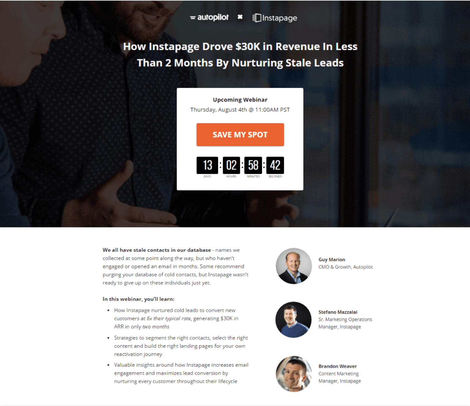
Goal: Webinar Signups
Call to Action: Save My Spot
What They Did Well:
- The countdown clock creates a sense of urgency
- Image Choice
- Highlighting benefits
Percolate
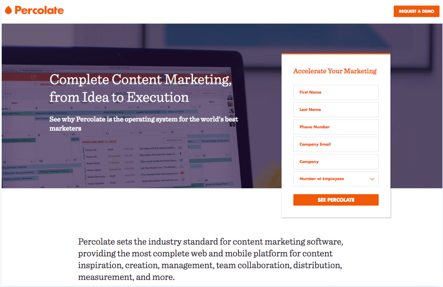
Goal: Contact Information Collection
Call to Action: See Percolate
What They Did Well:
- Headline
- Brevity of the contact form
- Use of orange for the CTA buttons
Get Response
.png?width=700&name=Get%20Response%20(1).png)
Goal: Membership Signups
Call to Action: Sign Up Free
What They Did Well:
- Clarity of the offer
- Highlighting notable clients
- Color Palette
Casper
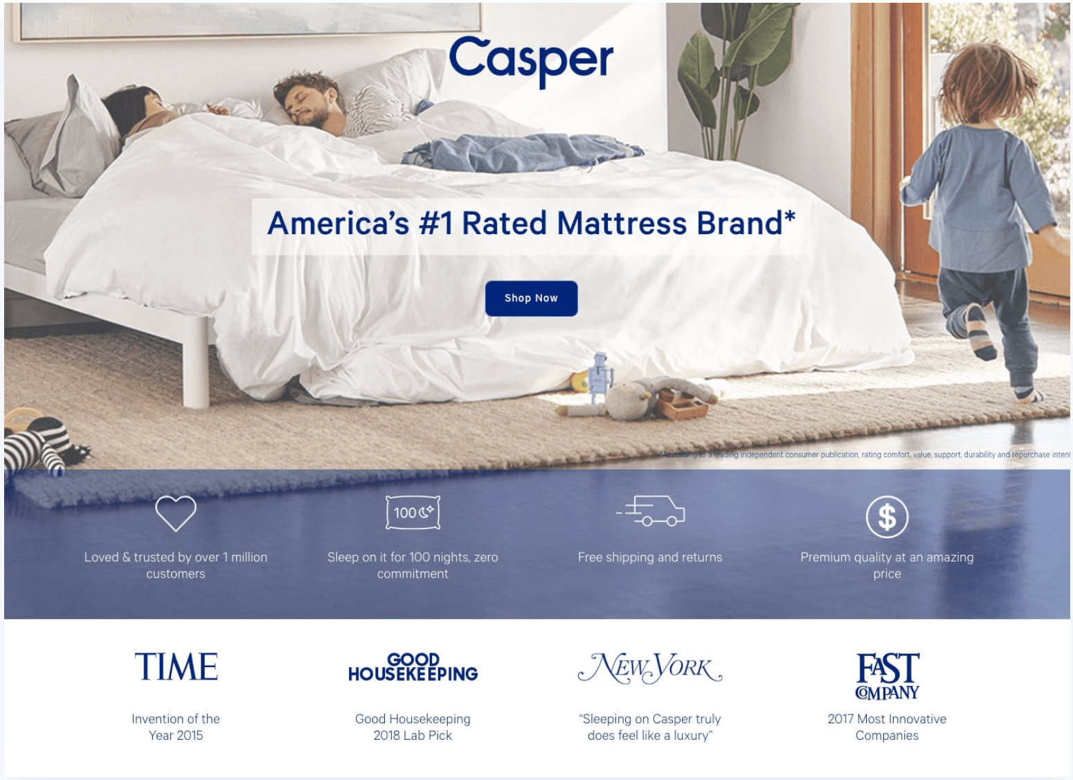
Goal: Sales
Call to Action: Shop Now
What They Did Well:
- The perks with the little icons
- Highlighting press coverage
- Image choice
Quip
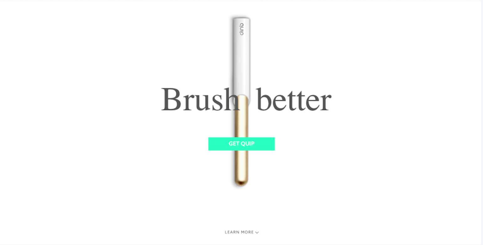
Goal: Sales
Call to Action: Get Quip
What They Did Well:
- Sleek, minimalist design
- Use of whitespace
- Concise copy
Muck Rack
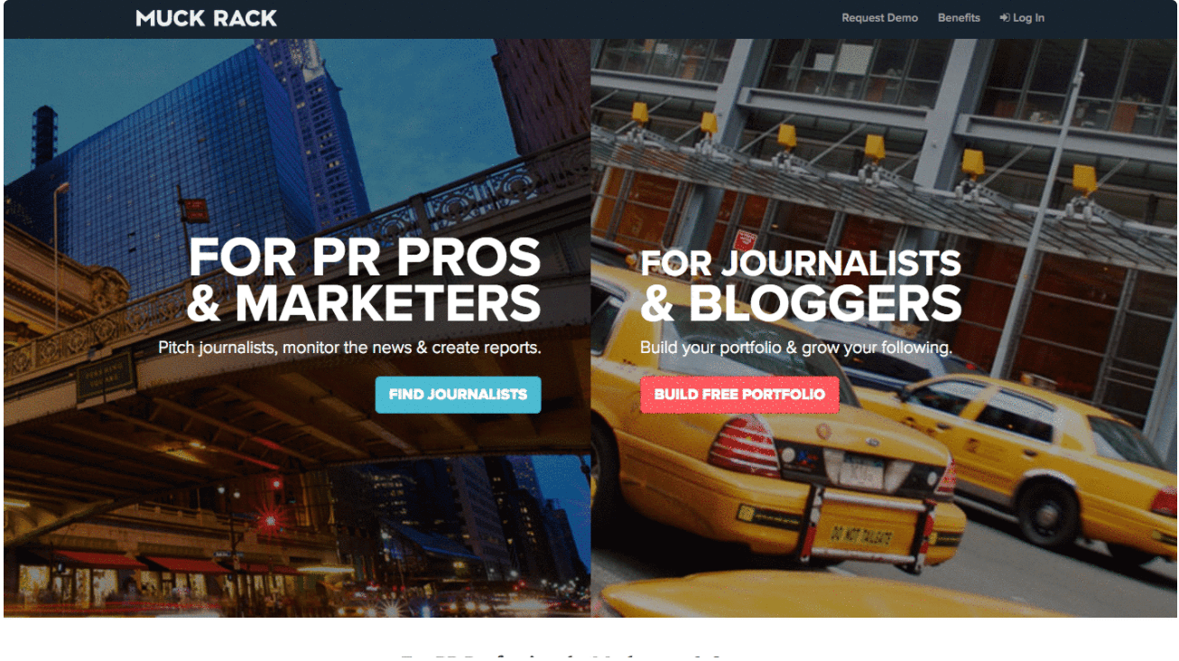
Goal: Membership Signups
Call to Action: Find Journalists, Build Free Portfolio
What They Did Well:
- Use of dual CTAs
- Image choices
- Concise copy
Shopify
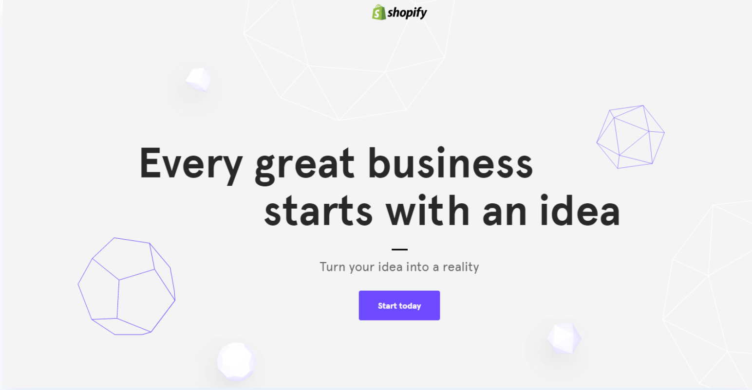
Goal: Membership Signups
Call to Action: Start Today
What They Did Well:
- Headline
- Sleek, minimalist design
- Color contrast
Lyft
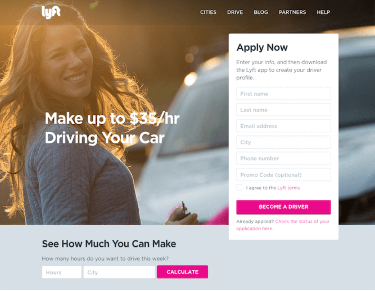
Goal: Driver Signups
Call to Action: Become A Driver
What They Did Well:
- Clarity of what’s in it for visitors
- Brevity of the contact form
- The secondary CTA to calculate typical pay
Uber
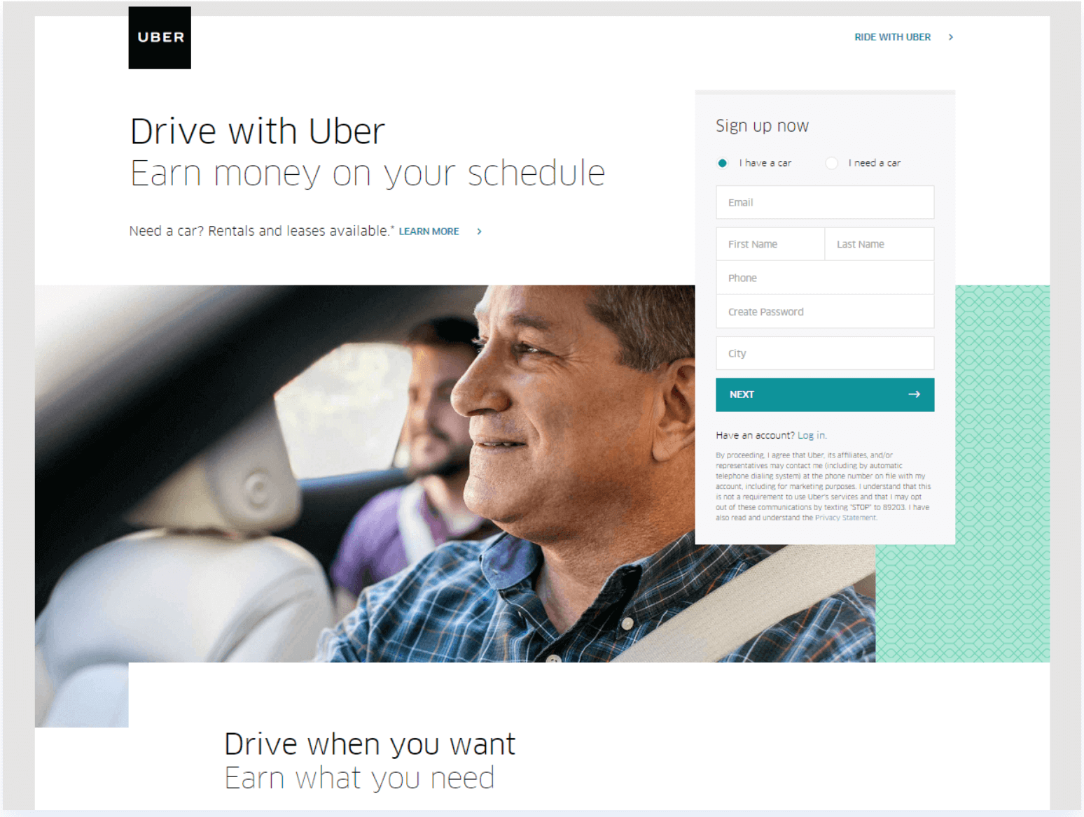
Goal: Driver Signups
Call to Action: Sign up now
What They Did Well:
- Copy
- Color pallette
- Contact form brevity
AirBnB
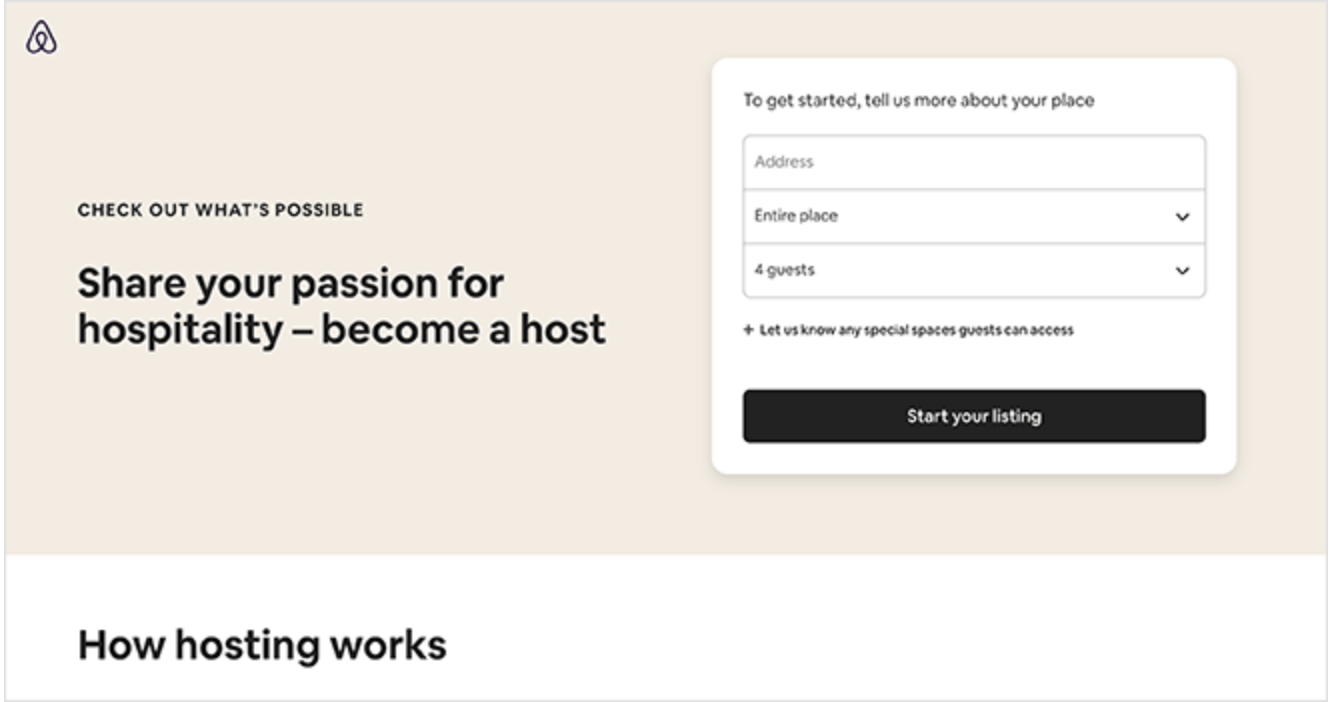
Goal: Host signups
Call to Action: Start your listing
What They Do Well:
- Emphasis of low risk
- Headline
- Simplicity
Dropbox
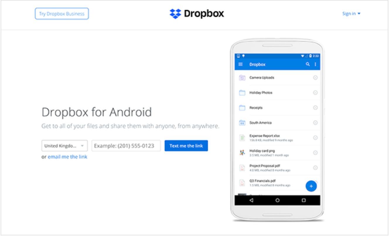
Goal: Membership Signups
Call to Action: Text me the link
What They Do Well:
- Subtitle
- Use of whitespace
- The picture of what it looks like on mobile
Alexa
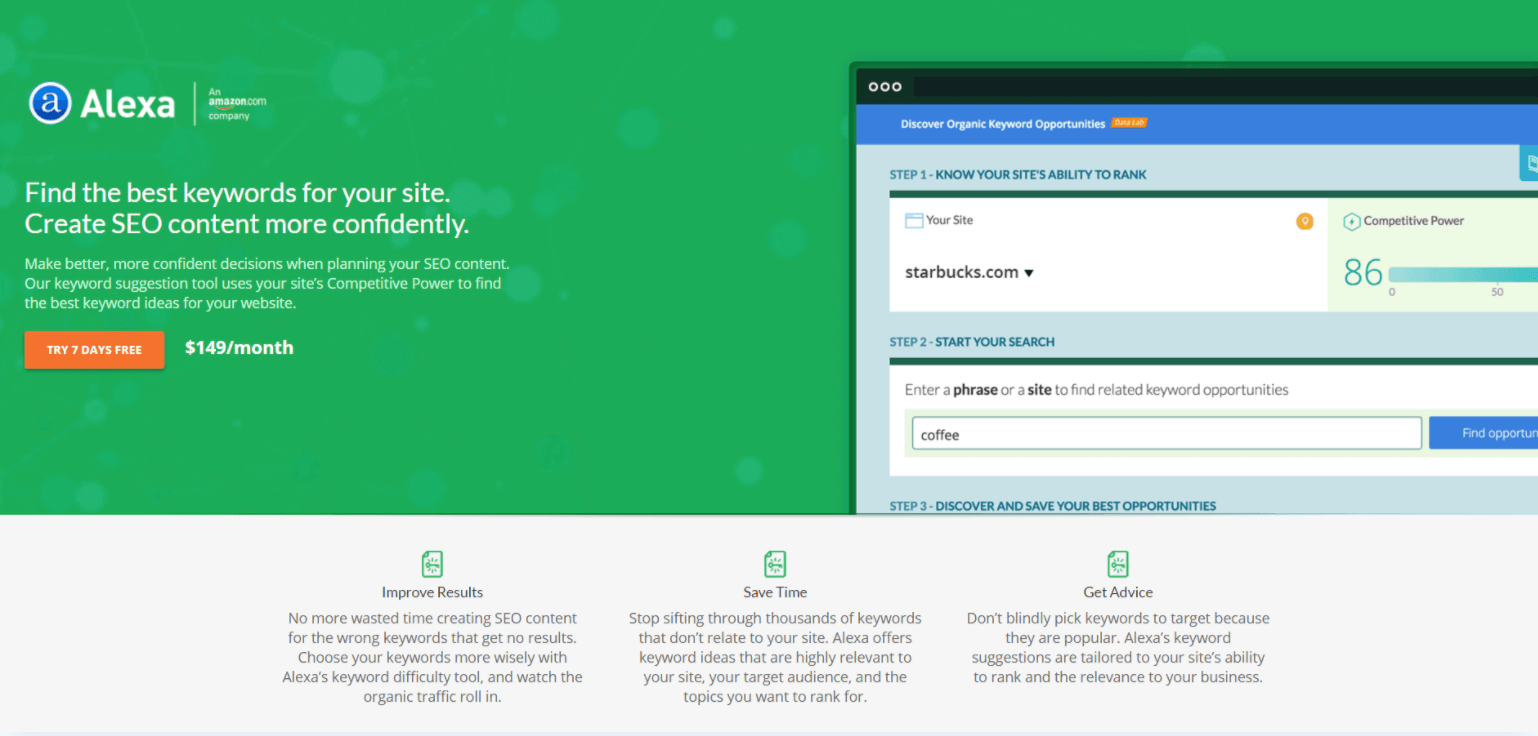
Goal: Free Trial Signups
Call to Action: Try 7 Days Free
What They Do Well:
- Emphasis of benefits
- Call to Action
- Headline
Hubspot
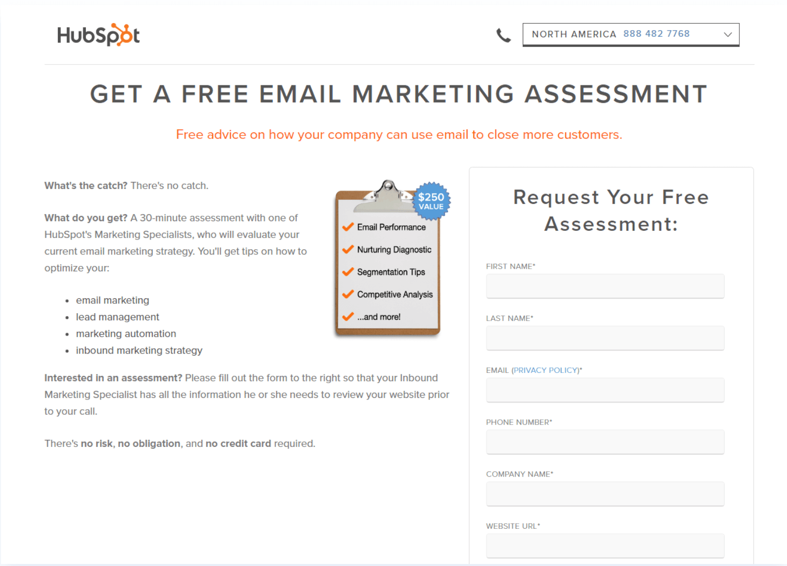
Goal: Contact Information Collection
Call to Action: Request Your Free Assessment
What They Did Well:
- Emphasis of benefits
- Contact form brevity
- Offering
Domo
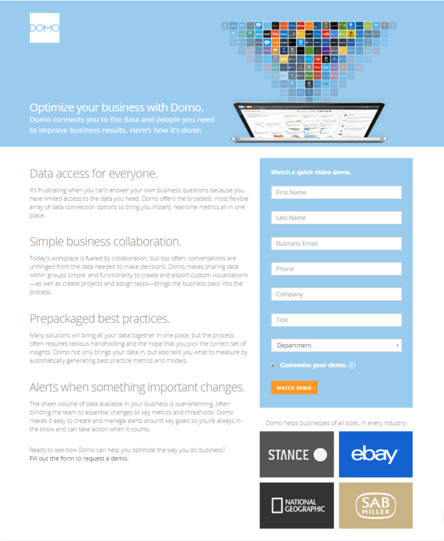
Goal: Contact Information Collection
Call to Action: Watch Demo
What They Did Well:
- Highlighting notable clients
- Explanation of what Domo does
- Simplicity
Google Cloud Platform
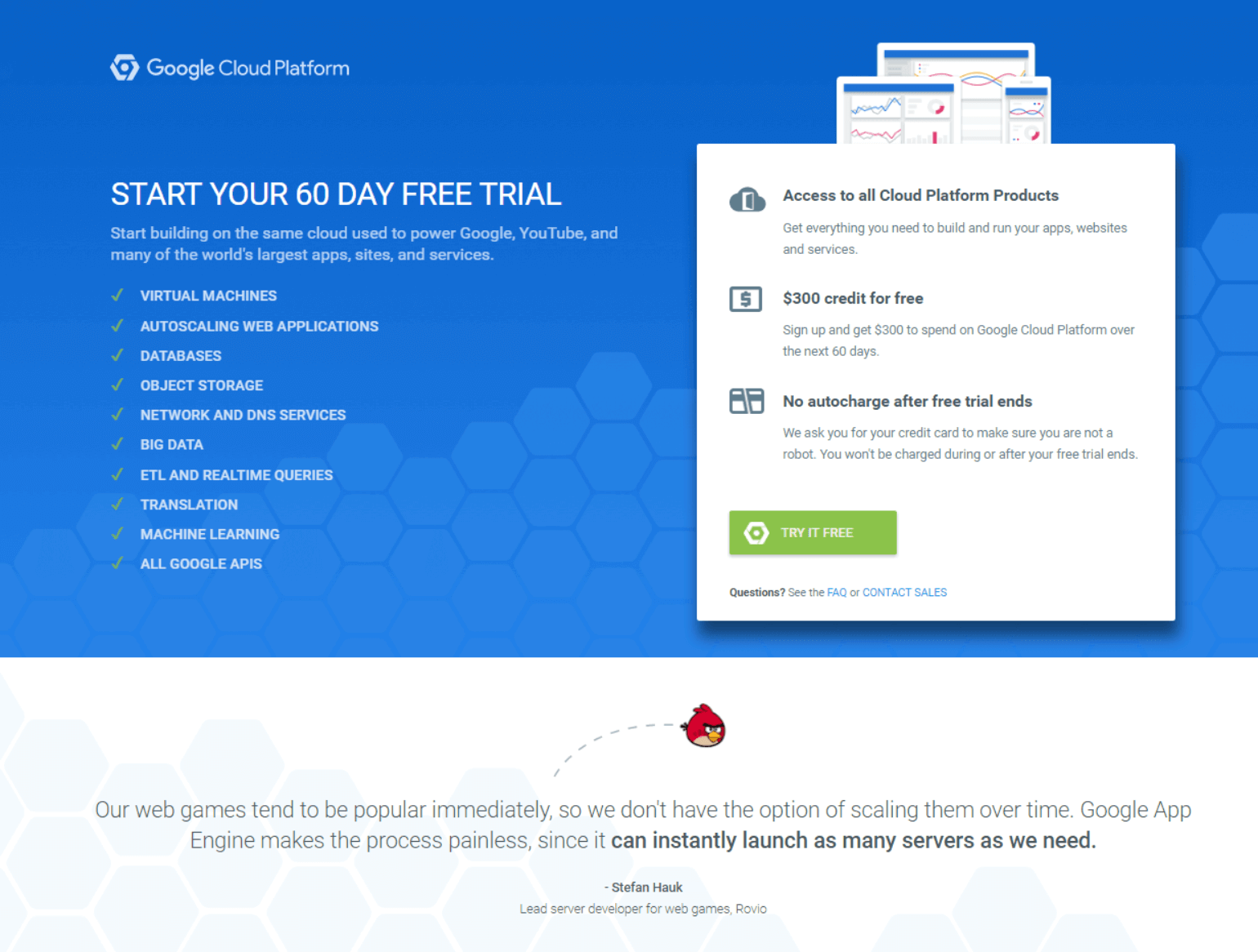
Goal: Membership Signups
Call to Action: Try it Free
What They Did Well:
- Highlighting the benefits
- Linking to FAQ and contacting sales
- The background with the hexagons is a tech aesthetic
Asana
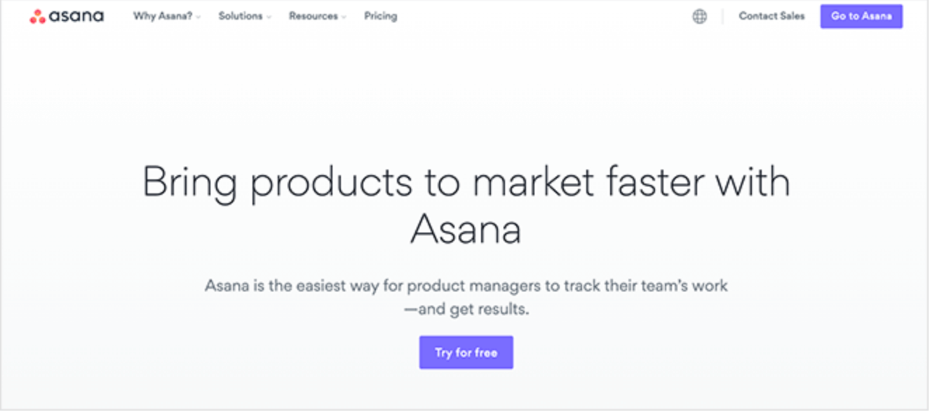
Goal: Membership Signups
Call to Action: Try for free
What They Did Well:
- Simplicity
- Concise Copy
- Easy navigation
WalkMe
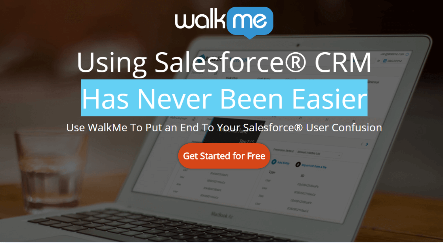
Goal: Membership Signups
Call to Action: Get Started for Free
What They Did Well:
- CTA button placement
- Brevity
- Concise explanation of what it is
Codecademy

Goal: Membership Signups
Call to action: Try it For Free
What They Did Well:
- Highlighting benefits
- Copy
- Use of color
Active Campaign
.png?width=700&name=Active%20Campaign%20(1).png)
Goal: Membership Signups
Call to Action: Start your free trial
What They Did Well:
- Copy
- Highlighting benefits
- Visuals
PayPal
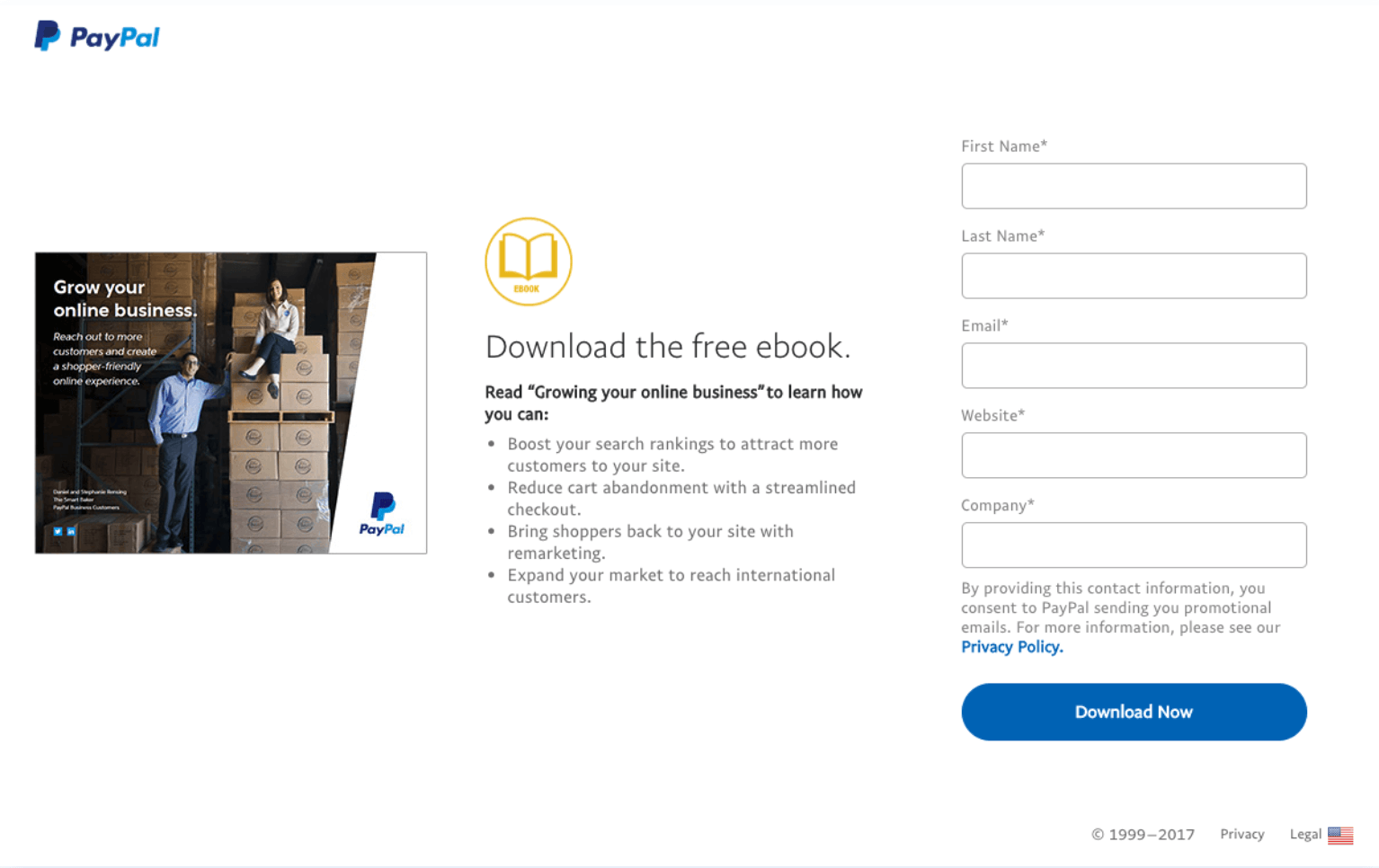
Goal: Contact Information Collection
Call to Action: Download Now
What They Did Well:
- Contact form brevity
- Summary of the ebook
- Simplicity
WordStream
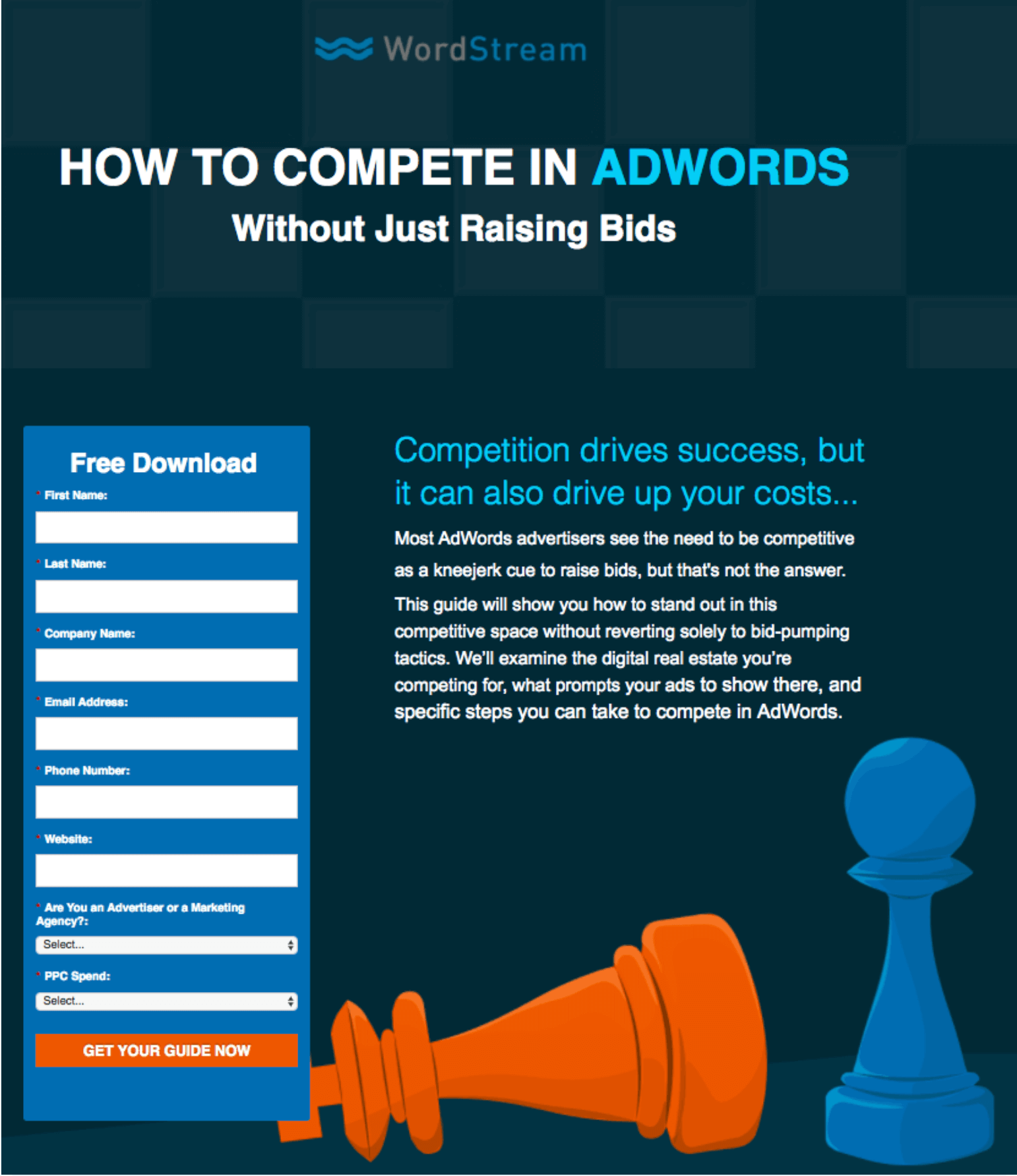
Goal: Contact Information Collection
Call to Action: Get Your Guide Now
What They Did Well:
- Summary of the ebook
- Symbolism in the illustration
Salesforce
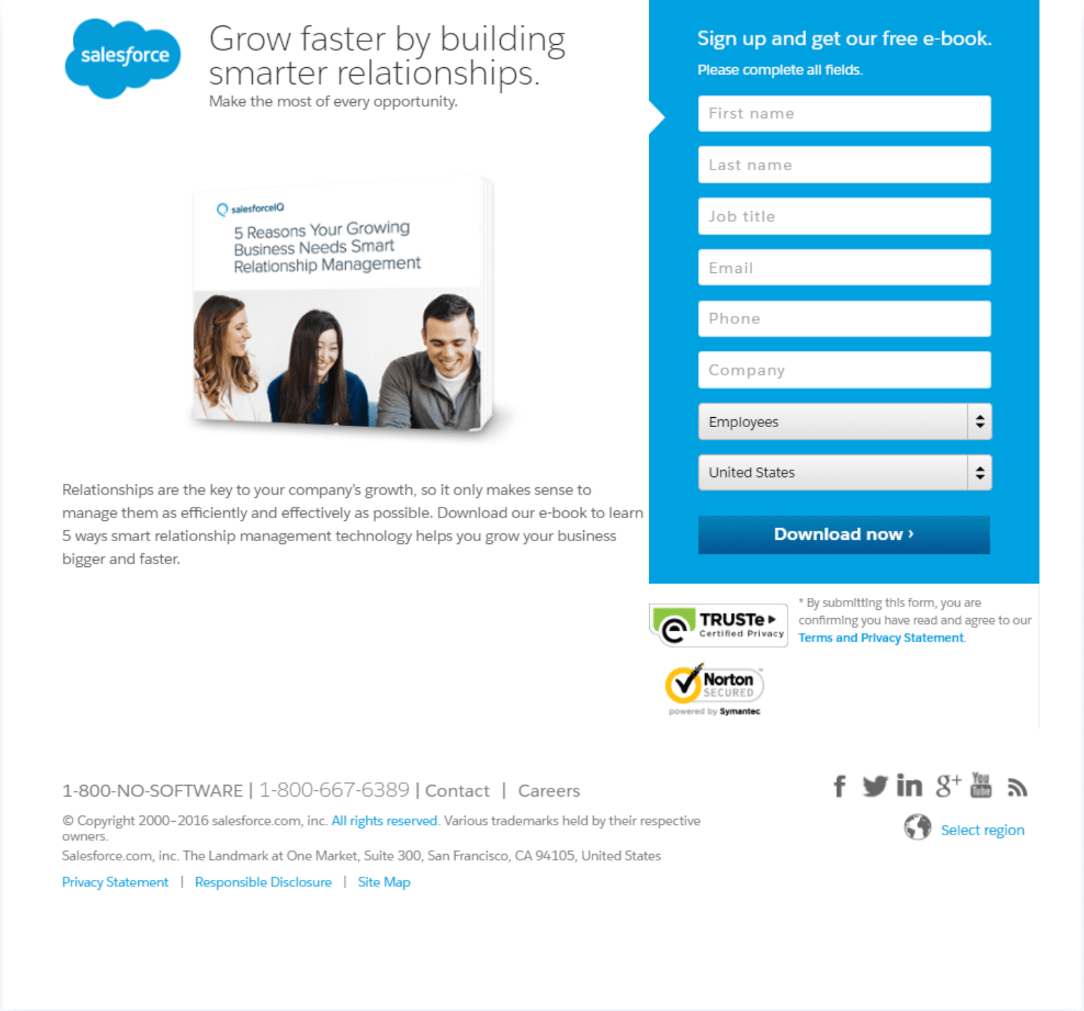
Goal: Contact Information Collection
Call to Action: Download Now
What They Did Well:
- Highlighting benefits
- Use of the same blue as the logo
- Use of whitespace
UserTesting
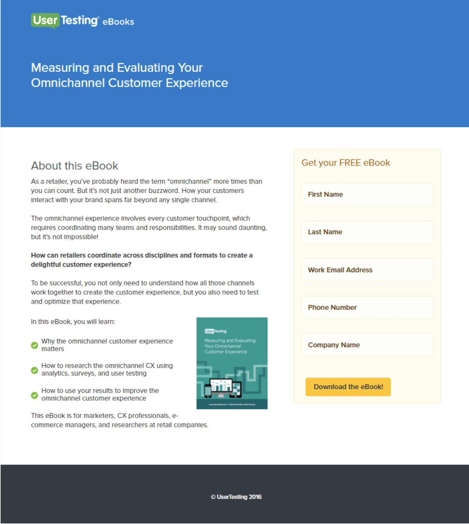
Goal: Contact Information Collection
Call to Action: Download the Ebook
What They Did Well:
- Summary of the ebook
- Highlighting benefits
- Contact form brevity
Test Your Landing Pages for Better Conversion Rates
A/B testing is the process of testing out two versions of a web page and seeing which one meets the intended goal better. It isn’t a one and done thing. As you develop more landing pages, test for the following and use strategies that work moving forward:
|
Shorter or longer text |
More direct or urgent messaging |
Background or text colors |
|
Images |
Still image vs. video |
CTA size |
|
CTA placement |
Page layout |
Offering |
How Sav Can Help
Whether you’re creating your own landing pages or buying your domain, Sav is here to help your small business succeed online by making every step of the process easy and affordable. That way you have more time and money to run your business. Get started for free today.