
What Is a Brand Style Guide?
A brand style guide dictates the branding of a company. This includes the appearance and feel of the logo, website, blog, advertisements, and any other design elements or marketing materials.
Brand style guide, brand guidelines, and brand book are used interchangeably. You can think of it as a branding rulebook. Whatever you call it, these guides combine graphic design, writing, and the goals of your company to create a cohesive strategy.
.jpg?width=5184&name=hal-gatewood-tZc3vjPCk-Q-unsplash%20(1).jpg)
Why Do You Need a Brand Style Guide?
Brand consistency is important to any company’s success. Achieving that is hard to do without laying out the rules. Especially as your company grows and gets more and more people involved in these decisions. More specificity in branding also means your marketing materials will be higher quality and more on-brand than they would be otherwise.
How to Create a Brand Style Guide in 5 Steps
1. Collect Inspiration
Many companies, including the ones on this list, make their brand guides available for the public to view online. As you read through them, take note of the formatting as well as what you like and dislike.

2. Define Your Brand Guide Elements
Brand Story
A good narrative can make the difference between a company that’s kinda cool and a company that people are loyal to. That narrative also needs to be consistent or risk coming off as dishonest or inauthentic. Laying out the important details of your brand story in your style guide makes sure that all material that highlights it gets it right.
.jpg?width=6016&name=claudia-wolff-MiJTU6lqksg-unsplash%20(1).jpg)
Mission Statement
Similarly, including your mission statement in your brand guide makes sure that every marketing material works towards your company’s goal.
Logo Guidelines
Be sure to include the following logo design specifications in your guide:
- Size and proportions
- Whitespace instructions
- Colors
- All approved brand logo variations
- Examples of improper logo use

Brand Color Palette
A color palette or color scheme is the group of colors a company uses in its visuals. Sticking to a color palette is important for brand recognition. We all know Twitter blue and McDonald’s yellow and red. Be sure to include the following codes for each color for easy matching:
- Color match: PANTONE name and number
- Print: CMYK
- Digital: HEX and RGB
.jpg?width=3347&name=mika-baumeister-fxv5qihaqGE-unsplash%20(1).jpg)
Typography and Font Guidelines
Consistent typography and fonts are also essential for brand recognition. Typographic guidelines dictate the fonts used in
- The logo
- The tagline
- The website
- Ads
- Blog posts
Whichever font you choose, make sure it's readable and won't slow down your website.
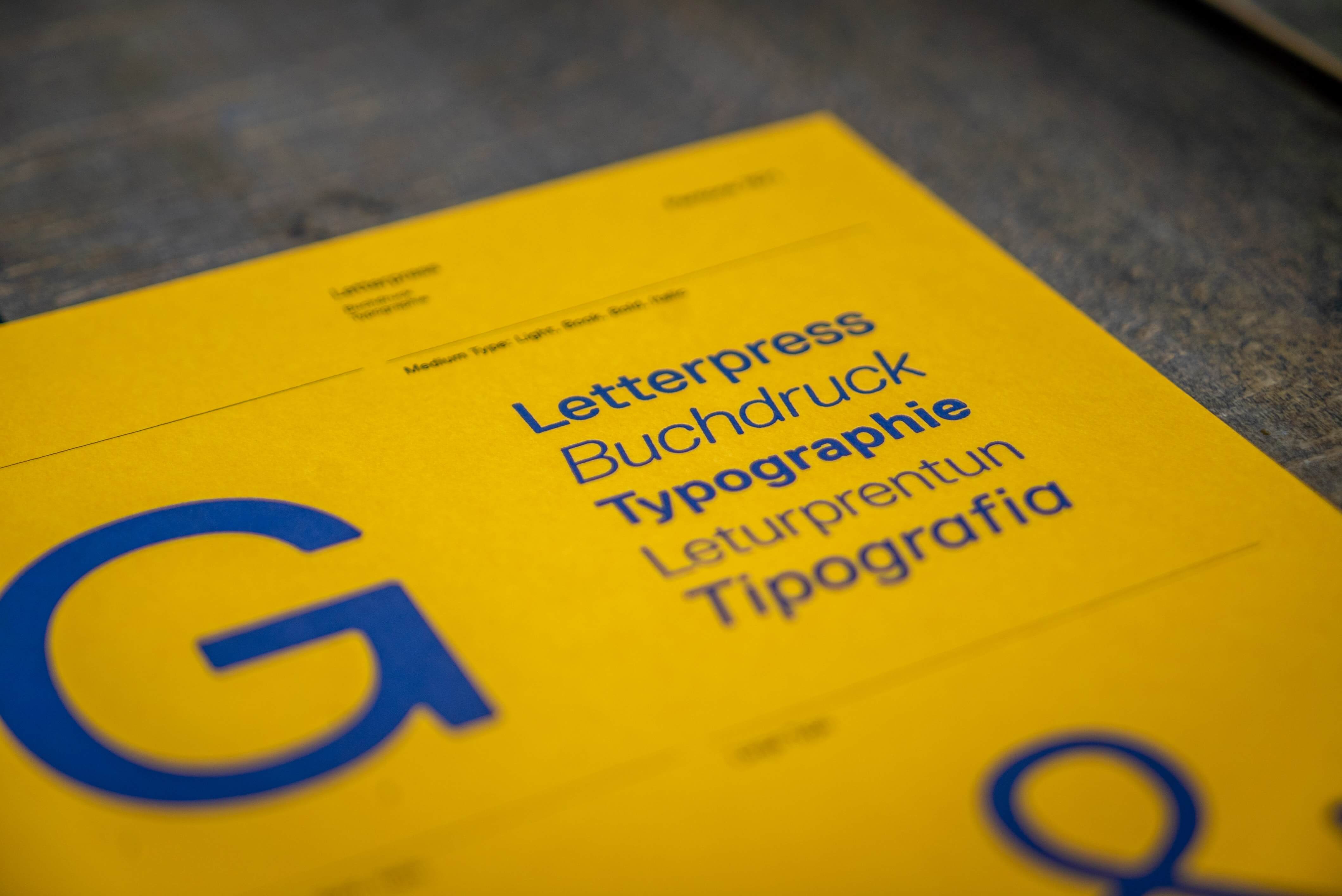
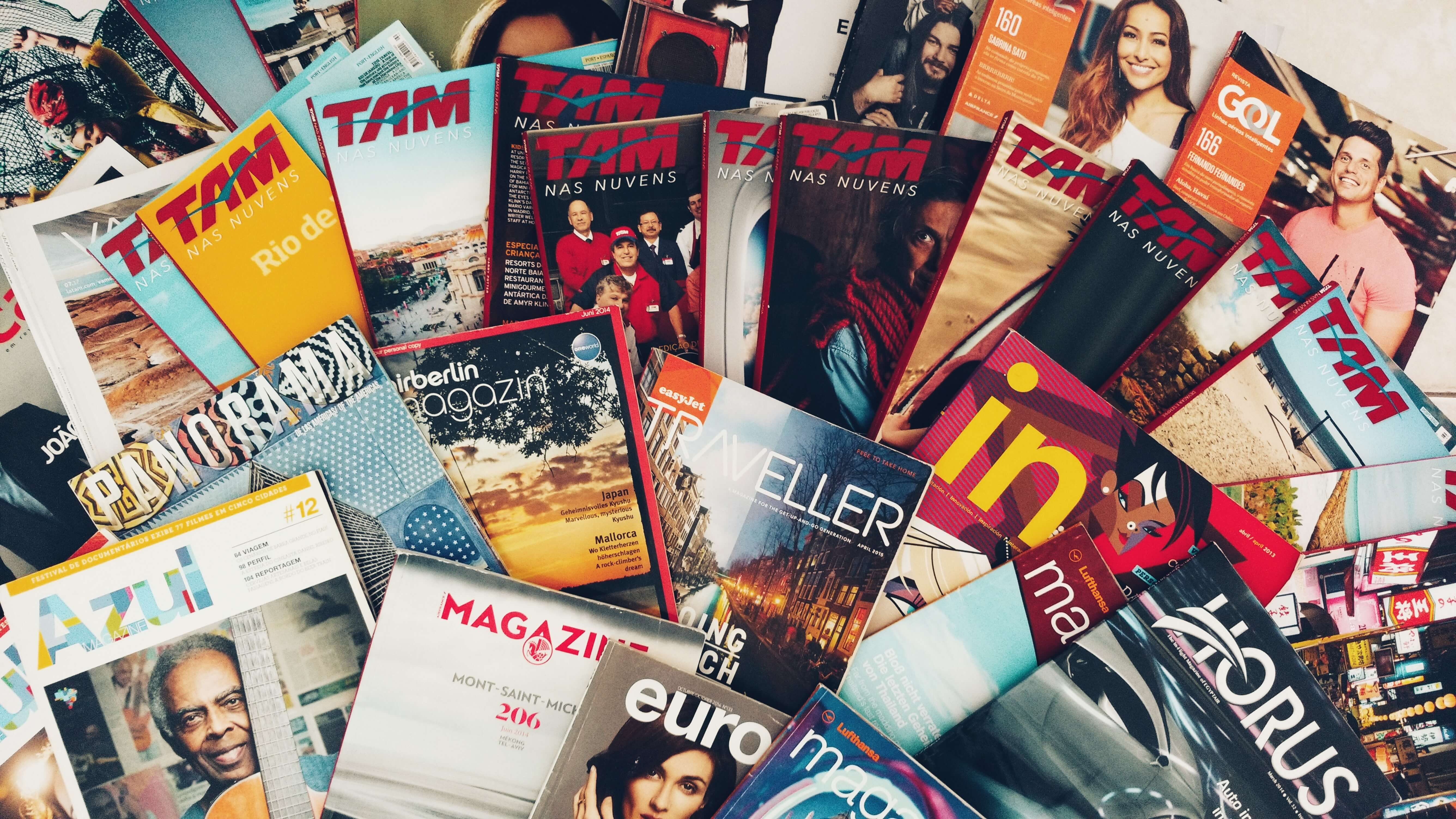
Image Guidelines
Image guidelines include any rules about using photos and images in your branded materials. This could include when it is and isn’t appropriate to use images, image size guidelines, and sources of fair use stock photos.
Editorial Style Guide
An editorial style is an important set of guidelines for anyone who writes anything on behalf of your company from the PR team to copywriters and content marketing writers. It determines your brand voice. The first step to creating an editorial style guide is choosing an editorial style (like Associated Press or Chicago Manual of Style). These guides also typically includes details about
- Phrasing
- Topics the brand can and can’t write about
- Stances on mentioning other companies
- The reading level to write at
- The buyer persona’s preferences
Buyer Personas
A buyer persona is a representation of your target audience. This is the person your brand content is for. It only makes sense to include them in your brand style guide.
3. List Other Collateral Your Guide Should Cover
Depending on your company’s needs, there may be other collateral you need to cover in your style guide. For example, primarily digital brands need specifications for the website and app. Companies that sell physical products need packaging guidelines. Brands with an active social media presence may need guidelines specific to social posts.
.jpg?width=4842&name=brands-people-8ryz8T0bWx4-unsplash%20(1).jpg)
4. Outline Your Guide
Once you know what your guide needs to cover, make an outline to get the ideas flowing and establish what order you want to put all of your information in. A style guide template is a great place to start if you’re stuck.
5. Revisit Periodically
%MCEPASTEBIN%
.jpg?width=6000&name=chris-lawton-5IHz5WhosQE-unsplash%20(1).jpg)
26 Style Guide Examples
Now that you’ve learned the basics for creating your own brand style guide, let these examples from all kinds of companies inspire you.
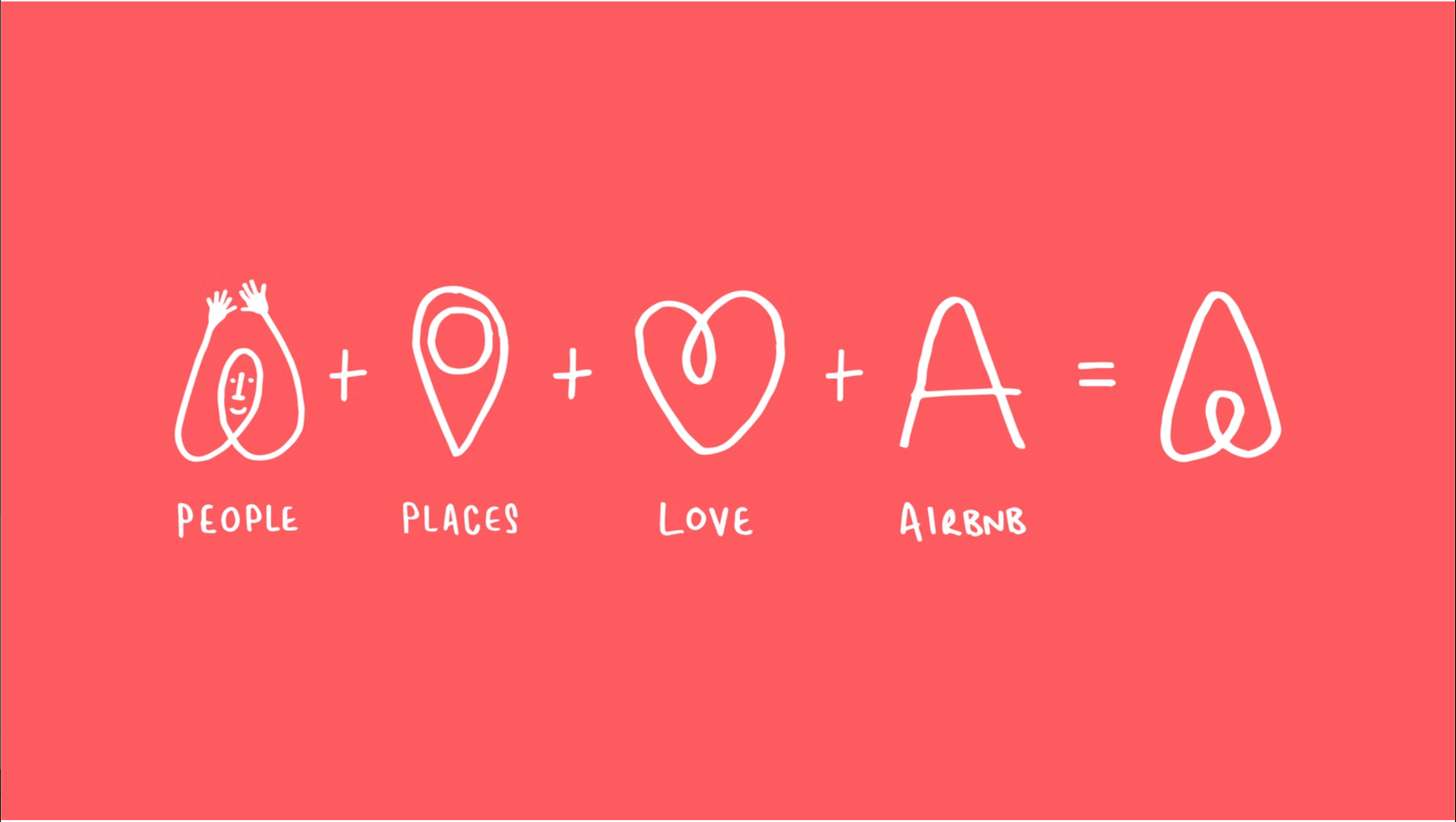
1. AirBnBAirBnB’s brand guide does a great job of highlighting the story of the company and brand identity. They even included this cute little sketch explaining their logo.
2. Alienware
Alienware’s brand style guide looks as sleek and futuristic as its products.

3. Apple
Everyone recognizes an Apple product. That’s thanks in no small part to the brand guidelines, which include not only the typical brand elements, but the appropriate guidelines for all Apple branded apps.
4. Barre & Soul
East coast yoga studio chain Barre & Soul has a specific aesthetic and feeling they want to evoke in their visitors. Their brand guide starts with a mood board and description of that aesthetic and feeling, then lays out all the details how they make it happen. 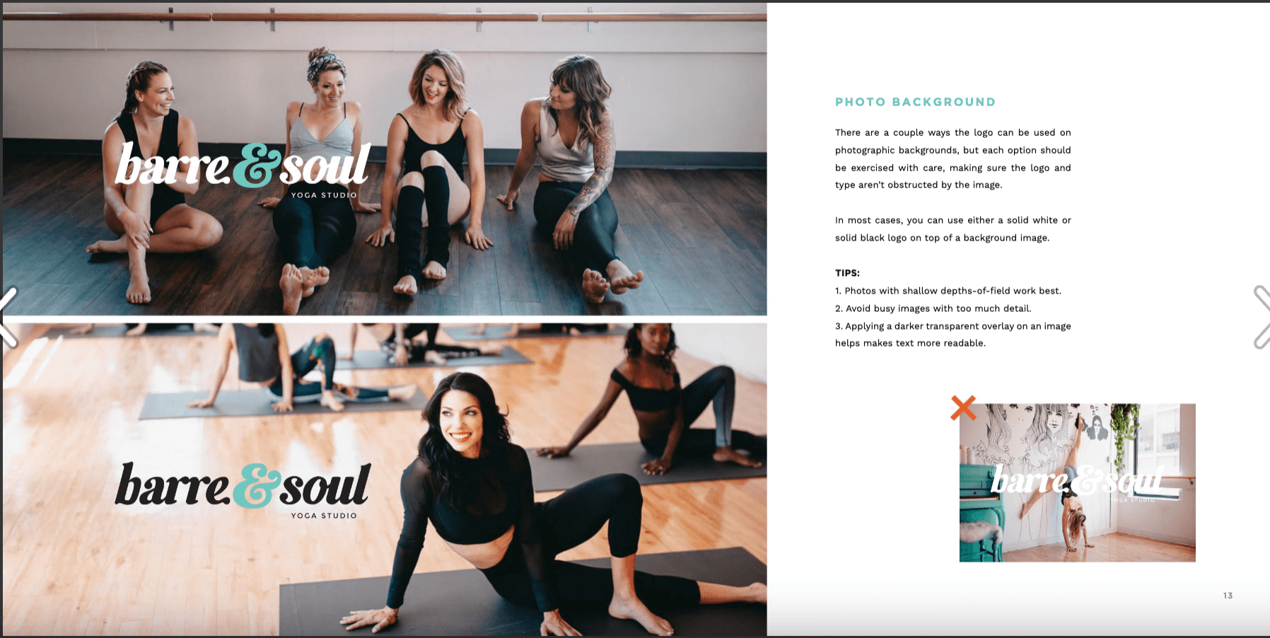
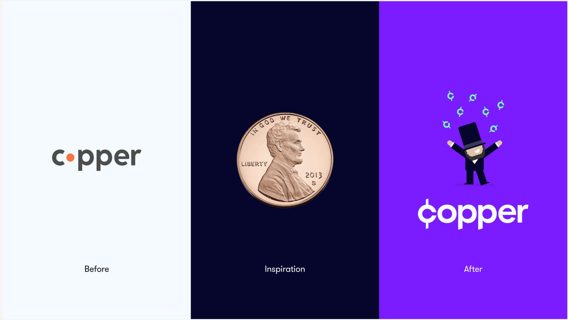
5. Copper
Copper is a financial app geared towards teenagers. Its brand guidelines and the guide itself reflect their youth-centric branding approach.
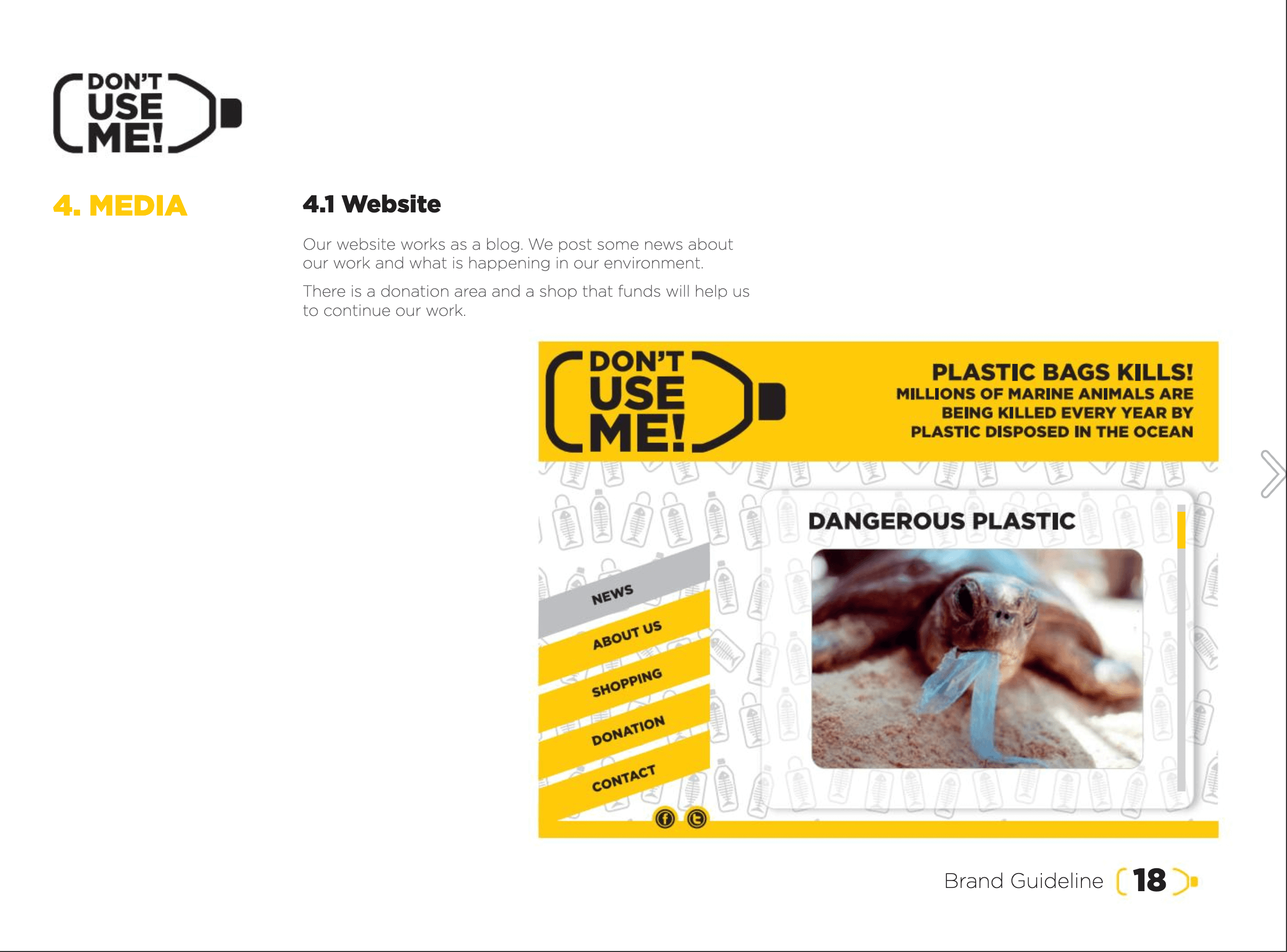
6. Don’t Use Me
Charity groups have brand style guides too. Anti-plastic pollution organization Don’t Use Me lays out their simple, effective visual language with a particular focus on merchandise and digital branding.
7. Fender
Fender is an iconic brand, so it only makes sense that their brand guide is slick and specific. 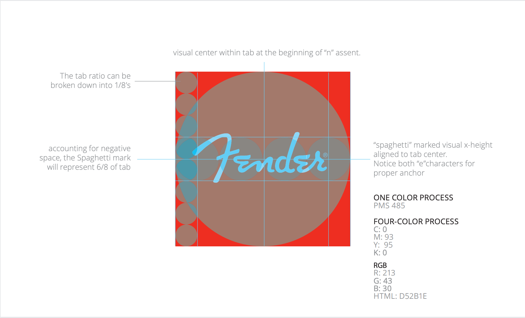
8. Fisher-Price
You don’t become one of the most successful toy brands in the world without rebranding a few times. That’s why Fisher-Price’s brand guide doesn’t just dictate its current whimsical brand image, but highlights the history of the company and how its look has changed over time. This approach fleshes out a larger brand identity. 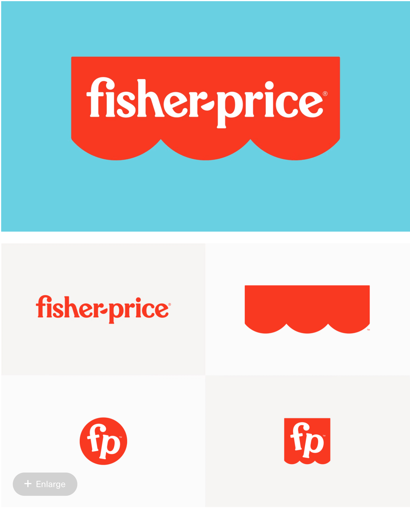
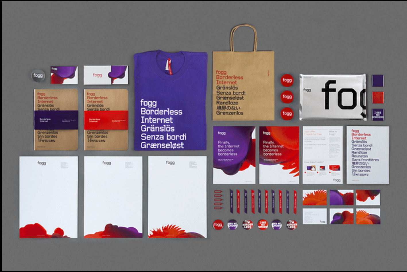
9. Fogg
The brand guide for Croatian internet provider Fogg connects the company’s visuals and branding to its mission to provide internet without borders. Thus the red and purple abstract shapes, merchandise that says “borderless internet” in several languages, and the block, tech-looking font.
10. Herban Kitchen
Kitchen membership program Herban Kitchen’s clever branding choices don’t stop at their punny name. Their brand guide meticulously outlines everything from what exactly they do to the brand experience at their locations to their clever social media and guerrilla marketing campaigns.
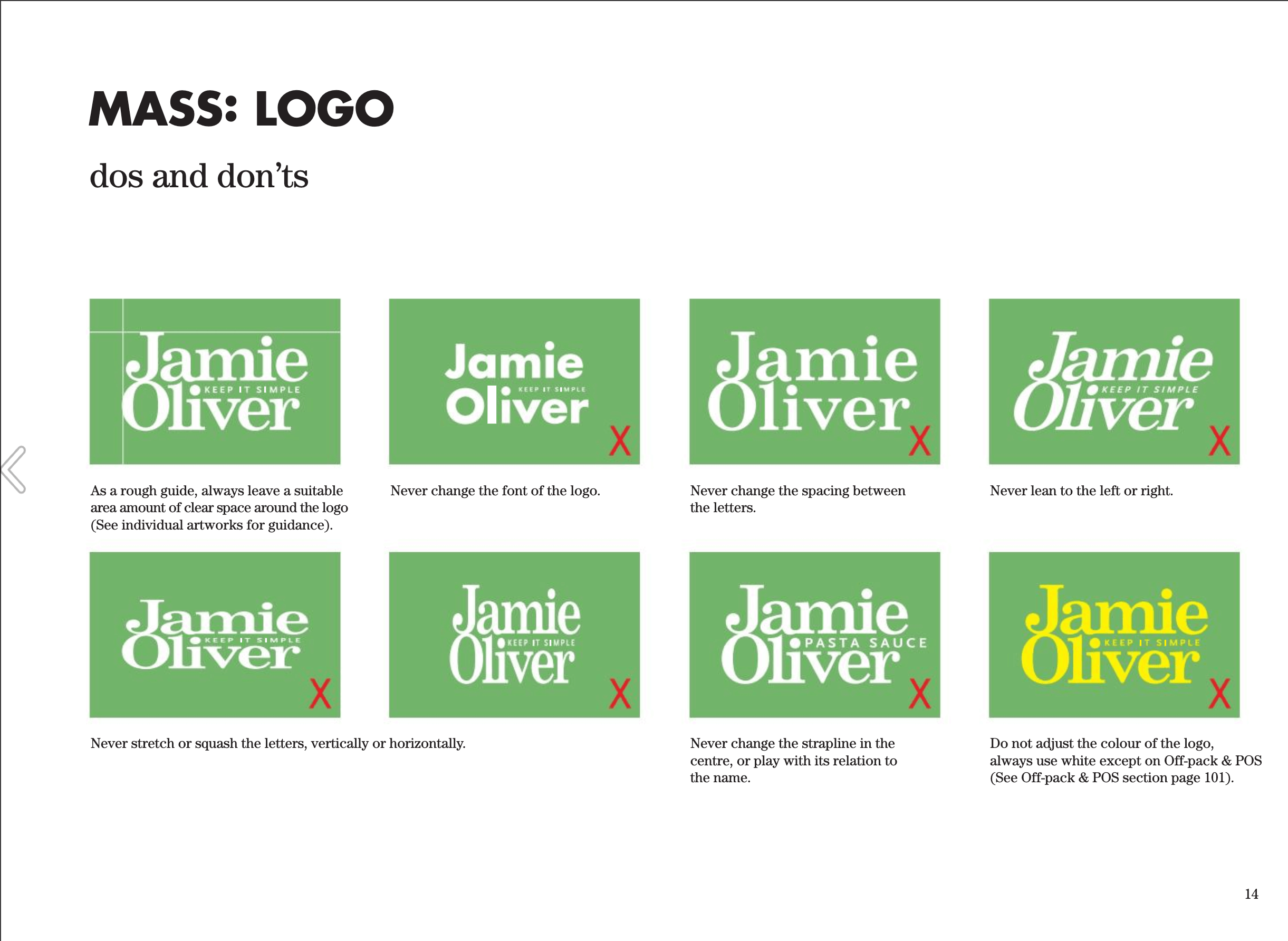
11. Jamie Oliver
Jamie Oliver isn’t just a chef. He sells products, appears on TV, and gives his kids weird names. His brand guide brings every aspect of his career together under a cohesive brand identity.
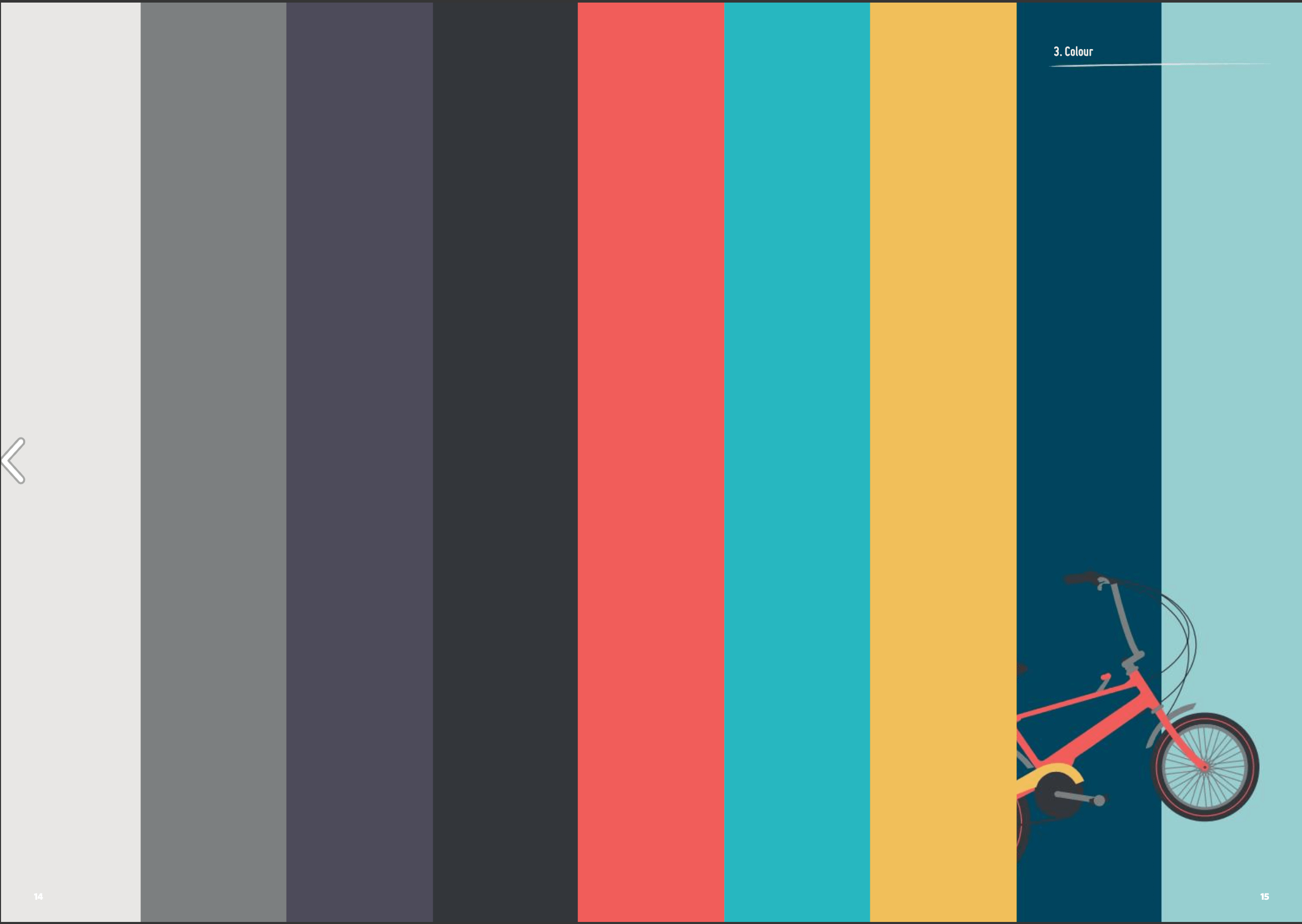
12. Love to Ride
Love to Ride is an online community for cycling enthusiasts and advocates. Their aesthetic is colorful and whimsical and the text of their brand guide incorporates humor with lines like “riding a unicycle is tricky. Using our logo correctly is not.”
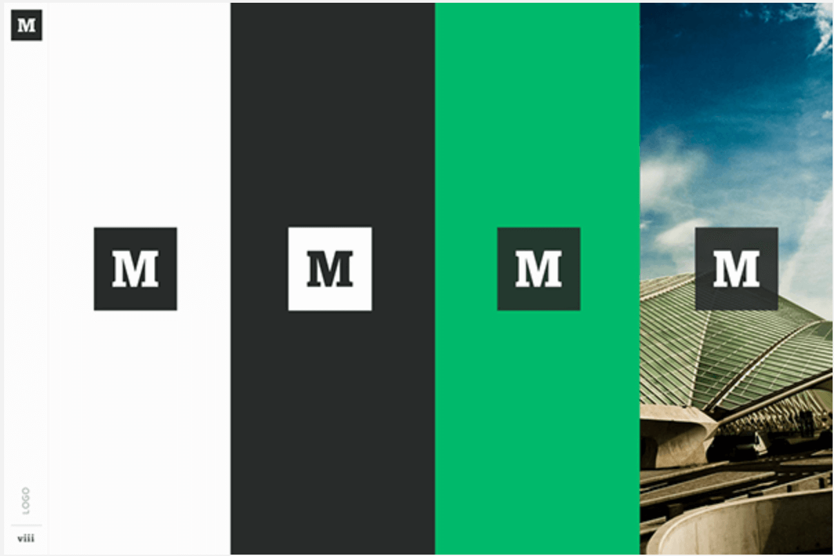
13. Medium
Online article publication giant Medium’s brand guide is very specific about typography and colors.
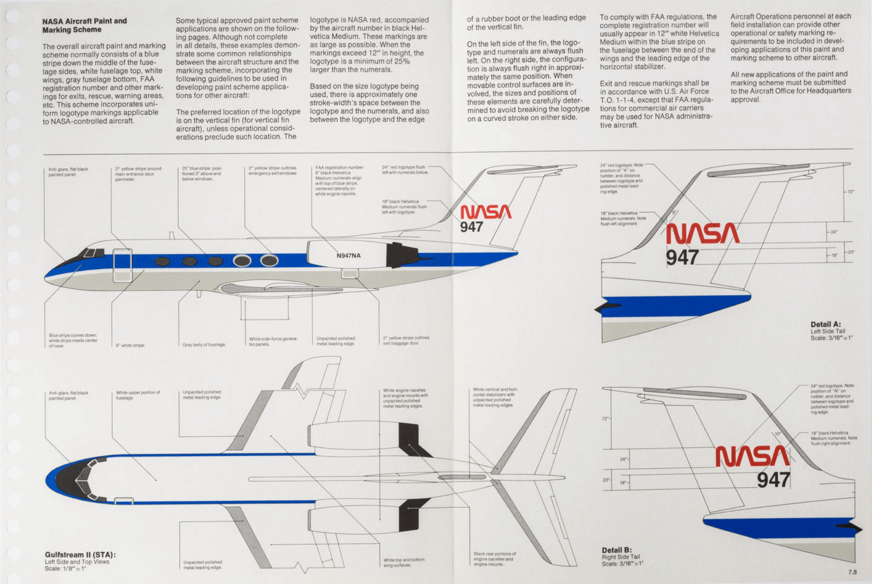
14. NASA
Yes, NASA has a brand book. Theirs is extra interesting because, well, it’s NASA and it includes cool information that guidelines that aren’t relevant to more typical brands.
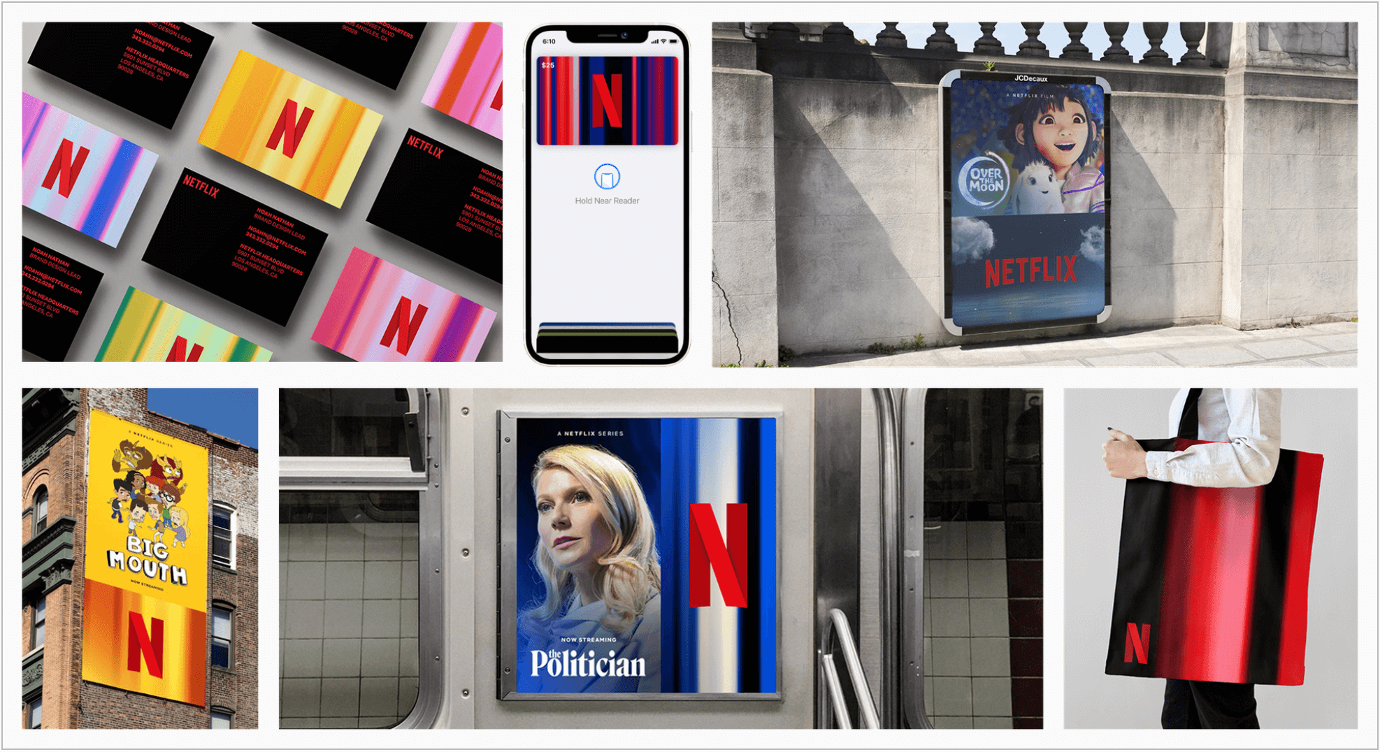
15. Netflix
Netflix has come a long way since they started mailing DVDs to your house. Their red N and two-note jingle are everywhere. Their brand history and guidelines for the future are laid out in their style guide.
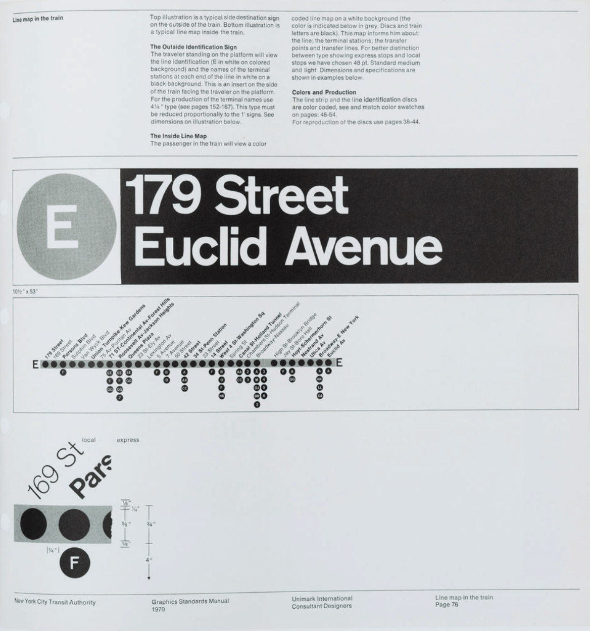
16. New York City Transit Authority
Subway stations are recognizable by their signage and iconography. That’s no accident. It was all laid out it the NYCTA standards manual.
17. Nike Pro Services
The brand guide for Nike’s exclusive, invitation-only loyalty program, Nike Pro Services, explains the logic behind their visual identity.

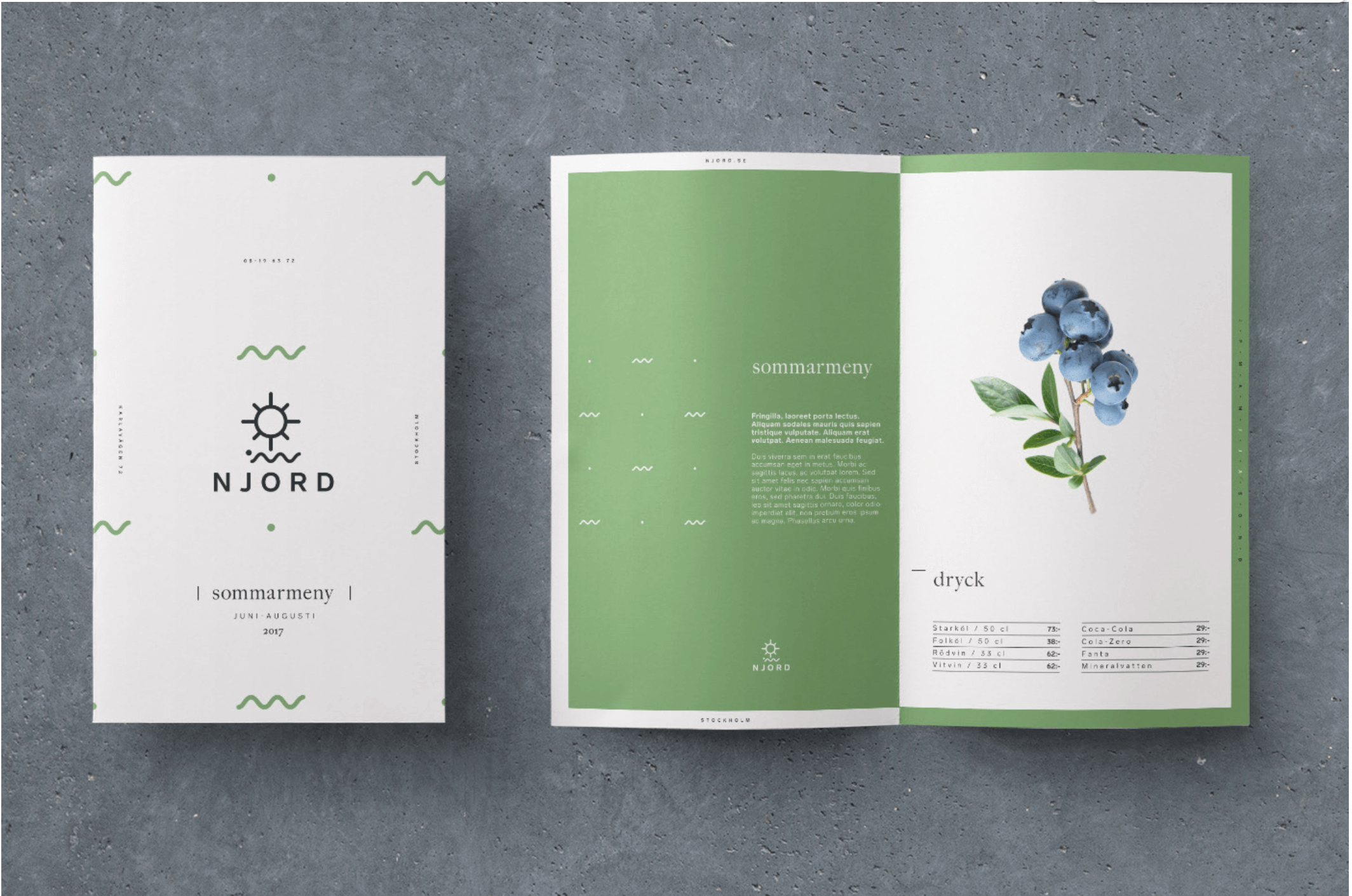
18. NJORD
NJORD, a restaurant in Oslo with a focus on sustainability and local ingredients, uses minimalist, nature-inspired visual elements in their branding. Their style guide itself is visually clean and connects the brand experience to the company’s values.
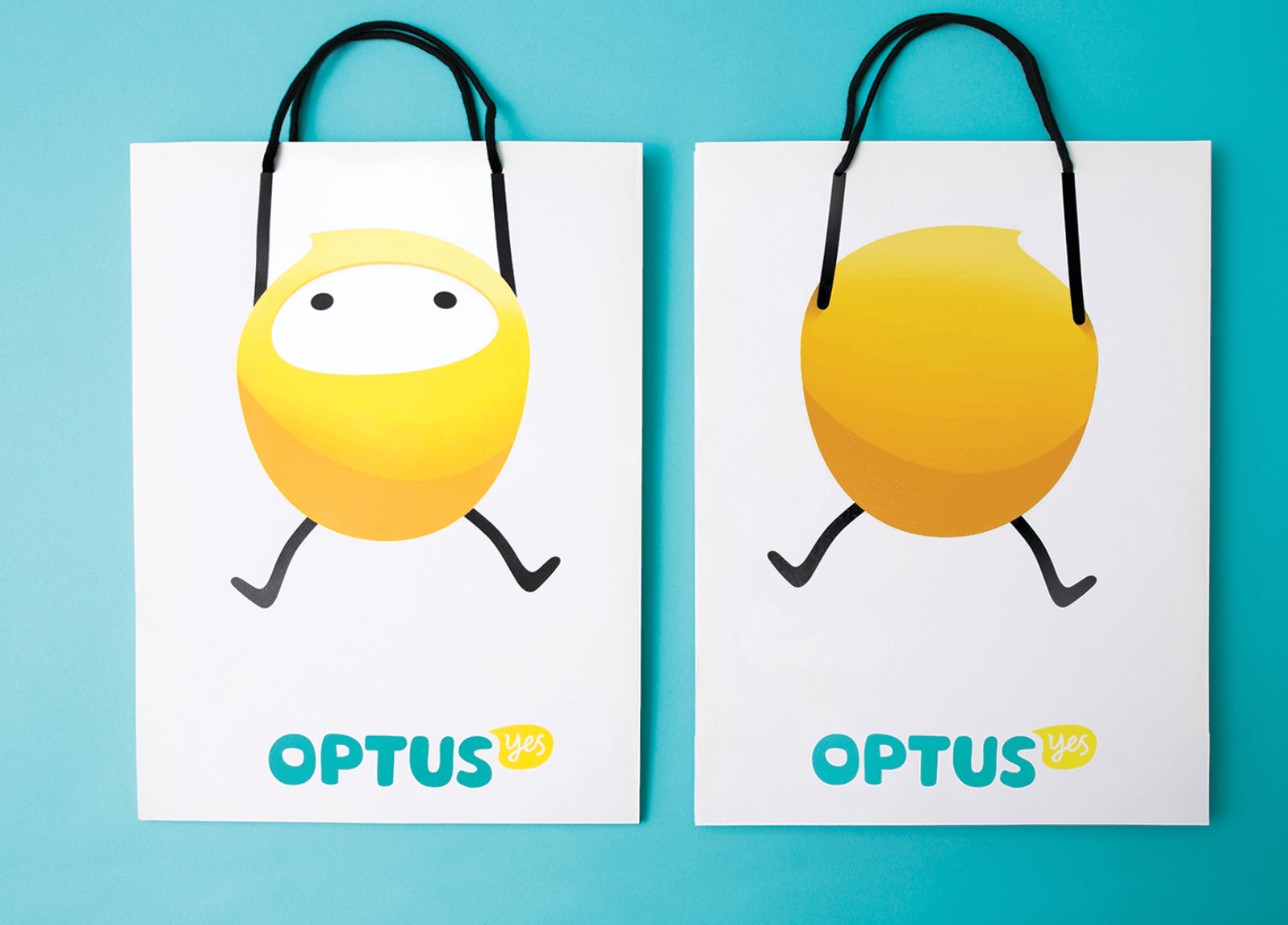
19. Optus
Australian telecom company Optus has won awards for their branding. Their brand guide makes it easy to see why. Their custom typeface, cute lemon-yellow mascot, “declaration of yes,” and enthusiastic, conversational tone of voice create a winning brand identity.
20. Skype
Skype’s brand guidelines use the same humor and plain, easily understandable language as their marketing materials. 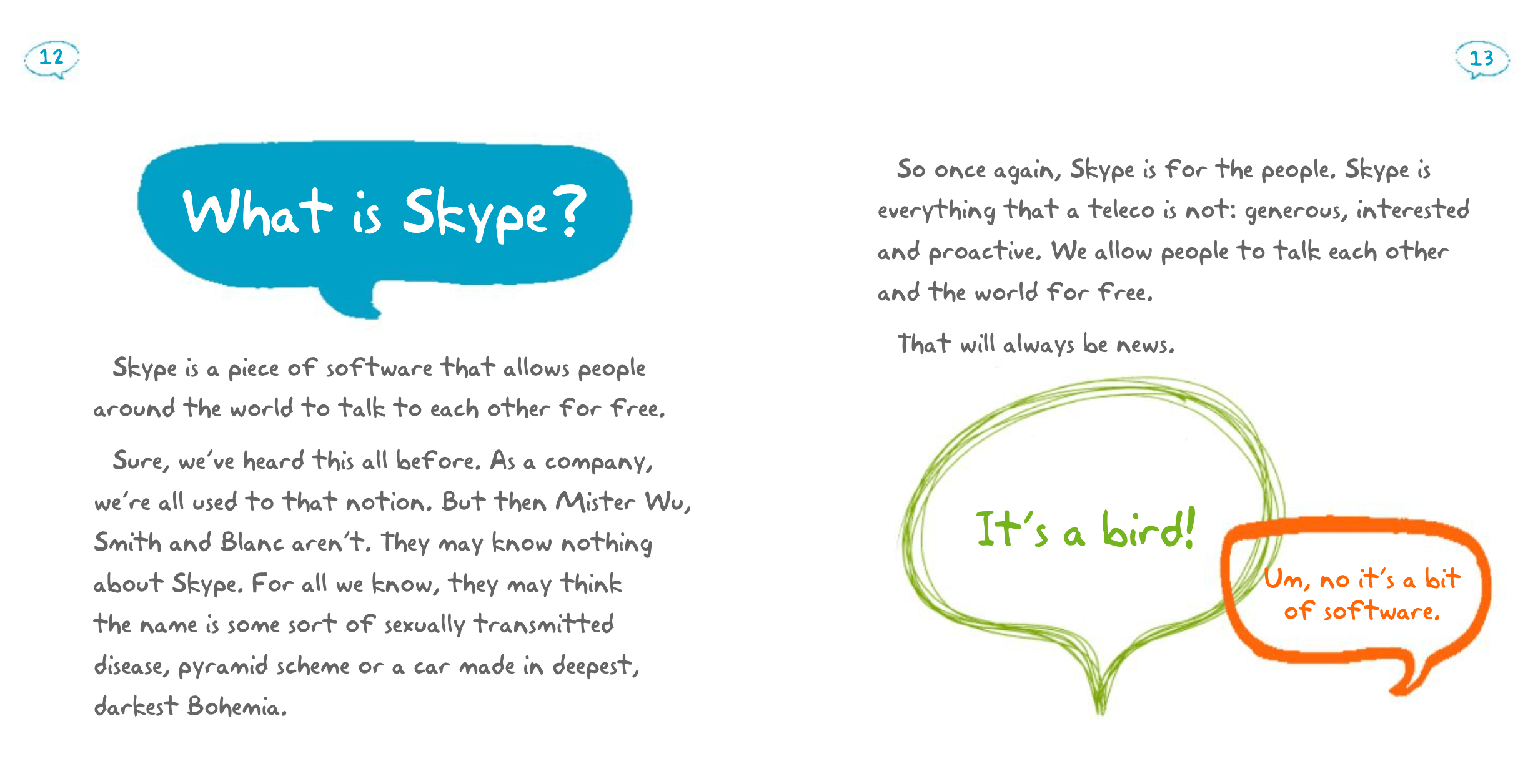
21. Spotify
Spotify’s brand guidelines keep their app user-friendly and their brand consistent and recognizable. 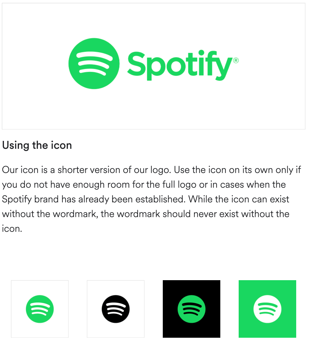
22. Sushi & Co.
Baltic Sea cruise ship restaurant Sushi & Co.’s visual elements are clever without being complicated. Their brand guide dictates three colors, simple graphics, a pretty scale pattern, and clean, readable typography. 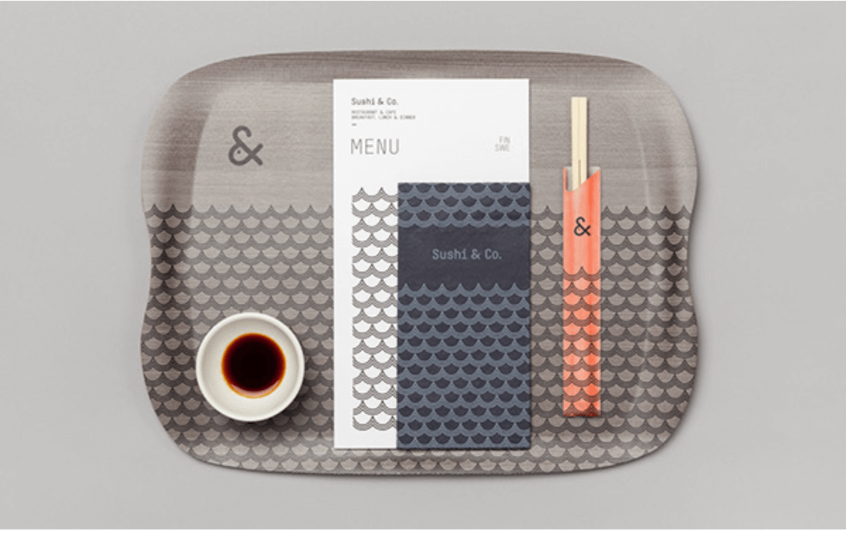
23. University of the Arts Helsinki
Universities are brands too. That’s why when three arts academies merged in 2013 to create University of the Arts Helsinki, they created a brand guide to help them appeal to the hip, creative young people who make ideal students. 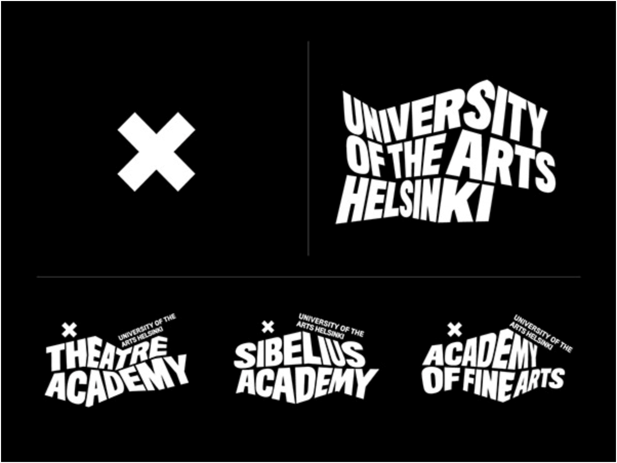
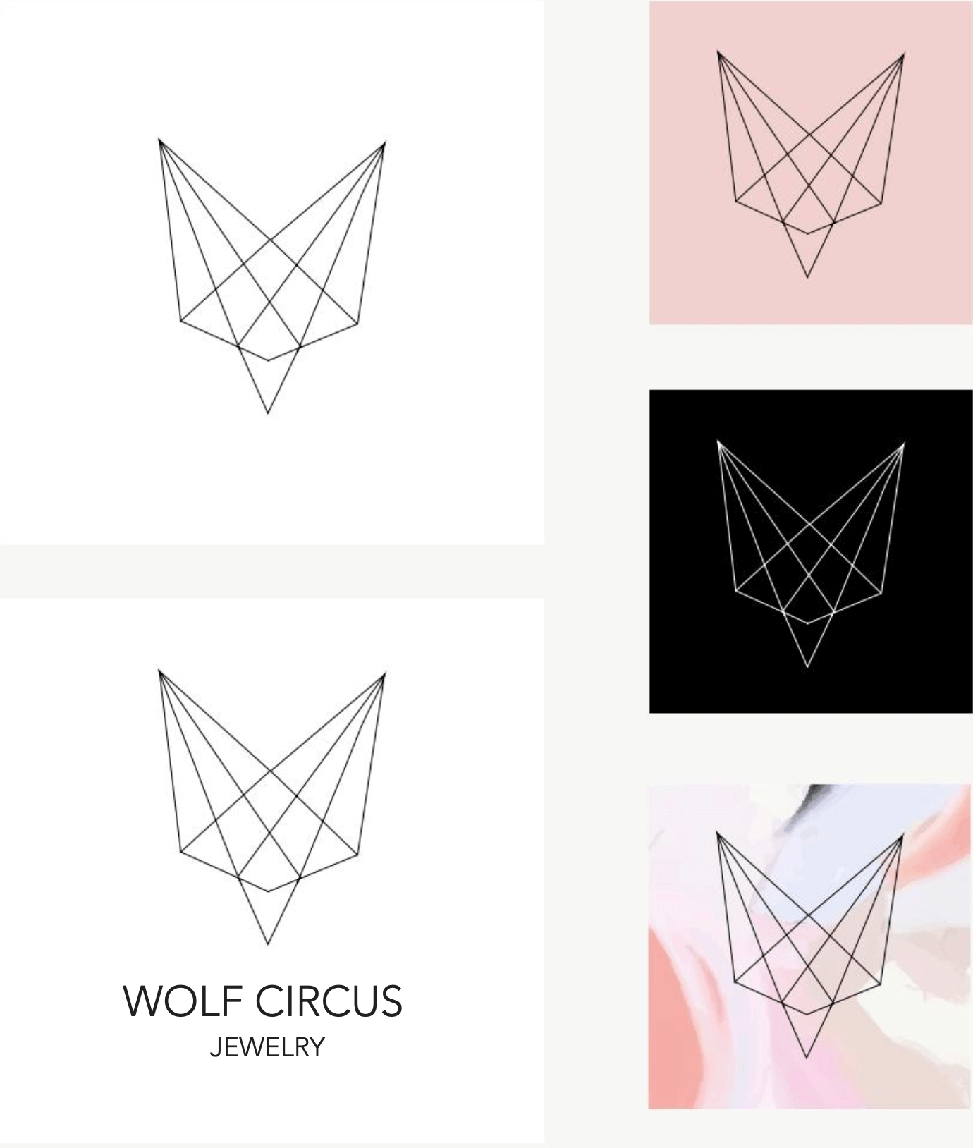
24. Wolf Circus Jewelry
Vancouver-based boutique Wolf Circus Jewelry is modern, feminine, and creative. Their brand style guide is meticulous about the brand aesthetic.
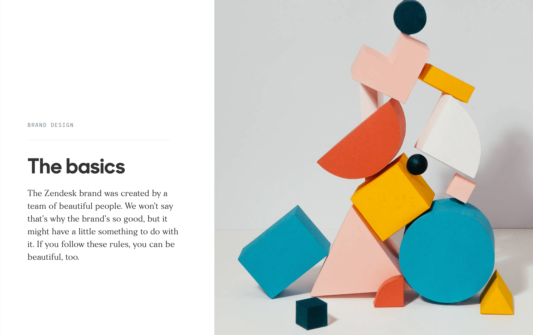
25. Zendesk
Zendesk is a quirky brand. But that quirkiness isn’t spontaneous, it’s planned out meticulously in their detailed, yet entertaining style guide. Their visual brand assets are made up of a series of small geometric shapes that they call “relationshapes.” Their brand colors are named after cartoon characters. They refer to variations on their copy tone as “mild” and “spicy.”
How Sav Can Help
Whether you’re buying a custom domain, building a professional website, building your brand, or managing your online presence, Sav is here to help small businesses succeed online. See how today!

Recommended articles
How to Make a Media Kit
What is a Media Kit? A media kit, also known as a press kit, is a document that businesses give to journalists and media outlets before an...
Read more
What is Brand Voice? [And How to Create One]
What is Brand Voice? A brand voice is the unique personality a brand takes on in all of its communication channels. And it’s not just about...
Read more
A Beginner's Guide to the Product Development Process
What is Product Development? Product development is the process of creating a new product or updating an existing product from idea to...
Read more