

A business card lets you make a good first impression on potential clients and collaborators. It’s not just to let people know how to contact you, its design can also communicate what you and your business are all about. Take design inspiration from these professional business cards from a variety of styles.
Who Needs a Business Card?
A business card is a great networking and marketing tool for a wide variety of professionals, including but not limited to:
- Small business owners
- Freelancers
- Real estate agents
- Job seekers
- Anyone who wants to expand their network
Benefits of Having a Business Card
A Good First Impression
Handing someone a business card during a networking interaction makes a strong impression.
A More Professional Image
Having a business card shows people that you’re a legitimate professional.
Make it Easy for People to Follow Up
People forget things. If you give them a business card with your contact information, they’ll be able to contact you easily and you won’t miss out on opportunities.
Contact Information to Put on a Business Card
- Your full name
- Phone number
- Email address
- Website
- Logo and slogan
- Business address (if applicable)
- Social media handles (if applicable)
Business Card Design Ideas For Every Taste
Let’s dive into some business card inspiration to help you create the perfect one.
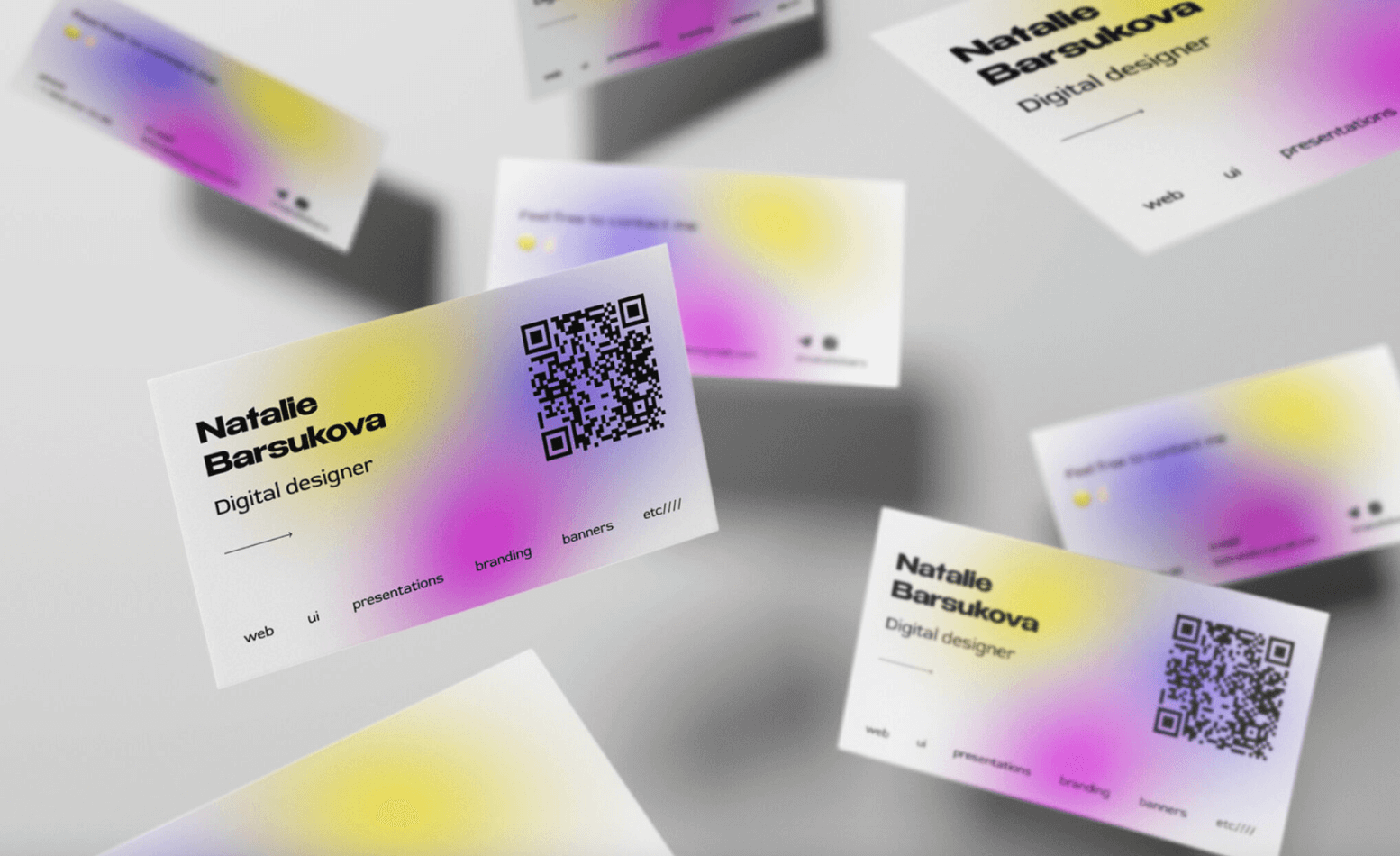
Creative Business Cards
Creative business cards have a unique element that makes them stand out from the rest. Creative business cards are great for industries like design, advertising, consulting, and art.
Here are some design elements for creative business cards:
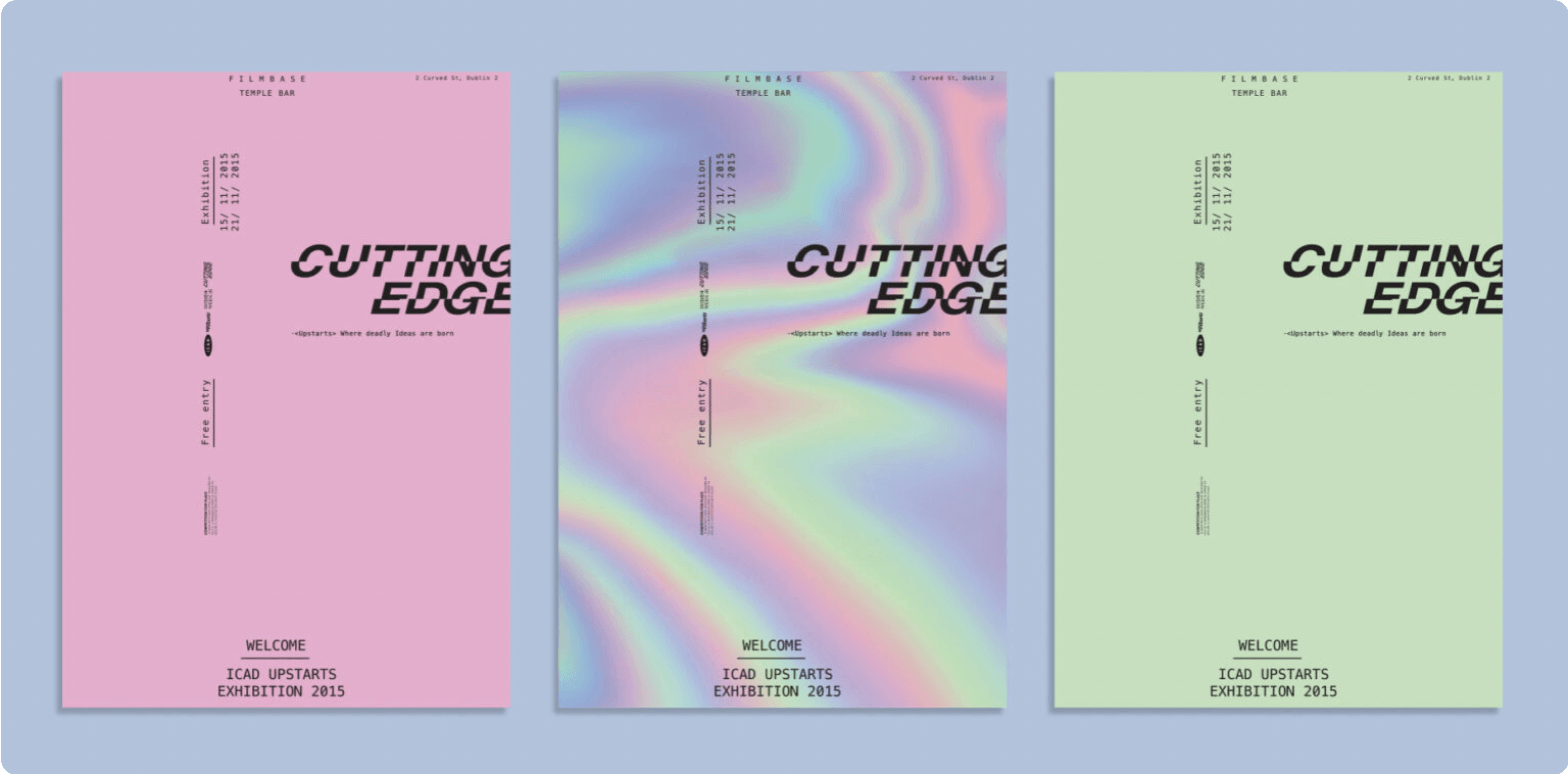
Gradients
Blurs and gradients are trendy in graphic design. They add a dreamy and captivating look to your business card designs and web design.
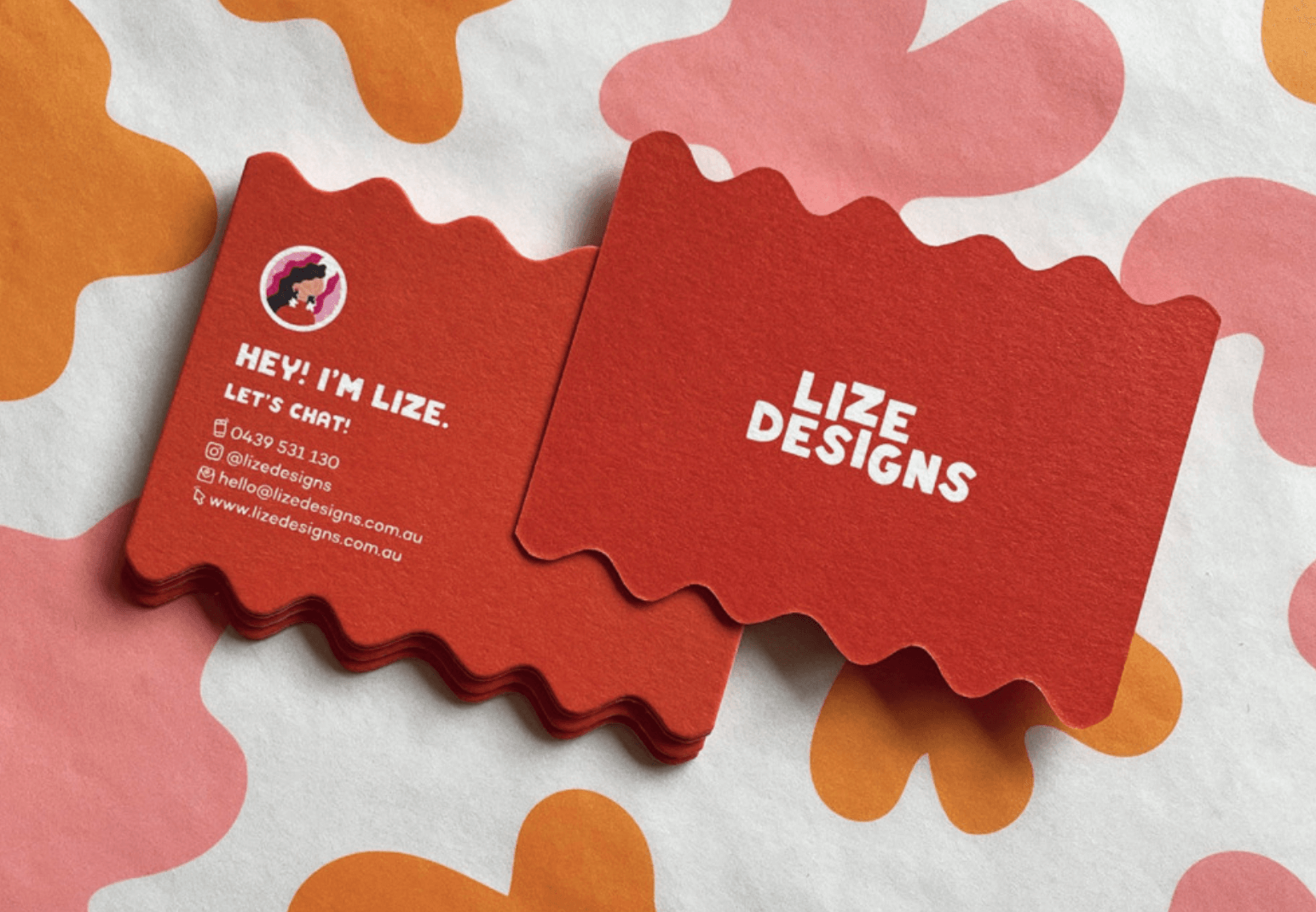
Unique shapes
Some business card designs set themselves apart by thinking outside the box in terms of the physical shape of the card and the materials that it’s made from. Rounded edges and recycled materials can make your small business stand out.
Eye-catching color combinations
People hold on to colored business cards for 10x longer than a plain white one. The right color palette can make sure they hang on to yours.
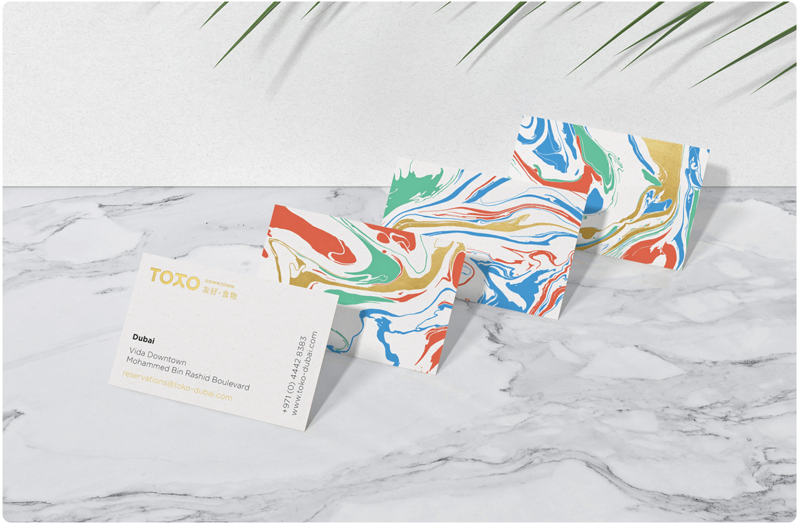
Patterns and illustrations
Try using handmade illustrations or unique patterns in your business card design to capture your client’s eye.
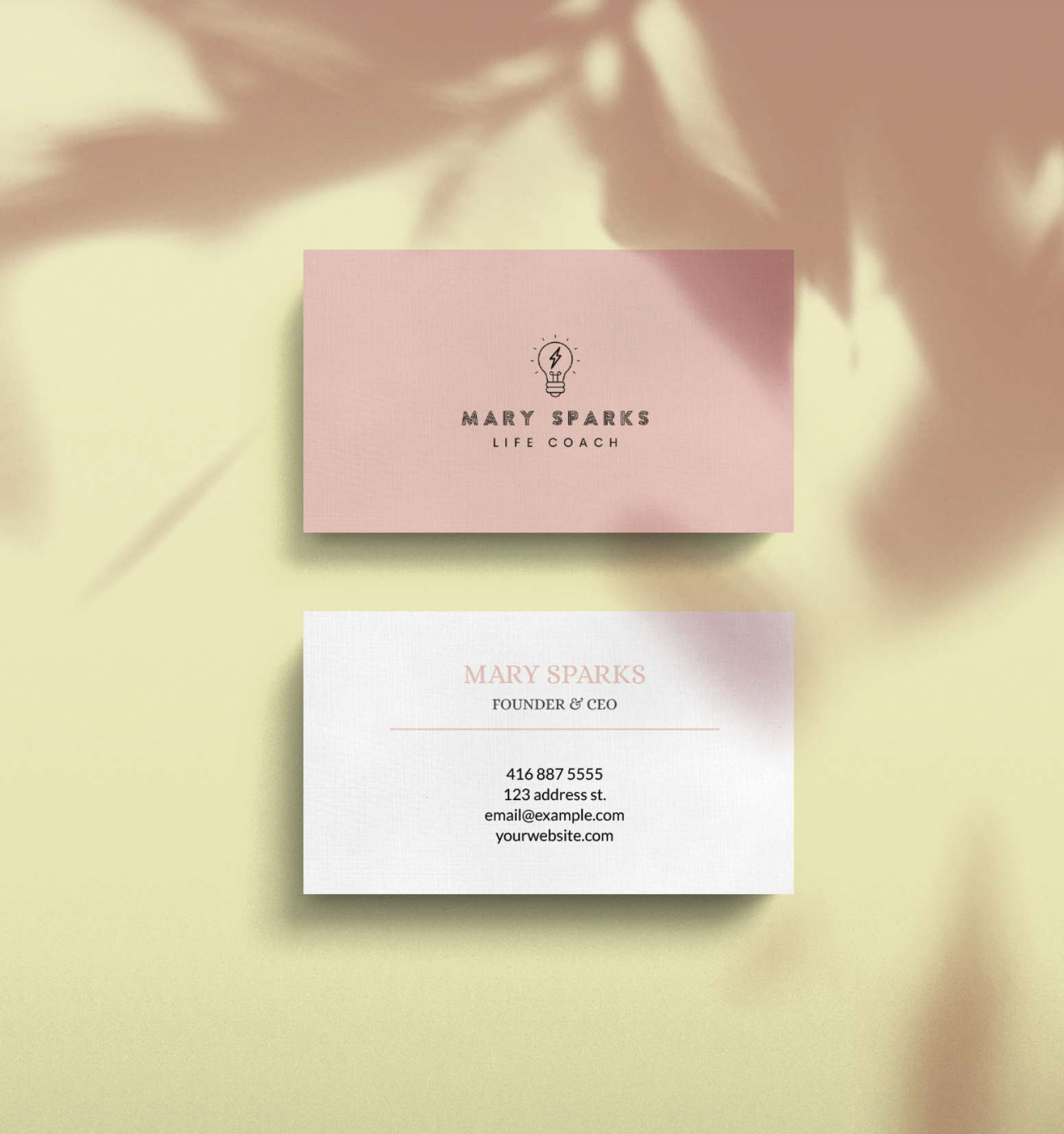
Modern Business Cards
Modern business cards are contemporary, cutting edge, and professional. A modern business card says you’re forward-thinking and efficient. They’re a great fit for accounting, law, architecture, construction, or consulting.
Here are a few graphic design ideas to make your professional business card modern:
Portraits
A portrait of yourself helps people remember you. It’s especially useful if you work with clients in person. Child care, dog walking, teaching, and coaching are industries where a portrait on your business card would be a great touch.
Monochrome colors
A simple monochrome color palette with unique fonts, shapes, and patterns creates a clean, contemporary look.
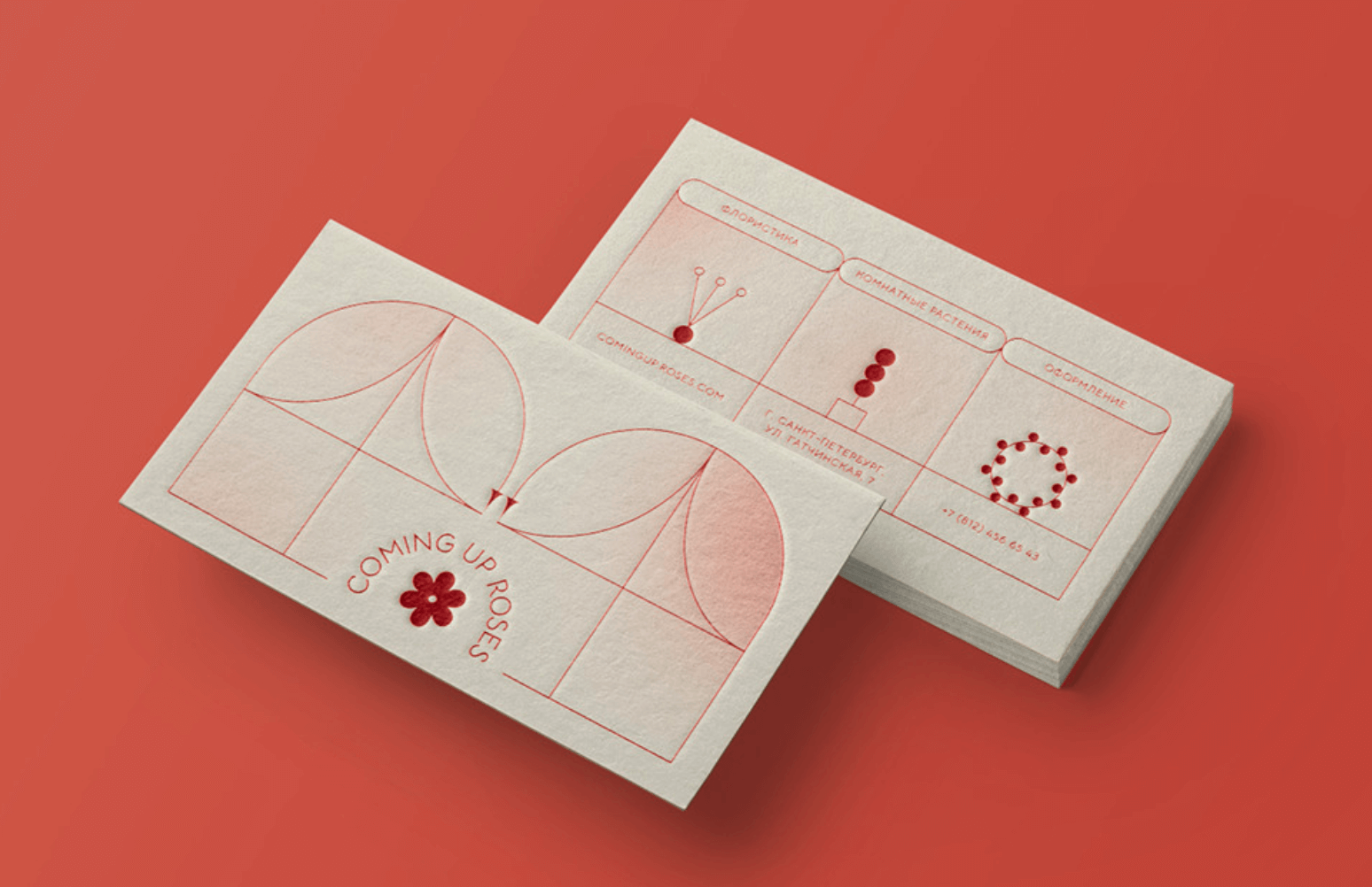
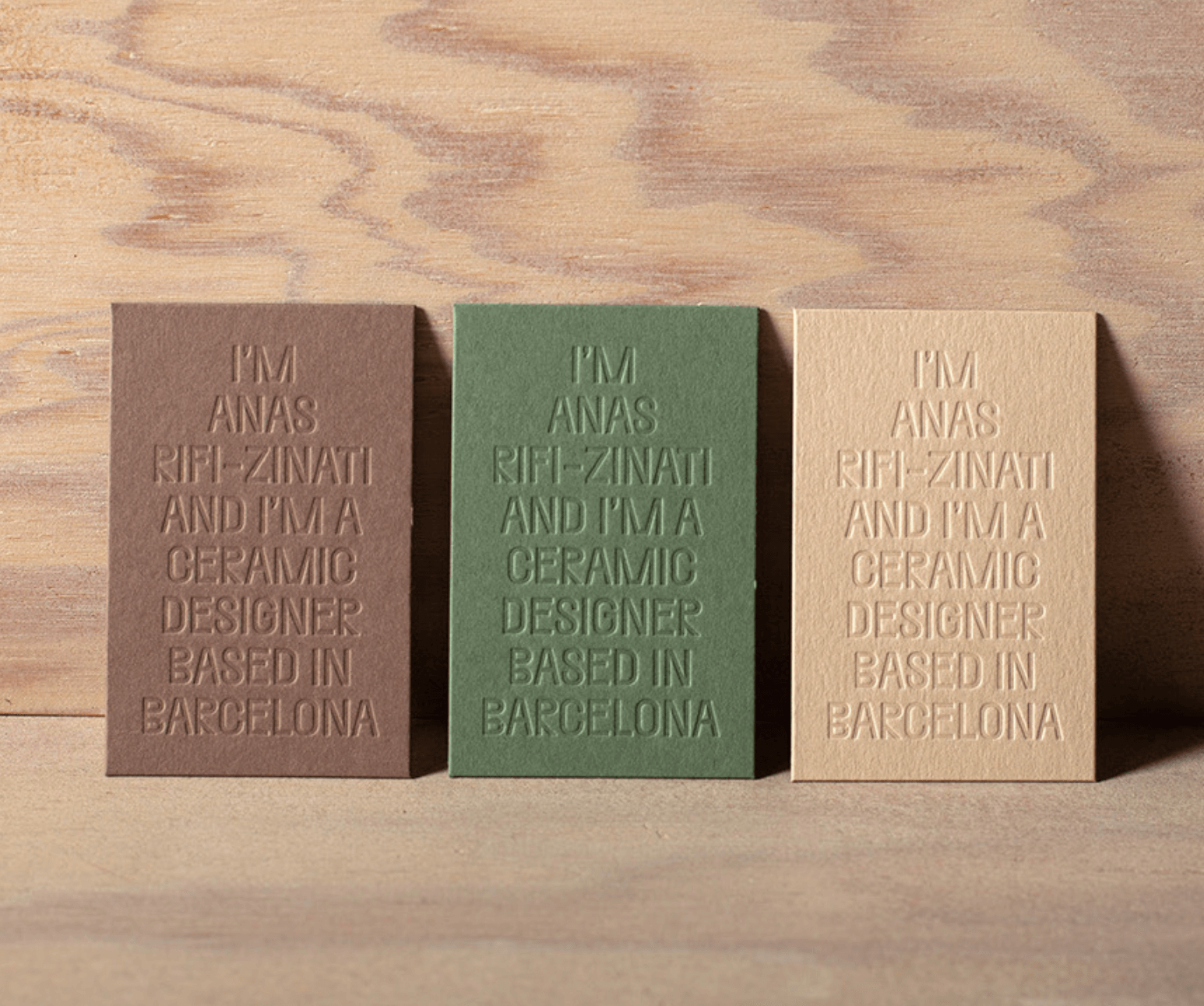
Embossing, Raised lettering, and Textured patterns
Raised or embossed lettering can give your business card design a sleek, high quality look. Bold color palettes and gold foil go great with embossed lettering or logos. A textured pattern is another way to bring some three dimensional luxury flair to your business card ideas.
Retro Business Cards
If you like a hip, vintage feel for your business and branding, follow some of these retro design tips to get your potential clients groovy with you.
Retro color combinations
Mauve, cobalt, mustard, and pumpkin in your color palette create a 70s-style look. Adding a grainy texture to pastel colors also creates an old-school visual effect.
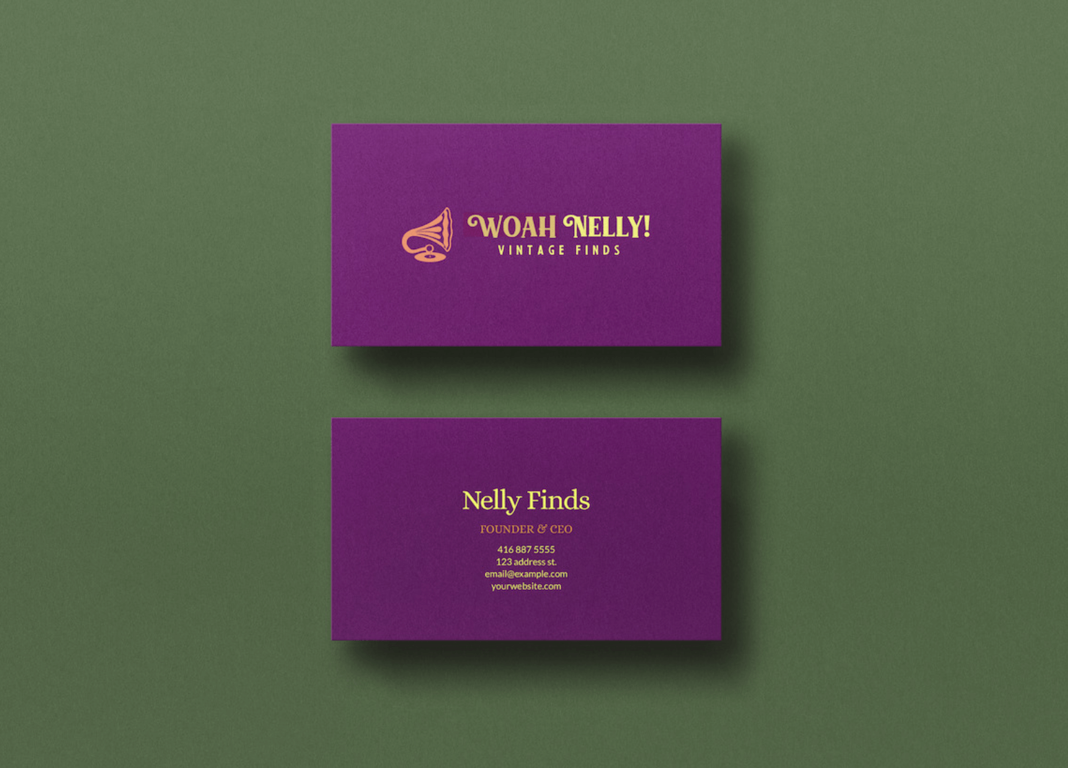
Handwritten or serif fonts
Whether the look you’re going for is simple vintage or funky and groovy, serif fonts and handwritten typography are classics. With the right colors, these words will really pop.
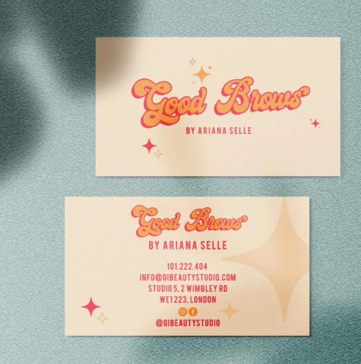
Decorative elements and symbols
Add a handmade feel to your retro business card with some decorative swirls and patterns. Play around with handmade patterns, enclosures, and symbols for a retro, nostalgic appeal.
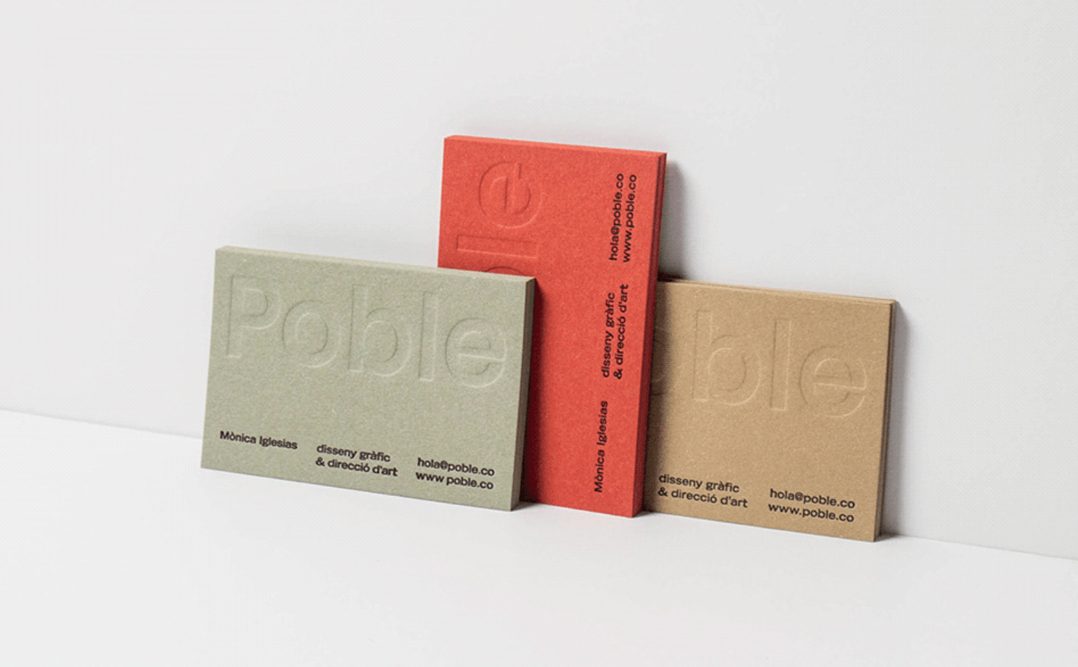
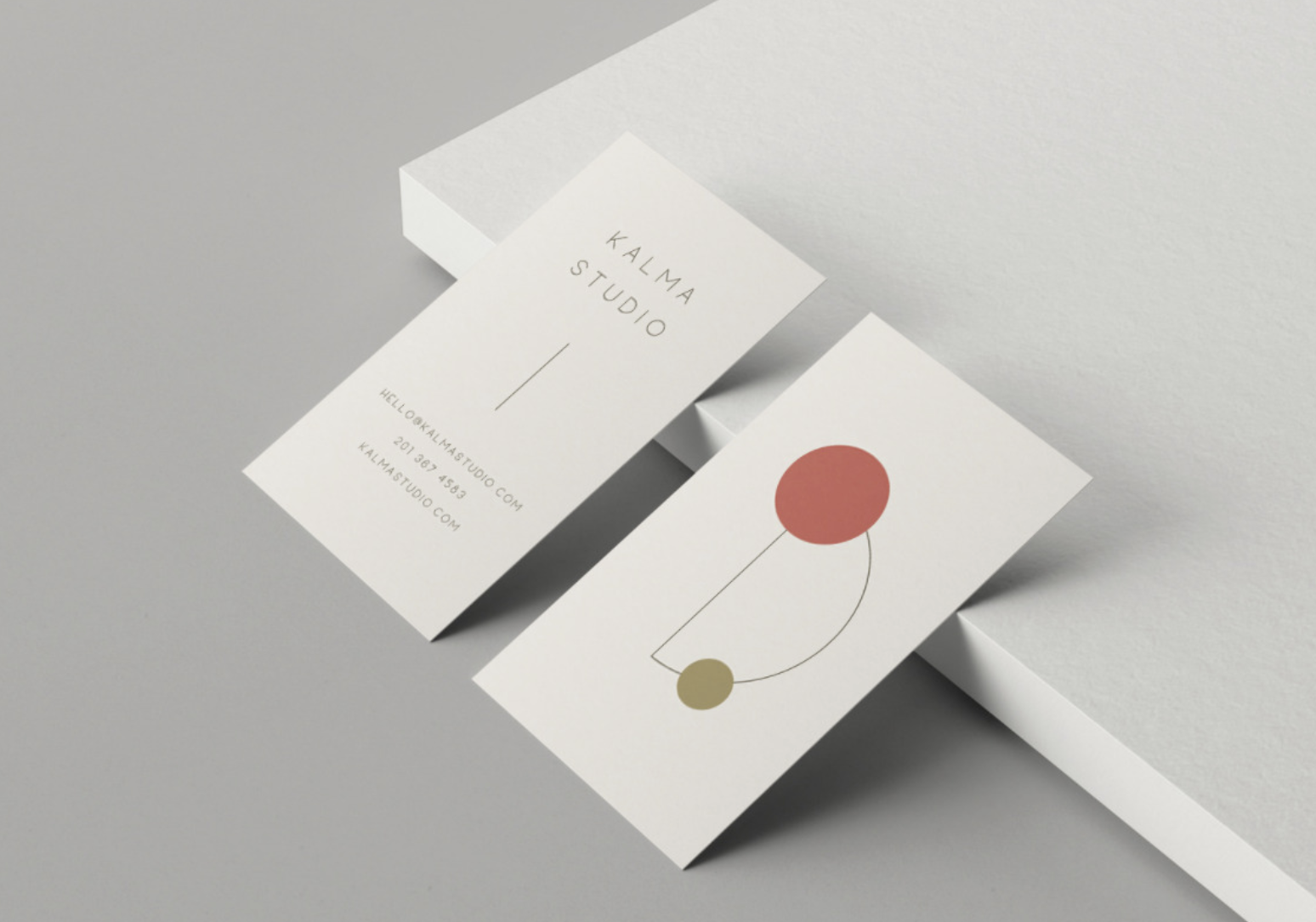
Minimalist Business Cards
Minimalist business cards offer a clean, sharp appeal. These direct, confident, and modest designs are well-suited for consulting, coaching, counseling, and functional design. These elements create minimalist business card design:
Simple color palette
A minimalist color palette involves one accent color to offset the negative space and black lettering. More than one accent color makes the graphic design not minimalist anymore.
Sans Serif Fonts
Sans serif fonts are the most minimal fonts. They’re sleek, contemporary, and easy on the eyes.
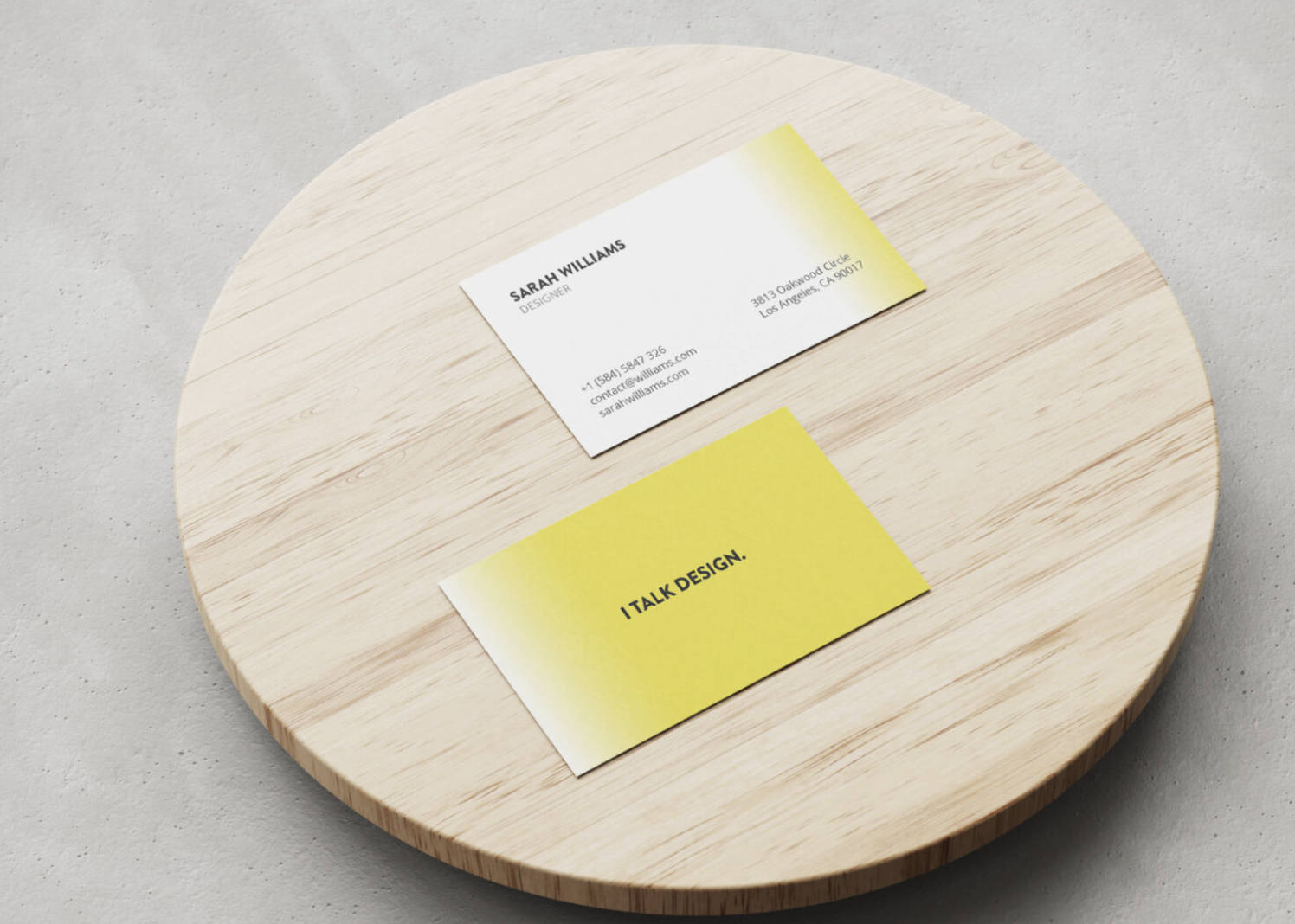
White Space
With a minimalist business card design, don’t be afraid of too much negative space. You don’t want to clutter your background with too much design.
Simple Logo
For visual designs besides the text, just stick to a simple logo. If this is a personal business card and you don’t already have a logo yet, you can use a design tool to easily create one.
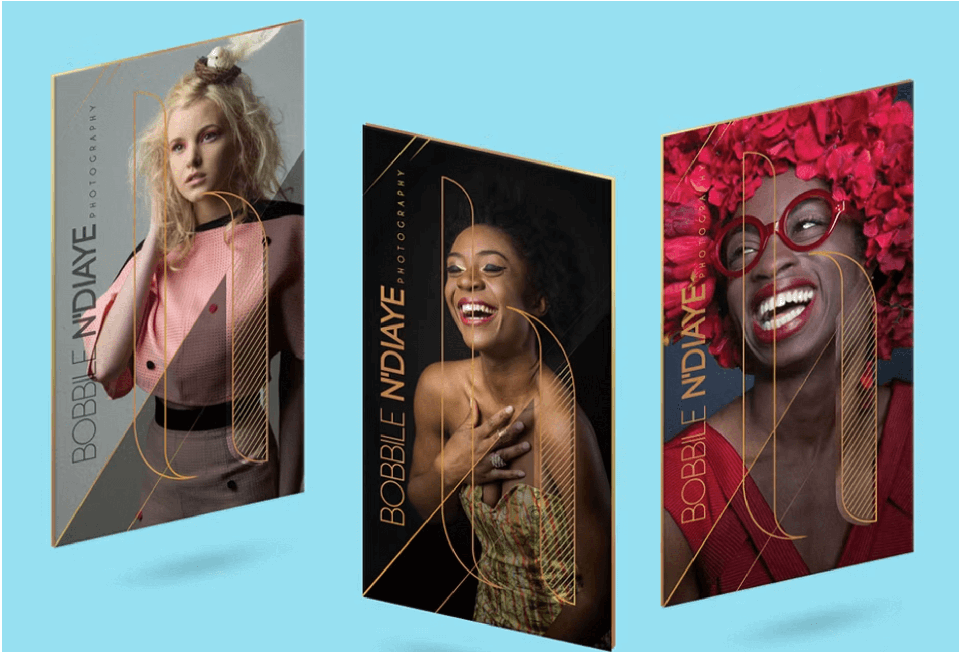
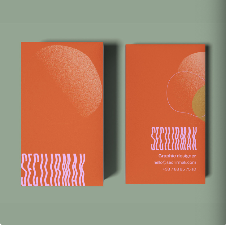
Vertical Business Cards
Vertical business cards are unconventional and work well for creative industries like design, architecture, brand consulting, advertising, and personal branding. Here are some ways to make a vertical business card look its best:
Bold colors
A bold color palette looks great on a vertical aligned business card. These two elements combined scream “notice me and don’t throw me out!”
Embossing and texture
Adding a touch element is another way to make the most of a vertical alignment.
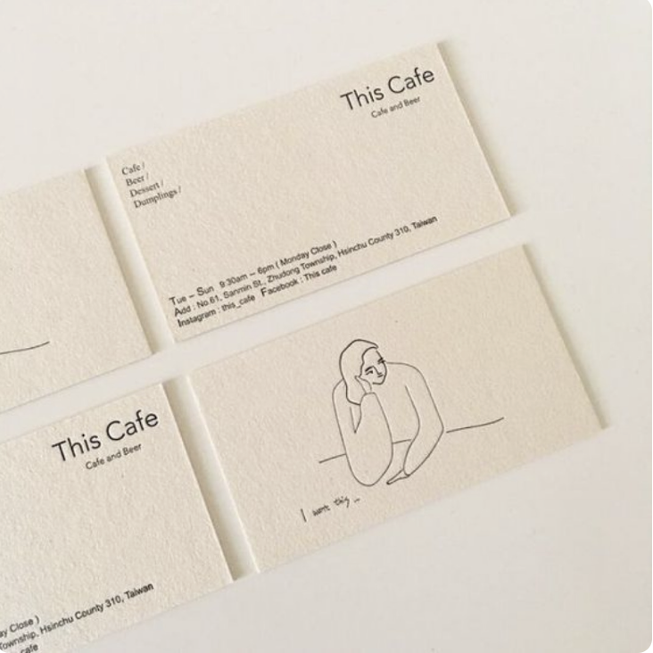
Illustration
Putting a picture on the front of your business card and your contact information on the back invites people to turn it over and engage with it.
Vertical business cards are also great for colorful blurs, bold backgrounds, and psychedelic lettering. Vertical business cards aren’t for playing it safe. Get creative but stick to the rules of visual hierarchy for clarity.
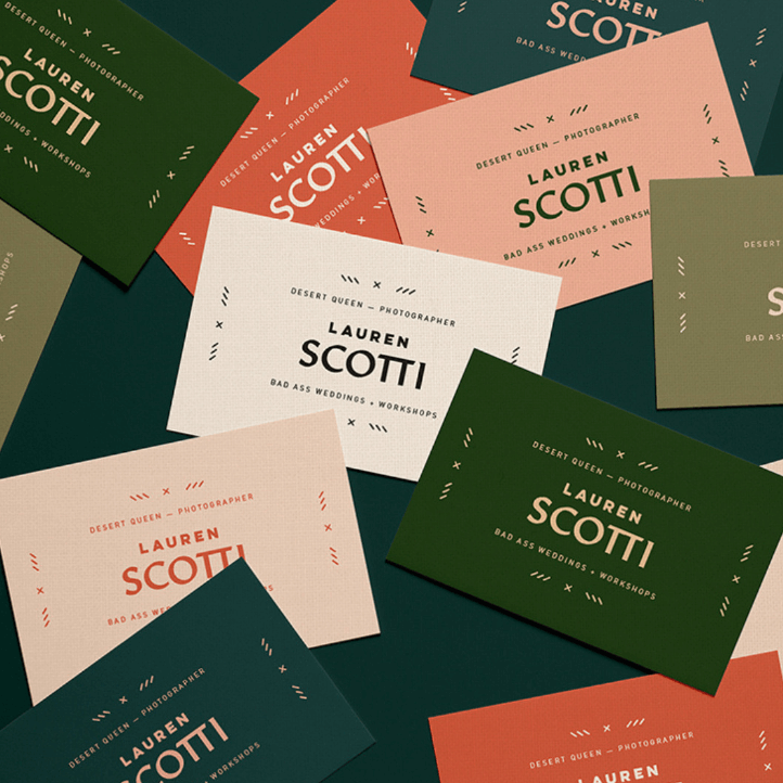
Colorful Business Cards
For artists, designers, and businesses with fun and quirky branding, a splash of color could be the perfect touch to your business card.
Interactive Business Cards
If you don’t want to carry around physical cardstock business cards, an app with a generated dynamic QR code that links to your website, social media, and other contact information.
Choosing Color Combinations for Your Business Card
Choosing colors that reflect your brand identity takes a little thought, but it’s not hard. First, get familiar with the messages that colors send. Then, use a color scheme formula to choose yours.
Color Associations
Colors can send a message about your brand beyond “this one is pretty” and “this one is ugly.” Color psychology studies have determined what traits US consumers associate with colors. Here are some common examples:
Red
- Speed
- Urgency
- Energy
- Passion
- Elevated Heart Rate
- Frequently used on sale and clearance signs
Orange
- Optimism
- Happiness
- Aggression
- Action
- Often used on Call to Action buttons
Yellow
- Warmth
- Positivity
- Youth
- Optimism
- Attention-grabbing
Green
- Wealth
- Health
- Nature
- Relaxing
- Often used for health and wellness companies
Blue
- Trust
- Security
- Serenity
- Frequently used in tech and banks
Purple
- Creativity
- Wisdom
- Confidence
- Soothing
- Often used for beauty products
Pink
- Creativity
- Exuberance
- Romance
- No longer exclusively associated with women’s interest products
Brown
- Warmth
- Honesty
- Down-to-Earth
- Often used for vintage goods
Black
- Power
- Luxury
- Modernity
- Frequently used for luxury goods
White
- Minimalism
- Transparency
- Simplicity
- Frequently used in tech
Gray
- Maturity
- Authority
- Rarely used on its own or as a main color
Creating Your Color Palette
Find Your Primary Color
The first step is to choose the main color. This will typically be the color of your logo. Choose it based on the traits you want people to associate with you and your company.
Decide On The Number of Colors
Next, decide on a number of colors. Most common color schemes use two, three, or four colors.
Choose Your Secondary Colors
Next, choose the rest of your colors. Secondary colors are a mix of two primary colors. Think purple, orange and green. Tertiary colors are a mix of a primary color and a secondary color like red-orange, yellow-orange, yellow-green, blue-green, blue-violet, and red-violet.
Don’t Forget Your Neutral Colors
Neutral colors are grays, browns, blacks, and whites. They may not be as exciting, but they’re a crucial part of any color scheme. They’re the colors for the body text. Sometimes they’re for the backgrounds.
Neutral colors are great for text and backgrounds. Logos should be primary or secondary colors.
Types of Color Schemes
Here are a few common methods for choosing color combinations that go together:
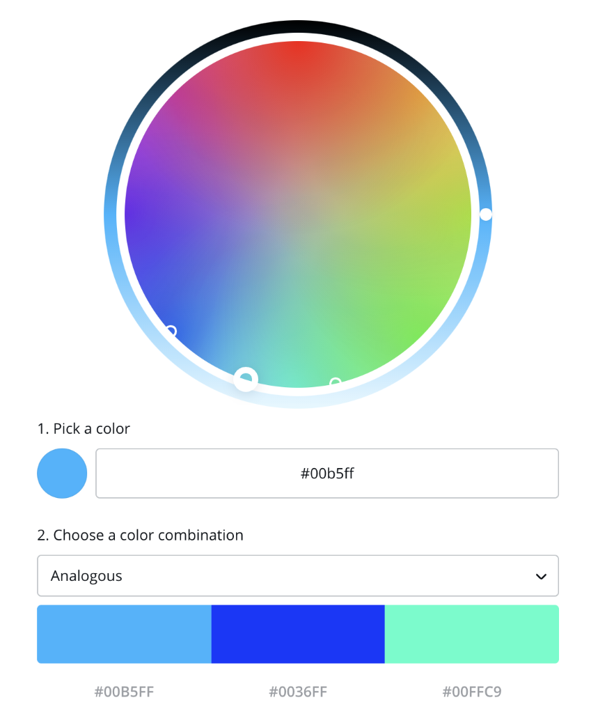
Analogous
An analogous color scheme uses colors that are next to each other on the color wheel. This can be difficult to do for beginners, as similar colors can easily overpower each other and color contrast between the background and text is important on websites for readability purposes. But if you find the right balance by changing the tints, the results could be vibrant and eye-catching.
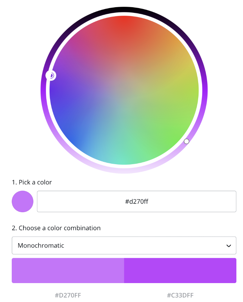
Monochromatic
A monochromatic color scheme has one main color in different shades. This is the easiest type of color scheme to create and results in a simple, understated look. However, it’s not the best idea for every website.
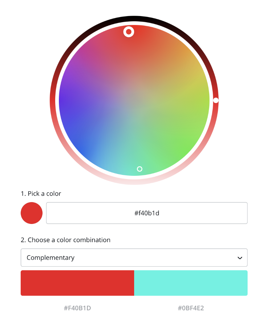
Complementary
A complementary color scheme includes colors that are directly opposite of each other on the color wheel. Complementary colors create a high contrast look, which makes them a great choice for websites and brand colors.
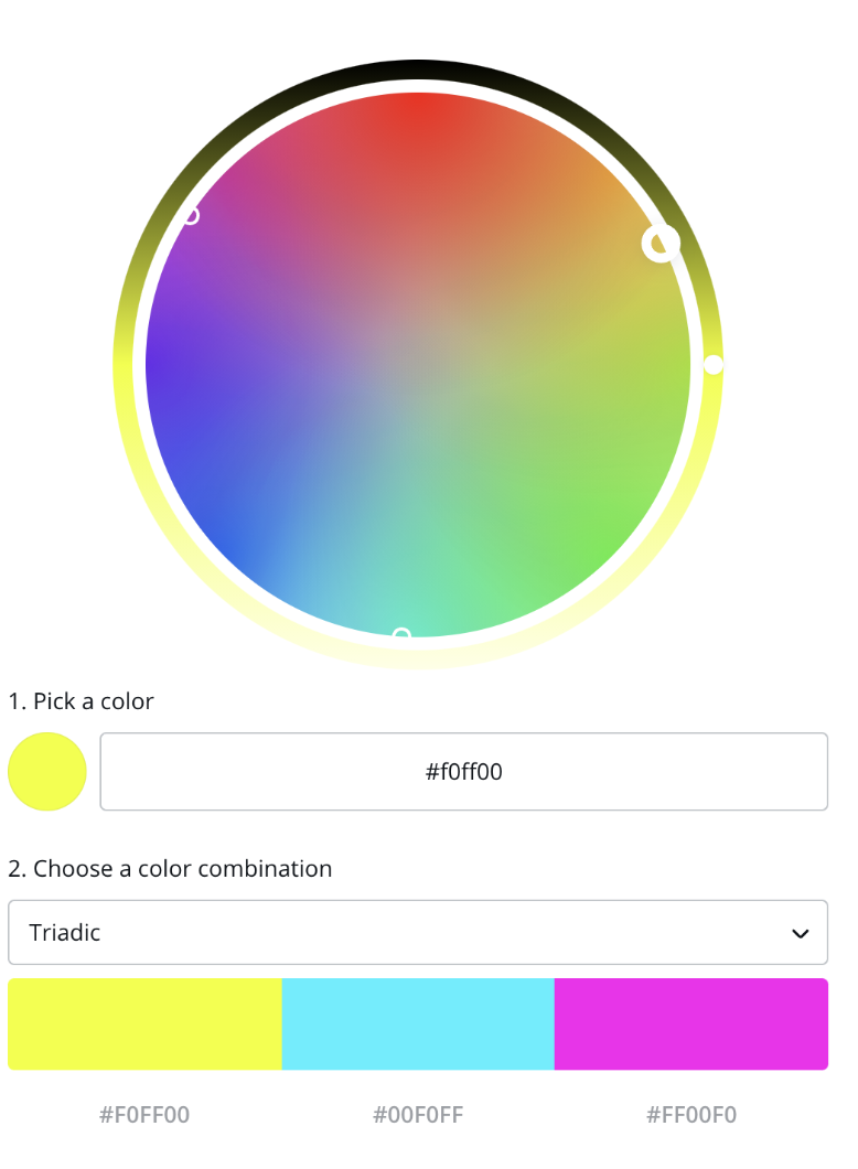
Triadic
A triadic color scheme uses three colors that are 120 degrees apart on the color wheel, making a triangle. Triadic color schemes are balanced and harmonious.
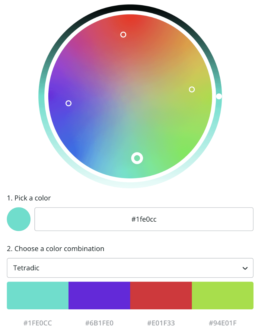
Rectangle/Tetradic
A rectangle or tetradic color scheme uses two pairs of complementary colors that are separated by at least one color. It will look like a rectangle on a color wheel.
Achromatic
An achromatic color scheme uses exclusively black, white, and gray. An all black and white business card may not be a good idea, but throwing in a bright accent color against an otherwise achromatic scheme can have a cool effect.
Color Tools
If you’re stuck on choosing the perfect colors, try some of these tools to get your creative juices flowing.
ColorZilla can find the HEX code for any color.
Color Space automatically generates color schemes. Great if you get stuck.
Dribbble is a great place to find inspiration from other designs.
Palleton makes it easy to choose colors on a color wheel from different types of color schemes.
Coolors randomly generates color schemes.
If you have design needs but don’t have the skills to meet them yourself, Canva is wonderful. Their color wheel tool is a great starting point.
Many website builders, including Sav's, have their own color picker tools.
Choosing Business Card Fonts
Your typography choices also send a message about your business. Here’s what the different types of fonts say to their viewers:
Serif Fonts
Serif fonts are named for the little feet on the letters. They convey the following traits:
- Classic
- Traditional
- Trustworthy
Time, Vogue, and Tiffany all use Serif fonts.
Popular Serif Fonts
- Times New Roman
- EB Garamond
- Playfair Display
- Baskerville
- Lora
- Merriweather
- Bodoni
Sans Serif Fonts
Sans serif fonts don't have the little feet. They convey the following traits:
- Modern
- Clean
- Minimalist
Facebook, Google, Netflix, and Spotify use sans serif fonts.
Popular Sans Serif Fonts
- Helvetica
- Arial
- Open Sans
- Roboto
- Montserrat
- Avenir
- Proxima Nova
Slab Serif Fonts
Slab serif fonts have bigger, blockier serifs than standard serif fonts. They convey the following traits:
- Bold
- Quirky
- Confident
Volvo, Sony, and Honda use slab serif fonts
Popular Slab Serif Fonts
- Rockwell
- Roboto Slab
- Courier New
- Arvo
Script Fonts
Script fonts are written in cursive. They convey the following traits:
- Elegant
- Unique
Johnson and Johnson, Instagram, Cadillac, and Ford use script fonts.
Popular Script Fonts
- Pacifico
- Allura
- Dancing Script
- Satisfy
Handwritten Fonts
Handwritten fonts, well, look like handwriting. They are not common with bigger companies. They convey the following traits:
- Informal
- Artistic
Popular Handwritten Fonts
- Knewave
- Permanent Marker
- Patrick Hand
- Amatic SC
- Just Another Hand
Decorative Fonts
Fonts that don't fit into any of these categories are called decorative fonts. They convey the following traits:
- Stylized
- Distinctive
- Dramatic
IBM, Disney, and Lego use decorative fonts.
Popular Decorative Fonts
- Fredericka
- Fredoka One
- Lobster Two
- Bangers
Font Pairings That Work
- Serif + Sans Serif
- Sans Serif + Script
- Sans Serif + Sans Serif
Business Card Design Tips
Showcase yourself, your brand, or your business
Don’t be afraid of white space
Use icons for imagery that presents your business
Combine icons and imagery to match your offerings
Keep it simple with your color choices
Choose fonts that make a statement
Business Card Templates and Tools
- Canva
- Looka
- VistaPrint
- Adobe Express Business Card Maker
- 99Designs
- MOO
- Staples
- JukeBox
- PsPrint
- GotPrint
- Zazzle
How Sav Can Help
No matter what your business card looks like, it should lead to a website with beautiful, engaging web design. Here at Sav, we make it easy to create one with our low prices on custom domains, drag and drop templates, and functional widgets. Start your free trial today to start taking your business to the next level!