
What’s a one-page website?
A one page website is a single-page design where a user can see all of the information on-site by scrolling down instead of using a navigation menu to see more.
Why should I have a one-page website?
Putting all of your content one landing page often leads to a better user experience than segmenting content into several web pages and can lead to higher conversion rates. One-page web design is a good choice for small businesses, marketing agencies, and single product companies.
What should I include in my one-page website?
Planning all of the information you’ll include is essential for one-page layouts. Most one page websites include:
- Your logo, tagline, and other similar branding elements
- An about section
- Information on your products or services
- Reviews or testimonials
- A CTA to drive an action
- Social media icons so visitors can follow your business on social media
- A contact form and/or contact information
Single-page Website Best Practices
Don’t go overboard with the features
Use your space wisely. Putting too much that doesn’t contribute to the user experience could overwhelm site visitors.
Order content in an intuitive way
Place your most crucial information higher up on the page.
Stay true to your brand
The colors scheme, fonts, animations, and other visual elements of your site should be consistent with your branding.
The Best One-Page Websites to Inspire You
Find one-page website design inspiration from these websites for a variety of industries.
Single-Product Websites
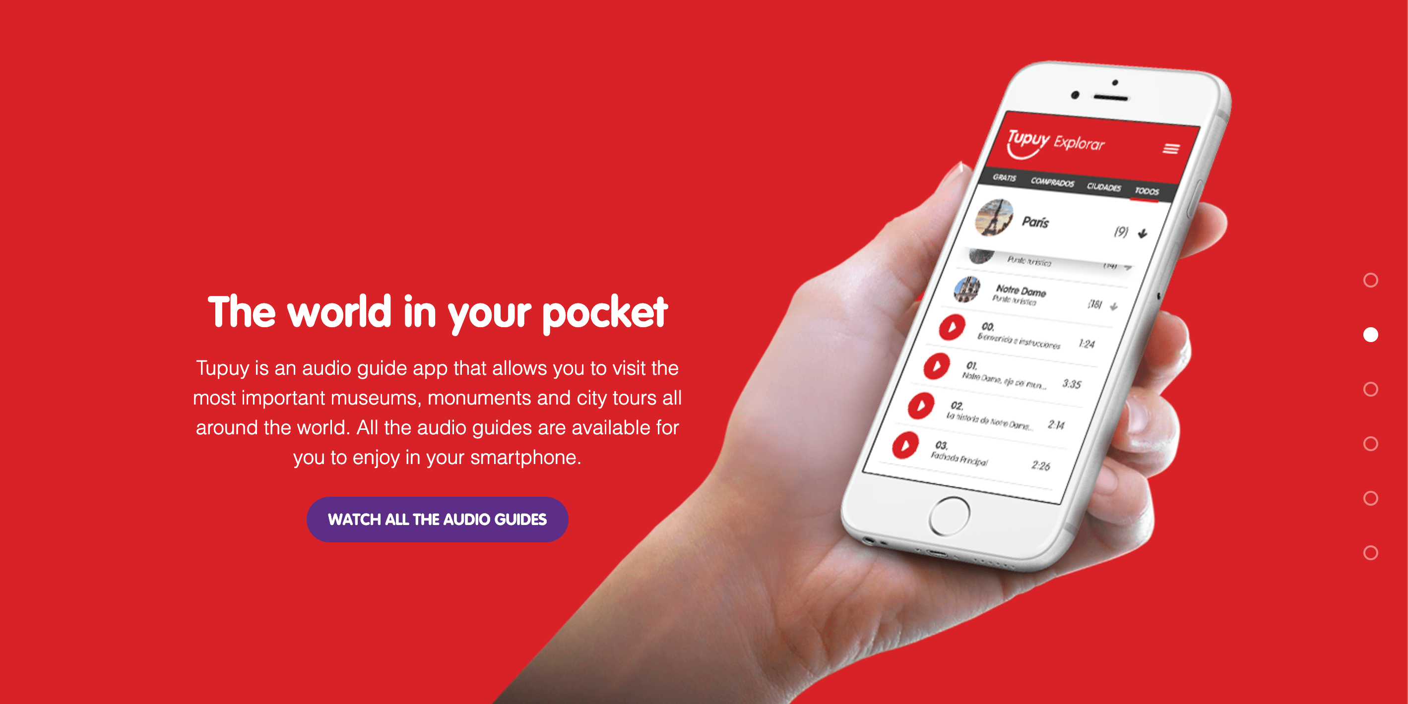
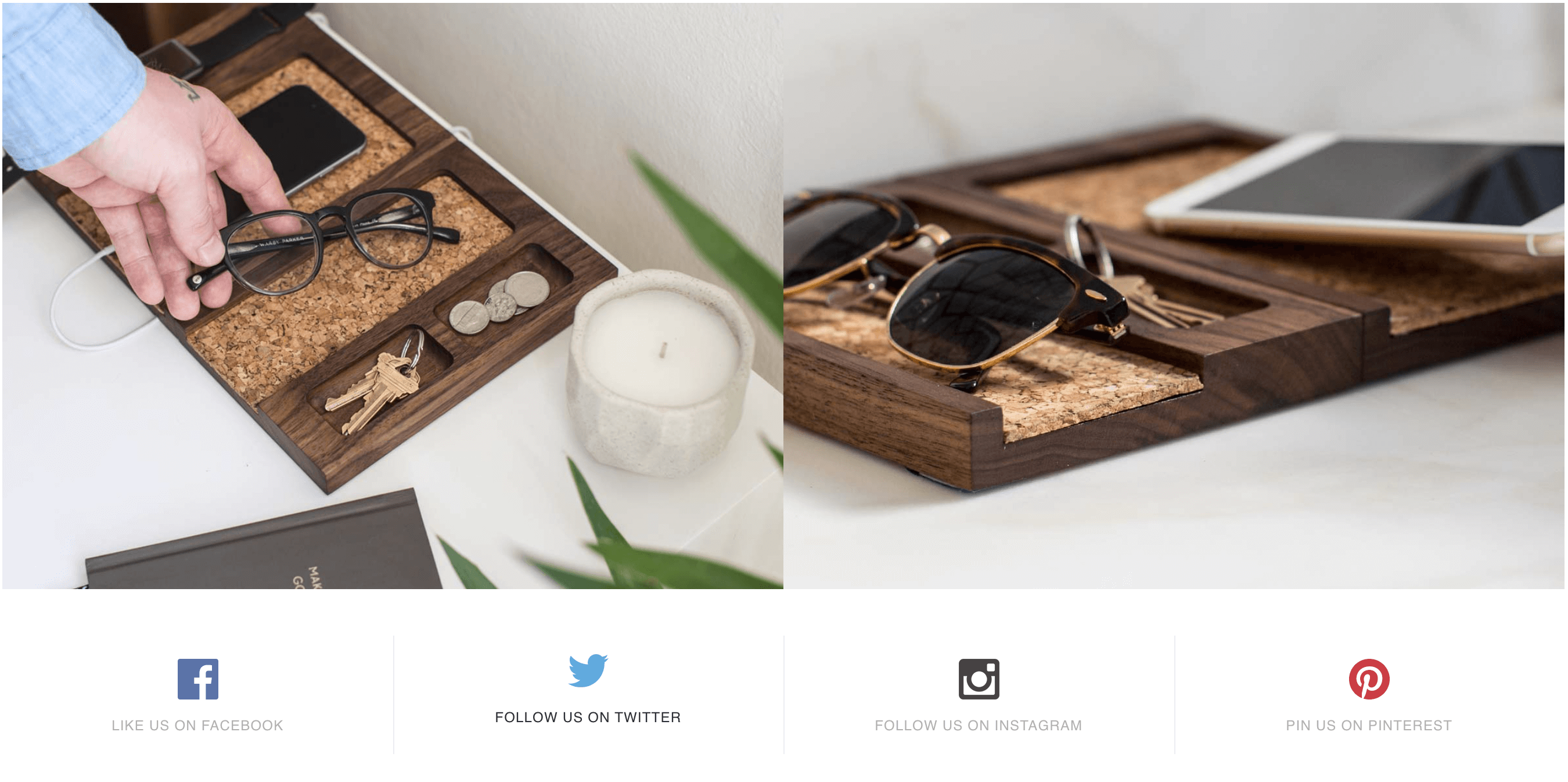
Tupuy
This product-based, one-page website interactively highlights all the product’s important features and provides users with a clear call to action.
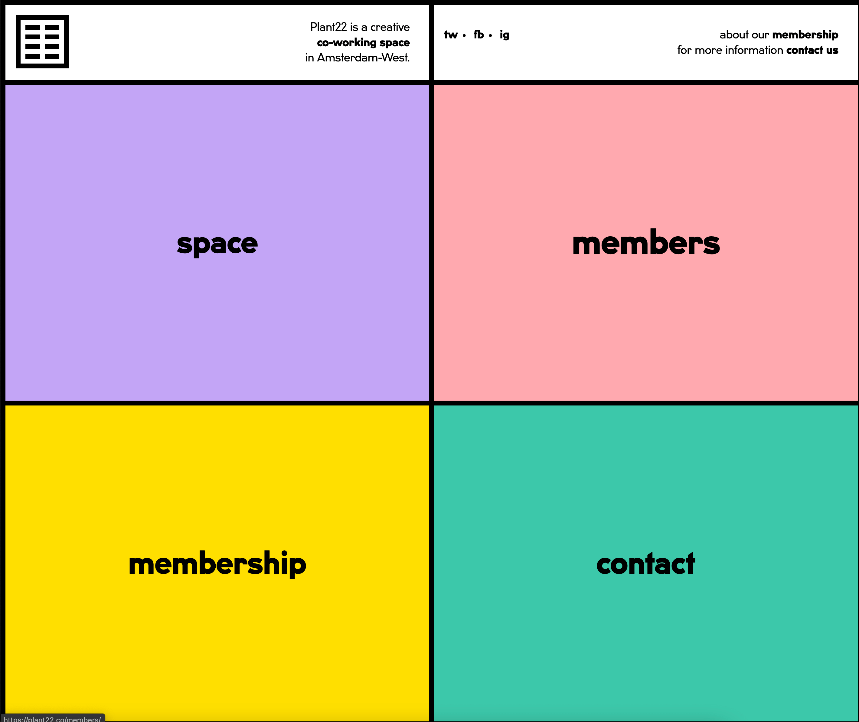
Plant22
The minimalistic design and HTML template are unconventional and creative. When a user clicks on each box, it opens a pop-up overlay without opening a new tab for a seamless user experience.
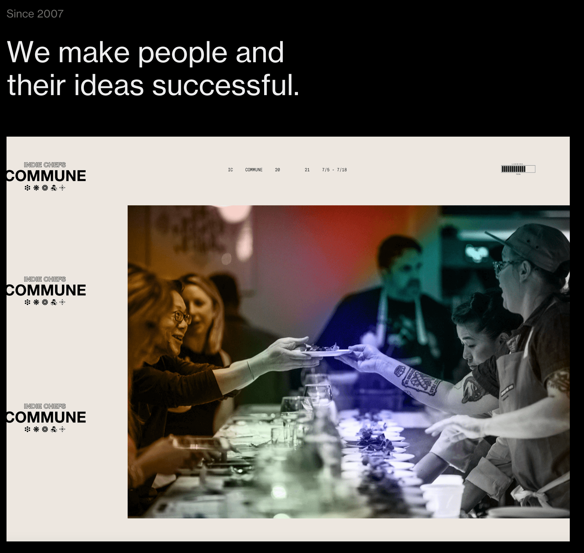
Small Business Websites
Cafe Frida
This website is a great example of how well single page websites can work for small businesses. It includes a lot of information in one long scroll and the flower animations make it pretty without overwhelming the viewer.

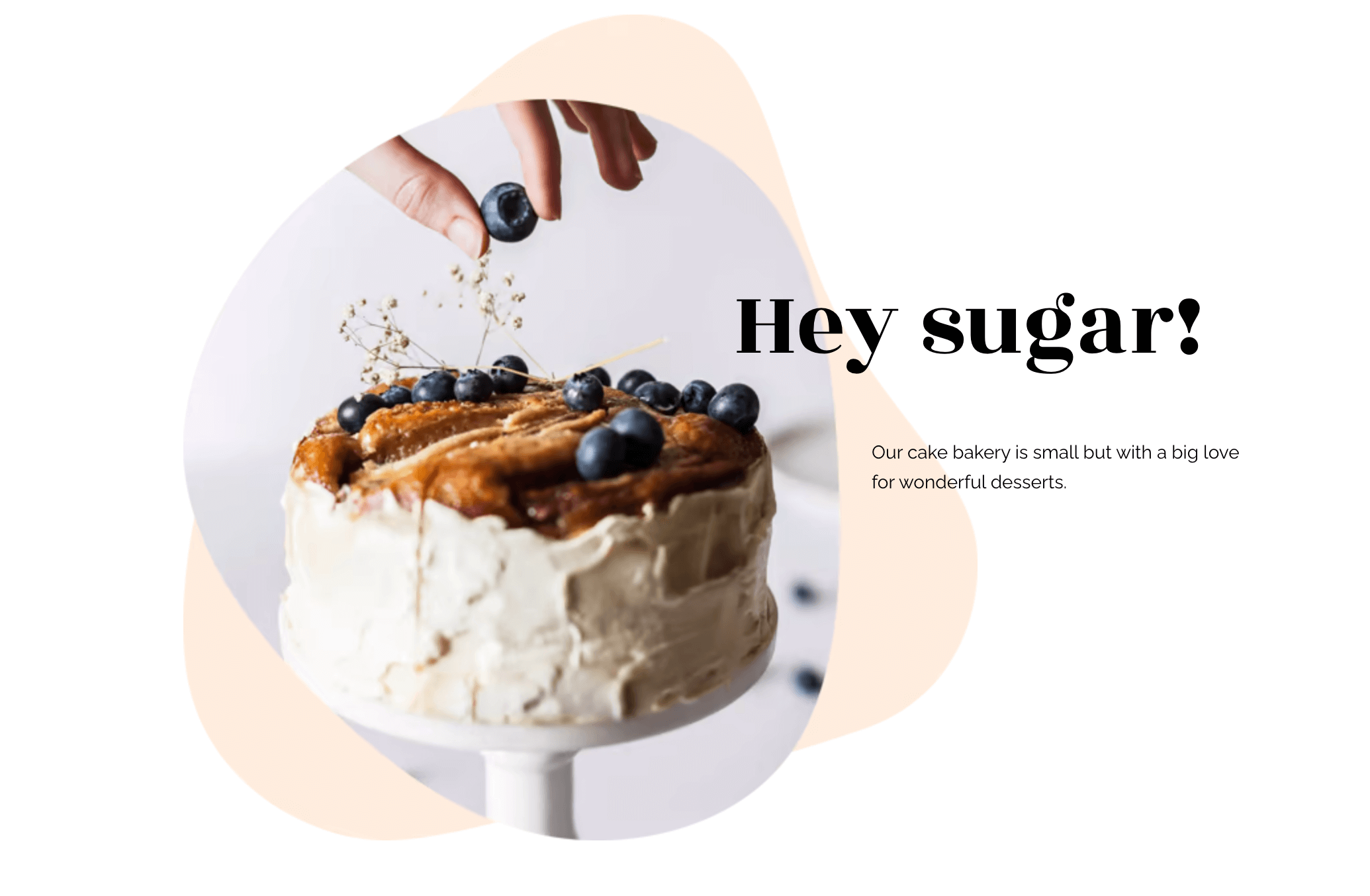
Sugaro
Sugaro’s whimsical website makes it quick and easy to scroll from top to bottom without missing any important details. To make it easy for customers to get in touch the contact button has a direct link to an email app.
Agency Websites
Purple Orange
Purple Orange’s one-pager does a great job of displaying client testimonials with limited real estate. It shows that there’s no need to hide your reviews on another page. You can show them off front and center.
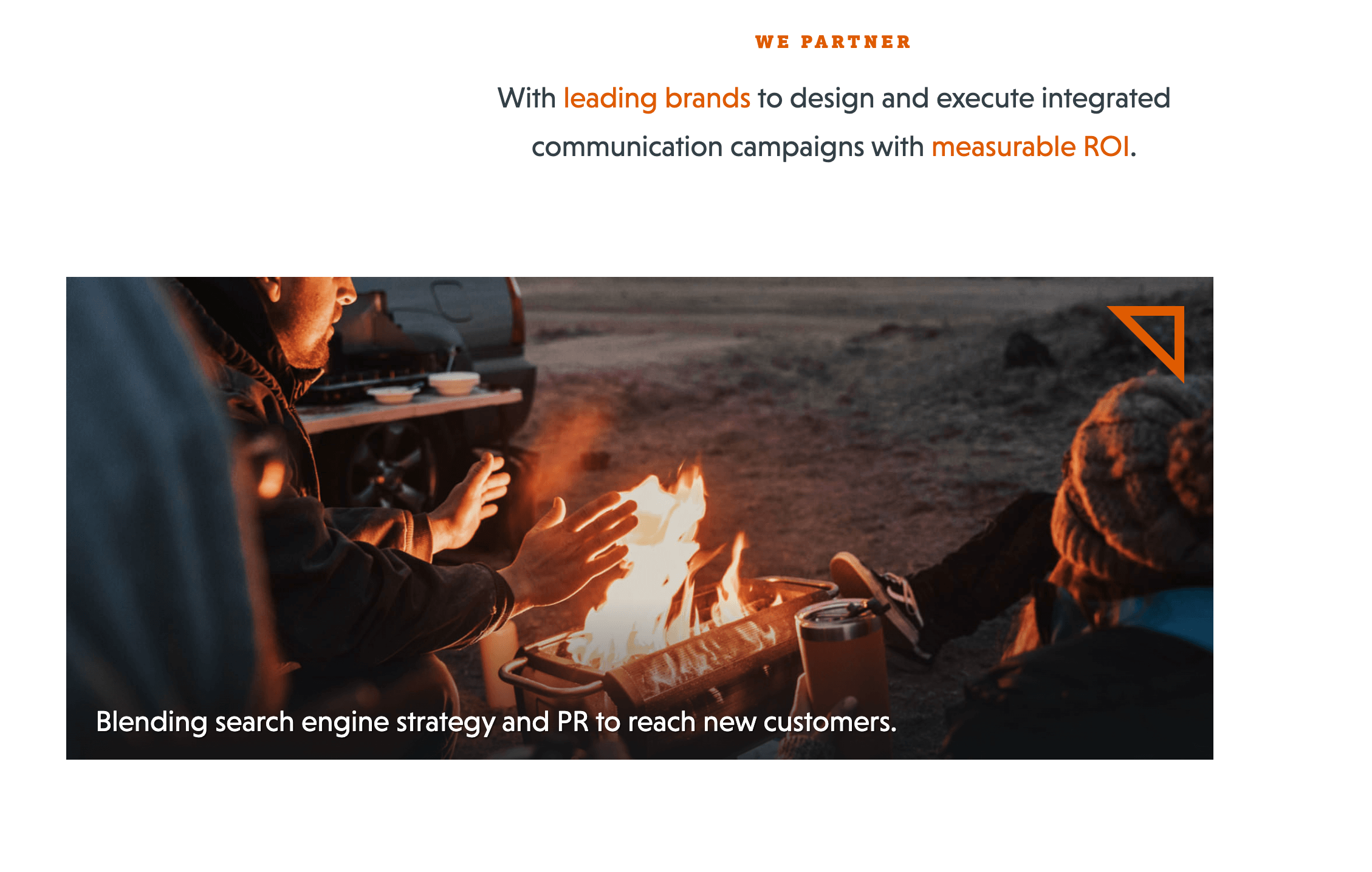
Always Creative
Always Creative’s one-page website that shows that you can contain media-heavy content in a slick layout. It uses parallax scrolling to make the agency’s work the forefront of the site.
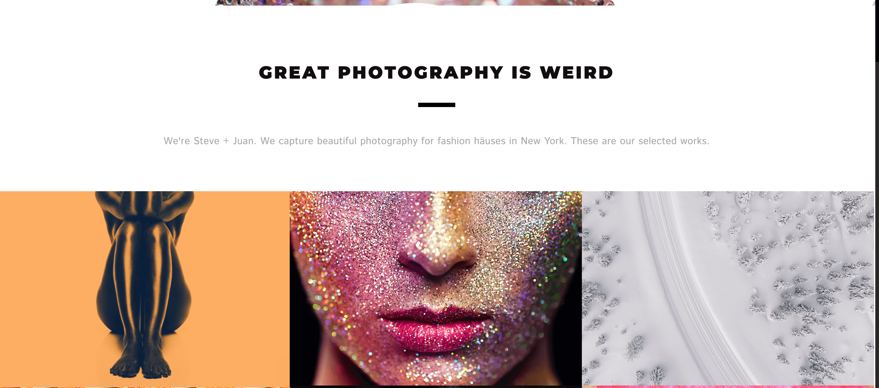
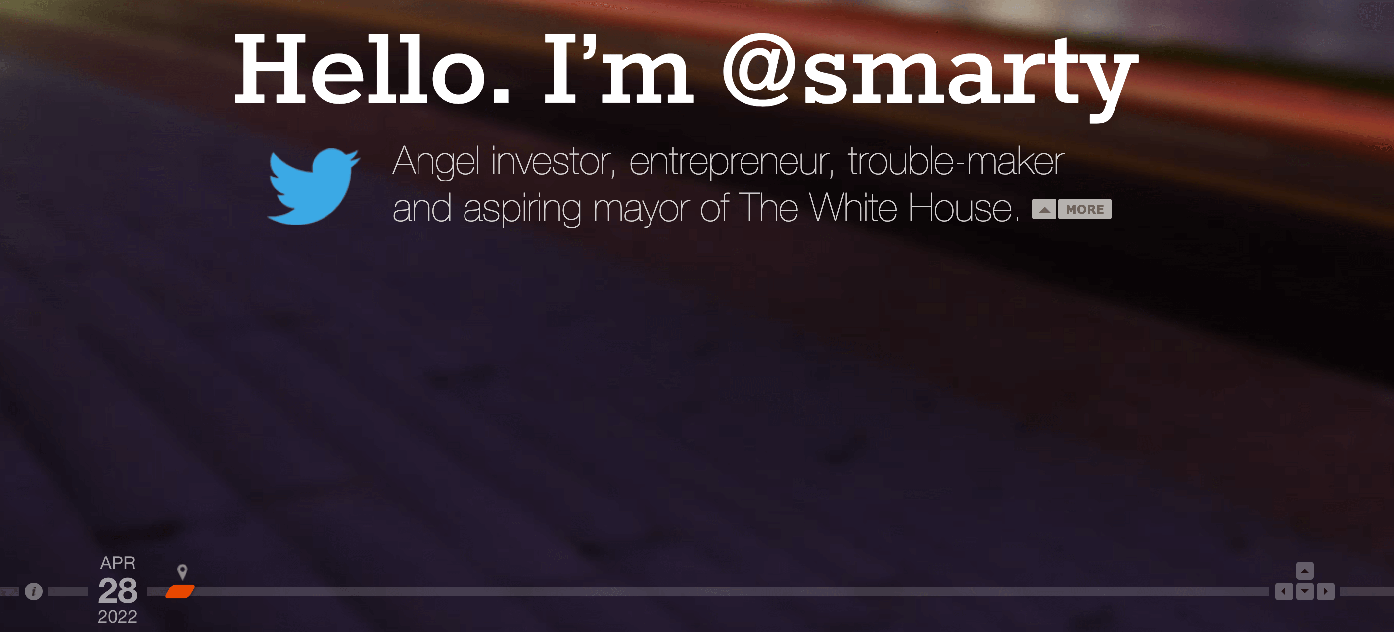
Portfolio Websites and Personal Websites
94 Photography
94 Photography’s one-page website is as visually stunning as their photos. The design lets the photos do the talking and allows users to enlarge images with one click.
Marty
This portfolio uses creative UX design to display his work and give viewers an idea of who he is and what he’s about.
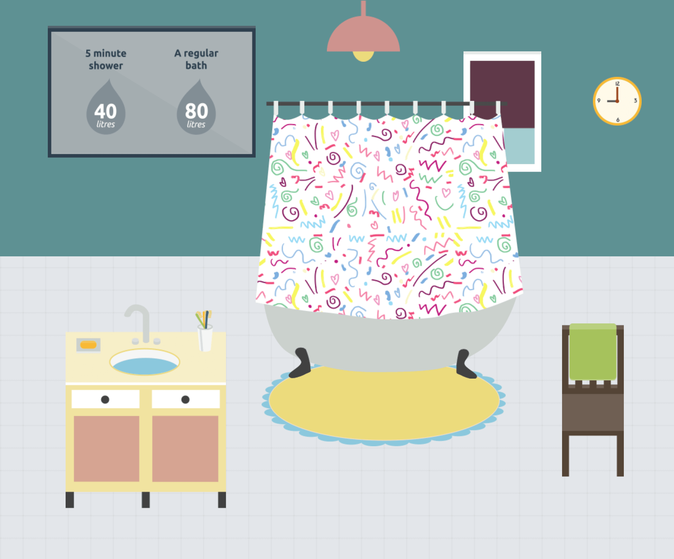
Nonprofit Websites
Every Last Drop
This UK water initiative uses the scrolling one-page design to engage and inform visitors about the water they use.
Ecommerce Websites
Rest
Ecommerce may not typically be a good fit for a one-page website, but Rest demonstrates that they can work well for a single product or collection. The video banner tells the audience more about the product without taking up more space on the page.
 Event Websites
Arroyo
Arroyo’s one-page website starts with a full-page image overlaid with text and a CTA button. As you scroll, you’ll find more information about the event including but not limited to speakers, frequently asked questions, and related social media accounts.
You Gotta Love Frontend
Frontend keeps all the relevant event information on one page, but then uses subdomains to house information about past events. This is a good option for events that occur every year.

How Sav Can Help
With Sav’s website builder, you don’t have to code or break the bank to create a beautiful one-page website. Whether a one-page site or a multi-page website fits your business needs, we’ve got the website templates at pricing that fits your budget. Start building with us today!

Recommended articles
A Complete Guide to Facebook Ad Sizes
Facebook ads are an essential part of any social media marketing strategy. Facebook may not be the most popular social network for the...
Read more
How to Come up With Ecommerce Product Ideas
Whether you’re starting a new ecommerce business or expanding a pre-existing one, what products to sell online is an important decision....
Read more
The 10 Best Providers for Print on Demand Books
Always wanted to write your own book? Self-publishing with a print on demand book service can make that dream a reality more easily than...
Read more