

Scroll to the bottom of the blog to view the links mentioned in this video!
The homepage is the welcome mat of your website. It can make or break whether or not a visitor becomes a customer. Whether a visitor found it from a landing page, a Google search, a social media post, or an ad, it’s their introduction to your company. That’s why it’s important to do it well. Follow these tips to get those precious conversions.
The Benefits of a Well-Designed Homepage
Here are just a few of the ways a well-designed homepage can benefit your website.
Introducing your business to your target audience
Since the homepage is often the first part of your website visitors see, your target audience should be able to tell right away that your business is for them. Communicating your company’s values, purpose, and what makes you unique on your homepage is a great way to reel in customers.
Improving the user experience on your website
When a visitor lands on your homepage, they’ll typically need to navigate to another page. This navigation should be intuitive and consistent across all pages.
.jpg?width=5184&name=alvaro-reyes-qWwpHwip31M-unsplash%20(1).jpg)
Achieving more conversions
A major goal of any small business website is to convert visitors into customers. Your homepage design can help you pull that off with well-placed calls to action and being memorable enough to stick in their minds if they don’t make a purchase right away.
Improving brand awareness
The homepage is the part of the website where branding matters the most. Centering your logo, tagline, and purpose lets visitors know what your brand is all about without having to look too hard.
.jpg?width=7166&name=chase-clark-T69h1_YfR-w-unsplash%20(1).jpg)
What Makes a Good Website Homepage Design?
Makes a good first impression
Have you ever passed judgement on the legitimacy of a website based on its design? Well, you’re not alone. Cheap, dated web design doesn’t just look bad, it can give visitors the impression that your business is behind the times or a scam. Every page of your website should look appealing and professional, but the homepage is where looks matter the most.
Clearly answers who you are what you do
Visitors who have never heard of your company before should be able to figure out what it is within seconds. Concisely communicating who you are and what you do lets them know whether or not they’re in the right place. Don’t get too detailed though, you still have an About Page.
.jpg?width=6000&name=sara-kurfess-ELuA9ispQHo-unsplash%20(1).jpg)
Makes the target audience feel something
Making a good first impression is just the beginning of a memorable homepage. The next step is making potential customers feel something. What that is depends on you and your company. You can make them laugh with jokey copy. You could move them with a heartfelt narrative about your company’s mission. You could impress them with pictures of your coolest work. You could get them on board with your cause by making them angry. Whatever emotion you appeal to, commit to it.
Sets you apart from your competitors
Everyone has competitors. A visitor to your website is likely also considering alternatives. Show these comparison shoppers why they should pick you by highlighting what makes you unique.
Solves a problem
How can your business help users solve a problem or answer a question in their lives? You can communicate this on your homepage by making a clear value proposition.
.jpg?width=4502&name=olav-ahrens-rotne-4Ennrbj1svk-unsplash%20(1).jpg)
User-friendly
If a user can’t successfully make a purchase, contact customer service, make an appointment, or anything else that they would visit your website to do without assistance, they won’t stick around long. Since your homepage is the welcome mat to your website, it’s important to make sure visitors can get to any part of the website from it.
Optimized for multiple devices
No matter what business you’re in, mobile traffic matters. Not designing a mobile-friendly website means leaving behind valuable potential customers. In 2020, mobile users accounted for more than half of the global traffic and 70% of websites have already shifted to serving mobile experience. Its SEO benefits mean mobile-friendly websites rank higher in Search Engine Results Pages. Here are a few essential elements of mobile-friendly web design to incorporate into your about page and everywhere else on your website.
Simple Design
Complex designs may look great on a desktop screen, but more design details mean a slower load time and can make your site harder to use with a smaller screen. With sleek, minimalistic visuals you can create a simple design without sacrificing aesthetics.
.jpg?width=3000&name=kelly-sikkema-o2TRWThve_I-unsplash%20(1).jpg)
Fast Loading Speed
People use smartphones on the go and are often trying to look up information quickly. This is why speed is a top priority when building a mobile-friendly website. Though you cannot ultimately control the speed at which your website loads, here are some tips that will help:
- Use AMP (Accelerated Mobile Pages)
- Compress your images and CSS
- Check your web hosting plan
Optimized Images
Images are an important part of any website, but they take up a lot of space and can take a long time to load, both of which are detrimental to mobile users. You can fix that by
- Resizing images
- Hiding big images
- Compressing image files
Responsive Template
Responsive themes adapt the same content to the device that’s displaying it. Most website builders offer responsive templates. In fact, all of Sav’s templates are responsive because we value our mobile users.
Readable Fonts
When choosing a font for your website, choose a standard font in a larger size. Custom fonts are not only less readable, but may take longer to load than standard fonts. This can become a problem for mobile users, especially if they are in an area where signal is weak. Large text is also a must for mobile-friendly design. Size 12 or 14 is typically sufficient for the desktop version of a site, but depending on the font it may be too small for mobile. If your text looks big enough on your desktop, see how it looks on your phone.
.jpg?width=5184&name=brett-jordan-M9NVqELEtHU-unsplash%20(1).jpg)
Spaced Out Links
It’s always irritating when you accidentally click the wrong thing on a touch screen. If your responsive website has several links or buttons, space them out to prevent that from happening.
Image Alt Tags
Image alt tags are text descriptions of images that are embedded into the sitemap. They allow screen readers, a device that allows blind people to use screened devices by reading the contents out loud, to parse images. Image alt tags also benefit mobile users who turn off images to save loading time and serve an SEO purpose.
Avoid Pop-Ups
Pop-ups can ruin the mobile web browsing experience. They take up far too much of the screen and users are more likely to give up than click the little x. It’s best to do without them altogether, but if you can’t include essential information without a pop-up, make the close button nice and big.
.jpg?width=4288&name=erda-estremera-sxNt9g77PE0-unsplash%20(1).jpg)
Includes calls-to-action (CTAs)
Once a visitor is on your site, what do you want them to do next? Good homepage design includes a primary and secondary CTA. The primary CTA is usually related to the intended final action. It can be something like “Shop Now,” leading to your ecommerce store. It could be “make an appointment,” leading to your booking calendar. The secondary CTA may be something like “learn more,” “contact us,” or “request a demo.” For both types, make sure the CTA button is nice and big and placed logically.
Uses great visuals
The fonts, colors, images, and buttons you choose go a long way in creating a great user experience. Standard, readable fonts are essential for functionality and mobile-friendly optimization. Using bold colors with high contrast makes your homepage look and function great. Images can communicate things that words can’t. The size, shape, and color of CTA buttons can affect how likely visitors are to click through.
Doesn’t stay the same
Your business is always growing and changing. So should your homepage to reflect the changing needs of your customers.
.jpg?width=5866&name=icons8-team-dhZtNlvNE8M-unsplash%20(1).jpg)
Builds trust
It's one thing to say that your business is great, but it's even more powerful to show other people saying it's great. Including social proof on your homepage lets visitors know that your business is the real deal. This could take the form of reviews, testimonials, press coverage, or logos of notable clients.
How to Design a Great Website Homepage
Get the Layout Right
People typically read websites in an F-shaped pattern: from left to right then top to bottom. Content on the top of the page and the right-hand side of the page will get the most attention. Place the heading and the hero image at the top of the page to draw people in to read further and your CTAs above the fold to make sure people notice them.
Consistency is Key
No matter which page a visitor is on, it should all look like the same website. The elements of each page should also flow together and make visual sense. Nobody wants one picture to stick out like a sore thumb.
.jpg?width=3043&name=jaye-haych-7tkDoo2L_Eg-unsplash%20(1).jpg)
Don't Be Afraid of Whitespace
To a web design novice, the pressure to keep your site from feeling empty can easily swing too far in the other direction. Too much content on the page will overwhelm many users and lead them to click off the page before they know anything else about your business. The trick is using the whitespace to your advantage.
Use the Right Pictures
A picture may be worth a thousand words, but too many pictures can overwhelm viewers and slow down your website’s loading speed. Every picture needs to serve a purpose. Pick one or two from these categories to add to your homepage experience.
.jpg?width=5472&name=landon-martin-TQWvE-pqoeU-unsplash%20(1).jpg)
Your Space
Entice visitors to stop by your business location with an inviting picture of your space when it’s lively.
Team Members in Action
Action shots show your audience that your business is all about the people who make it happen.
Work Examples
Go ahead, show off a little! Including a small number of examples of your work on your homepage shows visitors the quality you provide without having to click away to a portfolio page. Though it is still a good idea to include a link to your portfolio page.
The Best Homepage Design Examples
Now that you know some hot homepage design tips, take inspiration from some of the best homepages on the internet from big multinational brands to small businesses like you.
1. Dropbox
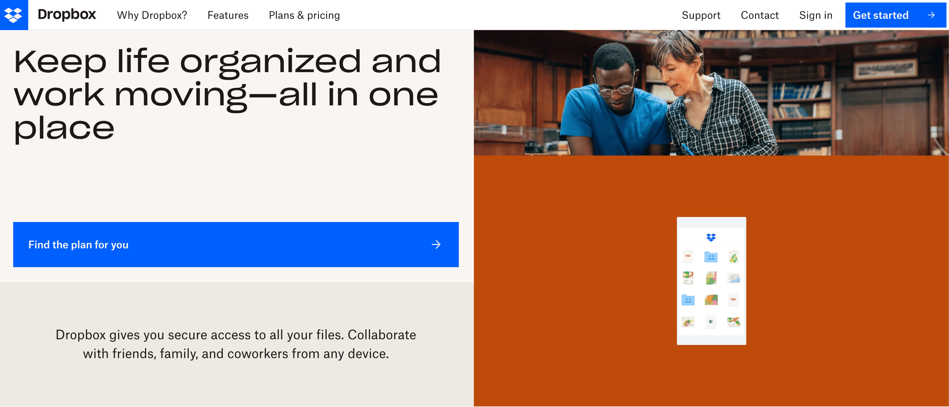
Dropbox uses concise copy and a little animation on the side the get visitors’ attention and make it clear what they are.
2. AirBnB
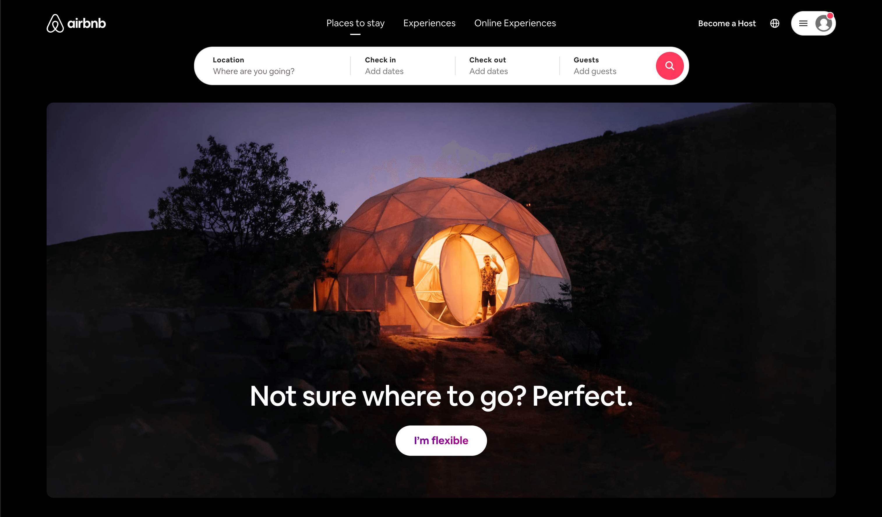
AirBnB lets the visuals do the talking on their homepage, but they don’t sacrifice ease of navigation. The search bar at the top makes booking a rental easy and seamless.
3. Evernote
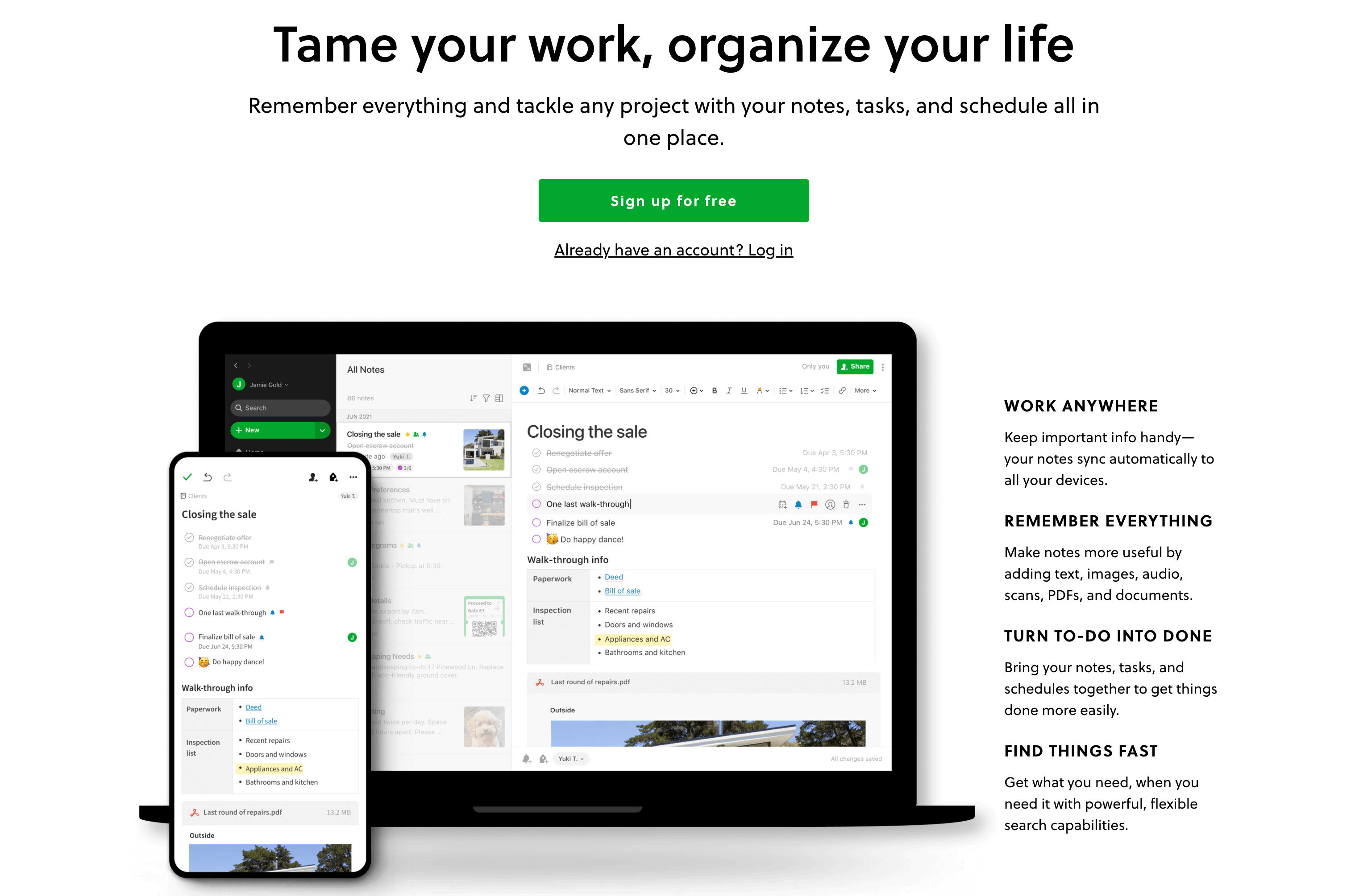
Evernote’s homepage is informative without bogging the reader down with too many details and spaced out without looking sparse. It’s right in the sweet spot.
4. Parallax
.png?width=3054&name=Screen%20Shot%202022-02-18%20at%201.48.03%20PM%20(1).png)
Parallax is a great example of an on-brand homepage. Their visuals scream tech.
5. Neuro Gum
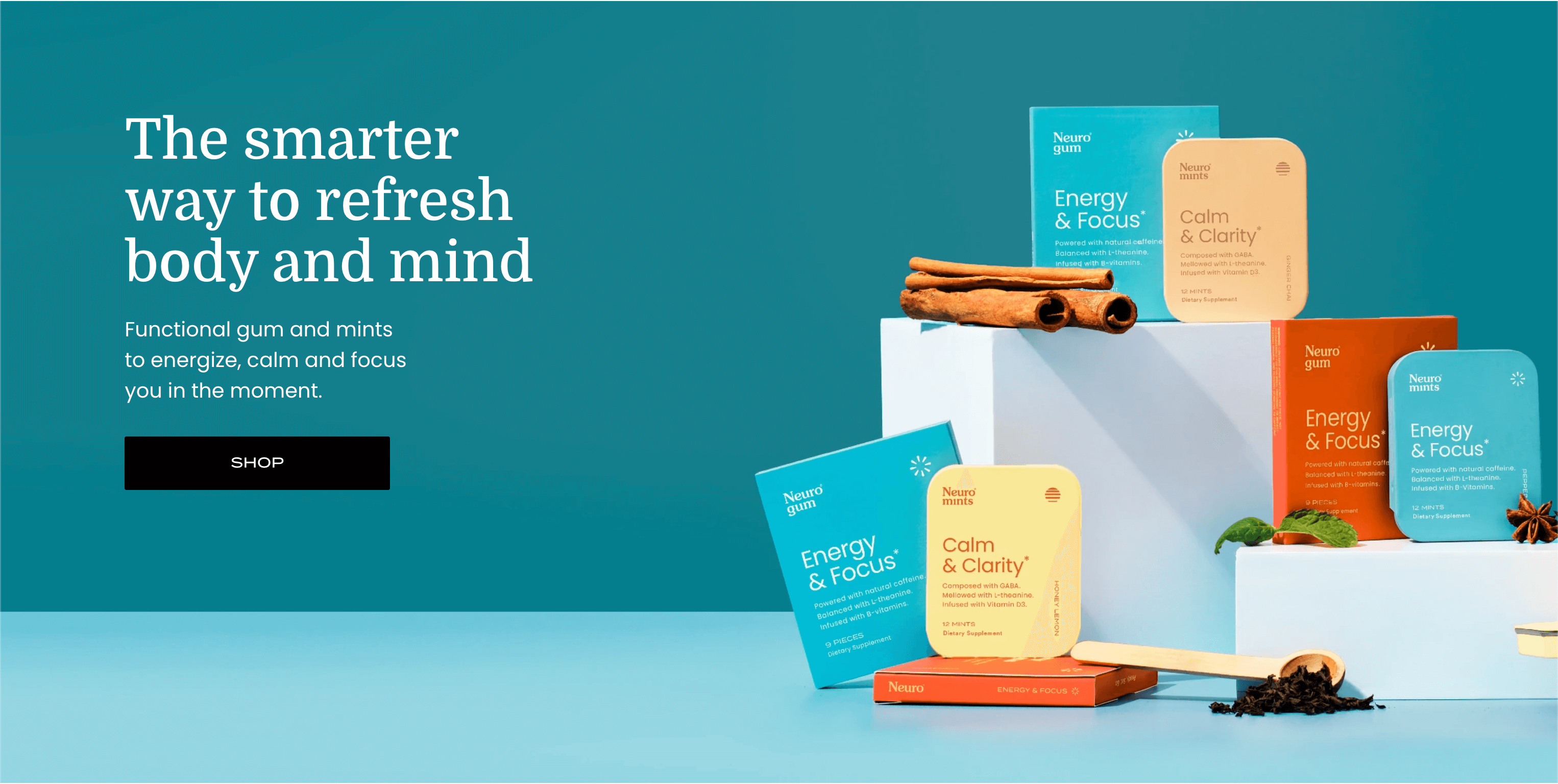
You can tell from Neuro Gum’s homepage that they’re a contemporary, trendy company. The way they display their products in the hero image next to ingredients like lemon, honey, and cinnamon illustrates their health-centric mission.
6. Malai
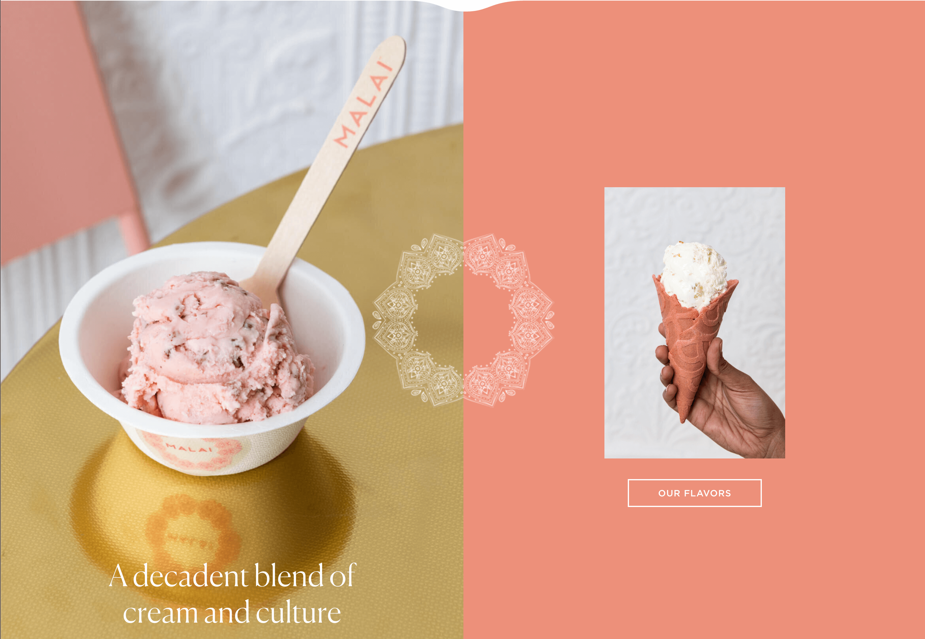
Who wouldn’t want a lick of Malai ice cream after looking at this homepage?
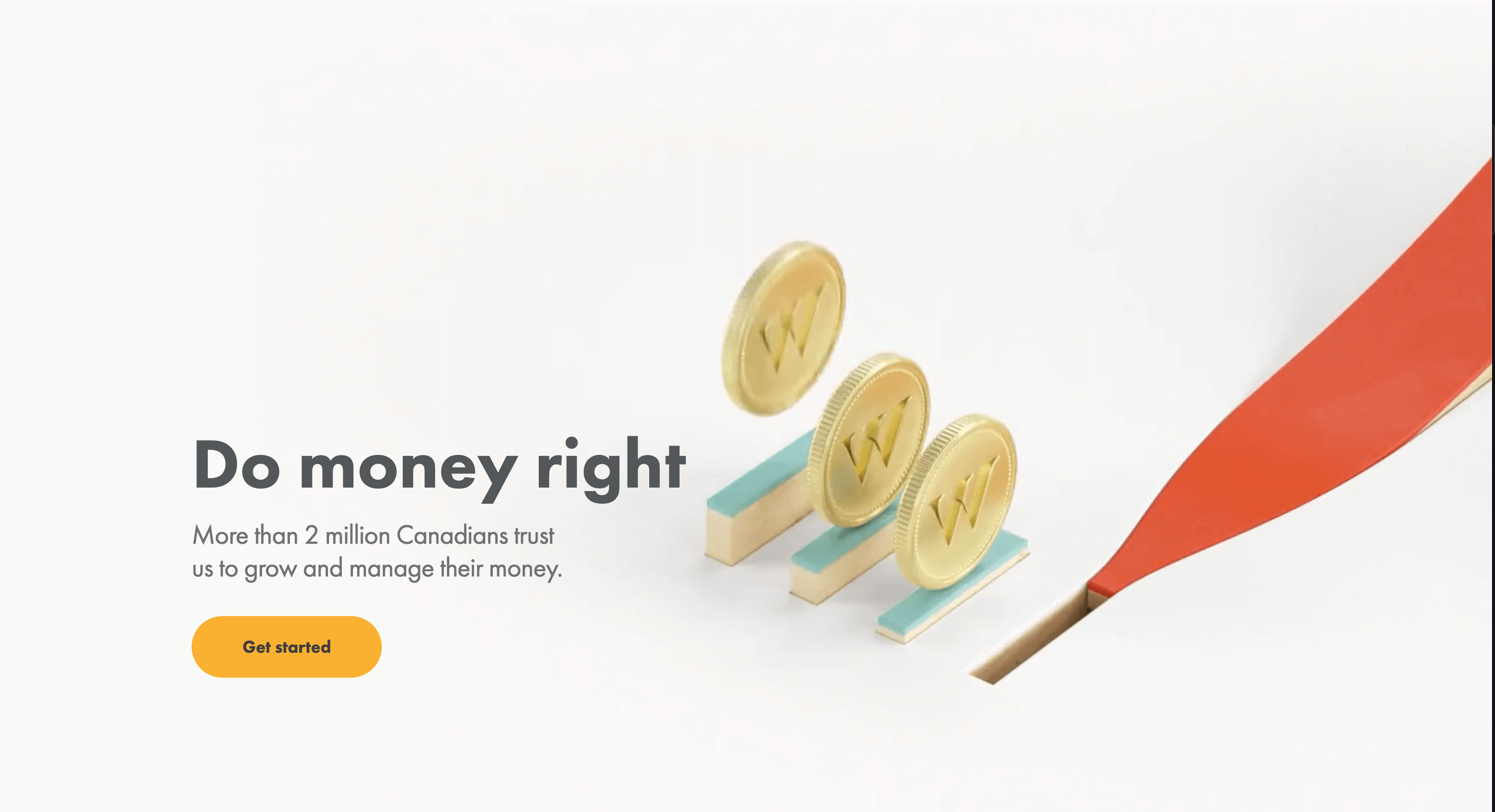
7. Wealthsimple
Money may be confusing, but Wealthsimple’s website isn’t. Their homepage briefly describes what they are with the punchy tagline "Do money right," has a fun little animation, and prompts the users to get started. That’s all it needs.
8. BrightFarms
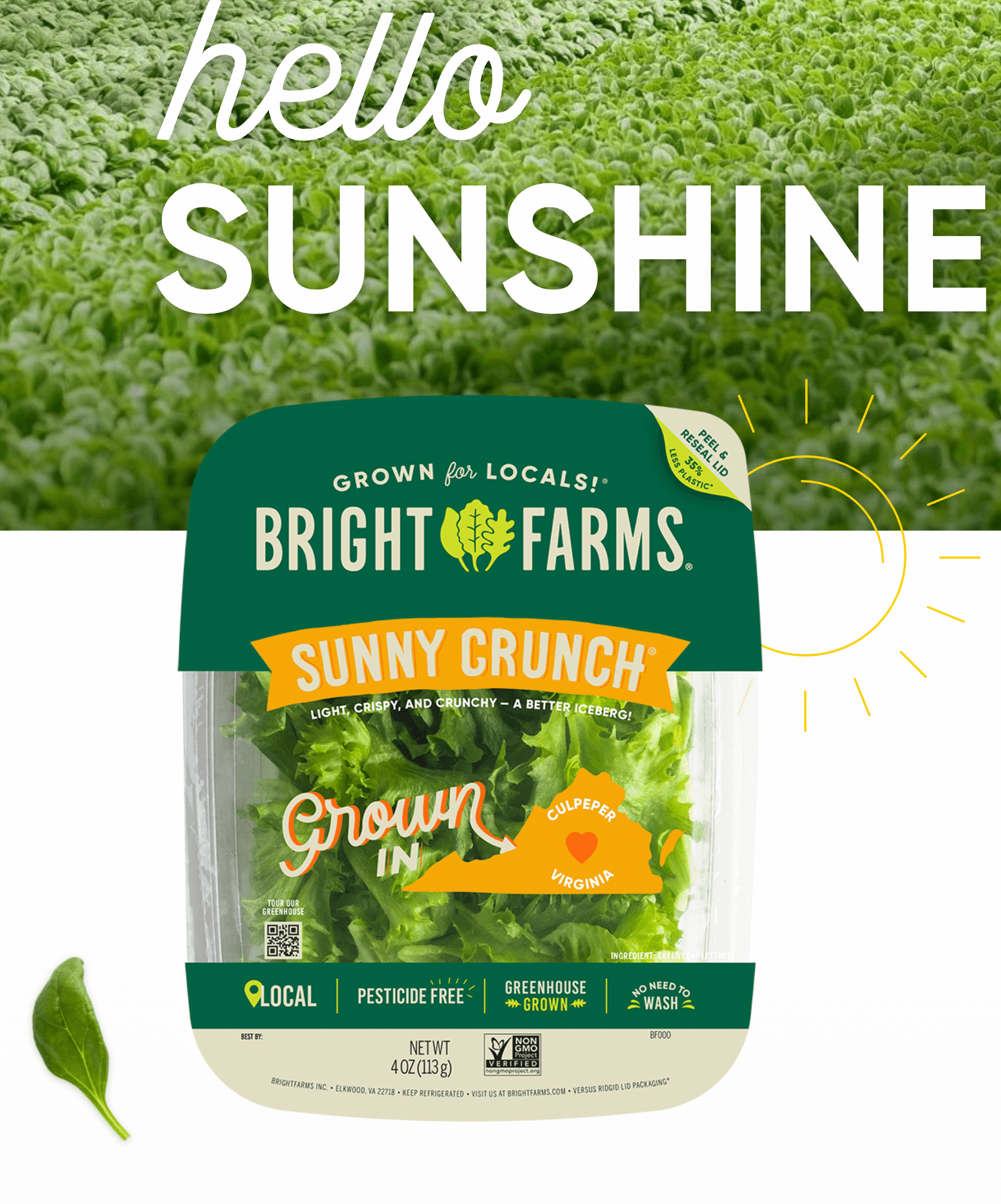
BrightFarms manages to make lettuce interesting with their bright, happy visuals and "HELLO SUNSHINE" tagline
9. 56K Cloud

56K Cloud may not put a lot of information on their homepage, but they do have that cool illustration and easy navigation for visitors who are drawn in by the promise of a cloud journey.
10. West Studio
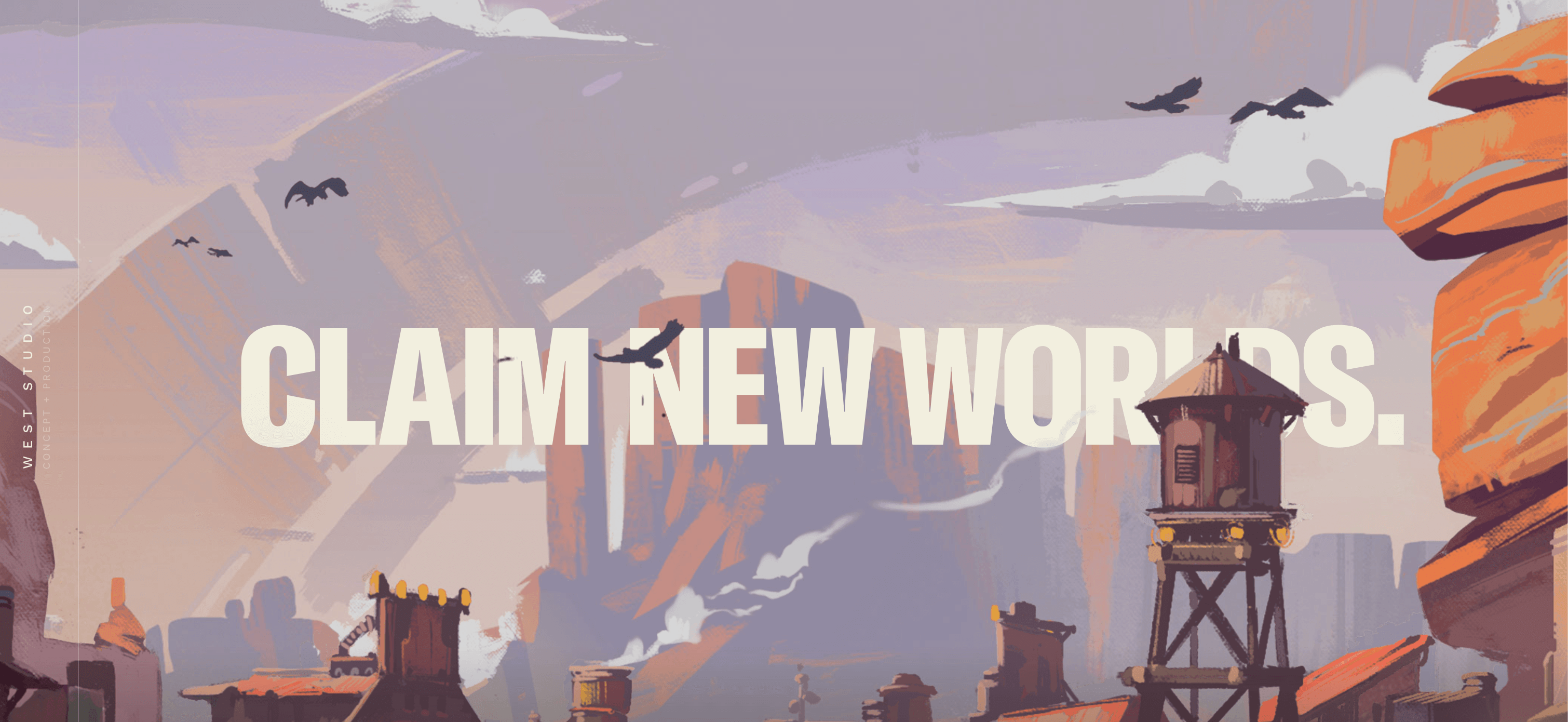
Visual development company West Studio lets their fantastical art do the talking on their homepage. The invitation to claim new worlds is vague, yet enticing.
12. Ark Shelter
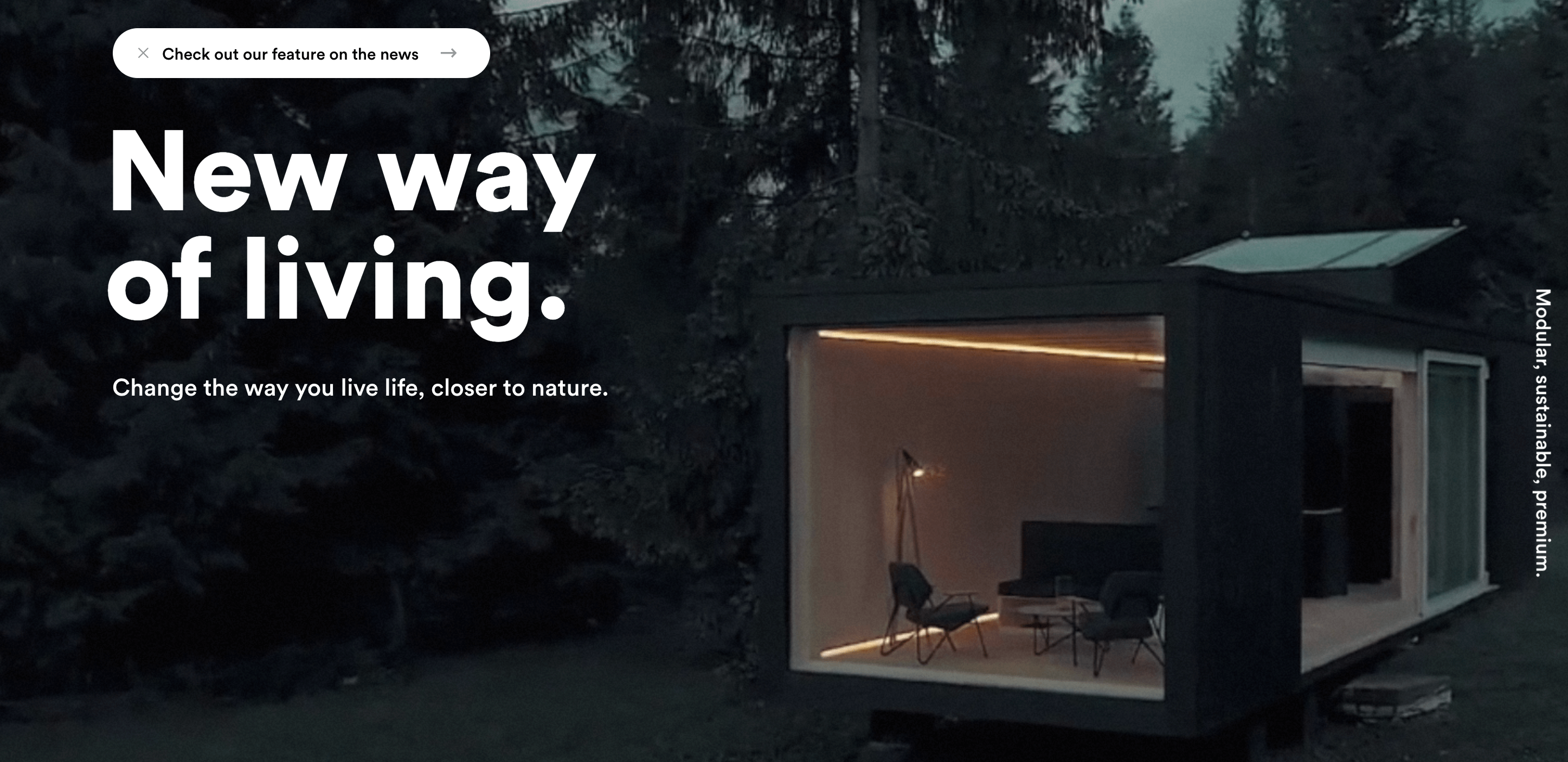
Contemporary housing company Ark Shelter invites potential customers to an eco-friendly, modular way of life with a panoramic view of one of their creations. The "check out our feature on the news" button is a great way to highlight press coverage on the homepage without it taking up much space.
13. Kaber
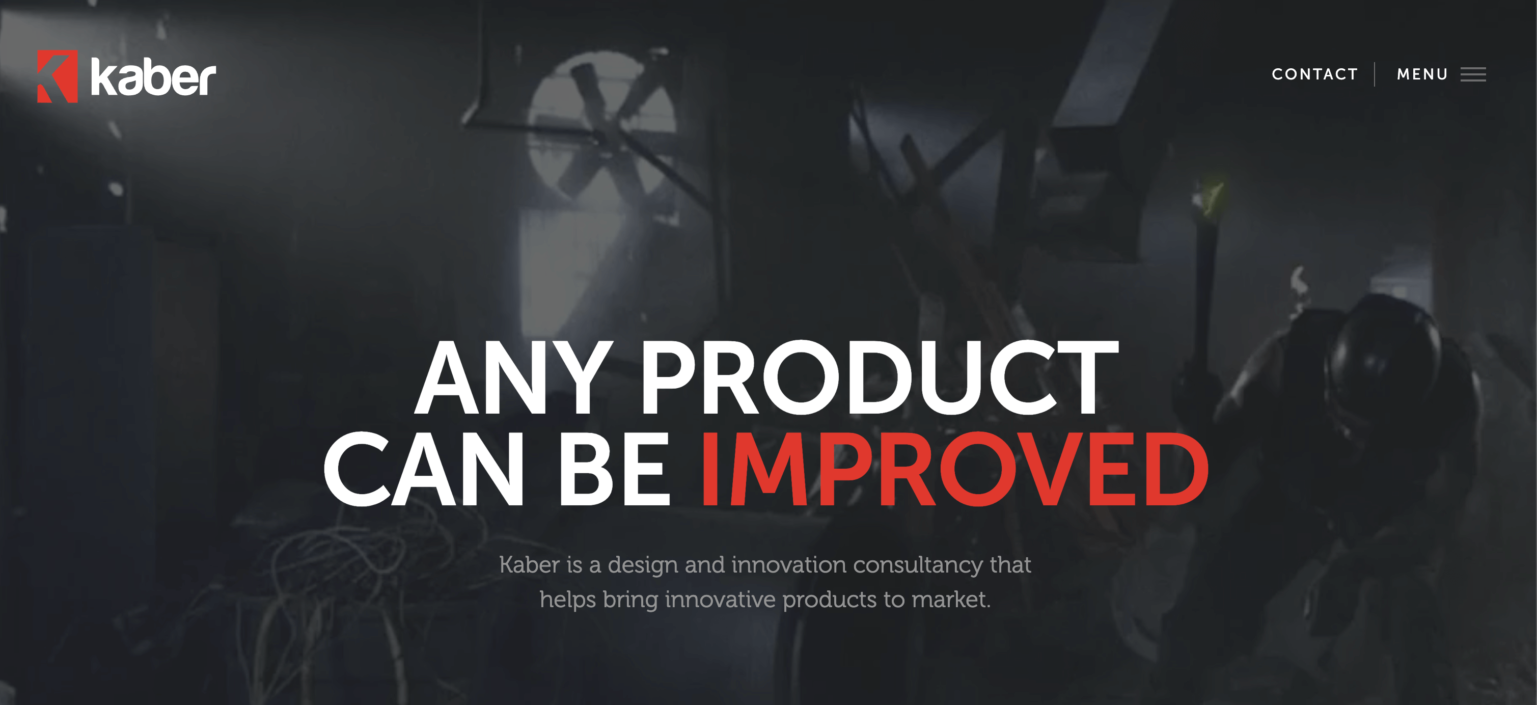
Kaber’s combination of intense action animation and simple, descriptive copy make a strong first impression.
14. Mint
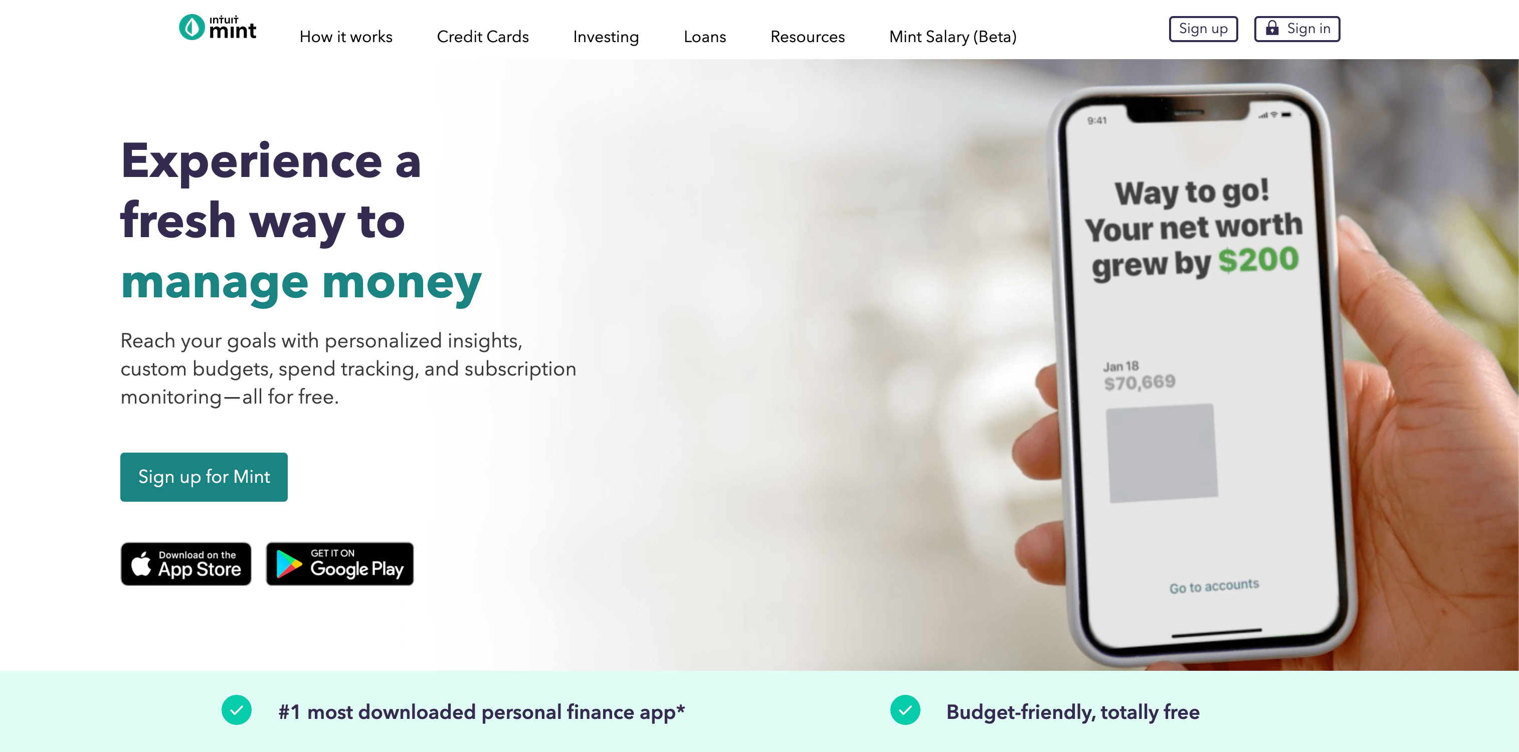
Intuit’s budgeting tool Mint introduces themself with an animation of a customer celebrating after seeing a notification, as if to tell the audience, “you can feel like this too if you use our product.”
15. Gogoro
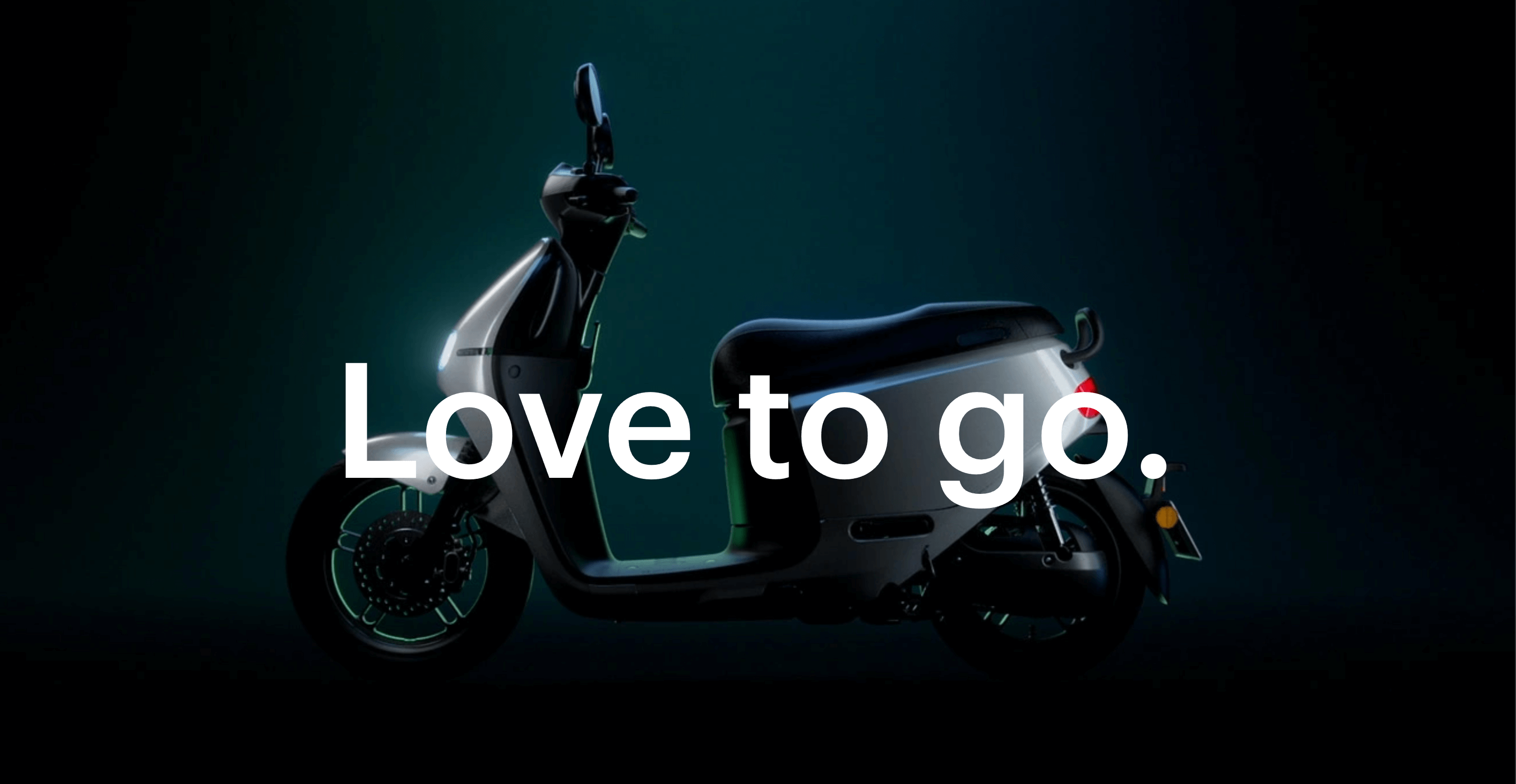
Electric vehicle company Gogoro fills their homepage with green, futuristic imagery to convey both environmental friendliness and their innovation.
16. Basecamp
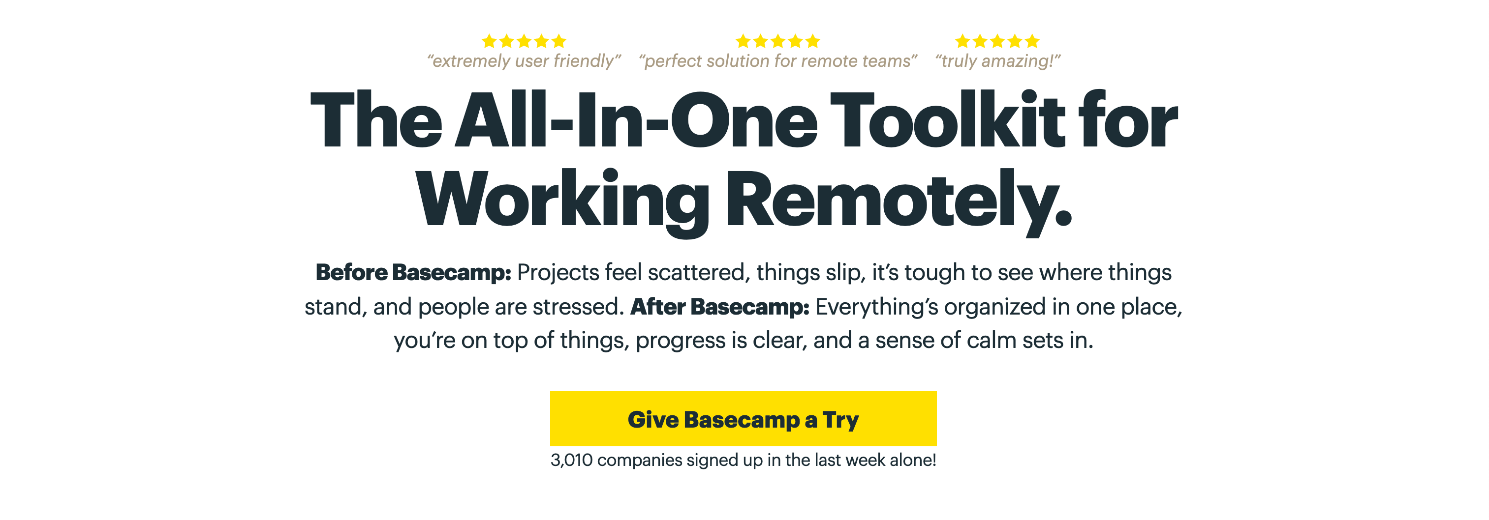
Remote work productivity tool Basecamp may keep their web design simple, but they know when to pack a punch with copy and color. The yellow button that reads “Give basecamp a try” draws the visitor’s attention and then gives them a low-pressure sell.
17. KIND
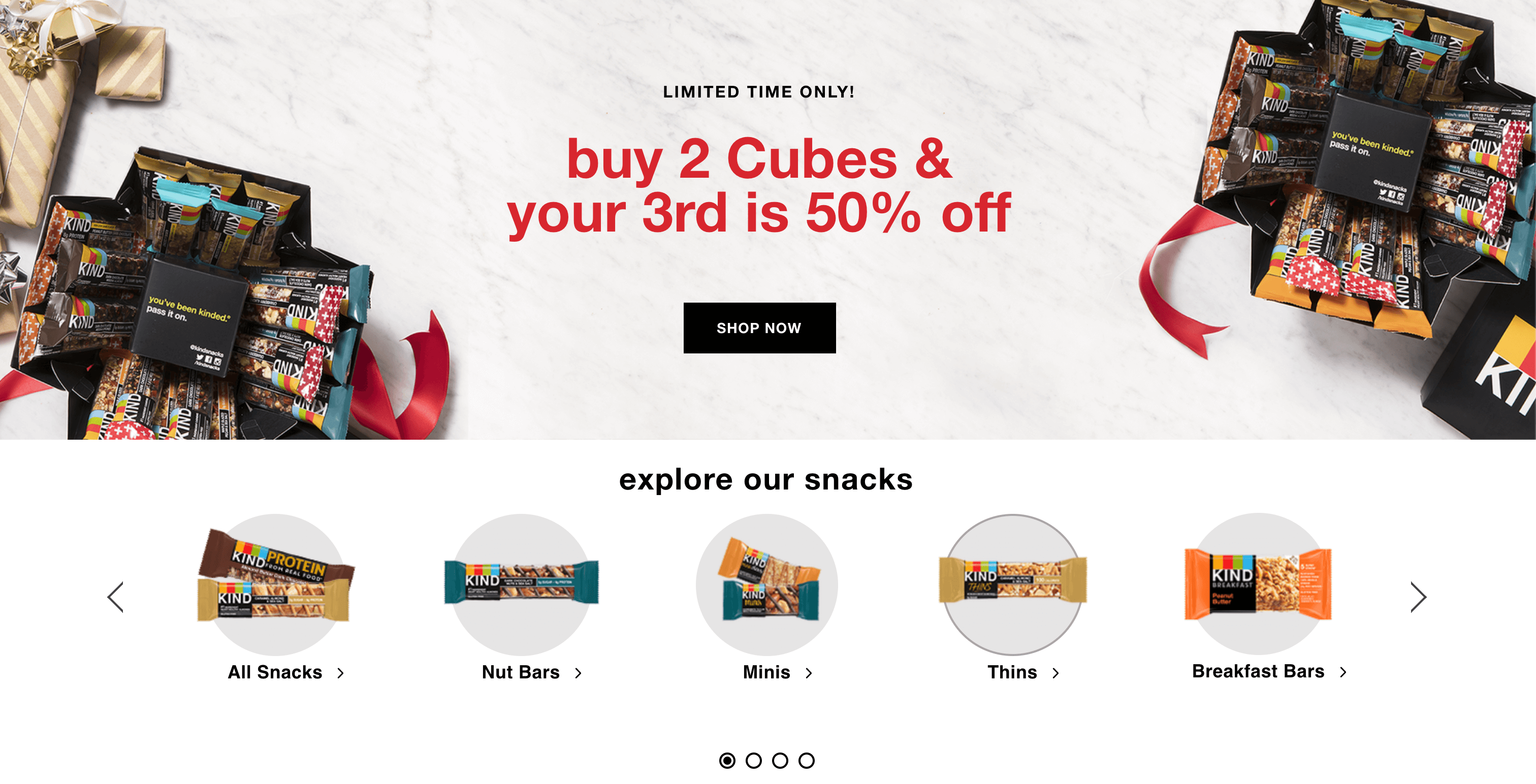
The carousel of KIND bars on this homepage makes it easy to make a purchase and find out more about their snacks.
18. Zenni Optical
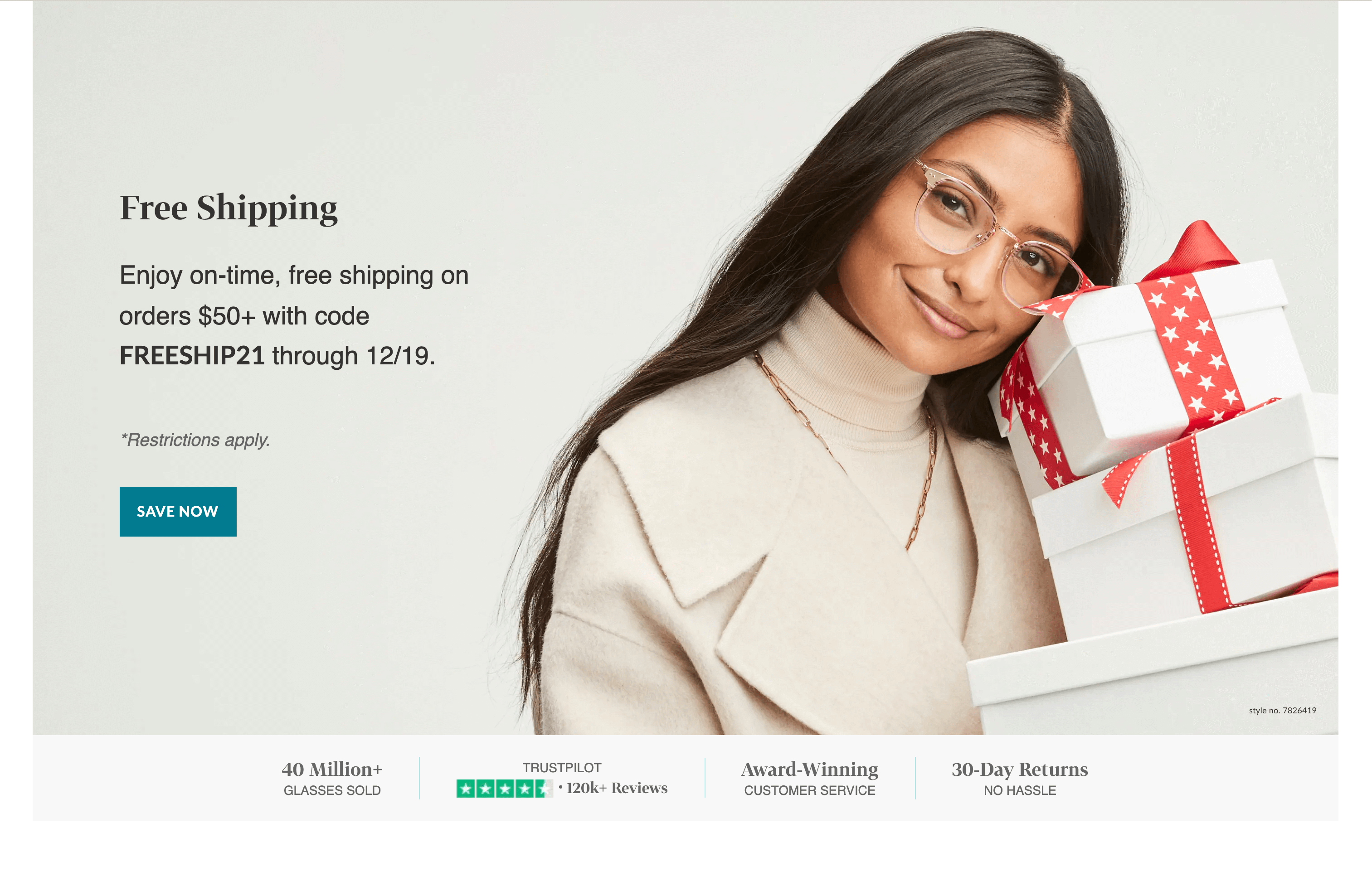
Zenni optical uses their homepage to promote their sales right away.
19. Oscar
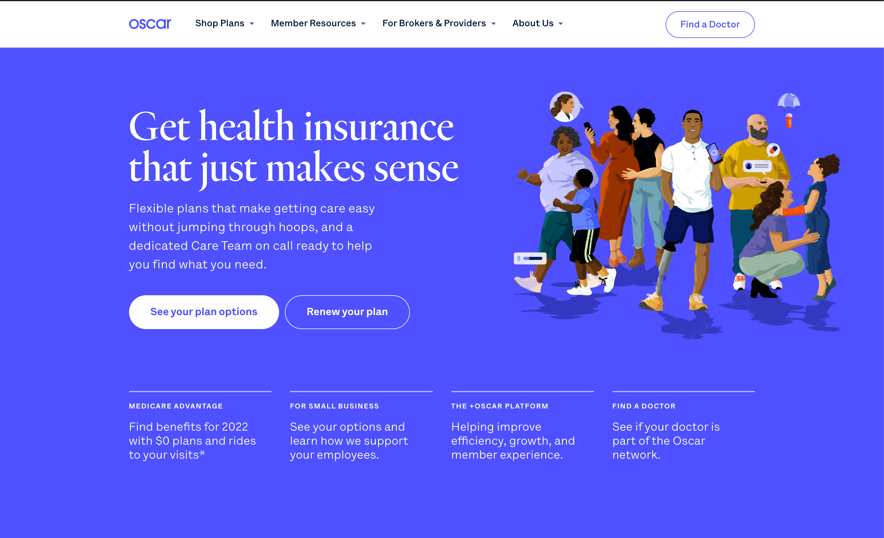
Health insurance is famously intimidating, but Oscar’s homepage feels inviting.
20. CocoKind
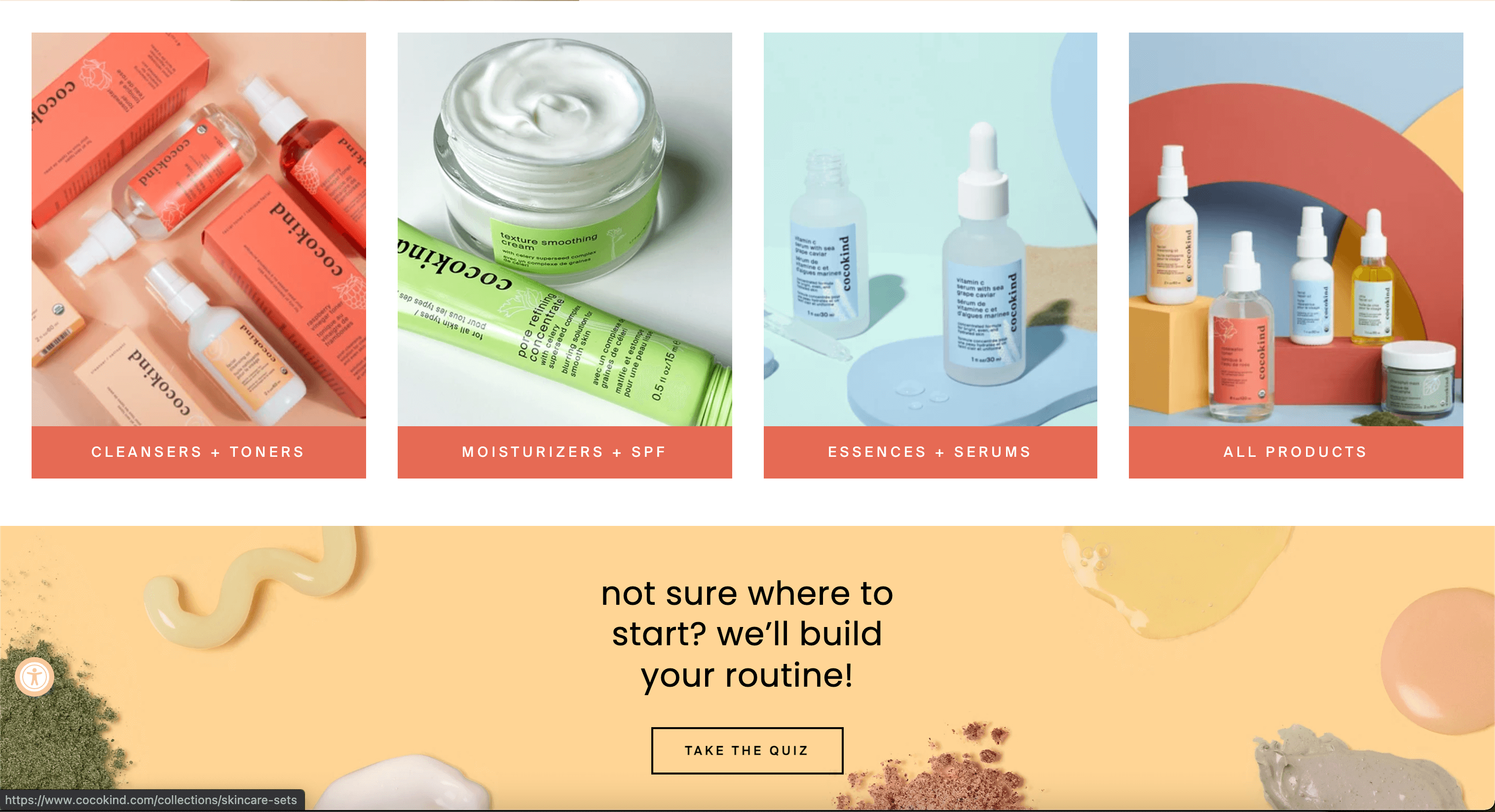
CocoKind skincare highlights their best selling products at the top of their homepage and then includes a quiz to help visitors discover which products are right for them.
21. Welly
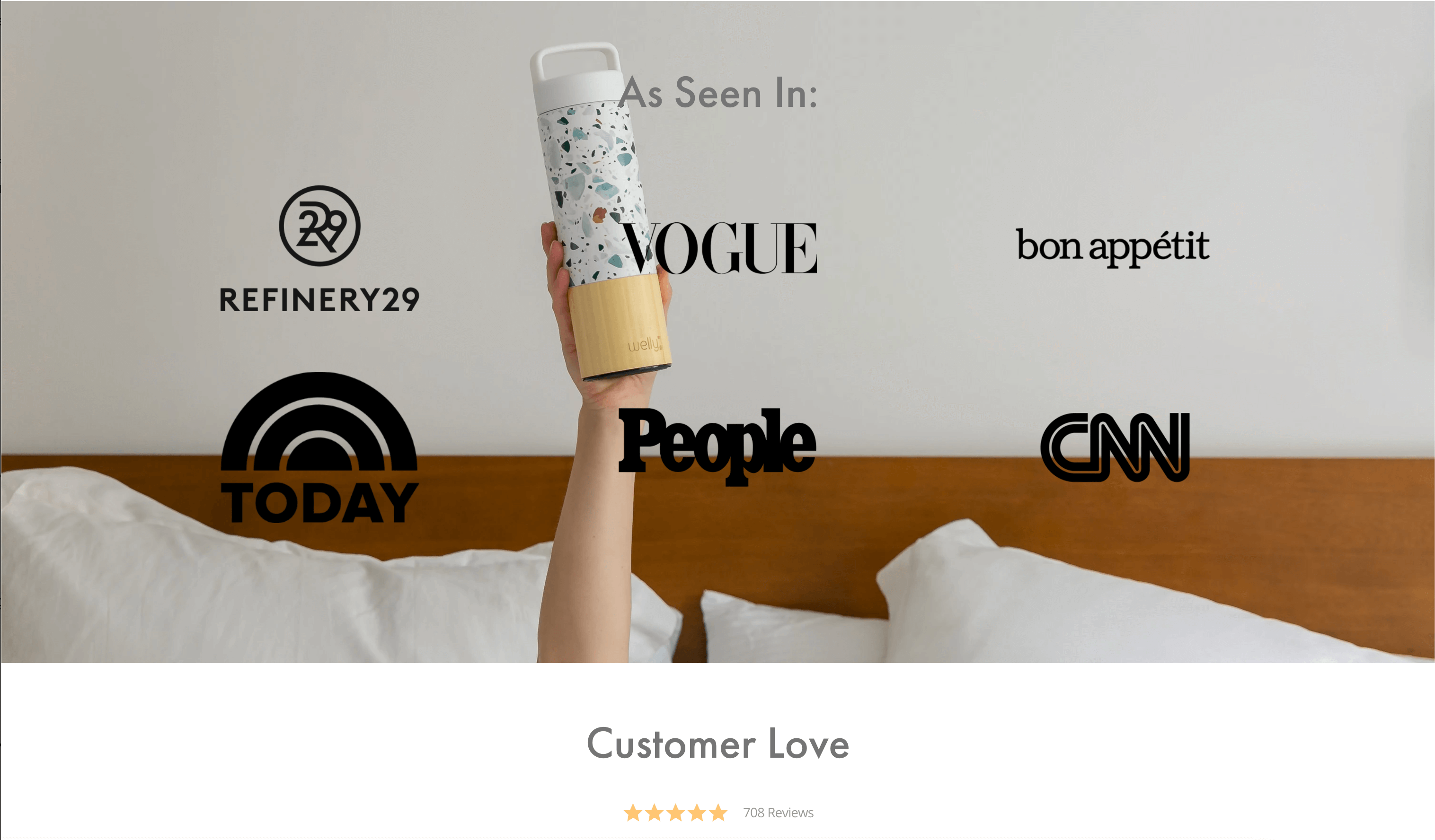
Welly includes reviews and press coverage on their homepage to highlight what makes their water bottles different from ordinary ones.
22. This is Sleep
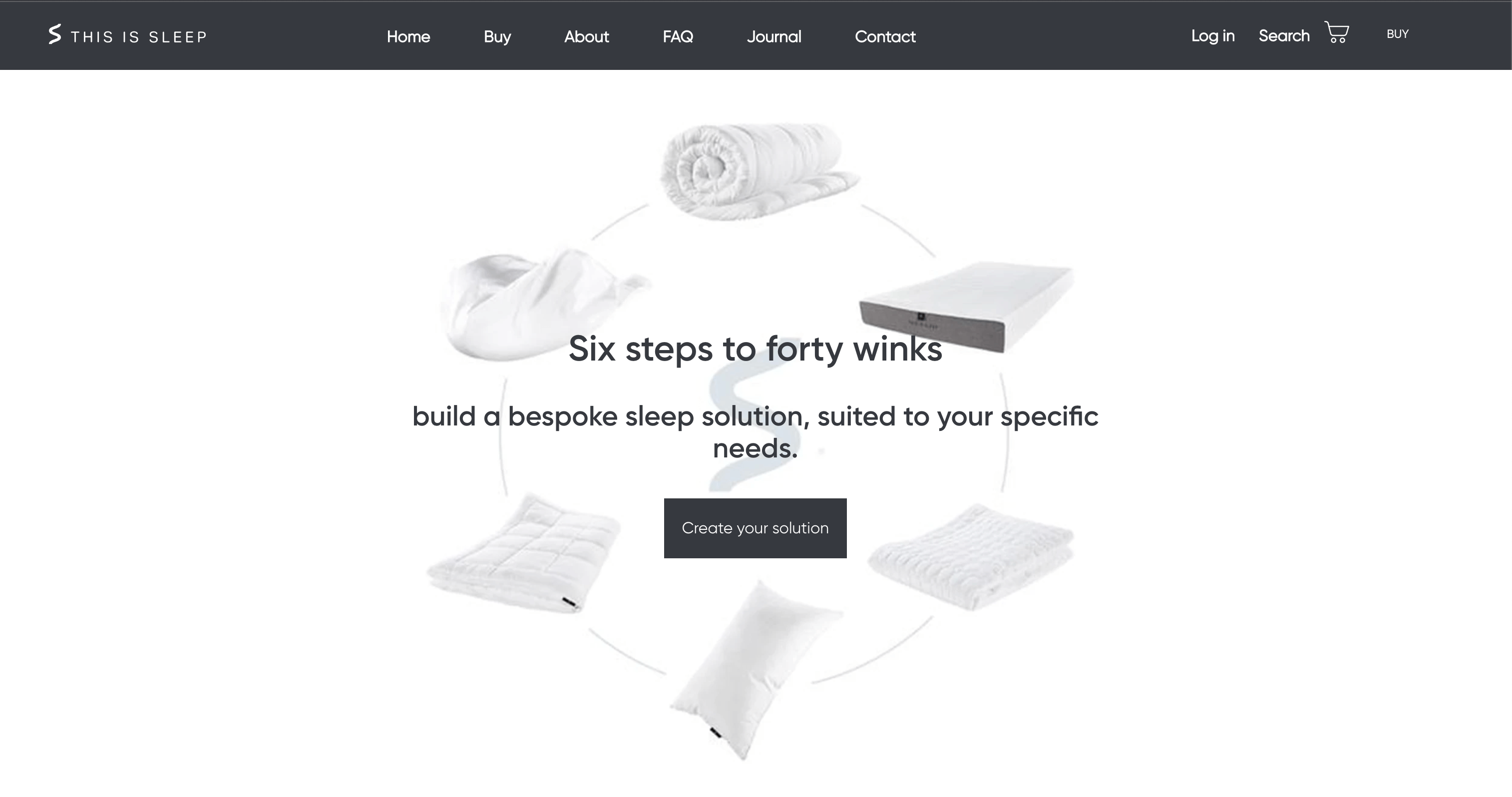
This is Sleep’s homepage is as straightforward as the name of the company.
23. New York City Ballet
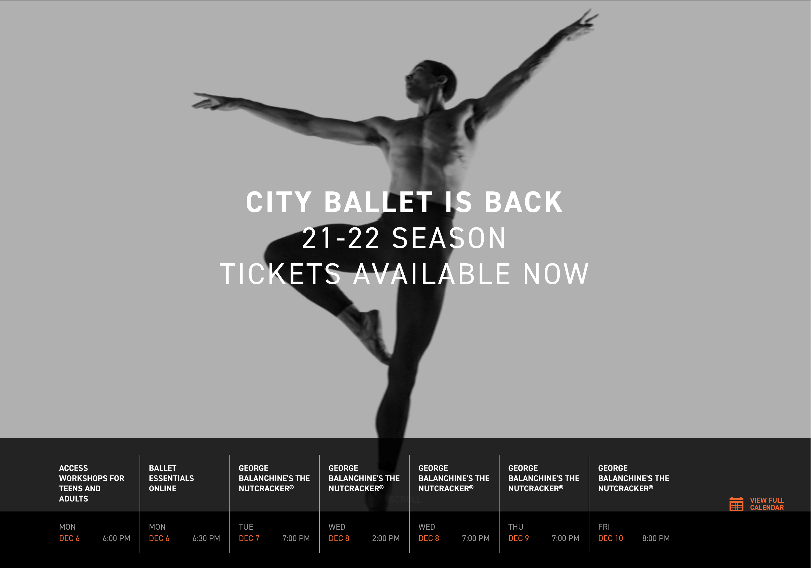
It only makes sense for a world-famous ballet company to center movement on their website. The calendar bar also makes it easy to book tickets.
How Sav Can Help
From your About Us Page to your Homepage to your Ecommerce store, Sav’s website builder can help you succeed online. All Sav website builder customers can take advantage of great ecommerce features including - but not limited to - 40+ payment methods, multi-currency support, real-time order and shipment tracking, and automated advertising with Google Shopping. With a successful website, your business will grow in ways you never imagined in no time. What are you waiting for? Get started today!
Links Mentioned in the Youtube Video:
How to Choose a Color Scheme For a Website: https://www.youtube.com/watch?v=a37Ms...