What is a Logo?
In the simplest terms, a logo is a visual representation of a brand or product. It can include words, images, or both. Since your logo represents the essence of your company, it should be consistent, recognizable, and positive in its associations.
You might use your logo:
- On your website
- On your business cards
- Various places in-store
- On products
- In marketing materials
- In your social media profiles and posts
- In your company email signatures
- On merchandise
- On product packaging
- On signs and other collateral for events
- On employee uniforms
Why are Logos Important?
A logo is an important piece of branding for your company. It’s often the first thing potential customers see of your company. Here are a few things a well-designed logo can do for your company:
- Make a great first impression
- Define your brand identity
- Use as a branding tool
- Promote brand awareness
- Stand out from competitors
- Strengthen your message
Make a Great First Impression
Potential customers’ first interactions with many brands is seeing their logo. The associations they draw from it can shape how they see your company and whether or not they want to learn more about it. For example, if your logo looks dated, people may see your company as dated and dismiss it. Similarly, if your logo isn’t appropriate for your industry and target audience, it could confuse people about what you do.
.png?width=1600&name=A%20line%20of%20eyeballs%20emojis%20(1).png)
Define Your Brand Identity
Brand identity refers to the specific look and feel that your brand develops. A consistent brand identity lets customers look at anything from your company and know that it’s yours. The imagery, colors, and typography in your logo set the tone of your brand and can inform the rest of your brand kit to keep all of your visuals consistent.
Use as a Branding Tool
Similarly, your brand strategy is the collection of methods you use to communicate your brand message across all marketing channels you use. Using your logo on all of your channels is an easy first step.
Promote Brand Awareness
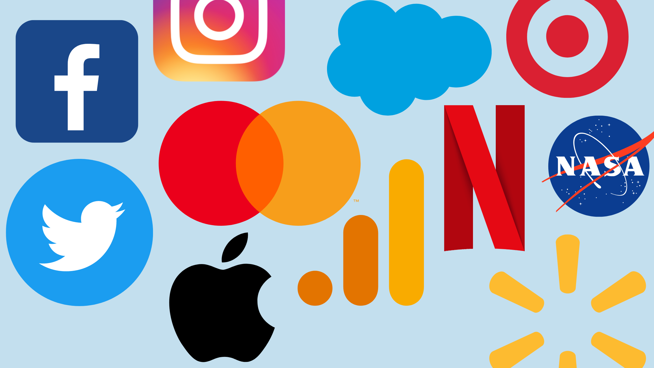
A logo is a powerful brand awareness tool because it gives people something to picture when they hear your company’s name. This is why many companies start out with combination mark logos that include both the name and a symbol, but then redesign the logo to include the brand mark alone. The Starbucks siren and the Twitter bird are well-known examples of this.
.png?width=1600&name=A%20megaphone%20(1).png)
Stand Out From Competitors
Though you want your logo to be appropriate for your industry and follow any established standards, it should also be unique enough to stand out. After all, the average American consumer is surrounded by ads and branding, but there’s no way we can remember all of them. An eye-catching logo is one way to help your brand stay in viewers’ minds.
Strengthen Your Brand Message
A strong logo can communicate your company’s personality, mission, and values without using words. One simple symbol can show your industry, what products or services you offer, your brand values, and the overall feel of your business.

The 9 Types of Logos
Different types of logos suit different needs for businesses. The 9 kinds of logos include:
- Monograms
- Wordmarks
- Letterforms
- Brand marks
- Abstract logo marks
- Mascots
- Combination marks
- Emblems
- Dynamic logos
1. Monograms
A monogram, also known as a lettermark logo, is a logo that uses an abbreviation or initials for your brand name. This type of logo is great for companies with long or clunky names or that go by an acronym like CNN or NASA. Cable News Network and National Aeronautics and Space Administration wouldn’t exactly fit in a logo. Monogram logos are also a great fit for:
- Tech
- Fashion
- Government agencies
- TV networks
Pros of monogram logos:
- Great for companies that go by initials
- Simple
- Easy to create
Cons of monogram logos:
- Can be boring
- Typography design is everything
Tips of using a monogram logo:
- Make fine details look good
- Keep it simple
- Incorporate your company’s full name if you’re a new company
- Use a custom typeface
Examples of Monogram Logos:
- HBO
- IBM
- NASA
- CNN
- HP
- Louis Vuitton
- LG
2. Wordmarks
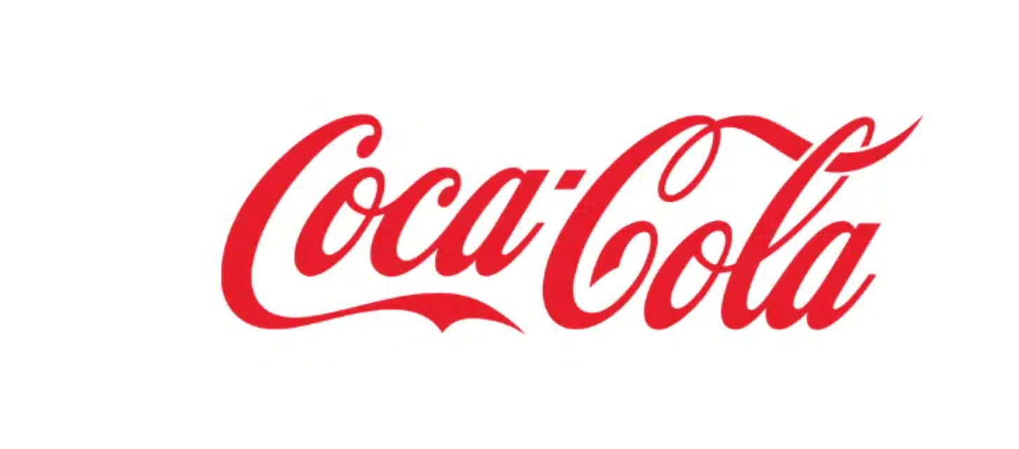
A word mark, also known as a logotype, is simply the company’s name in a specifically-designed font. Wordmarks don’t contain an image or symbol. This means the typography you use does all the talking for this type of logo. Wordmark logos are great for:
- Brands with catchy names
- New businesses that don’t have name recognition yet
Pros of wordmark logos:
- Simple
- Easy to mix with other design elements
- Easily recognizable
Cons of wordmark logos:
- Only works well with short brand names
- You may need to update the font every once in a while to keep it from looking dated
Tips for using a wordmark logo:
- Choose the right typeface
- Consider using a character feature
- Use color in your letters
Examples of wordmark logos:
- Visa
- Coca-Cola
- Subway
- Disney
- Toys R Us
- Kellogg’s
3. Letterforms
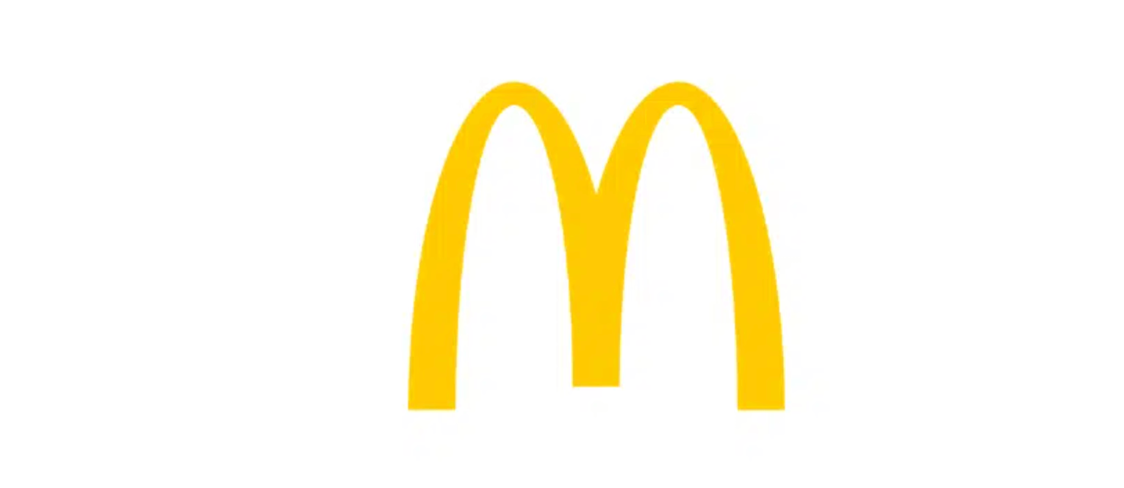
Letterforms are logos that only include the first letter of the company’s name. Letterforms aren’t usually the only version of the company’s logo. They’re often used in some contexts while a wordmark or lettermark is used in others. In order to get recognition from one letter alone, the shape and design needs to look catchy and not like a typical font. Letterform logos are great for:
- Use on websites, especially favicons
- Companies with long names
- Companies with high brand recognition
Pros of letterform logos:
- Looks professional
- Easy to recognize
- Scalable
Cons of letterform logos:
- Not a great choice for newer companies
- It may not function well on its own without the full name of the brand underneath at first
Tips for using a letterform logo:
- Make the design memorable
- Make sure it’s legible
Examples of letterform logos:
- Beats
- McDonald’s
- E! Online
- Netflix
4. Brand Marks
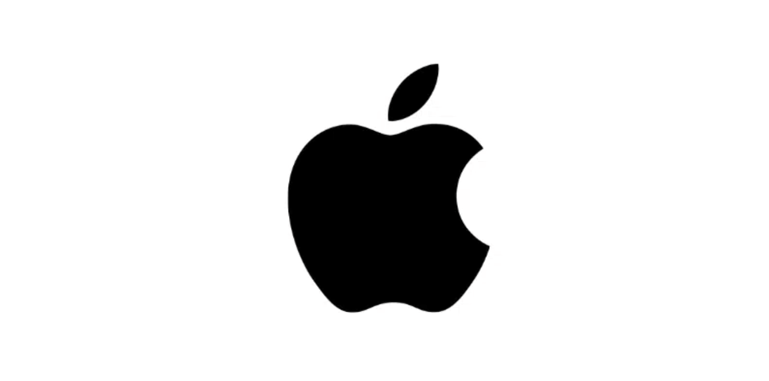
A brand mark, also known as a pictorial mark or logo symbol, is a logo that includes a symbol but no words or letters. They can be a literal representation of your brand name like the Apple logo, a suggestion of what your company does, like the Snapchat ghost, or a suggestion of your brand values like the Twitter bird that faces up to represent hope.
Early on, you’ll need to pair the brand mark with your company name to make a combination mark. Especially if the symbol isn’t literal. Once you’ve built up brand recognition and loyalty enough that people can associate the symbol alone with your company, you can consider changing it to a brand mark alone. Brand marks are great for:
- Tech companies
- Companies named after objects
- Rebrands
Pros of brand marks:
- Conveys ideas through a symbol
- Recognizable if the brand is popular
- Scalable (especially if you opt for a vector logo design)
Cons of Pictorial marks:
- Not the best option if you do not have a strong brand recognition
Tips for using a brand mark:
- Choose a symbol that represents your company’s values
- Go for a timeless symbol
Examples of brand marks:
- Apple
- Target
- Shell
- Snapchat
5. Abstract Logo Marks
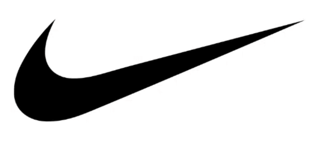
An abstract logo mark is a logo symbol that doesn’t look like a recognizable real object. This type of logo is a great choice if you want your logo to be unique to your company. Like with brand marks and lettermarks, you’ll probably need to pair it with your brand name until your brand recognition allows it to stand alone.
Abstract logo marks are great for:
- Companies with a solid brand identity
- Companies with few to no competitors
Pros of abstract logo marks:
- Unique
- Instantly recognizable
Cons of abstract logo marks:
- Not the best type of logo for new brands
- Can be harder to design a unique geometric shape than a symbol of a real object
Tips for using an abstract logo mark:
- Represent your brand values
- Pay attention to the details
- Make it easy to print
Examples of abstract logo marks:
- AirBnB
- Nike
- Olympics
- Google Drive
- Adidas
- Pepsi
6. Mascots
A mascot is an illustrated character, whether human or animal, that represents your brand. Since their expressions and contexts can change, mascots are more flexible than other types of logos. If you go this route, be sure to use a style that’s consistent with the message and tone you want to convey.
Mascot logos are great for:
- Children’s companies
- Other companies with fun, whimsical branding
- Social media and marketing campaigns
- Communicating brand identity
Pros of mascot logos:
- Evoke a fun and friendly vibe
- Easy to recognize
Cons of mascot logos:
- Hard to renew and change the character
- It can’t be used for brands that aim to send a professional message
Tips for using a mascot logo:
- Use details to depict a personality
- Make it scalable
Examples of mascot logos:
- The Michelin Man
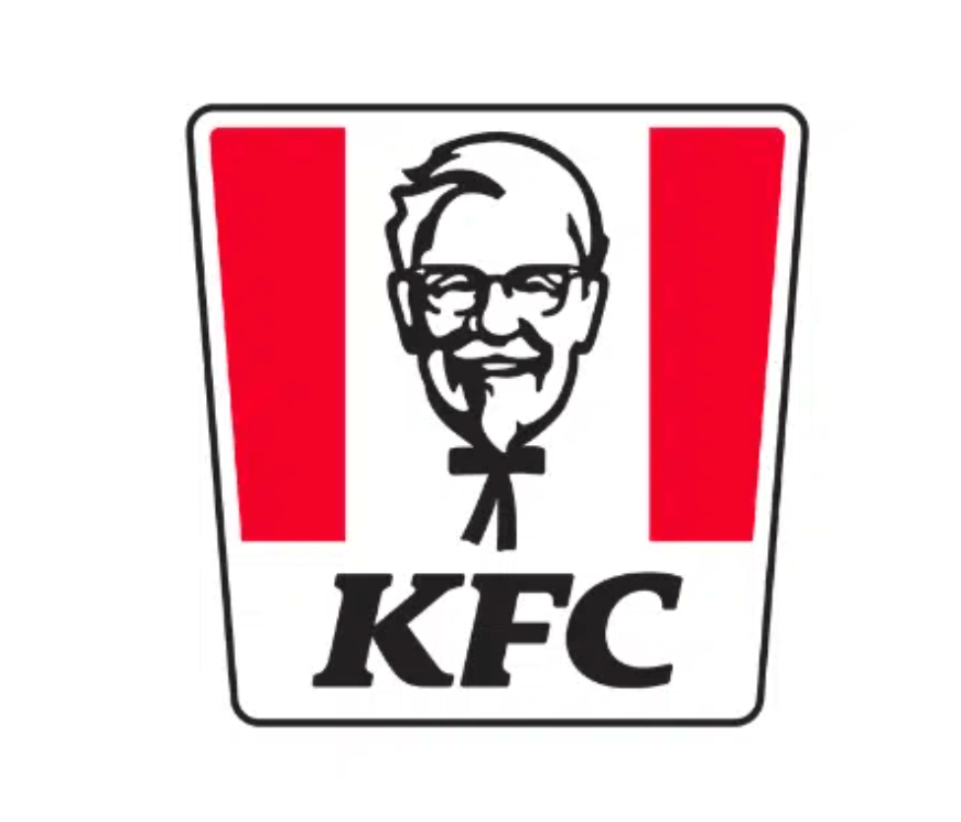
- KFC’s Colonel Sanders
- Kellogg’s Tony the Tiger
- Mr. Peanut
- Duo the Duolingo owl
- Pringles
- Lacoste
7. Combination Marks
A combination mark includes both a symbol and the name of your company. The symbol may be a brand mark, an abstract mark, a mascot, or even a letter mark. When most people think of a logo, they probably picture a combination mark.
Combination marks are great for:
- Building brand associations
- New businesses
- Restaurants
- Companies that want to use a brand mark, mascot, or letter mark, but aren’t recognizable enough to not have the name yet
Pros of combination marks
- Perfect for new businesses
- Easy to tweak later on
- Freedom to be as creative as you want to be
Cons of combination mark logos:
- It may look overloaded if it combines too many logo types
Tips for using a combination mark:
- Choose a solid symbol
- Keep sizing of the symbol and text in mind
- Leave enough space
Examples of combination marks:
- Doritos
- Burger King
- Pizza Hut
- Taco Bell
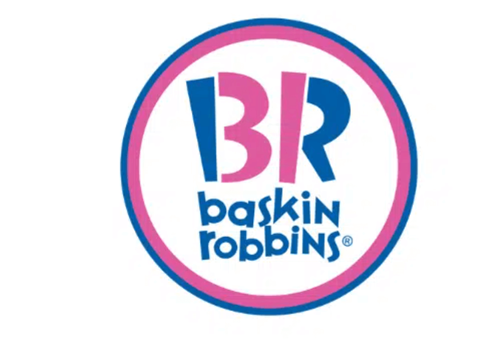
- Baskin Robbins
- CVS
- NBC
8. Emblems
Emblems, also known as crests, include text inside of a symbol. An emblem logo is a great choice for brands that want to communicate tradition and prestige.
Emblem logos are great for:
- Universities
- Sports teams
- Coffee brands
- Other brands that emphasize tradition
Pros of emblem logos:
- Memorability
- Traditional, official feel
Cons of emblem logos:
- It may not look very good when resized to a smaller resolution
- Hard to read when placed on a billboard
- More rigid than other types of logos
Tips for using an emblem logo:
- Make it scalable
- Be sure of your design because they’re harder to change later
Examples of emblem logos:
- Stella Artois
- Harley-Davidson
- NFL
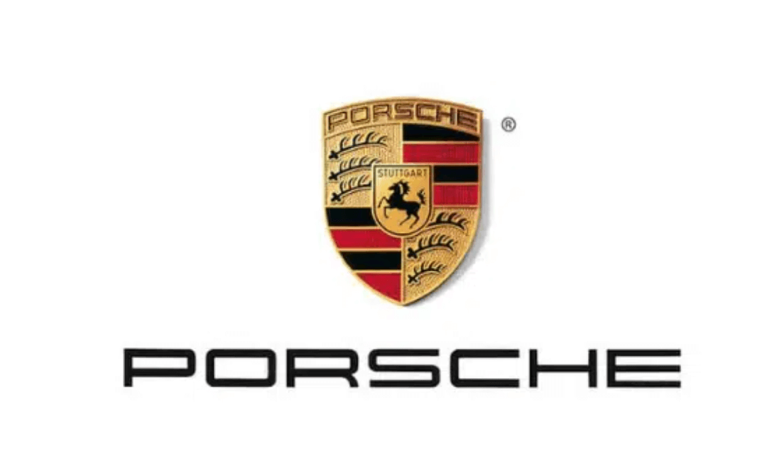
- Porsche
9. Dynamic Logos
Dynamic logos, also known as dynamic marks, are logos with different variations but are still recognizable as representing the same company. It may sound odd at first to have a logo that changes in different contexts, since logos’ whole thing is that they’re consistent. But consistency is what makes dynamic logos recognizable when you change one thing. Dynamic logos have the same basic framework that appears in every version of the logo. Dynamic logos are great for:
- Entertainment
- Creative industries
Pros of dynamic logos:
- They’re creative and fun
- You can modify your logo to fit the scenario
Cons of dynamic logos:
- May lose the associative power a static logo would bring
Tips for using a dynamic logo:
- The core shape should look good
- Keep the message consistent
Examples of dynamic logos:
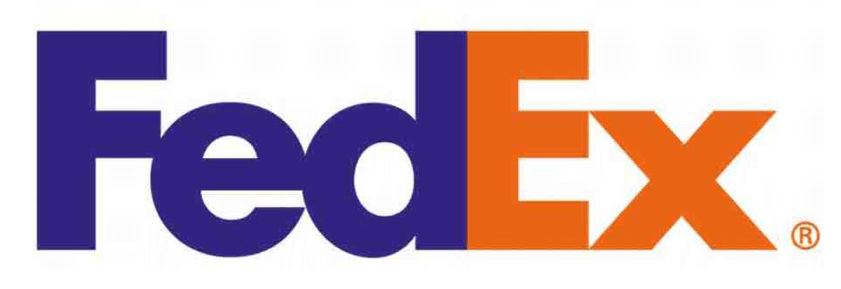
- FedEx
- Nickelodeon
- AOL
- MTV
How to Choose the Right Type of Logo for Your Business
When you decide what type of logo you’re going to use for your company, remember that your logo will exist both physically and digitally. It will also need to be scaled to a variety of sizes. Many companies have variations with and without their company name so they can use it in different contexts.
It’s important that your logo design leaves an impression of your brand, stands out compared to your competitors, and appeals to your target audience.
What Makes a Good Logo?
No matter which type of logo you choose for your business, good design will take your logo to the next level. Here are the major elements of logo graphic design.
Color
The color palette your logo is about more than aesthetics. The colors you choose send a message to the viewers about your company’s values and can even provoke an emotional reaction. Here are some common color associations in North America:
|
Color |
Associations |
|
Red |
Speed Urgency Energy Passion Elevated Heart Rate Sale and clearance signs |
|
Orange |
Optimism Happiness Aggression Action Call to Action buttons |
|
Yellow |
Warmth Positivity Youth Optimism Attention-grabbing |
|
Green |
Wealth Health Nature Relaxing Health and wellness companies |
|
Blue |
Trust Security Serenity Tech and banks |
|
Purple |
Creativity Wisdom Confidence Soothing Beauty products |
|
Pink |
Creativity Exuberance Romance |
|
Brown |
Warmth Honesty Down-to-Earth Vintage goods |
|
Black |
Power Luxury Modernity Frequently used for luxury goods |
|
White |
Minimalism Transparency Simplicity Frequently used in tech |
Typography
Whether your logo includes your brand name, a monogram, or just one letter, the typeface you use matters. Fonts affect the look and feel of your logo and send a message about your company.
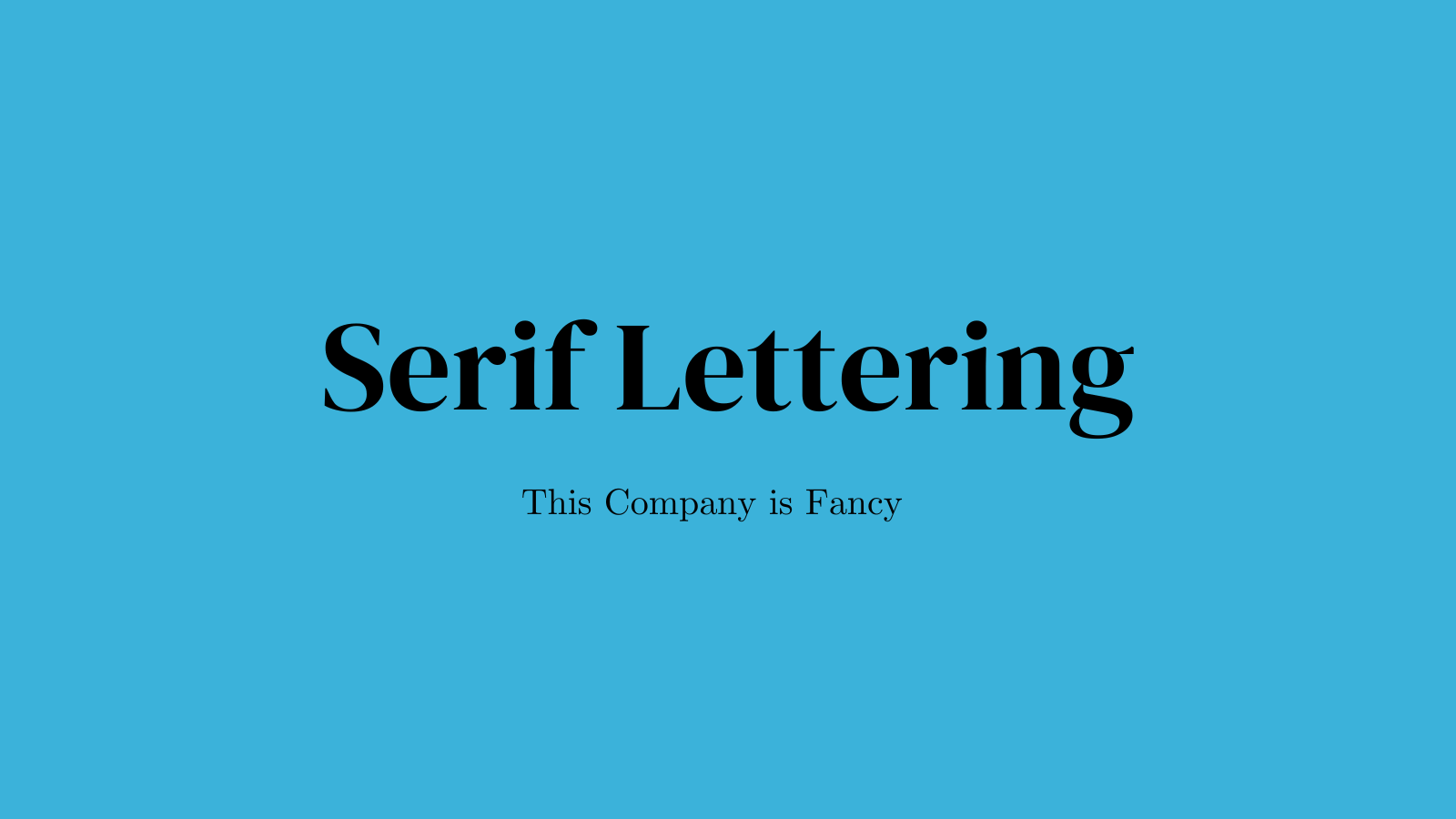
Serif
Serifs are the little feet on the letters, that’s how serif fonts get their name. Serif lettering is a great choice for brands that are:
- Classic
- Traditional
- Trustworthy
Examples of brands that use serif lettering:
- Time
- Vogue
- Tiffany
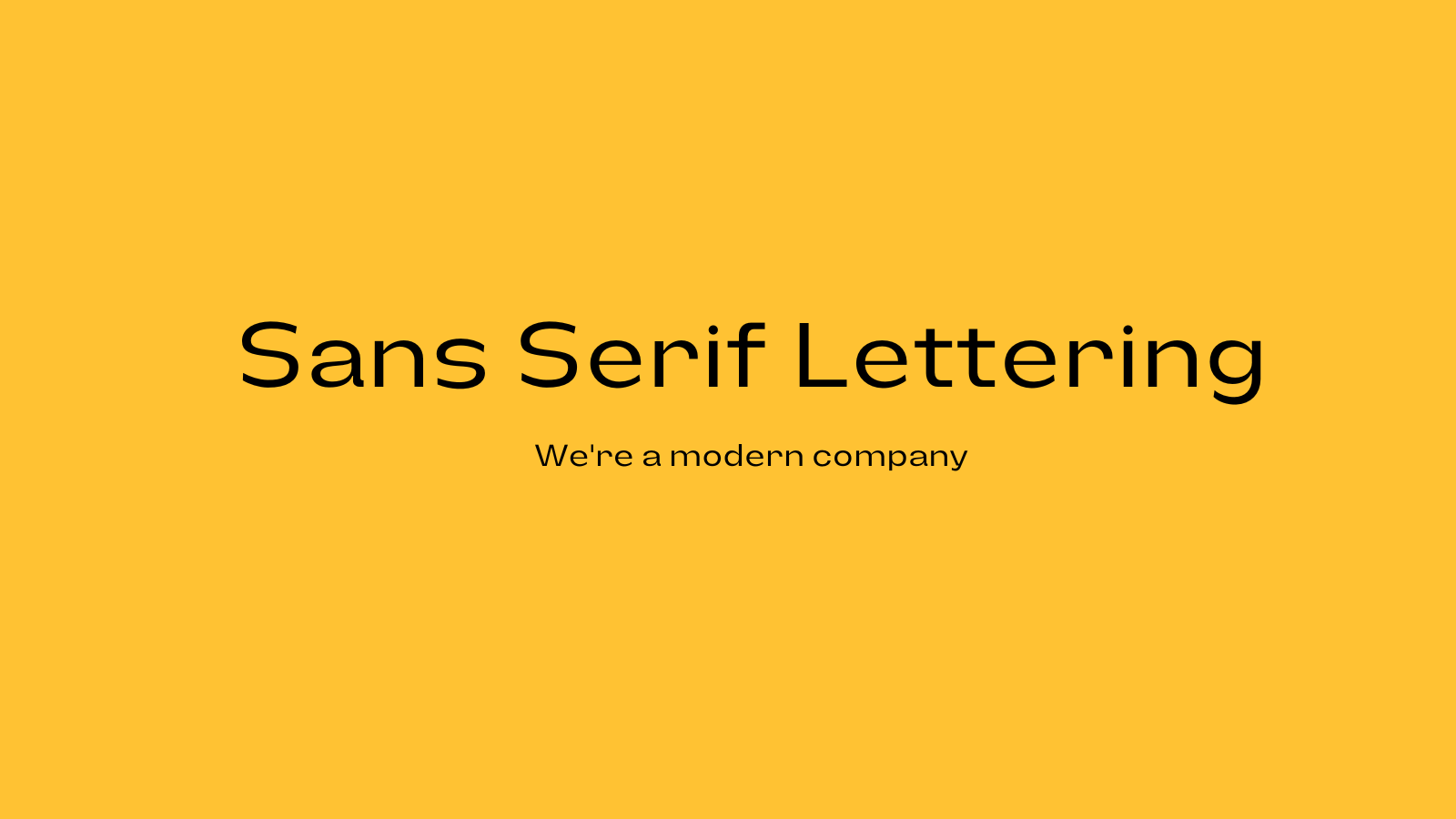
Sans Serif
Sans serif fonts don't have the little feet. Sans serif lettering is a great choice for brands that are:
- Modern
- Clean
- Minimalist
Examples of brands that use sans serif lettering:
- Netflix
- Spotify
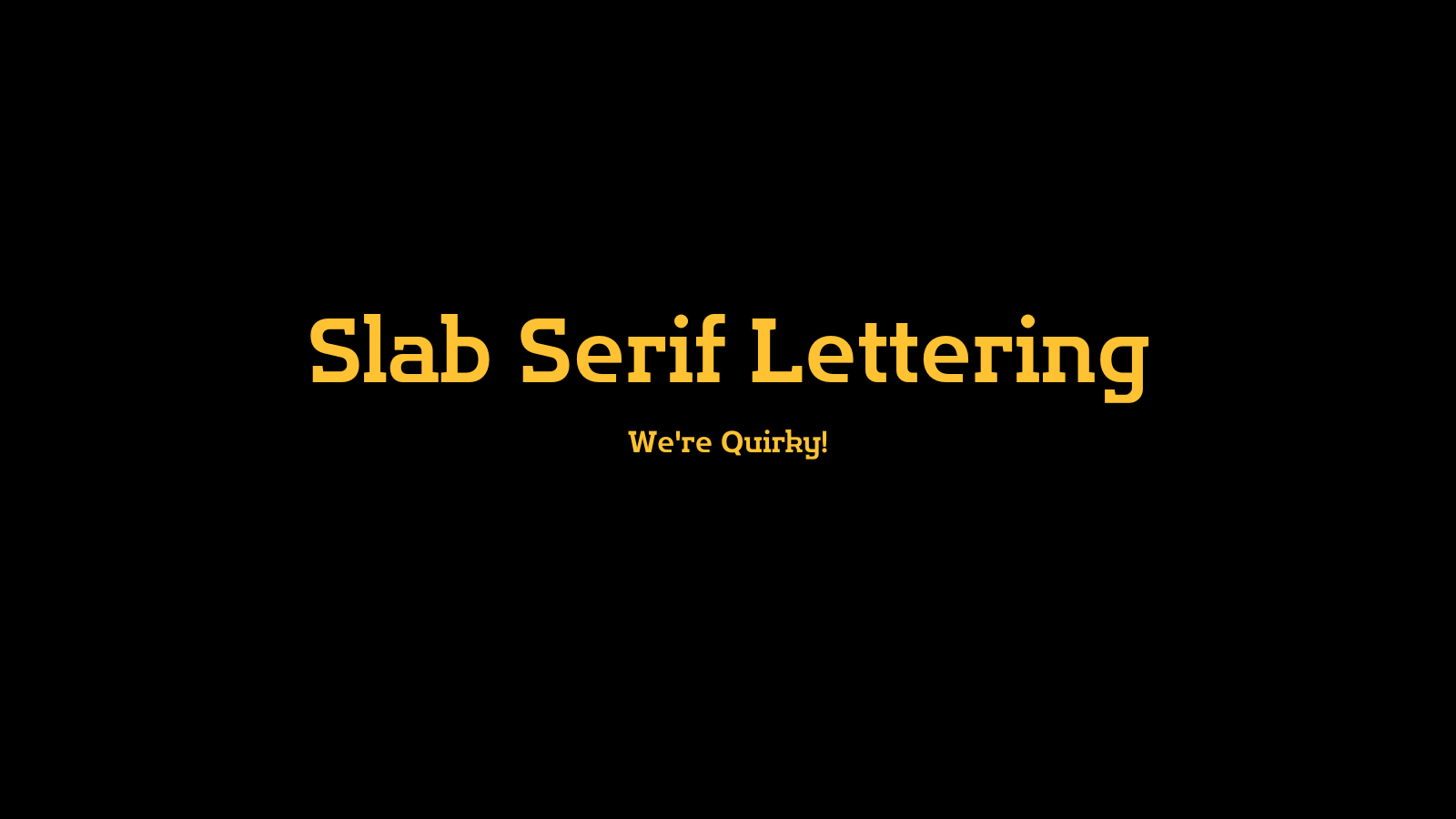
Slab Serif
Slab serif fonts have bigger, blockier serifs than standard serif fonts. Slab serif lettering is a great choice for brands that are:
- Bold
- Quirky
- Confident
Brands that use slab serif lettering include:
- Volvo
- Sony
- Honda
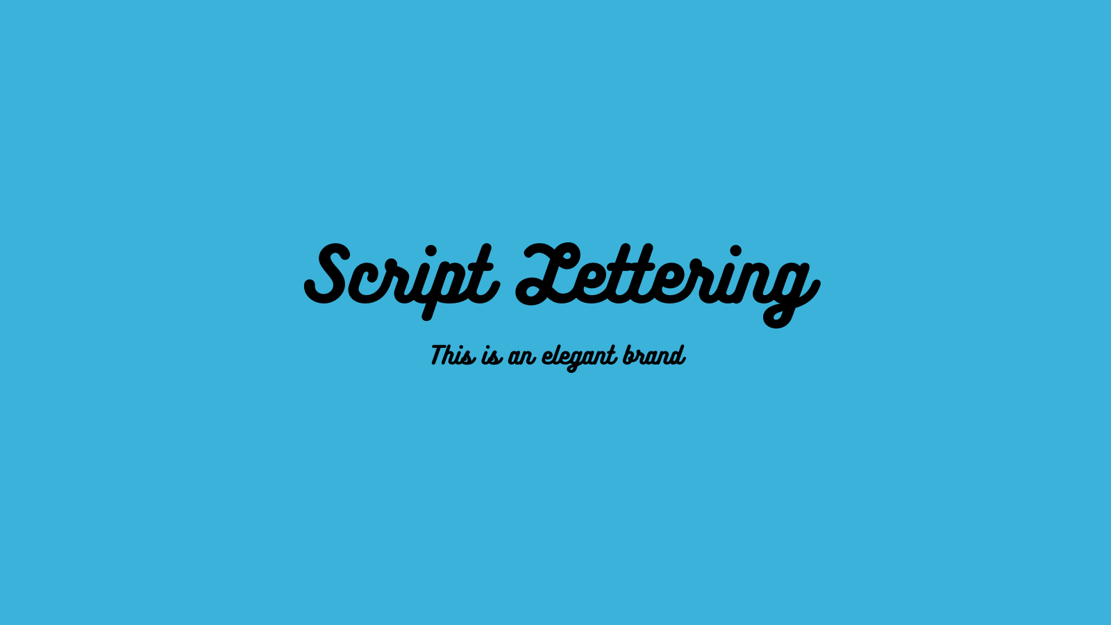
Script
Script fonts are written in cursive. Script lettering is a great choice for brands that are:
- Elegant
- Unique
Examples of brands that use script lettering:
- Johnson and Johnson
- Cadillac
- Ford
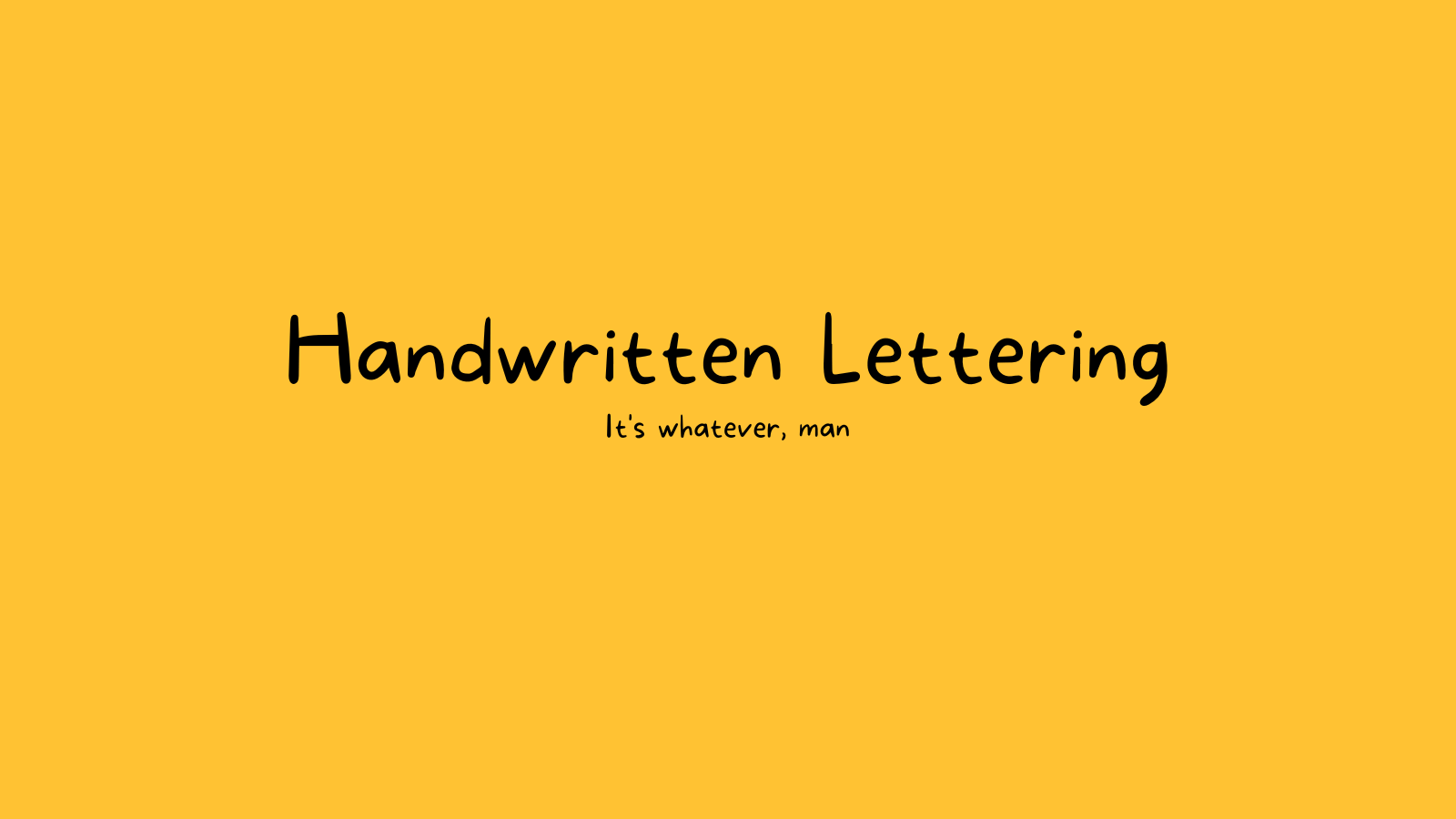
Handwritten
Handwritten fonts, well, look like handwriting. Handwritten lettering a great choice for brands that are:
- Informal
- Artistic
H&M uses handwritten lettering.
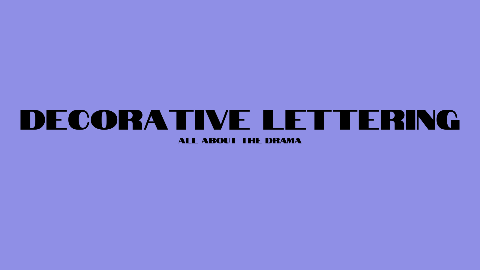
Decorative
Decorative lettering doesn’t fit neatly into the aforementioned categories because it’s usually custom and unique to the brand. Decorative lettering is:
- Stylized
- Distinctive
- Dramatic
Examples of brands that use decorative lettering:
- IBM
- Disney
- Lego
Negative Space
When it comes to graphic design, especially with logos, what you do with the negative space is just as important as the foreground. Effective use of negative space makes a cleaner look. If your design is too busy, the brand message will be harder for potential customers to receive.
Simplicity
Simple logos look good up close, far away, and at a variety of sizes. If you must include fine details, especially in mascots and emblems, make them a way to communicate personality, not traits that make or break recognition of your brand.
Meaning
The best-looking logo around won’t do its job if it doesn’t accurately reflect what your brand is about. All logos should be
- Industry appropriate
- Consistent with the tone of the brand
- Representative of the brand’s mission and values
- Appealing to your target audience
Use a Logo Maker
Using a logo maker is a great way to create a professional-looking logo even if you don’t have a lot of graphic design experience. Here are a few you can try:
How Sav Can Help
No matter which type you design, any great logo needs a great website to appear on. Here at Sav we make website creation and management easy and affordable for small business owners of all budgets. Start your free trial today to learn more!

Recommended articles
A Complete Guide to Facebook Ad Sizes
Facebook ads are an essential part of any social media marketing strategy. Facebook may not be the most popular social network for the...
Read more
How to Come up With Ecommerce Product Ideas
Whether you’re starting a new ecommerce business or expanding a pre-existing one, what products to sell online is an important decision....
Read more
The 10 Best Providers for Print on Demand Books
Always wanted to write your own book? Self-publishing with a print on demand book service can make that dream a reality more easily than...
Read more