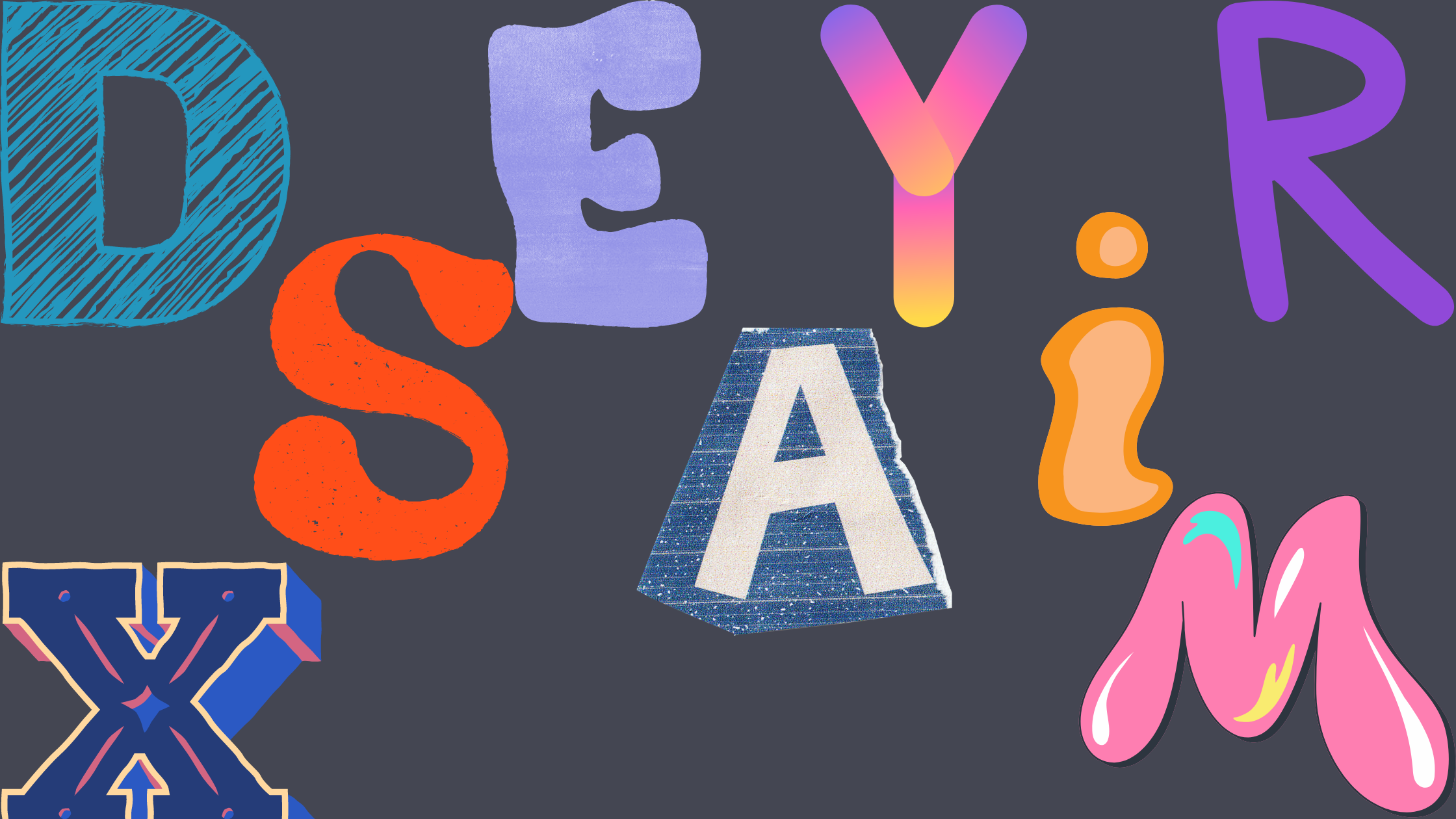
Most logos have text of some kind. Whether it’s the full name of the company, a slogan or tagline, or just a monogram of the company’s initials, the font the text is displayed in matters for your branding. If you’re stuck on which font to pick, here are some ideas to get you started.
How to Choose the Right Logo Font
Before we get into the myriad of logo font options, let’s break down how to choose the right font for your logo design. First, you’ll want to choose your font family. Then you need to think about how you’re going to use your logo and how it will match your brand identity. After that, look for inspiration from brands that are trying to accomplish something similar.
Choose a Font Family
The first choice you’ll need to make when you create your logo is which type of font you want to use. The options are
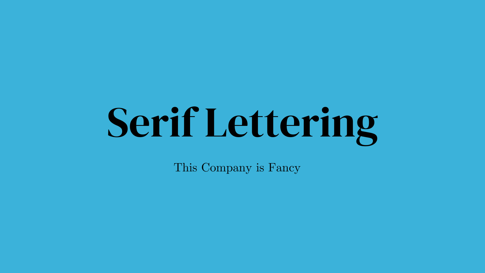
- Serif
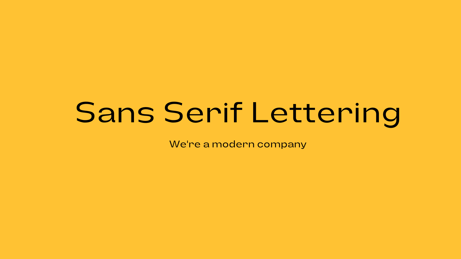
- Sans serif
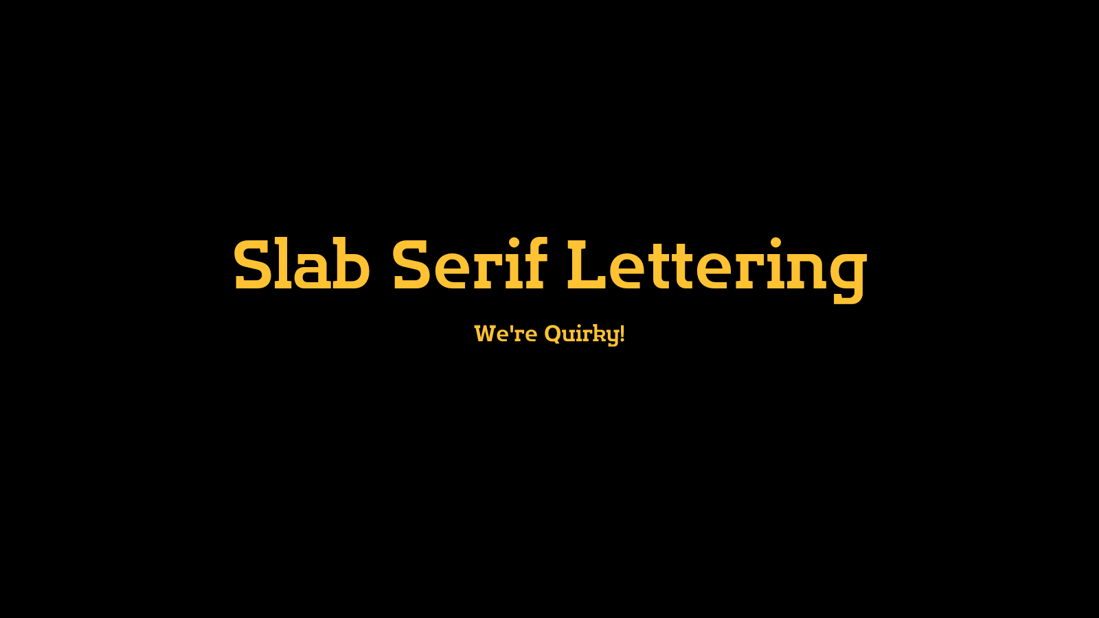
- Slab serif
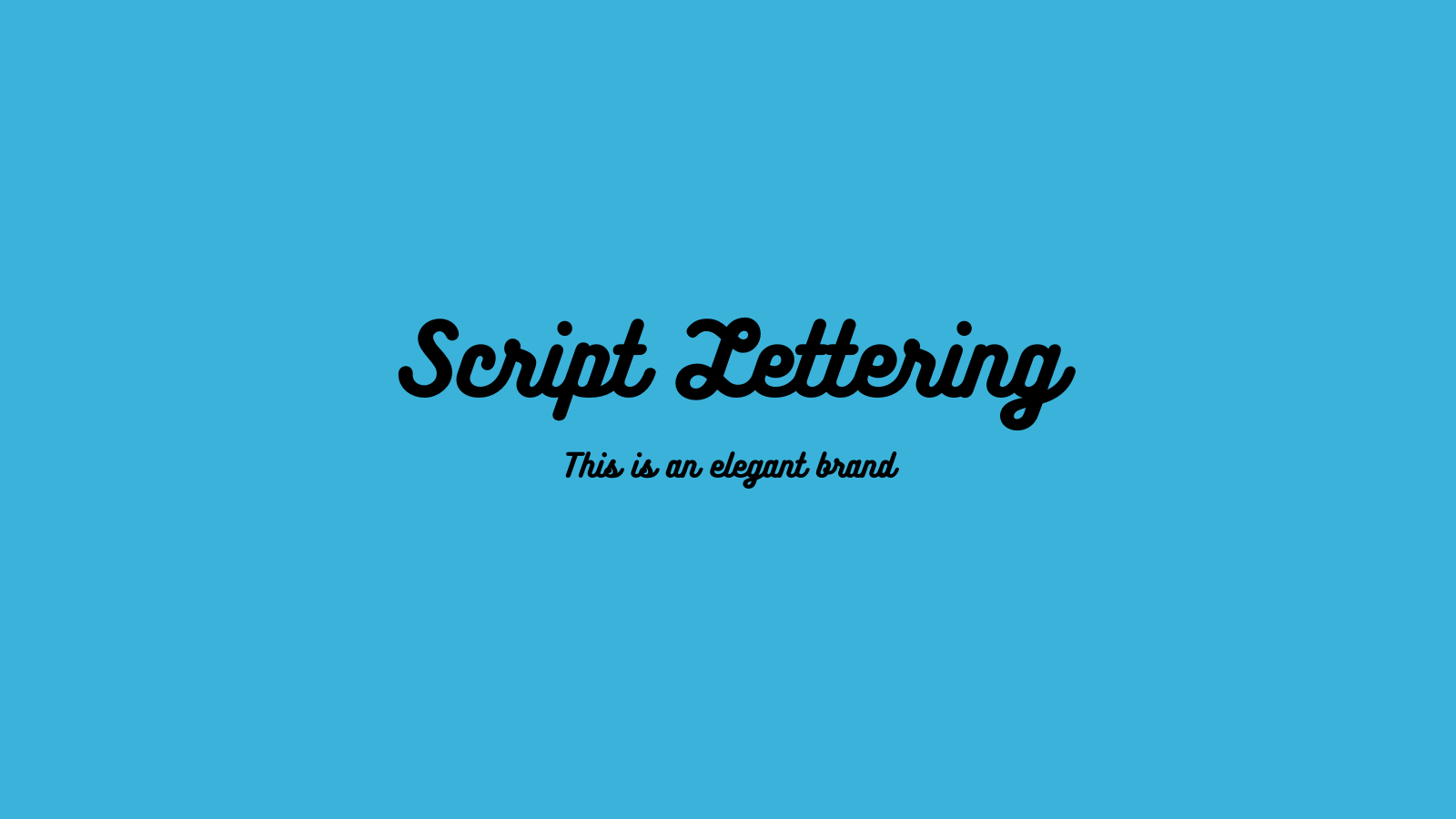
- Script
- Decorative
Each font family has its own messages and associations that will speak to different audiences.
Serif Fonts
Serif fonts have little feet at the end of each stroke in the letter. They create a traditional, timeless feel. Examples of common serif fonts include:
- Times New Roman
- Playfair Display
- Baskerville
- Bodoni
Sans Serif Fonts
Sans serif fonts don’t have the feet on the letters. They’re seen as more modern and forward thinking. Some examples of common sans serif fonts include:
- Helvetica
- Arial
- Open Sans
- Avenir
Slab Serif Fonts
Slab serif fonts have bigger, blockier feet than standard serif fonts. They’re known for a contemporary, modern feel. Some examples of common slab serif fonts include:
- Rockwell
- Roboto Slab
- Courier New
Script Fonts
Script fonts are typography in cursive. They give an elegant, personal touch to logos. Some examples of common script fonts include:
- Pacifico
- Allura
- Satisfy
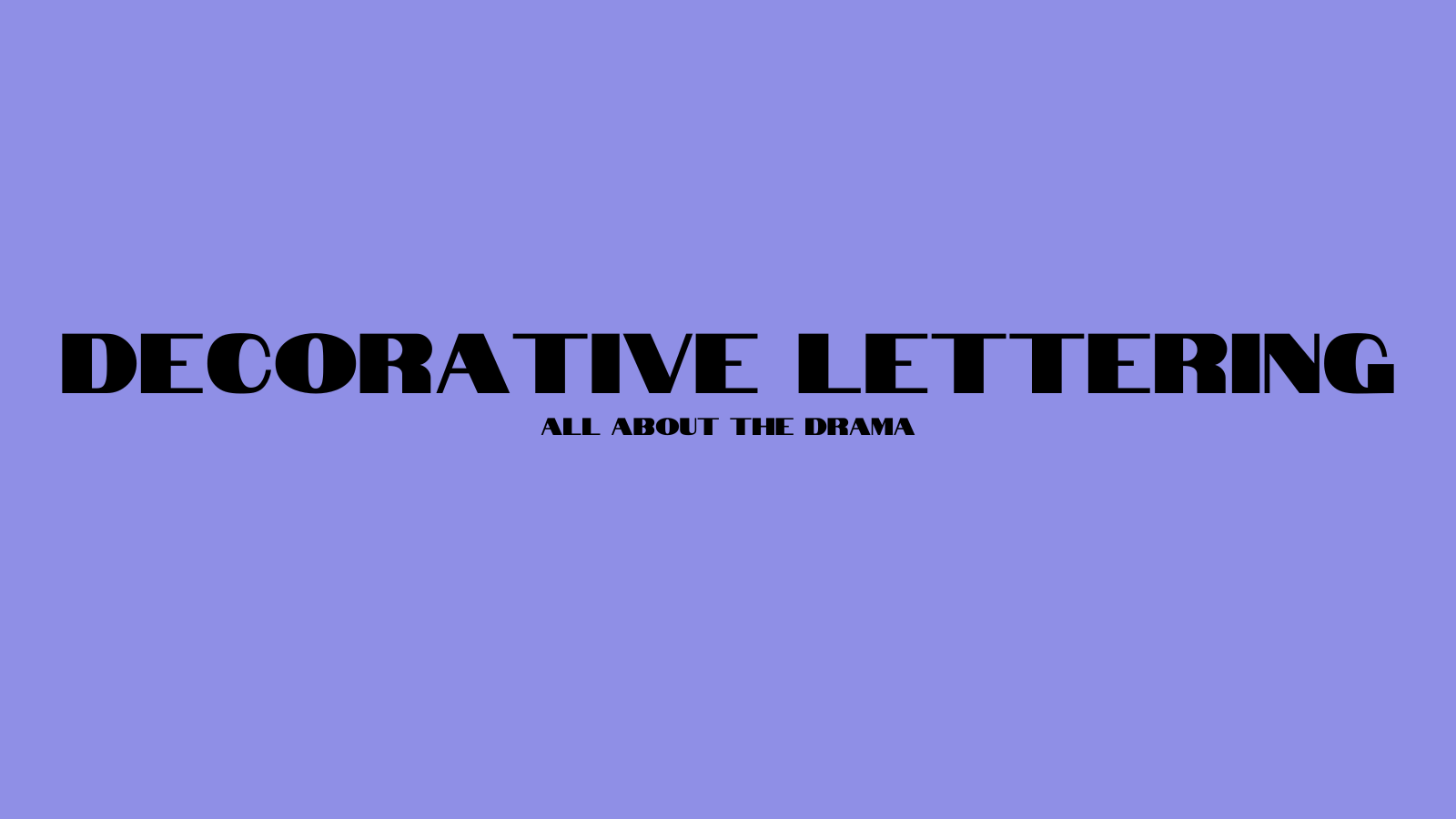
Decorative or Display Fonts
Some fonts are stylized and unique to the point that they don’t fit neatly into these categories. These are called decorative fonts or display fonts. They're often dramatic, bold, and artistic.
Consider How You’re Using Your Logo
Logos appear in a wide variety of places and contexts. Which ones do you plan on using yours in? Are you using it for a mobile app? Are you printing it on posters? Or signage and billboards? These will all require different font and design needs.
Match Your Brand Identity
Your logo is an important part of building your brand identity. It’s important to design it and pick a font in a way that sends the message you want to send to your audience.
Look for Inspiration
Once you know what you want in a logo font, look for inspiration from other logos that accomplish similar things and look for what they do well.

How Many Fonts Should You Use in a Logo?
Most logos only need one font, but sometimes you might need two. For example, if you include a tagline or the business type in the logo design. For example, using a simpler font for the word “barber shop” in small text under the logo. If you need to use two fonts, choose a pair that complements each other well and are distinguishable from each other.
How to Combine Logo Fonts
Here are some tips for pairing fonts together with a logo.
Statement Font + Subdued Font
Using a loud statement font for the main logo font and a simpler, more subdued font for the secondary font keeps the attention where it belongs and doesn’t clutter up the logo space.
Two Versions of the Same Font
You can also use the same font for both, but a heavier, bolder version for the main font and a lighter version for the secondary font. This creates a clean, consistent look.
Avoid Pairing Two Statement Fonts
The main thing you want to avoid doing is pairing two different statement fonts in one logo. Doing this is distracting and can clutter up the limited space.
The Best Serif Fonts for Logo Design
These serif fonts will give your logo an air of classic sophistication.
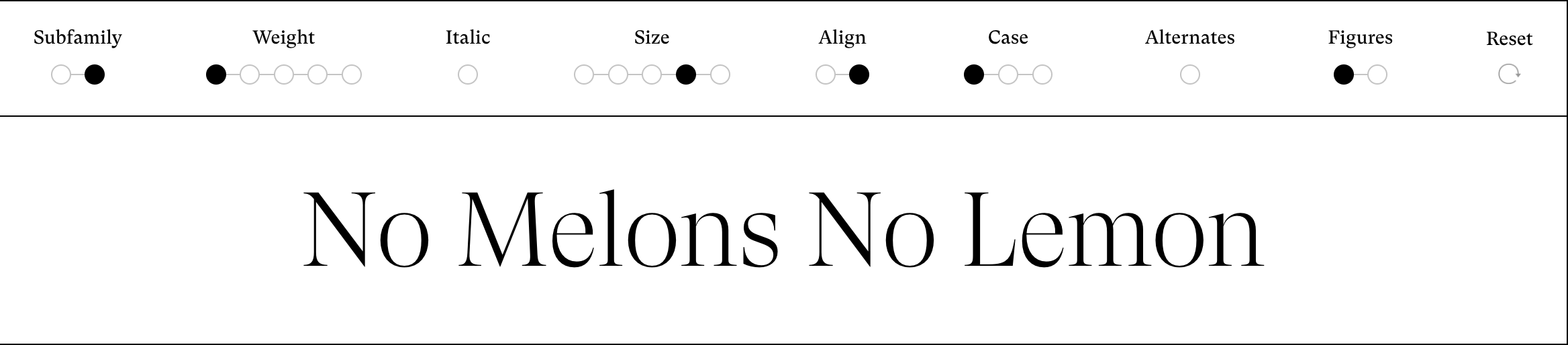
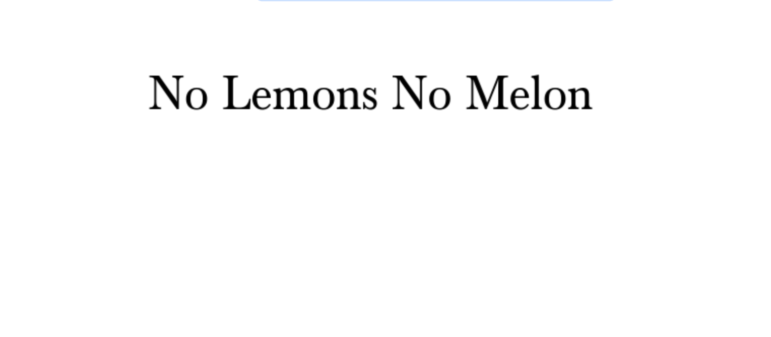
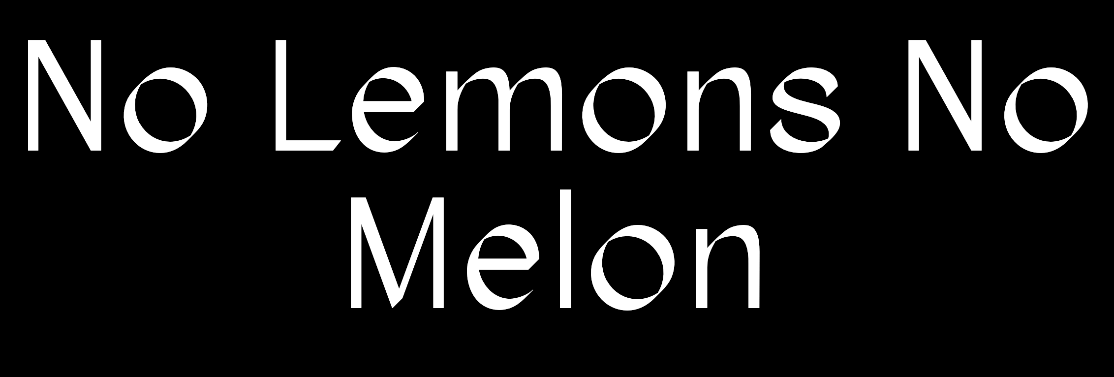
Cormorant
This typeface is recognizable by its flow, sharp serifs, and tall accents. Its versatility and scalability make it a great font for logos.
Font Type
Serif, Free
Designed By
Christian Thalmann
Foundry
Catharsis Fonts
Variations
- Nine styles
- Roman
- Italic
- Infant
- Infant Italic
- Garamond
- Garamond Italic
- Upright Cursive
- Small Caps
- Unicase
- Each style comes in five weights
Recommended For
Scalability, brands that want a classic look that doesn’t sacrifice visual appeal.
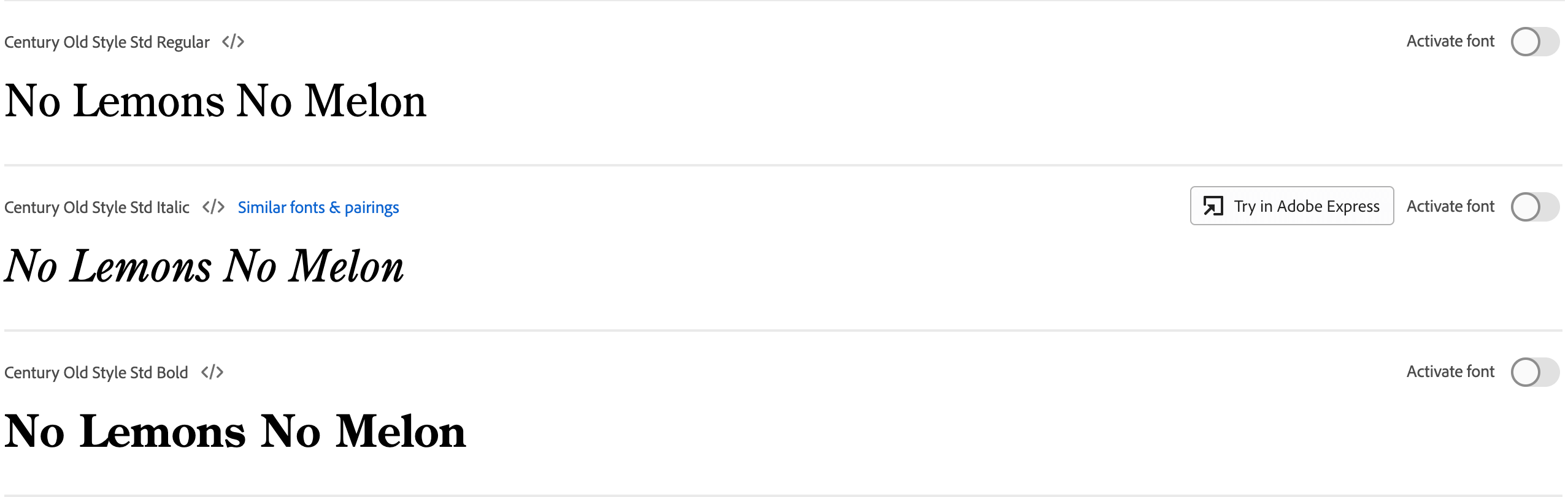
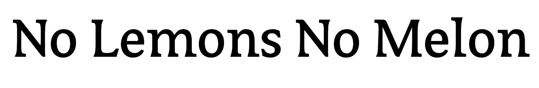
Century
Century was designed by a father-son duo at the turn of the 20th century. Its readability and versatility have ensured that it stays widely used today.
Font Type
Serif, Free
Designed By
Linn Boyd Benton and Morris Fuller Benton
Recommended For
Corporate settings, newspapers and magazines.
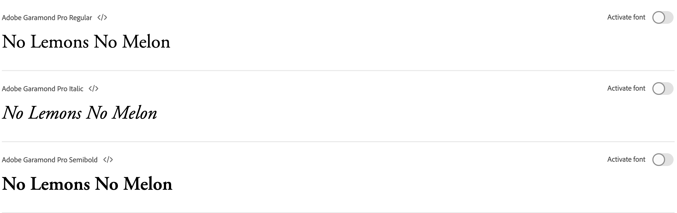
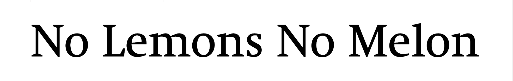
Garamond
Like Century, Garamond is another corporate classic designed by the Bentons. Its lines are heavier than Century’s and the letters are further apart. This makes the font easy to read and scale for a variety of needs.
Font Type
Serif, Paid
Designed By
Linn Boyd Benton and Morris Fuller Benton
Recommended For
Publishing, scalable for headlines and body text.
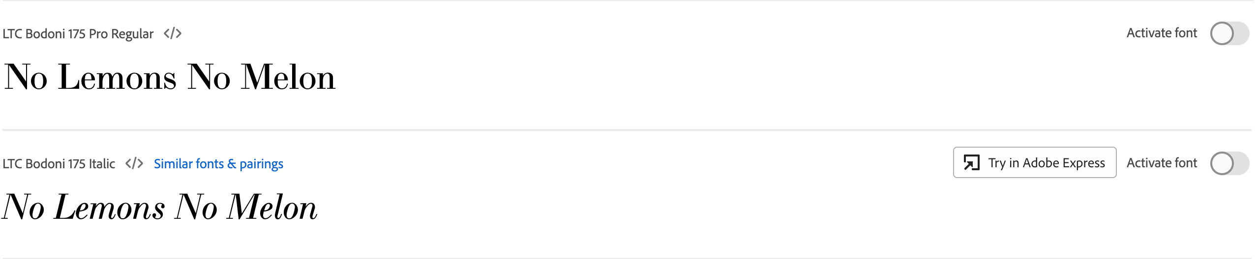
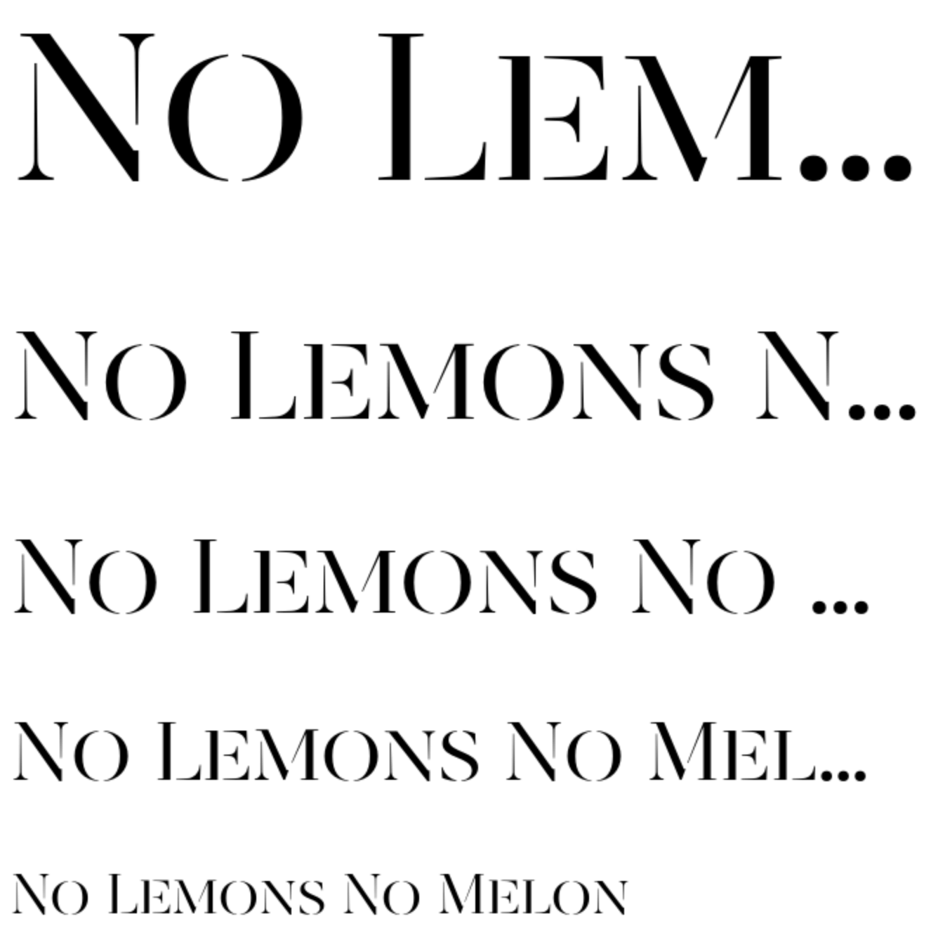
Bodoni
Bodoni is an old font. It was designed in 1800, but remains a timeless serif typeface that gives the brands that use it an air of sophistication and authority.
Font Type
Serif, Free
Designed By
Giambattista Bodoni
Recommended For
Fashion brands and other brands that want to exude a classic, authoritative style.
Recoleta
This 1970s-inspired font combines soft lines and angled strokes to create a typeface with a groovy personality.
Font Type
Serif, Paid
Designed By
Jorge Cisterna
Foundry
Latinotype
Variations
Available in a variety of styles and weights
Recommended For
Brands with a groovy, retro feel
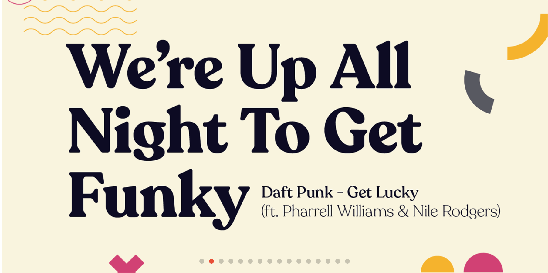
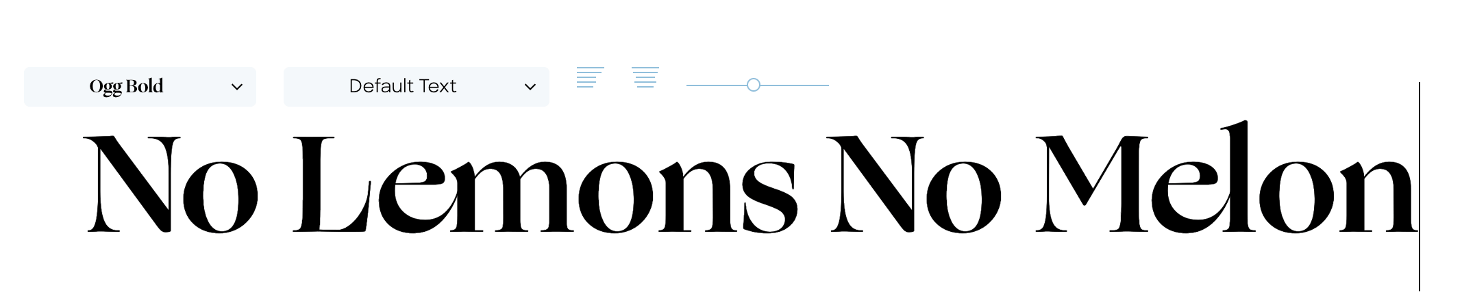
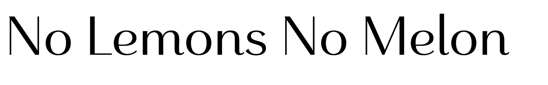
Ogg
Ogg is inspired by and named after 20th century hand lettering artist Oscar Ogg. Details like the interconnected letterforms make it a stand-out modern logo font.
Font Type
Calligraphic Sans Serif, Paid
Designed By
Lucas Sharp
Foundry
Village
Variations
Available in five weights with an italic version of each. Ogg Text is useful for body text and long form copy.
Recommended For
Companies with an expressive, luxurious brand personality.
GT Super
GT Super was released in 2018, but it takes inspiration from typefaces used for newspapers in the 1970s and 80s. Its sharp serifs and varied stroke widths make it an expressive font for logos and headings.
Font Type
Serif, Paid
Designed By
Noël Leu
Foundry
Grilli Type
Variations
- Text and display versions
- Each version has five weights
- Each weight has an italics version
Recommended For
Brands with a retro aesthetic and logos that need to look good in print and digital alike.
Baskerville
Baskerville is another old typeface, designed to be cut into metal in the 1750s. At the time, it was a contemporary twist on old-style typefaces. It has stood the test of time and continues to be used in graphic design today.
Font Type
Serif, Free
Designed By
John Baskerville
Foundry
Cufon Fonts
Recommended For
Book design, brands with a classic, authoritative feel.
FF Avance
This unique font's asymmetrical serifs give it the appearance of movement in a way that few other typefaces can.
Font Type
Asymmetrical Serif, Paid
Designed By
Evert Bloemsma
Variations
Available in eight variations
- Bold
- Bold Italic
- Regular
- Regular Italic
- Bold Italic SC
- Bold SC
- Regular Italic SC
- Regular SC
Recommended For
Sport, transport, and other motion-based industries.
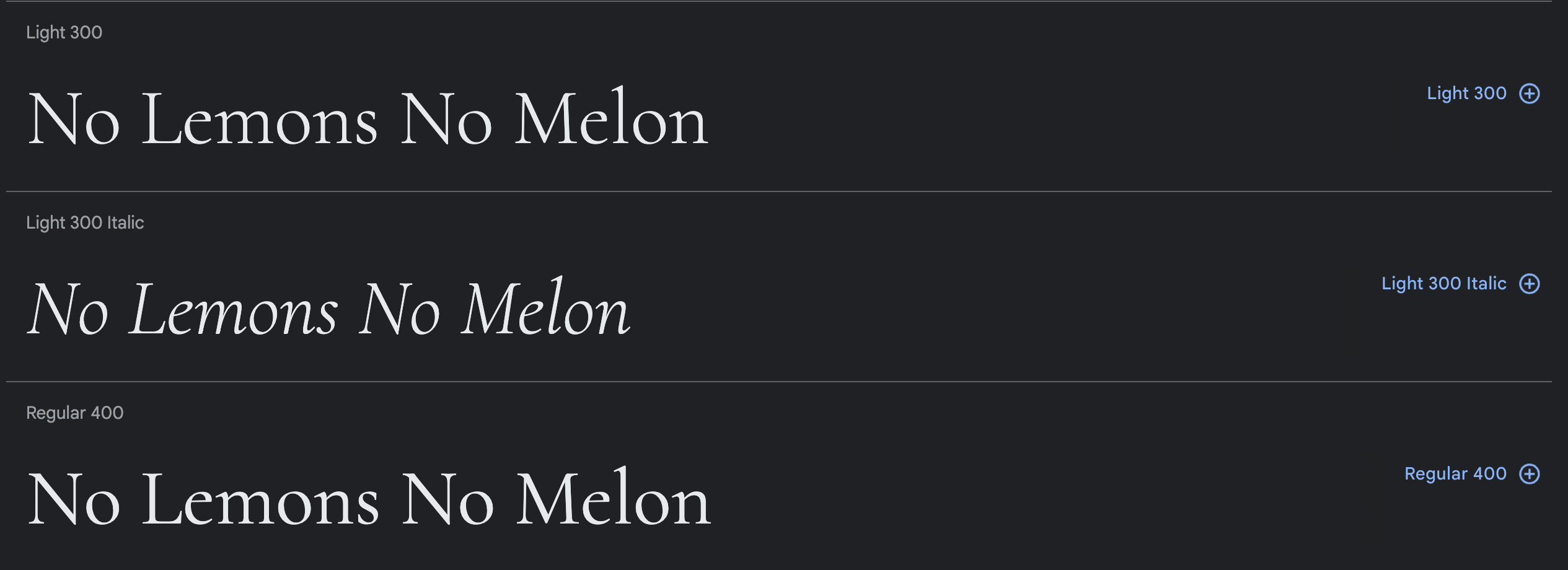
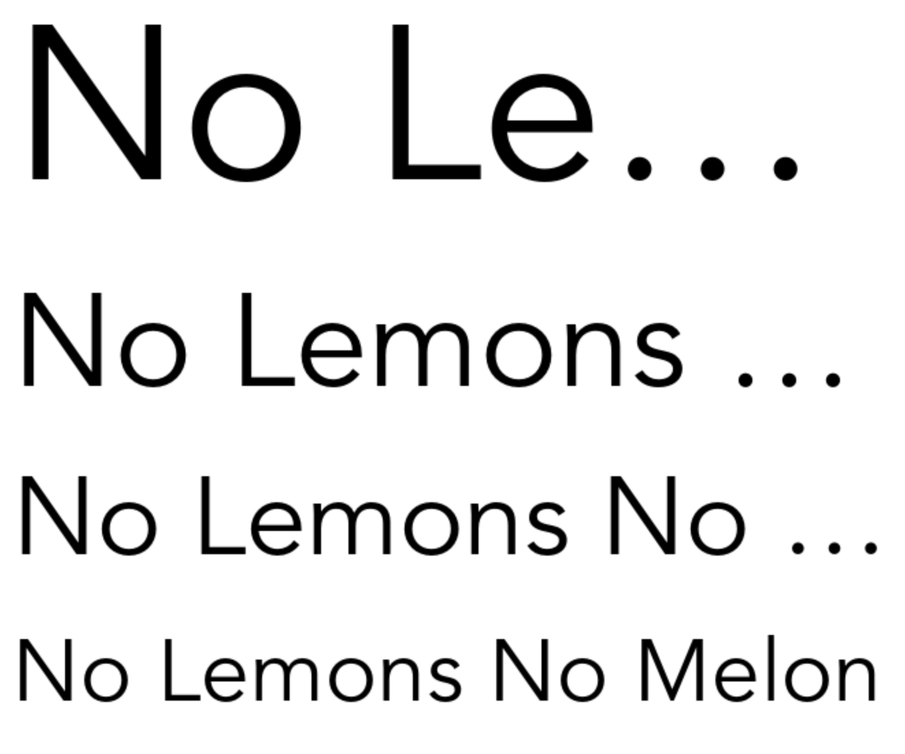
Neue Swift
Neue Swift was designed to emphasize the separations between words and lines to make text easier to read. This makes it a great choice for a secondary font in a logo where space is limited.
Font Type
Serif, Paid
Designed By
Gerard Unger
Variations
Available in twelve typefaces:
- Light
- Light Italic
- Regular
- Italic
- Book
- Book Italic
- Semi Bold
- Semi Bold Italic
- Bold
- Bold Italic
- Condensed Black
- Condensed Black Italic
Recommended For
Brands in the financial, health, and nonprofit industries
Revista Stencil
Revista Stencil combines the timeless style of a classic serif font with the rustic artistry of a stencil font.
Font Type
Stencil Display Font, Paid
Designed By
Daniel Hernández, Paula Nazal Selaive, and Marcelo Quiroz
Foundry
Latinotype
Recommended For
Trendsetting brands
The Best Sans Serif Fonts for Logo Design
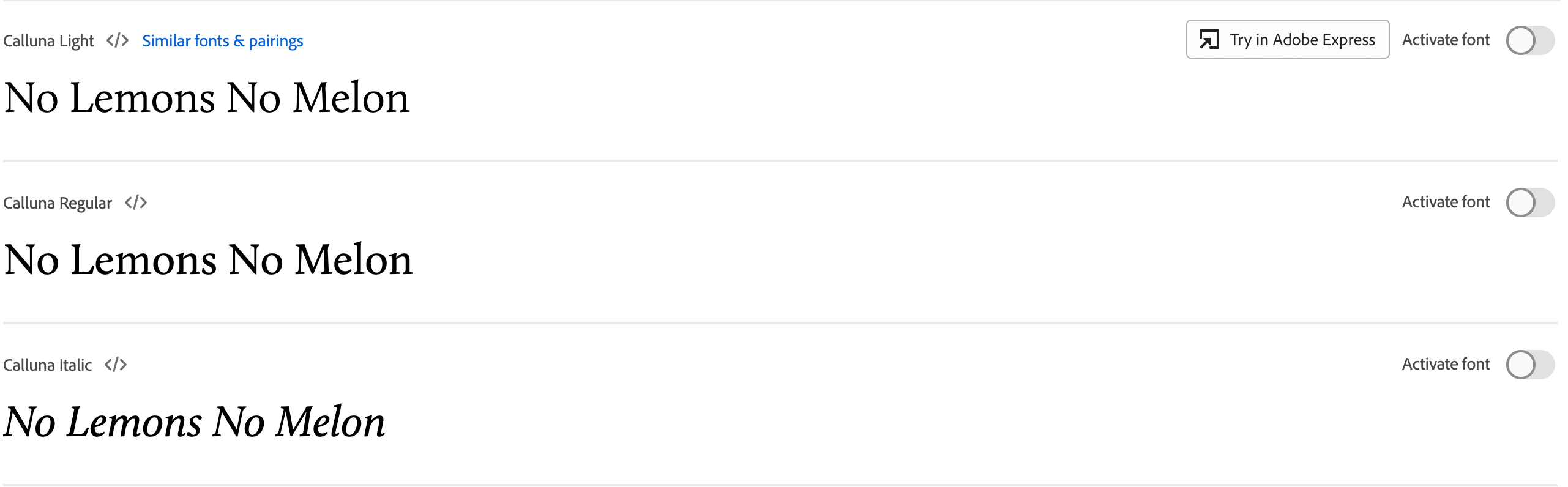
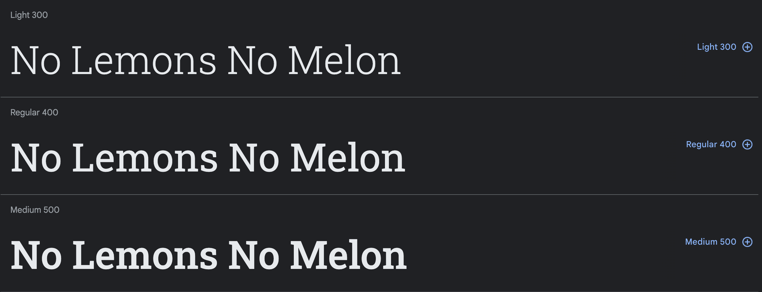
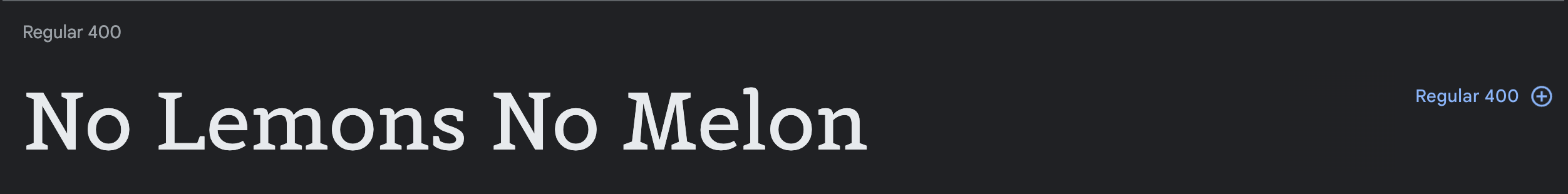
Calluna
The design of Calluna started when designer Jos Buivenga tried out adding slab serifs to his Museo font. The results were this crisp font that draws the eyes to the top right corner of each glyph.
Font Type
Slab Serif, Free
Designed By
Jos Buivenga
Variations
Available in eight styles.
Recommended For
A crisp, clean aesthetic.
Futura
Futura is one of the classics for a reason. It may have been released in 1927, but its versatility makes it a great font for web design as well as print. Its minimalist design is made of geometric shapes, straight lines that are almost even in weight, and very few curves
Font Type
Sans Serif, Paid
Designed By
Paul Renner
Foundry
Bauer Foundry
Variations
Available in a variety of weights, styles, and widths
Recommended For
Bold, no-frills brands. Commonly used for clothing companies
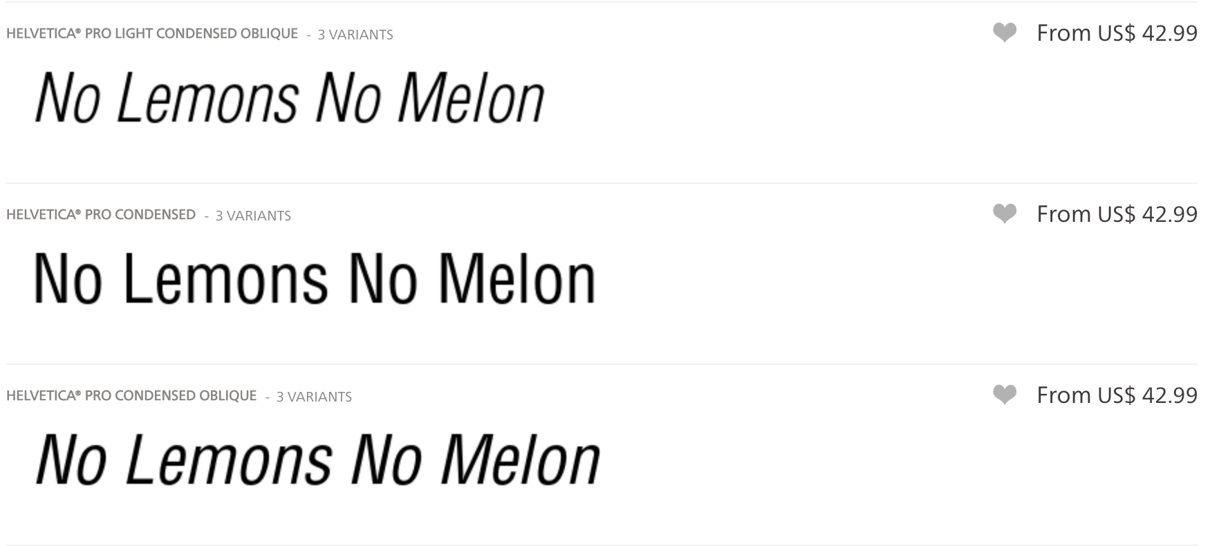
Helvetica
If you know fonts, you know Helvetica. Since its release in the 1950s, this king of the sans serif typefaces has been the perfect logo font for companies all over the world.
Font Type
Sans Serif, Paid
Designed By
Eduard Hoffmann and Max Miedinger
Recommended For
Understated logos that need to look good in a variety of settings
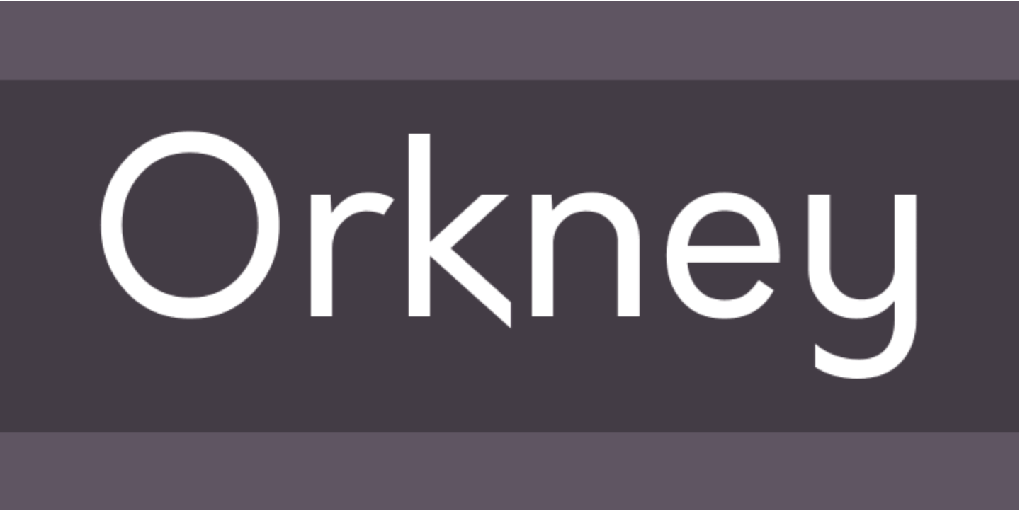
Orkney
Orkney is a unique, yet functional geometric typeface that can look good and clean in a almost any print or screen project.
Font Type
Geometric Sans Serif, Paid
Designed By
Samuel Oakes, Alfredo Pradil, and Cristiano Sobral
Variations
Available in four weights
Recommended For
A sleek look without sacrificing screen and print legibility
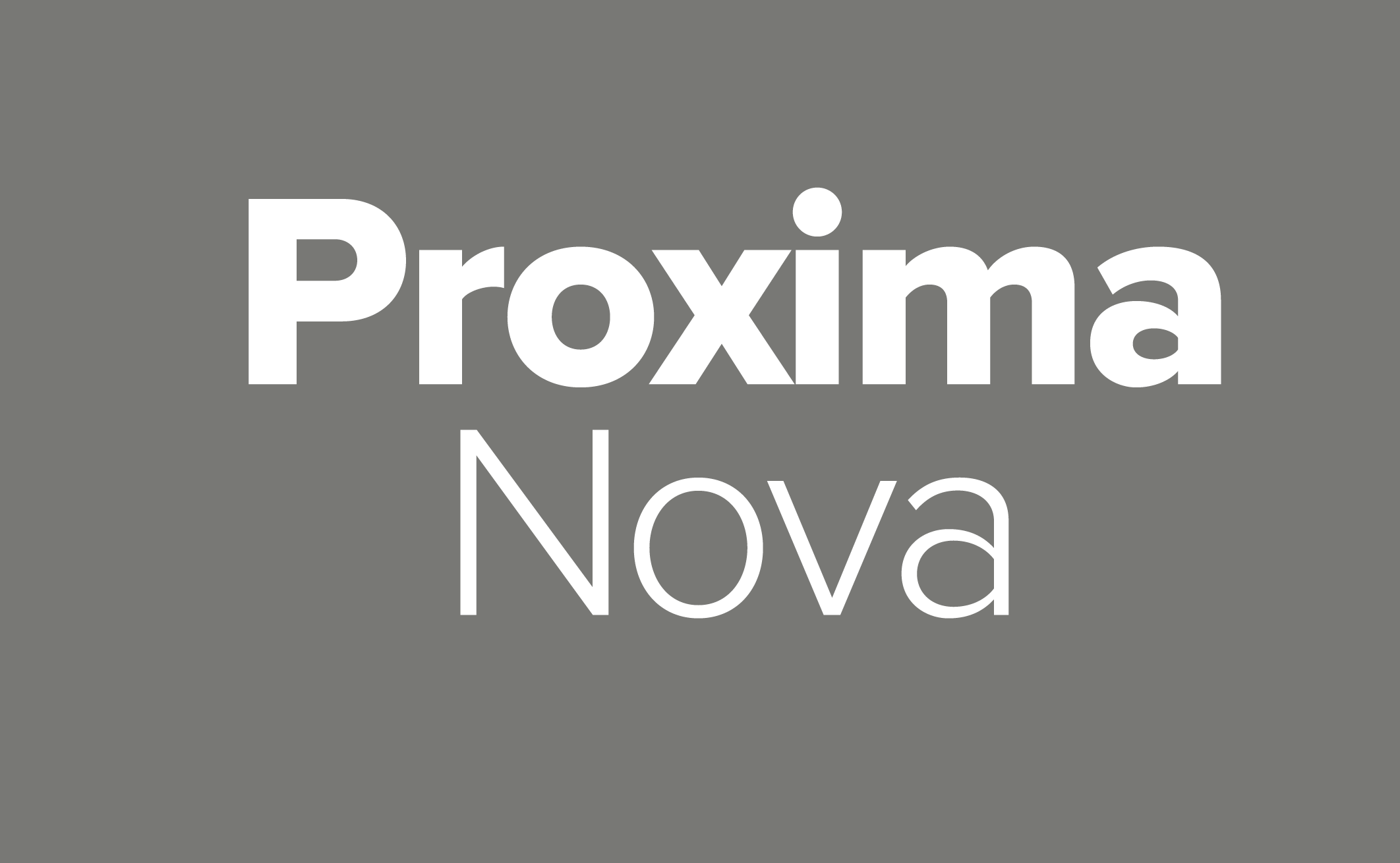
Proxima Nova
Proxima Nova has been especially popular in web design since its 2005 release. Its modern, geometric shapes make it the font of choice for plenty of digital media companies.
Font Type
Sans Serif, Paid
Designed By
Mark Simonson
Variations
- Seven weights
- Three widths
- Italics for each weight
Recommended For
Digital-first media brands going for a clean, sleek look
Avenir
Avenir is a perfect choice for a minimalist logo. It’s classified as a geometric typeface, but it pushes the boundaries of the classification with details like thicker vertical lines in the O. The font was released in 1988 as an update on previous popular sans serif fonts like Futura.
Font Type
Geometric Sans Serif, Paid
Designed By
Adrian Frutiger
Foundry
Linotype
Variations
- Light
- Book
- Roman
- Medium
- Heavy
- Black
Recommended For
A modern, understated look
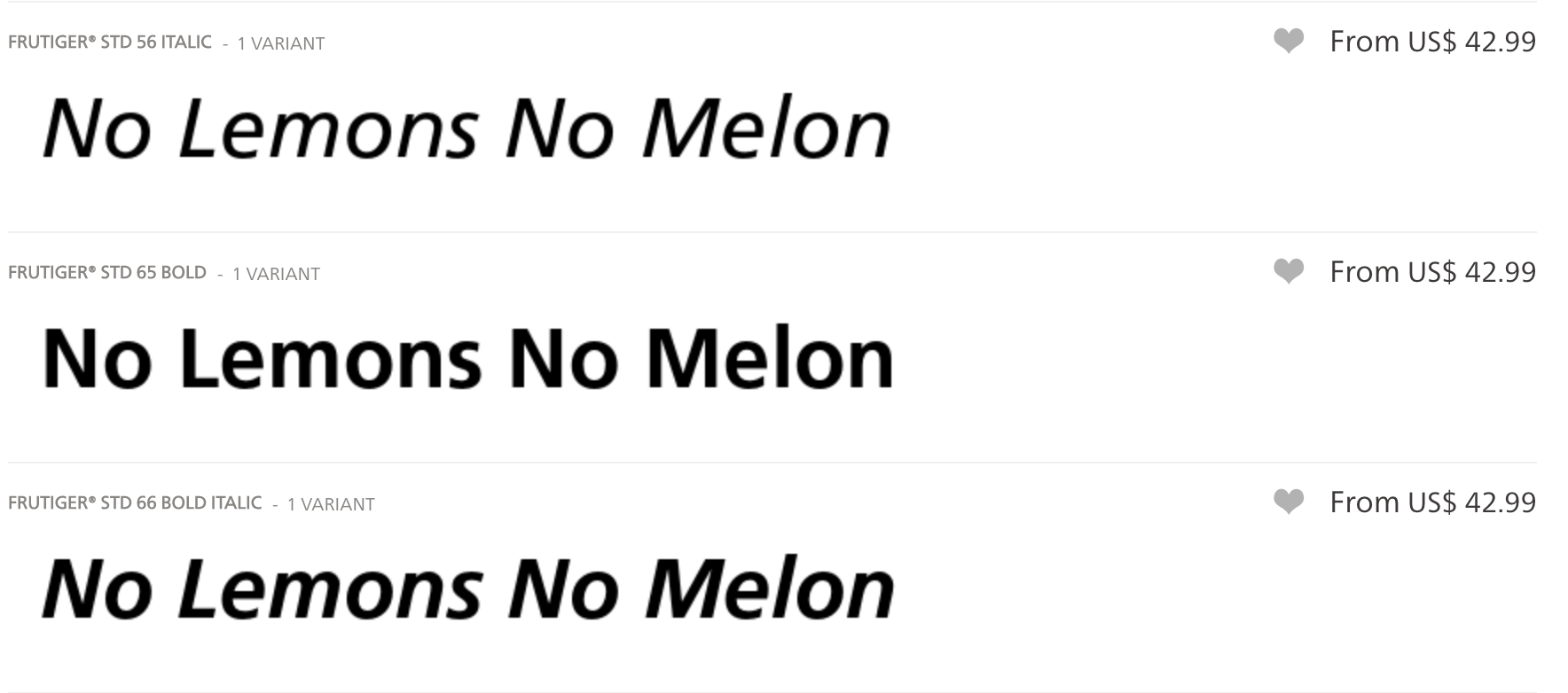
Frutiger
This typeface was designed with versatility in mind. It’s intended to be legible at any size and in any setting. Swiss Passports have used it for their lettering since 1985.
Font Type
Sans Serif, Paid
Designed By
Adrian Frutiger
Foundry
Linotype
Variations
Available in nineteen typefaces
- Light
- Light Italic
- Roman
- Italic
- Bold
- Bold Italic
- Black
- Black Italic
- Ultra Black
- Light Condensed
- Light Condensed Italic
- Condensed
- Condensed Italic
- Bold Condensed
- Bold Condensed Italic
- Black Condensed
- Black Condensed Italic
- Extra Black Condensed
- Extra Black Condensed Italic
Recommended For
Utilitarian brands with scalable logo use needs
Bowlby One SC
Bowlby One SC strives to combine utility and decoration to create the ultimate eye-catching font.
Font Type
All Caps Display Font, Free
Designed By
Vernon Adams
Variations
Also available as a lowercase font
Recommended For
Brands with a rough, ambitious feel
Bebas Neue
Bebas Neue is an extremely popular free font, often known as “the Helvetica of free fonts” by typography experts. Like Helvetica, Bebas Neue is versatile, modern, and uncomplicated.
Font Type
Sans Serif, Free
Designed By
Ryochi Tsunekawa
Foundry
Fontfabric Type Foundry
Variations
Available in five styles
- Thin
- Light
- Book
- Regular
- Bold
Also supports the Cyrilic alphabet
Recommended For
Brands looking for a technically straightforward, yet warm feel
Agentur
Agentur is a contemporary take on a traditional calligraphic style. It can make a great logo for a wide variety of industries and uses.
Font Type
Calligraphic Sans Serif, Paid
Designed By
Kenneth Knutsen
Foundry
Good Type Foundry
Variations
Available in text and display versions
Recommended For
Logos that need to stand out in print and on the web
GT America
GT America is a contemporary take on the crude typeface design style of the early 19th century. It makes a great sans serif logo font for brands looking for a modern spin on a classic look.
Font Type
Sans Serif, Paid
Designed By
Noël Leu
Foundry
Grilli Type
Variations
- Six styles
- Each has seven weights
- Each has six widths
Recommended For
Editorials and publishing
Orelo
The contrast between Orelo’s thin and thick lines make it unique for a sans serif typeface.
Font Type
Variable Sans Serif, Paid
Designed By
Adrien Midzic
Foundry
Pizza Typefaces
Variations
Available in over 100 styles, including a variable font which makes it great for animations.
Recommended For
Digital-first brands
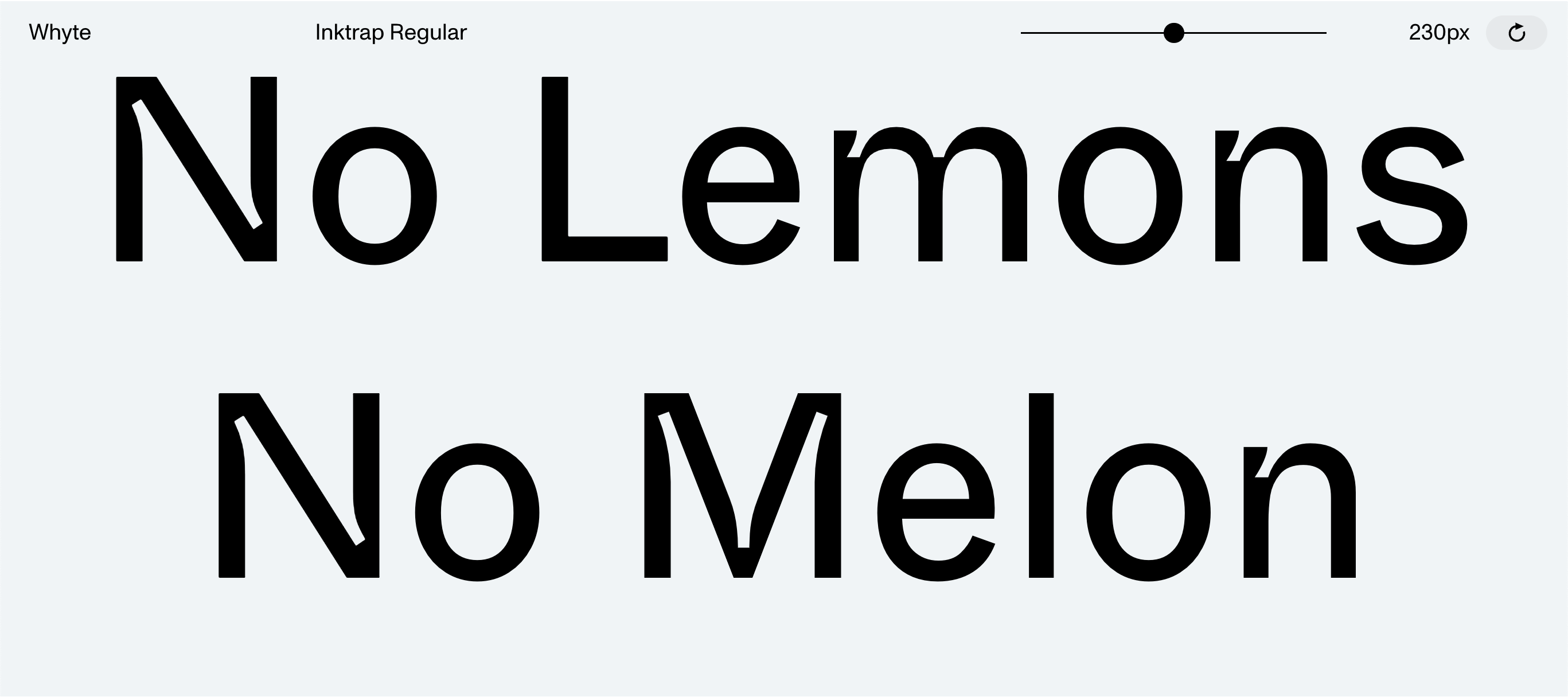
Whyte Inktrap
Whyte Inktrap takes advantage of a feature from typography’s past to create a quirky design. In the past, some letterforms were designed with missing corners that would later fill with ink during printing. These are called ink traps. Though they are no longer necessary today, they sure do look cool!
Font Type
Sans Serif, Paid
Designed By
Johannes Breyer, Fabian Harb, and Erkin Karamemet
Foundry
Dinamo
Variations
Available in ten different weights and italics for each one. They also offer a version without the signature ink traps for body text.
Recommended For
Creative, quirky, and retro brand personalities
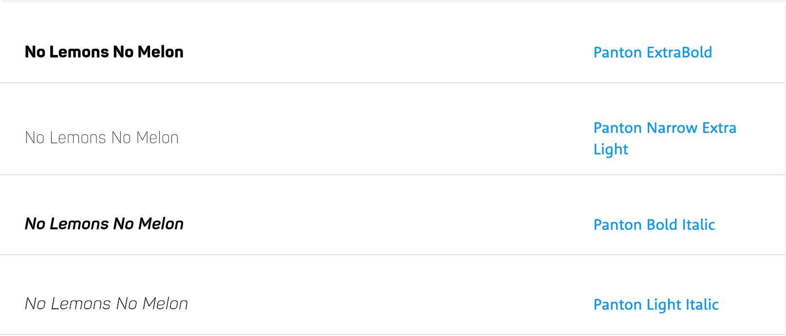
Panton
Designed in 2014, Panton is one of the newer fonts to the game. Its straight lines and rounded edges give it a bold, yet approachable look.
Font Type
Sans Serif, Paid
Designed By
Svet Simov, Ivan Petrov, and Simov Svetoslav
Variations
Available in 34 variations and 36 weights.
Recommended For
Printed merchandise, legibility in all mediums.
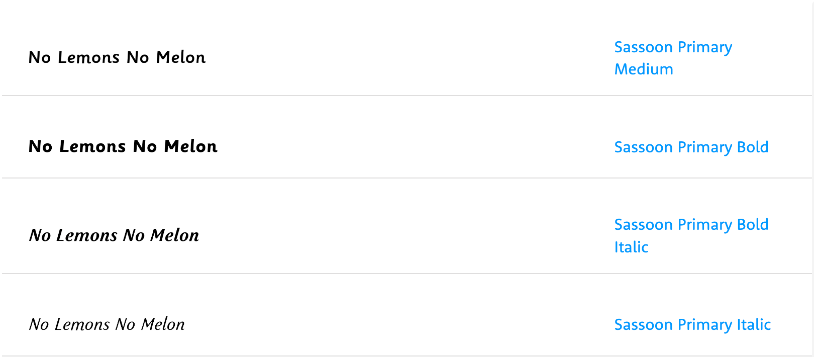
Sassoon
This sans serif typeface was designed in 1995 for use in children’s books. With its curls and swoops, each letter is infused with a childlike wonder.
Font Type
Sans Serif, Paid
Designed By
Rosemary Sassoon
Recommended For
Playful, family-friendly brands
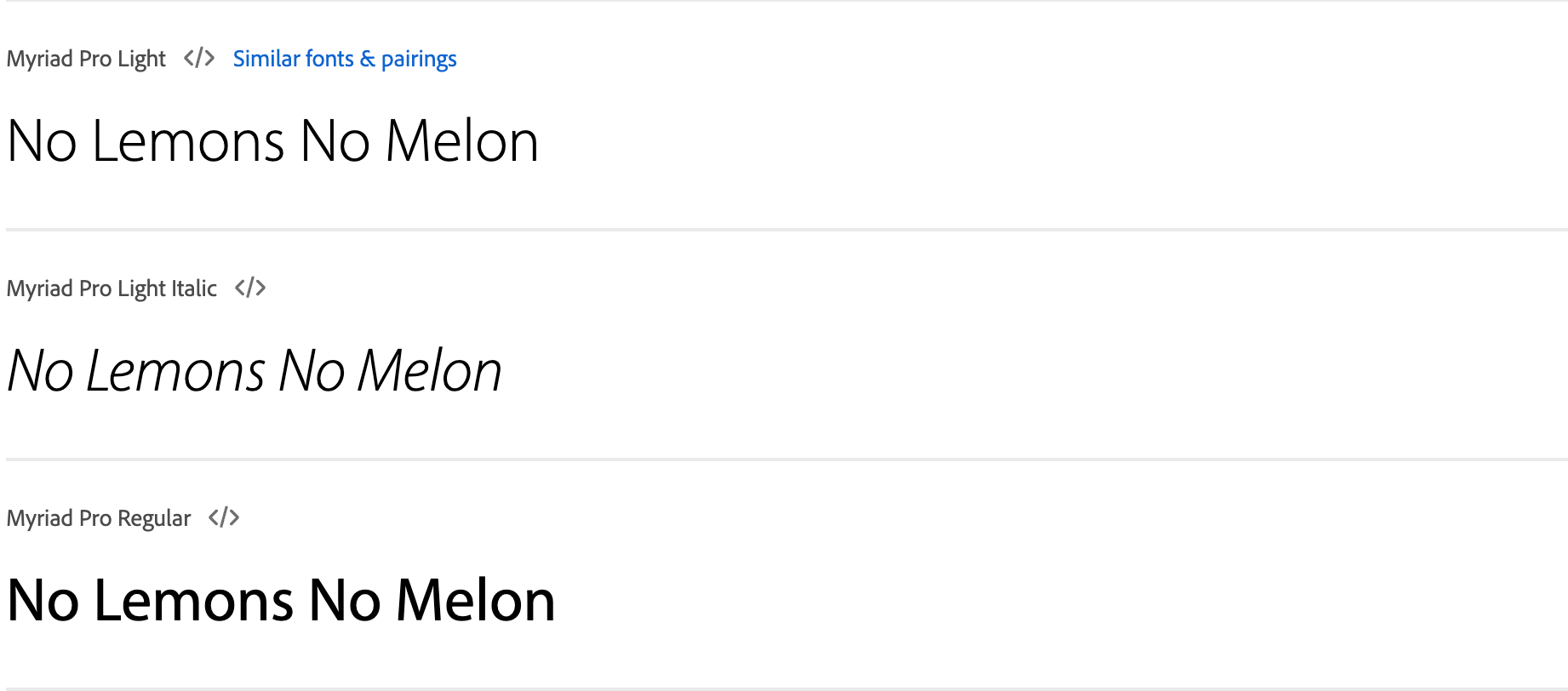
Myriad
Apple may have stopped using Myriad for its logotype in 2017, but it’s still a versatile font perfect for digital branding.
Font Type
Sans Serif, Paid
Designed By
Robert Slimbach and Carol Twombly
Recommended For
Digital branding, a neutral look
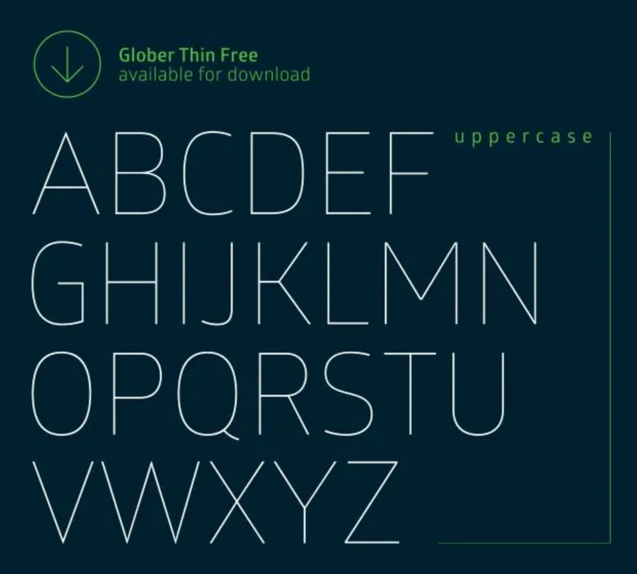
Glober
Glober combines perfect geometric forms with an approachable coziness. It' known for its readability in several languages.
Font Type
Sans Serif, Free and pro versions available
Designed By
Ivan Petrov and Svetoslav Simov
Variations
Available in nine weights, each with a matching italic:
- Thin
- Book
- Regular
- Semi Bold
- Bold
- Extra Bold
- Heavy
- Black
Recommended For
Brands with a technical, trendy feel
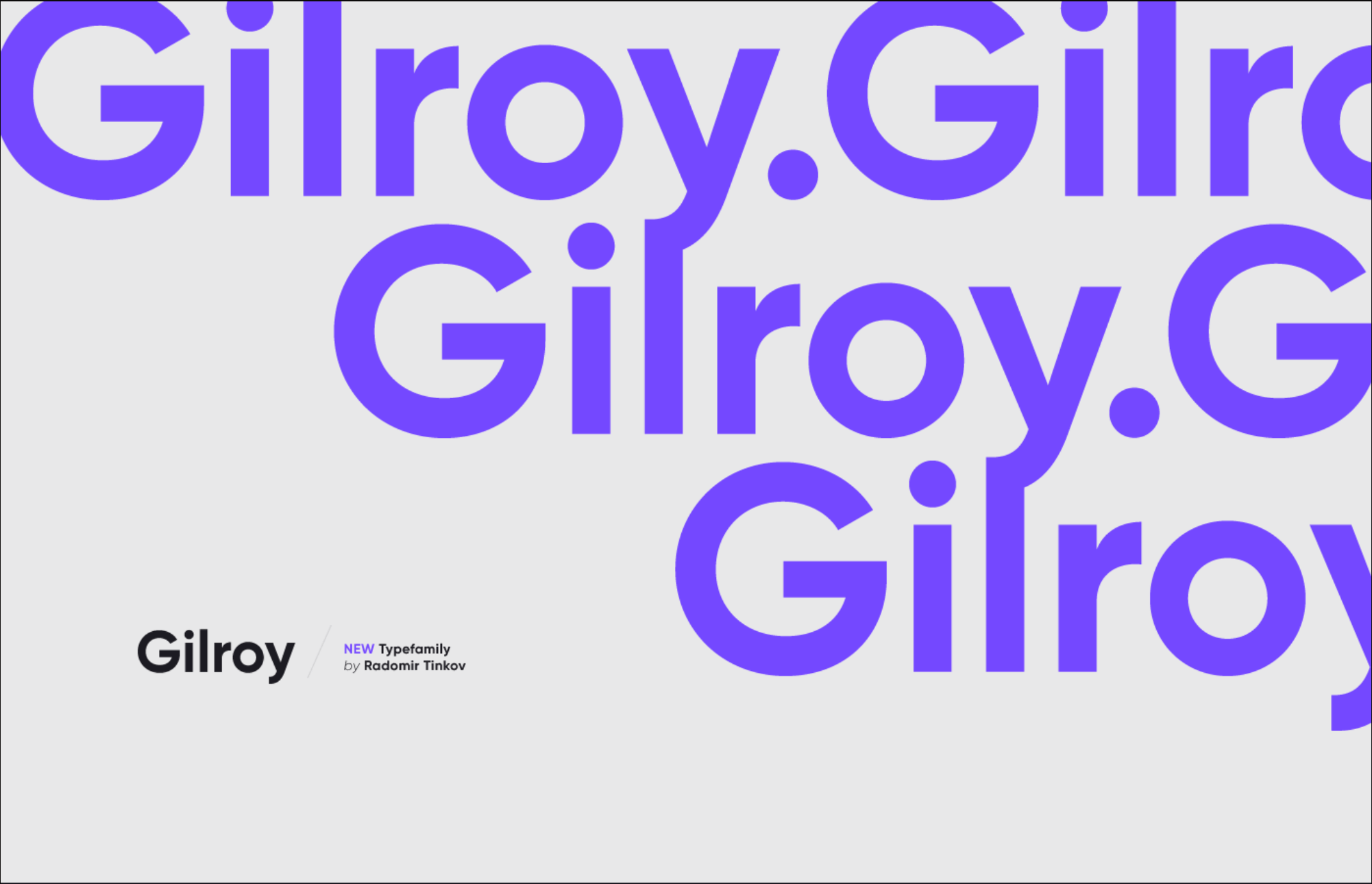
Gilroy
Designed in 2016, this striking, modern font is a new addition to the typography world.
Font Type
All Caps Sans Serif, Free and Pro versions available
Designed By
Radomir Tinkov
Variations
Available in twenty weights. Supports the Cyrilic alphabet.
Recommended For
Companies with a cutting-edge feel, multilingual design
The Best Slab Serif Fonts for Logo Design
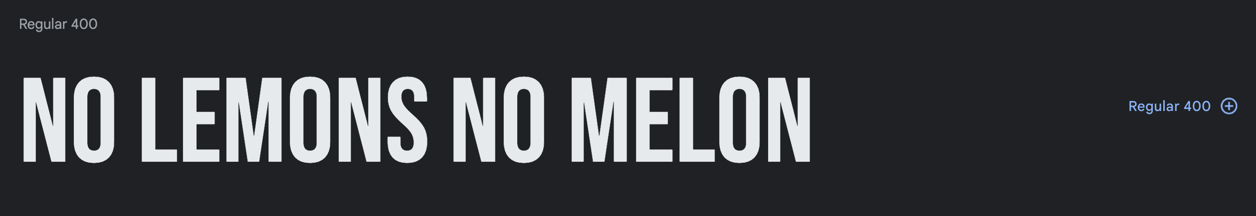
Roboto Slab
Roboto Slab has a softer look than most other slab serif fonts.
Font Type
Slab Serif, Free
Designed By
Christian Robertson
Variations
- Nine weights
- Condensed version
- Supports the Cyrilic and Greek alphabets
Recommended For
Easy font pairings with Roboto and other sans-serif fonts
Belgrano
This slab serif typeface was originally designed for print, but it’s been modified to work better on the web for text of all sizes.
Font Type
Slab Serif, Paid
Designed By
Jorge Cisterna
Foundry
Latinotype
Recommended For
Digital-first brands, can work as a display font and as body text
Grenale
Grenale is a more elegant choice than the average slab serif font. With its thin weights, contrasting strokes, balanced spacing, and geometric shapes, this modern font is the perfect choice for high-end logotypes.
Font Type
Slab Serif, Paid
Designed By
Jeremy Dooley
Recommended For
Modern, high-end brands
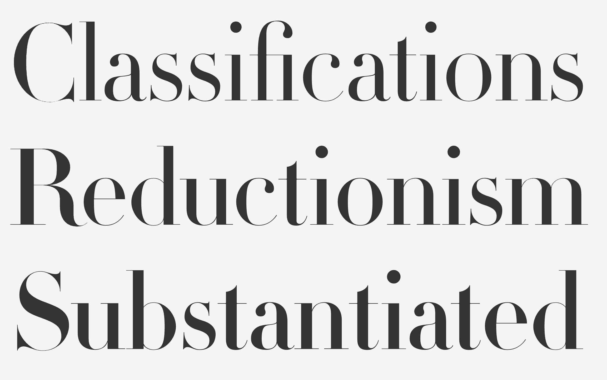
Didot
Didot was designed in 1799 and continues to bring elegance and grace in the fashion industry with its thick lines, thin curves, and squared off serifs.
Font Type
Serif, Paid
Designed By
Firmin Didot
Variations
Available in several weights
Recommended For
Fashion brands and other brands that prioritize an elegant feel
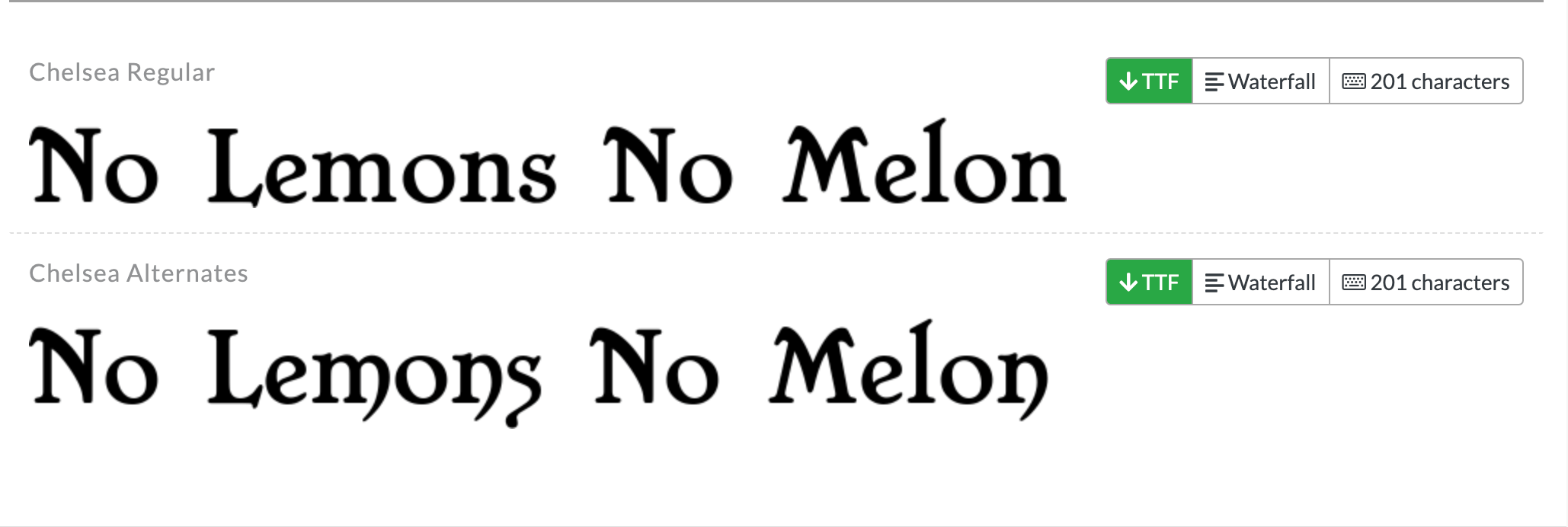
Chelsea
This font may have been created in 2016, but its look is retro and quirky.
Font Type
Slab Serif, Free
Designed By
Nathan Thompson
Recommended For
Retro, quirky brands
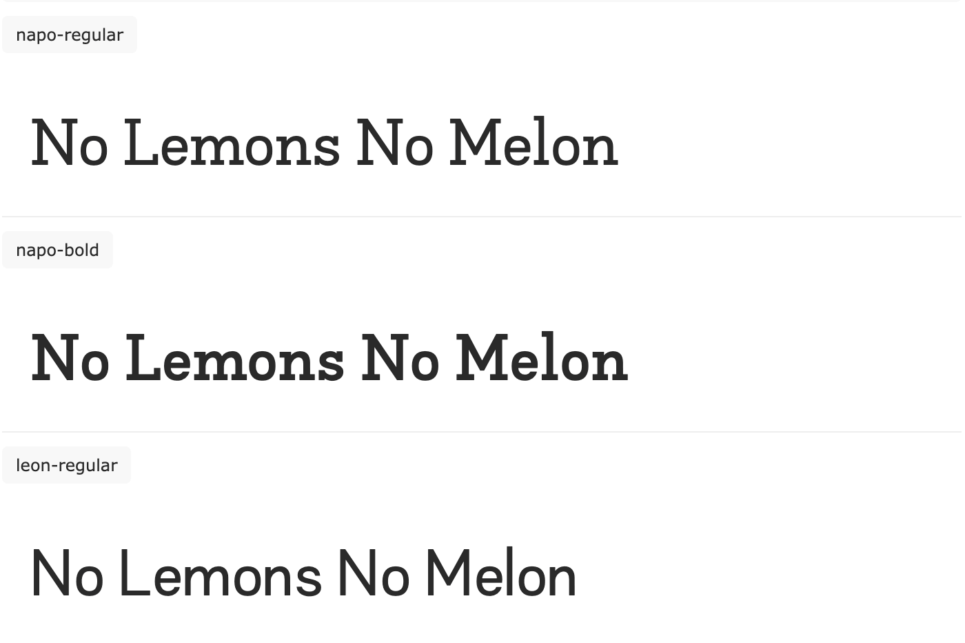
Napo
Isabella Ahmadzadeh created this font as part of her graphic design thesis and its modernity shows!
Font Type
Slab Serif, Paid
Designed By
Isabella Ahmadzadeh
Variations
- Available in display and body copy versions
- Four weights
- Light
- Regular
- Bold
- Extra Bold
Recommended For
Multilingual design, pairing with sans serif fonts
Trocchi
This 2012 font is inspired by a number of classic typefaces from the late 18th and early 19th centuries.
Font Type
Slab Serif, Free
Designed By
Vernon Adams
Recommended For
Logo design, display text, and body text for casual, contemporary brands
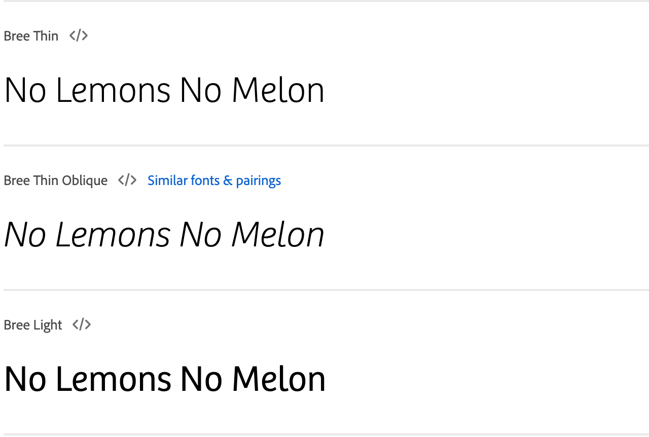
Bree
This 2008 font may not look handwritten, but its strokes and flourishes are inspired by human handwriting, giving it a joyful, spirited feel.
Font Type
Slab Serif, Paid
Designed By
Veronika Burian and José Scaglione
Recommended For
Youthful, outgoing brands in print and digital formats
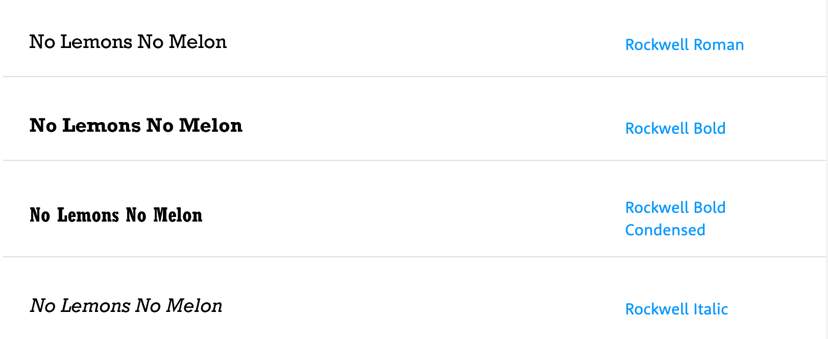
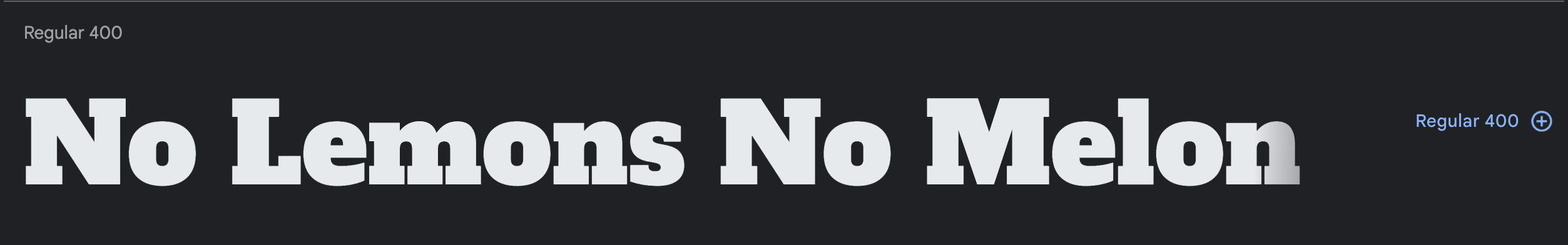
Rockwell
Rockwell’s thick, bold lines make it a better choice for logos and signs than body text.
Font Type
Slab Serif, Free
Designed By
Morris Fuller Benton
Recommended For
Brands that want to express confidence in their logo and signage design
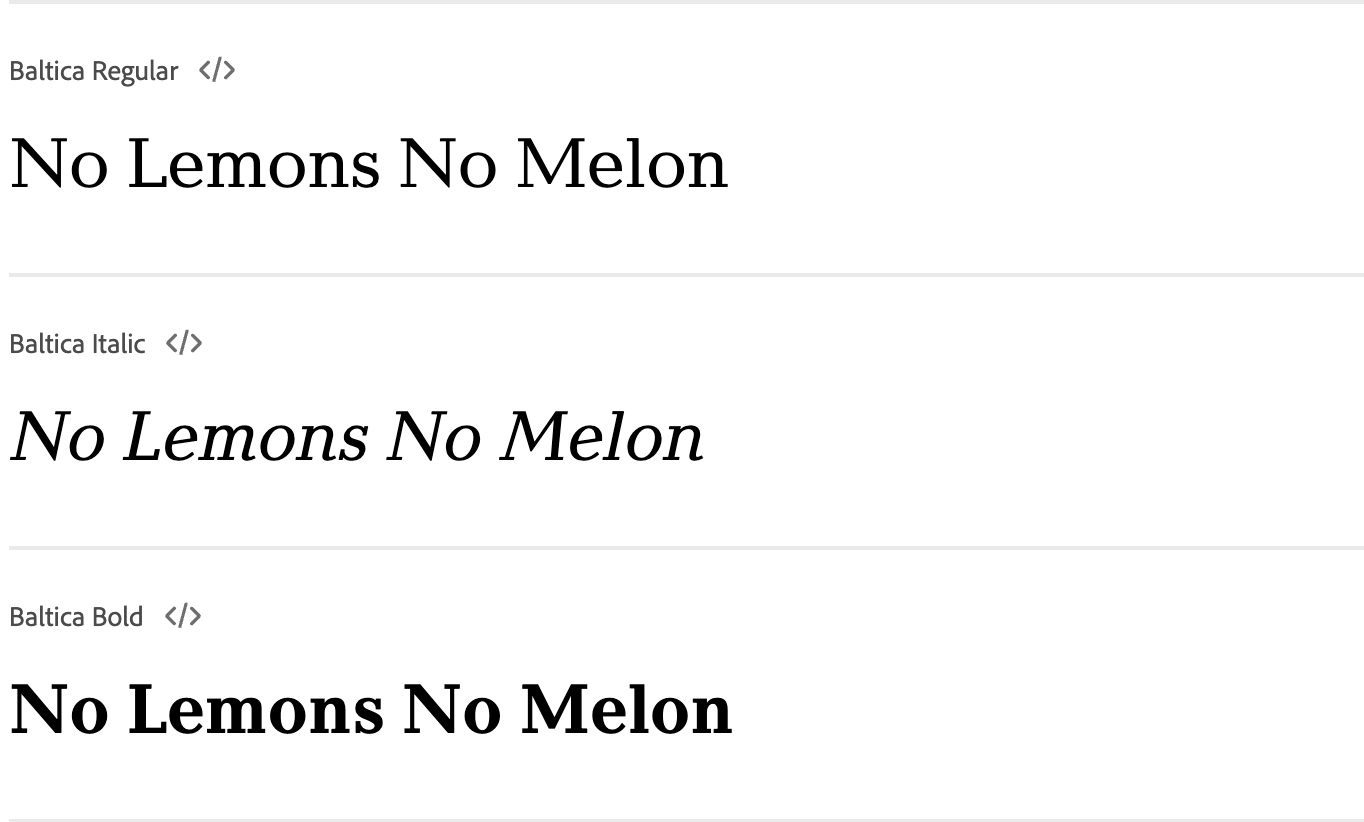
Baltica
The bracketed slab serifs that are a different width than the letterforms give Baltica a more classic look that its slab serif typeface counterparts.
Font Type
Slab Serif, Paid
Designed By
Vera Chiminoca, Isay Slutsker, et al.
Foundry
Polygraphmash Type Design Bureau
Variations
Available in four styles with matching italics
- Book
- Bold
- Extra Bold
- ExtraCond
Supports the Greek and Cyrilic alphabets
Recommended For
Brands that want to communicate tradition and authority
Alfa Slab One
Alfa Slab One is a more contemporary, heavier take on Six-Lines Pica Egyptian, a typeface created by Robert Thorne in 1821.
Font Type
Slab Serif, Free
Designed By
JM Solé
Recommended For
Creating contrast between your logo and other body text
The Best Script Fonts for Logo Design
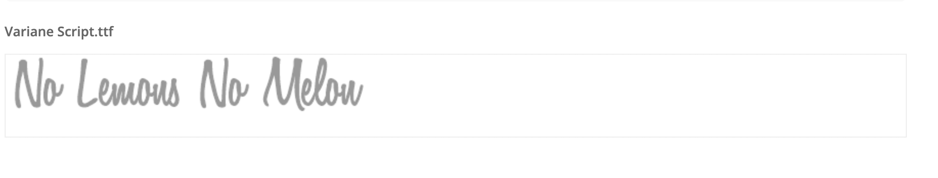
Variane Script
Variane Script is a clean, legible handwritten font. It looks chic in a variety of settings.
Font Type
Handwritten Script, Paid
Designed By
Boy Moch Tomi
Recommended For
Chic, elegant logos, printing on branded merchandise
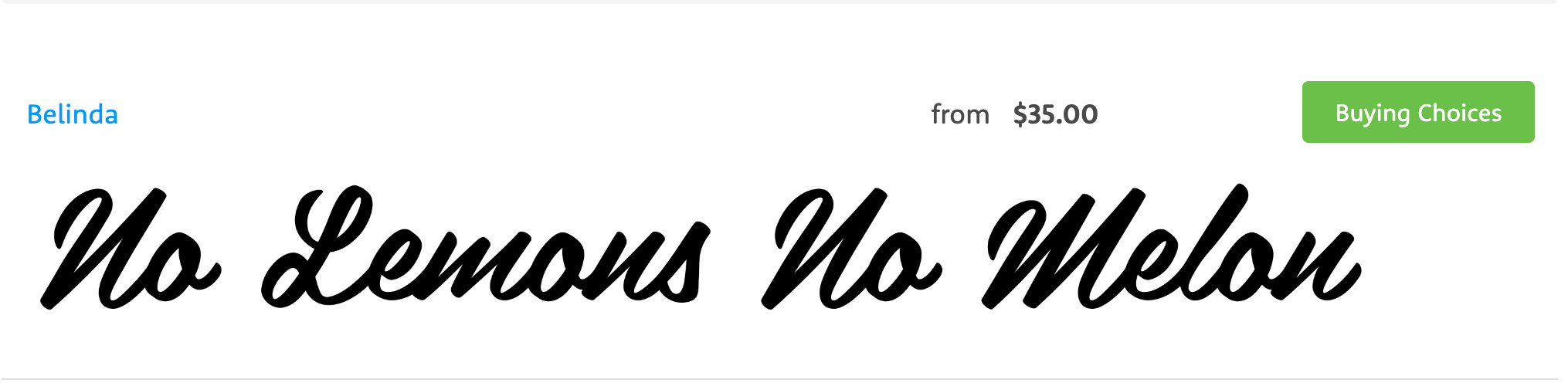
Belinda
Belinda script is an elegant brush script that doesn’t overdo it.
Font Type
Brush Script, Paid
Designed By
Mika Melvas
Recommended For
Brands with a sophisticated aesthetic, print settings
Grand Hotel
Grand Hotel’s upright, meticulous cursive lettering was inspired by the 1937 film Cafe Metropole. Its old film quality makes it a great fit for logos that want to emulate that feeling.
Font Type
Script, Free
Designed By
Brian J. Bonislawsky and Jim Lyles
Recommended For
Bakeries, hotels, and other businesses with a vintage flair
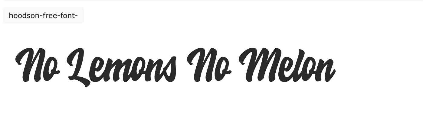
Hoodson Script
Hoodson Script is bouncy, retro, and straight up fun! It makes a great statement font for logos, posters, packaging, and more.
Font Type
Brush Script, Free
Designed By
Hendra Maulia
Recommended For
Logos, posters, and packaging for brands with a playful feel
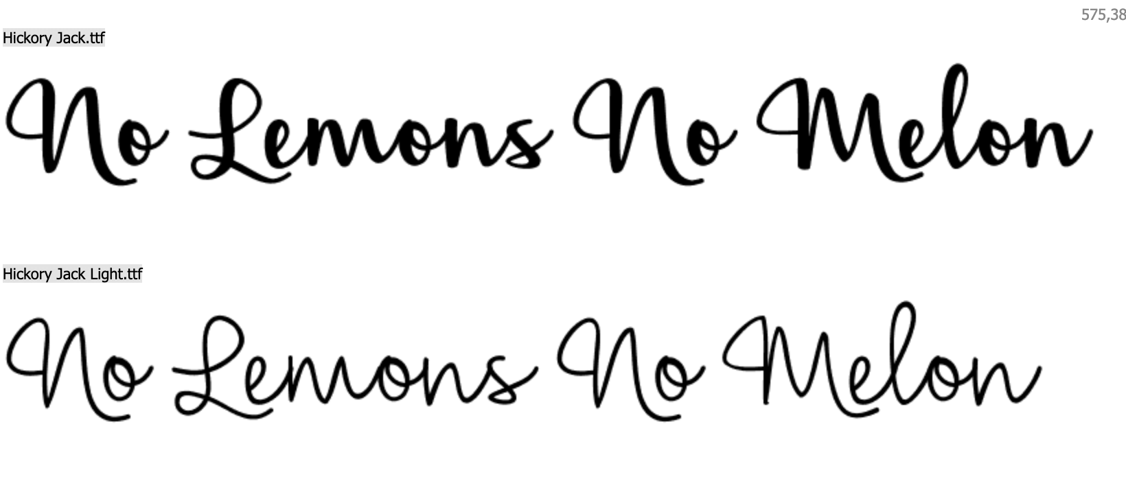
Hickory Jack
Hickory Jack is a script font that isn’t trying too hard. It’s understated and easy to read while still looking interesting.
Font Type
Handwritten Script, Free
Designed By
Brittney Murphy
Variations
Available in display and text variations
Recommended For
Brands with a casual, understated feel
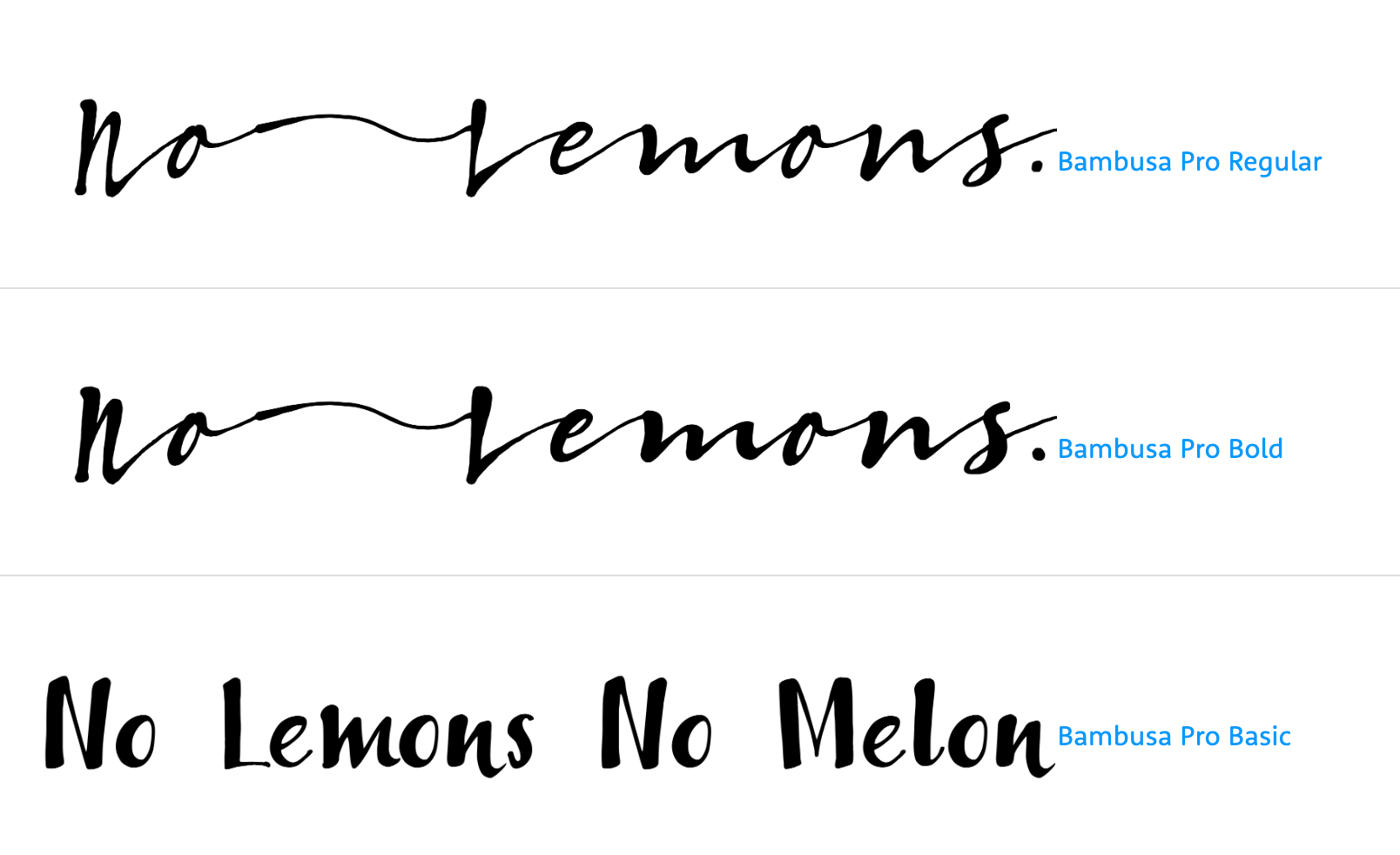
Bambusa Pro
There are handwritten scripts, then there’s this script typeface that actually looks like cursive handwriting without hours of calligraphy training.
Font Type
Handwritten Script, Paid
Designed By
Hanneke Classen
Foundry
Fontforecast
Variations
Available in five styles
- Regular
- Bold
- Basic
- Ornaments
Recommended For
Vintage and natural goods brands
Steak
This new script typeface inspired by 1930s American signage will look right at home in artisanal shops.
Font Type
Brush Script, Paid
Designed By
Alejandro Paul
Foundry
Sudtipos
Recommended For
Hip, vintage-inspired brands
The Best Display Fonts for Logos
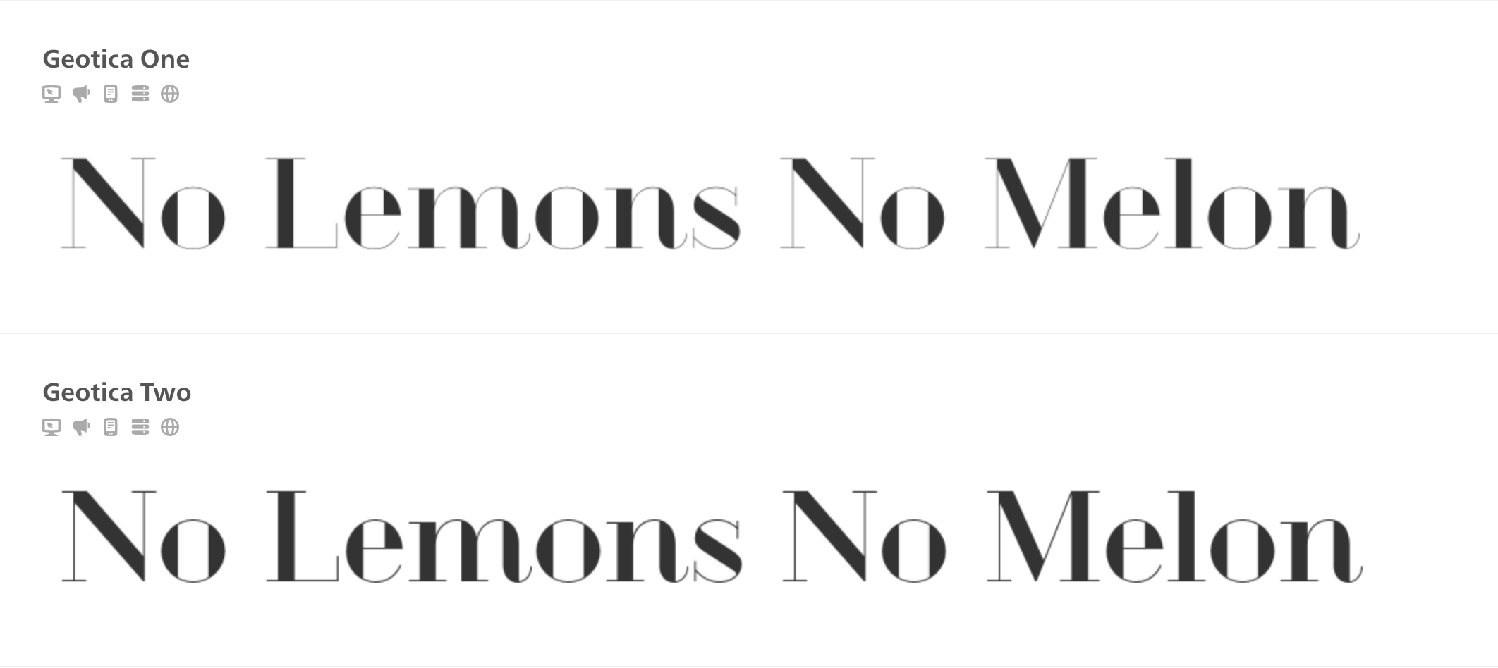
Geotica
This 2010 font is exactly what its name sounds like: geometric and exotic. The wire frames can either be filled or left open, making room for a variety of designs.
Font Type
Geometric Display Font, Free
Designed By
Jos Buivenga
Variations
Available in sixteen styles
Recommended For
Brands with a stylized feel
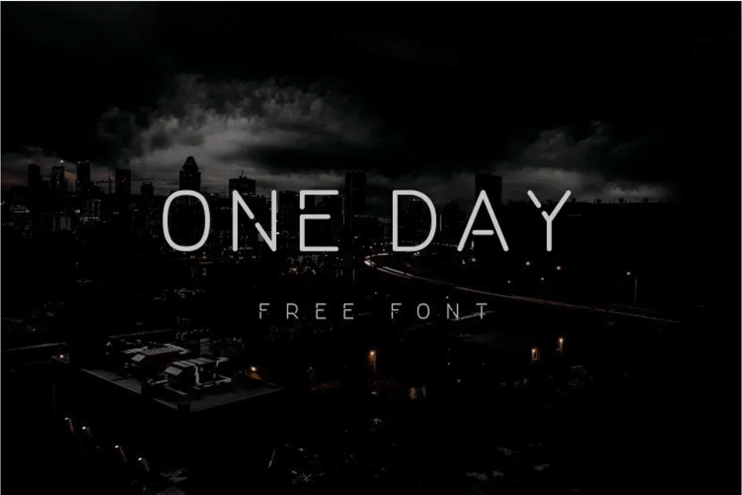
One Day
The broken lines in the middle of the letterforms give One Day an eye-catching, contemporary look that’s great for print, digital media, and logo design alike.
Font Type
All Caps Display Font, Free
Designed By
Nawras Moneer
Recommended For
Versatile brands with digital and print needs
Abril Fatface
Abril Fatface combines the weights associated with slab serifs and the sophistication associated with didones to create an elegant, yet funky experience.
Font Type
Slab Serif Display Font, Paid
Designed By
José Scaglione and Veronika Burian
Recommended For
Elegant headlines for publishing and editorials
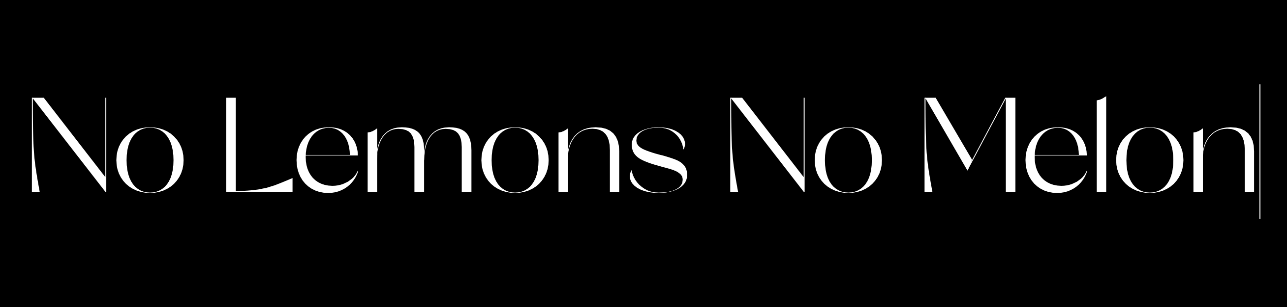
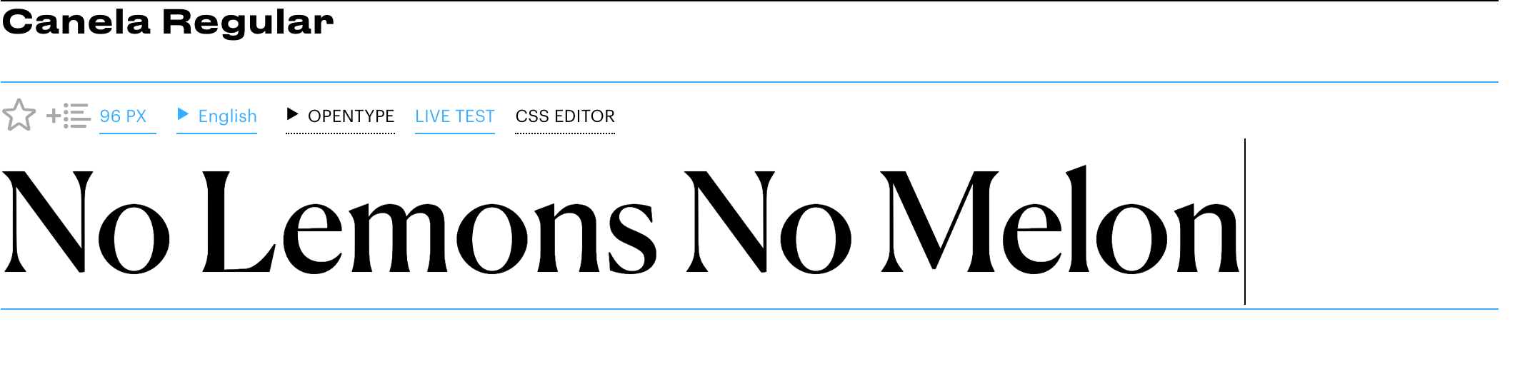
Canela
Canela isn’t quite a serif font, but it isn't quite a sans serif font either. It doesn’t have the little feet that define a serif font, but the contrast between the thicker and thinner lines are more typical of the former than the latter.
Font Type
Display Font, Paid
Designed By
Miguel Reyes
Foundry
Commercial Type
Variations
- Six weights
- Italics for each
- Three styles
- Canela Condensed
- Canela Text
- Canela Deck
Recommended For
Bold, stylish brands that defy classification.
Logo Fonts That Famous Brands Use
Now that you know a little more about the best logo fonts in each font type, let’s take inspiration from the fonts that some iconic brands use for their logos.
PS4: Phatboy Slim
The stylized, futuristic font PlayStation uses in its PS4 logo is instantly recognizable and represents the leap forward in gaming technology that the console brought at the time of its release.
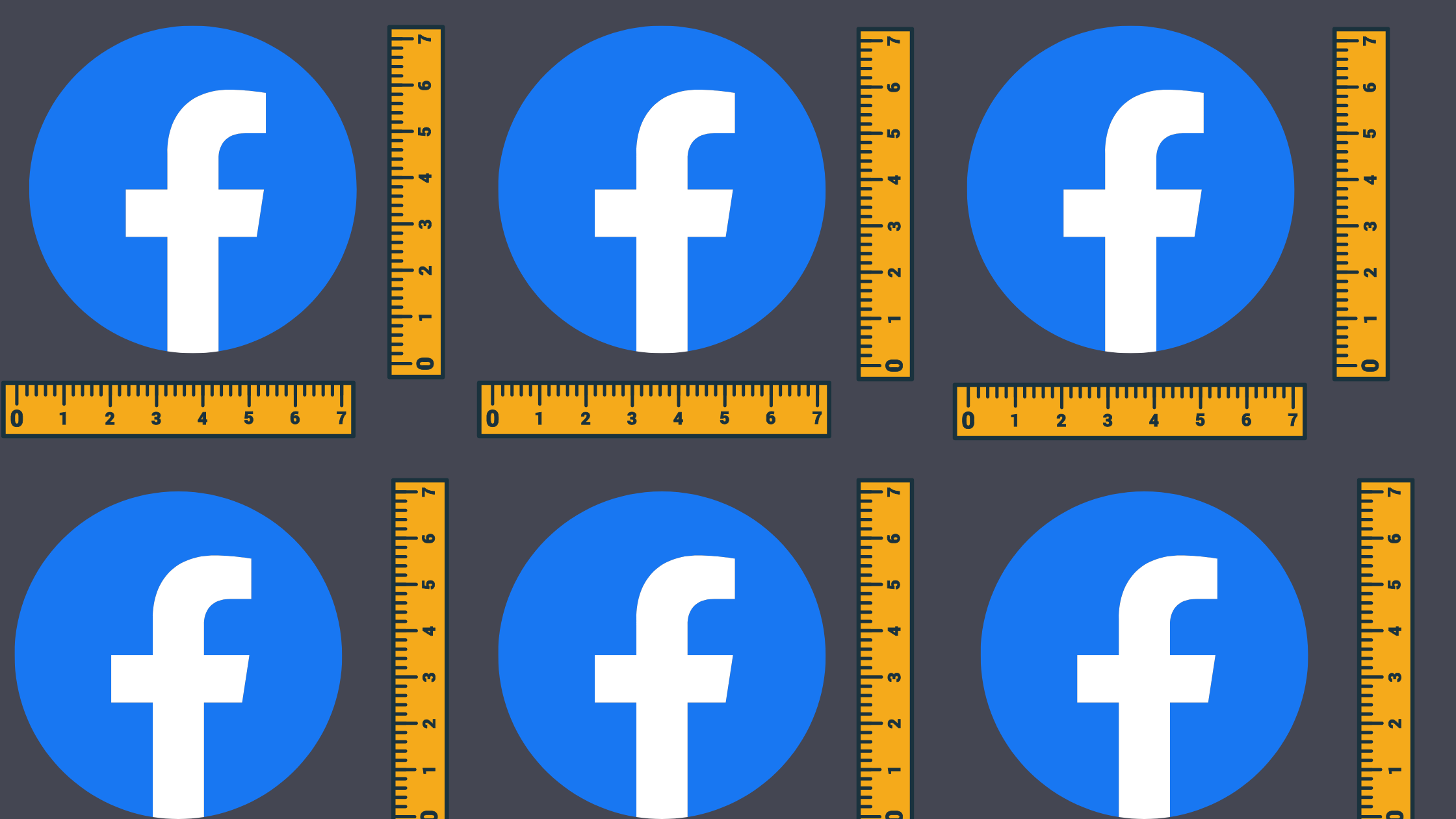
Facebook: Klavica
The Facebook typeface is the Klavica font with a few minor adjustments. The F and A are straighter than the standard font, the C is wider, and the separation in the standard font’s K was eliminated to give it a cleaner look.
Vogue: Bodoni
The classic, distinct look and the flexibility of the Bodoni font make it a great choice for elegant fashion brands. The Vogue logo uses a heavy, wide version of the font.
Coca Cola: Spencerian Script
Spencerian script is common in logos of companies that were founded in the late 19th and early 20th centuries. Ford is another example. The script is elegant and stands the test of time.
The Weather Channel: FF Meta Bold
FF Meta Bold is thicker and more casual than the standard FF Meta typeface. The heaviness of this variation puts more emphasis on the white text against the blue background.
Walmart: Myriad
Myriad is a strong, modern, professional font. Visa, Deloitte, and Rolls-Royce also use it. Walmart used it as part of their modernizing rebrand.
The New York Times: English Towne
This typeface has appeared in The New York Times’ masthead for decades. The highly stylized font gives an air of authority and history.
Nike: Futura Bold Condensed Oblique
The Nike swoosh may stand on its own, but when the brand does use its wordmark, it’s in a specific variation of the Futura font. It’s broad, bold, and tweaked to make it appear slanted.
Tommy Hilfiger: Gill Sans
Gill Sans was designed in the 1920s by Eric Gill. Since then, it’s been a popular choice for big brands that want a timeless, practical look that works no matter how you scale it. Other brands that use it include the BBC, Tag Heuer, and AMD.
Gap: Spire Irregular
The tall, thin capital letters of the Gap logo are so iconic that when they tried to change it in 2010, there was a public outcry that led the company to quickly change it back. The typeface is timeless and sophisticated.
FedEx: Univers Extended
Univers Extended gives a light, clean appearance to the FedEx logo. The wordmark places the letters closer together than the standard typeface so the arrow in the negative space can add a cool touch.
Armani: Didot
Didot is a dramatic, high-contrast serif font with a lot of variations. Like Bodoni, you can find it often in the fashion industry.
Spotify: Proxima Nova
Proxima Nova combines the shapes of classic fonts and the proportions of modern fonts. Its look provides a happy medium between trustworthy traditional fonts and hip, modern fonts.
Intel: Neo Sans
Neo Sans was one of the first typefaces to curve the corners on sans serif lettering. This technique gives it a softer, friendlier look than other sans serif fonts.
Panasonic: Helvetica
Helvetica is one of the most popular fonts in the world. It’s neutral, straightforward, and modern. Other companies that use the font in their logos include:
- Jeep
- Harley Davidson
- Skype
- Target
Free vs. Paid Fonts
Some of the fonts on this list are free and others cost money to use. There are pros and cons of each that go beyond which ones you like and dislike.
Free Fonts
- Don't always come in all weights
- Most don't offer multi-language support
- Narrow range of glyphs
- Good free fonts can be overused
- They might have poor kerning
Paid Fonts
- Various font weights
- Wide range of glyphs
- Higher in quality than free fonts
- No copyright issue if you pay for them
.png?width=1600&name=A%20price%20tag%20with%20three%20dollar%20signs%20on%20it%20(1).png)
How Sav Can Help
Sav is a growing business dedicated to empowering entrepreneurs, startups, and creators to succeed online. Whether you’re buying the perfect custom domain name, choosing the perfect template, perfecting your website, or going live and managing the online presence of your business, we’re with you at every step of building your beautiful website. Start your free trial to get started.