A logo is one of the first things to reflect your brand identity to potential customers. Whether you’re creating a new logo or doing a redesign, take design inspiration from some of the most iconic logos of all time.
Where do Logos Go?
- Website
- Business cards
- In-store
- On products
- Marketing materials
- Social media
- Email signatures
- Merchandise
- Packaging
- Events
- Uniforms
Logo Design Basics
Color Palette
The color palette your logo is about more than aesthetics. The colors you choose send a message to the viewers about your company’s values and can even provoke an emotional reaction. Here are some basic color associations in the United States:
Red
- Speed
- Urgency
- Energy
- Passion
- Elevated Heart Rate
- Sale and clearance signs
Orange
- Optimism
- Happiness
- Aggression
- Action
- Call to Action buttons
Yellow
- Warmth
- Positivity
- Youth
- Optimism
- Attention-grabbing
Green
- Wealth
- Health
- Nature
- Relaxing
- Health and wellness companies
Blue
- Trust
- Security
- Serenity
- Tech and banks
Purple
- Creativity
- Wisdom
- Confidence
- Soothing
- Beauty products
Pink
- Creativity
- Exuberance
- Romance
Brown
- Warmth
- Honesty
- Down-to-Earth
- Vintage goods
Black
- Power
- Luxury
- Modernity
- Frequently used for luxury goods
White
- Minimalism
- Transparency
- Simplicity
- Frequently used in tech
Gray
- Maturity
- Authority
- Rarely used on its own or as a main color
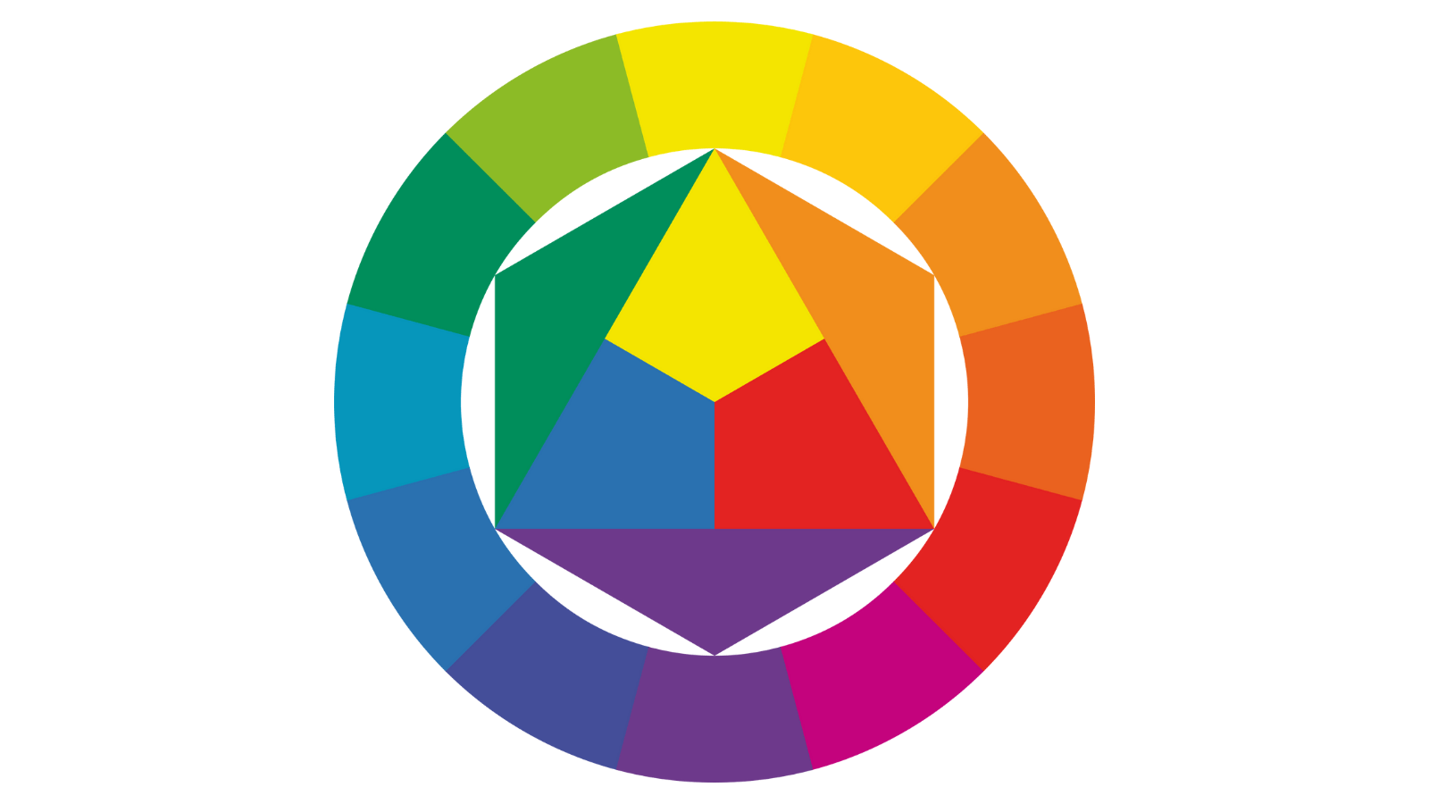
Types of Color Schemes
Most color schemes fall into one of these categories:
Analogous
An analogous color scheme uses colors that are next to each other on the color wheel. If you find the right balance by changing the tints, the results could be vibrant and eye-catching.
Monochromatic
A monochromatic color scheme has one main color in different shades. This is the easiest type of color scheme to create and results in a simple, understated look.
Complementary
A complementary color scheme includes colors that are directly opposite of each other on the color wheel. Complementary colors create a high contrast look, which makes them a great choice for logos that need to be spotted from a distance.
Triadic
A triadic color scheme uses three colors that are 120 degrees apart on the color wheel. The colors form a triangle with each other. Triadic color schemes are balanced and harmonious.
Rectangle/Tetradic
A rectangle or tetradic color scheme uses two pairs of complementary colors that are separated by one or more colors. The arrangement will look like a rectangle on a color wheel.
Typography
Whether your logo includes your brand name, a monogram, or just one letter, the typography you use matters. Fonts affect the look and feel of your logo and send a message about your company.
Serif Lettering
Serif fonts are named for the little feet on the letters. They convey the following traits:
- Classic
- Traditional
- Trustworthy
Time, Vogue, and Tiffany all use Serif fonts.
Sans Serif Fonts
Sans serif fonts don't have the little feet. They convey the following traits:
- Modern
- Clean
- Minimalist
Facebook, Google, Netflix, and Spotify use sans serif fonts.
Slab Serif Fonts
Slab serif fonts have bigger, blockier serifs than standard serif fonts. They convey the following traits:
- Bold
- Quirky
- Confident
Volvo, Sony, and Honda use slab serif fonts.
Script Fonts
Script fonts are written in cursive. They convey the following traits:
- Elegant
- Unique
Johnson and Johnson, Instagram, Cadillac, and Ford use script fonts.
Handwritten Fonts
Handwritten fonts, well, look like handwriting. They convey the following traits:
- Informal
- Artistic
H&M uses a handwritten font.
Decorative Fonts
Fonts that don't fit into any of these categories are called decorative fonts. They convey the following traits:
- Stylized
- Distinctive
- Dramatic
IBM, Disney, and Lego use decorative fonts.
Negative Space
When it comes to graphic design, especially with logos, what you do with the negative space is just as important as the foreground.
Simplicity
When you’re designing a logo, you have limited space to work with and you want to design something that looks good both up close and far away. That’s why a simple logo is usually a better choice than a complicated one with a lot of details.
Meaning
Perhaps the most important logo design element is that it accurately represents your brand and how you want the public to perceive you.
The Best Logo Design Examples
You don’t have to be a huge company with an audience all over the world to take inspiration from the most iconic logos around.
Tech Logos
The tech industry is all about modern logos with sleek design that use a lot of black and white and sans serif lettering.
Apple
The Apple logo, designed by Rob Janoff in 1977, is one of the most recognizable logos of our time. The design is minimalistic and it doesn’t take itself too seriously. There are several urban legends about the inspiration behind the design, but according to Janoff himself the stripes in the original were to show off the computer’s color display capabilities and the bite was so people would easily read it as an apple. It wasn’t intended as a reference to Alan Turing, Adam and Eve, or Isaac Newton.
Microsoft
The Microsoft logo has evolved over the years since it was originally designed in the late 1980s, but one thing has stayed the same: it has to look like a window. The window design was meant to convey the idea that technology opens windows to new opportunities.
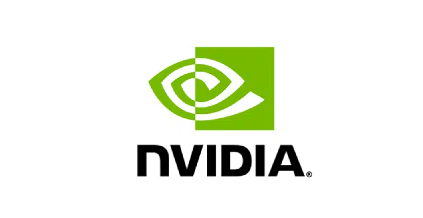
Nvidia
The main design element in Nvidia’s logo is the “all seeing eye” which symbolizes the company’s ongoing search for innovation. They chose the color green to represent success and growth. The composition with the spiral looks cool and alternative.
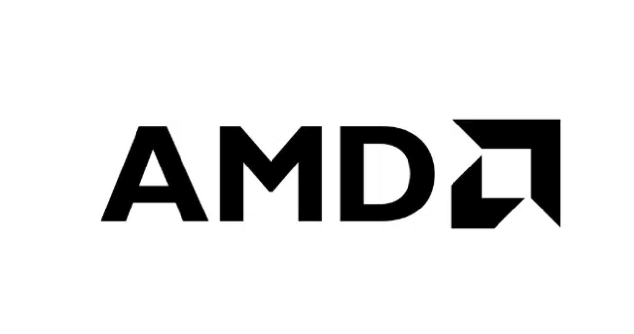
AMD
You’ve probably seen this logo on a sticker on your computer. You wouldn’t guess by looking at it that the logo has been the same for 50 years since the microprocessor company was founded in 1969. The sleek block letters and square arrowheads create a modern, authoritative look.
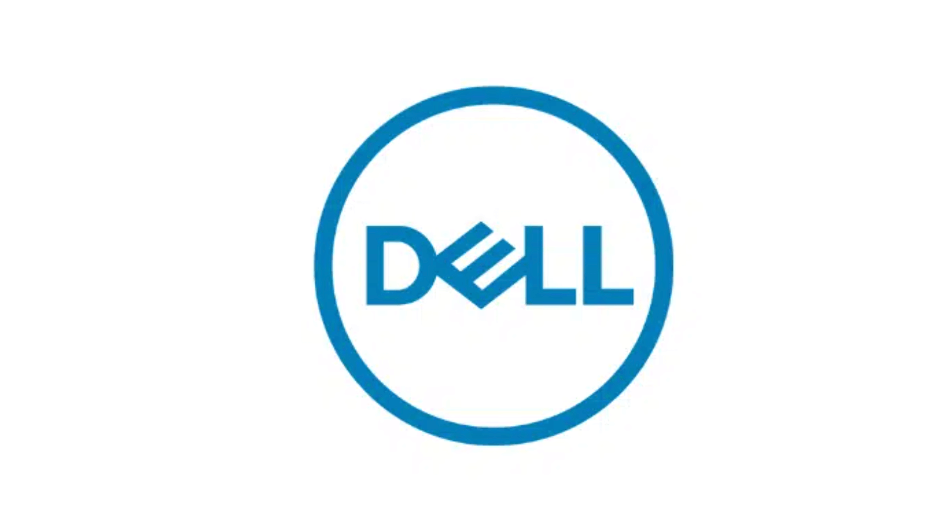
Dell
The Dell logo has had the sideways E that looks like a microchip since the founding of the company. They added the circle in 2010 to promote a global image. Like many tech companies, Dell uses blue to represent trust.
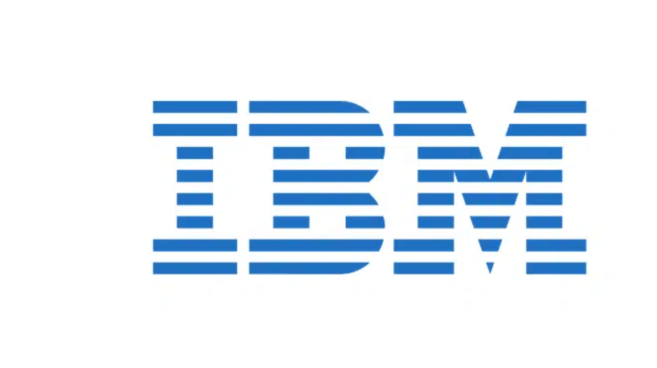
IBM
IBM is a classic tech giant. Their logo is a classic as well. Designed in 1972, the idea behind the big striped letters was to convey boldness and speed and to do something a little different than other companies’ logos.
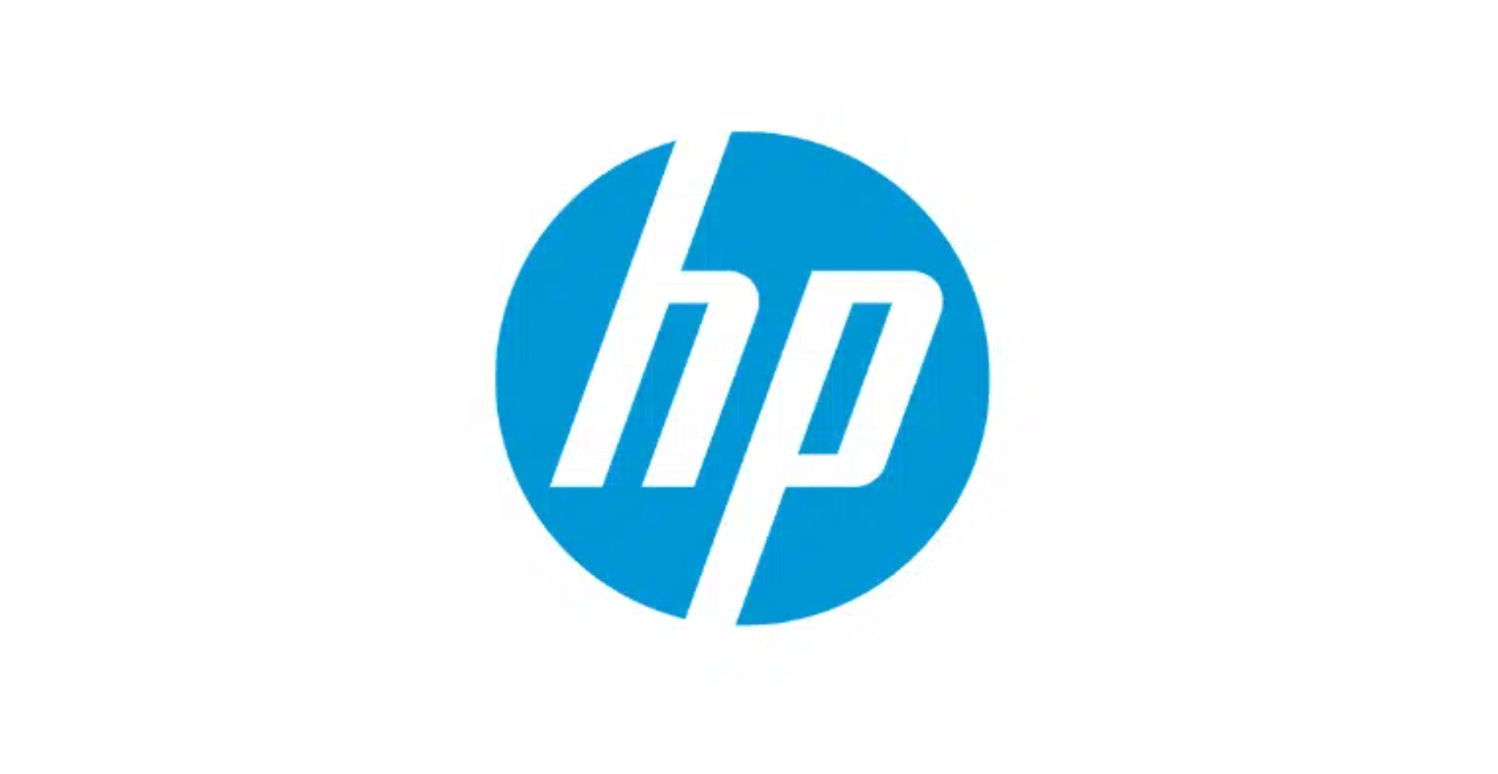
HP
Hewlett-Packard and their logo are also classics in the technology industry. The blue circle around the letters doesn’t just look slick, it’s meant to inspire a feeling of trust.
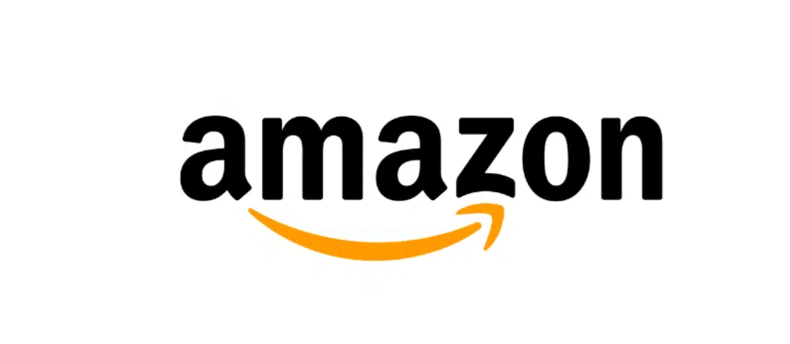
Amazon
Amazon is everywhere and so is its logo. The arrow doesn’t extend to the whole word because it symbolizes that they sell “everything from A to Z.” The arrow also deliberately looks like a smile because they aim to provide customer satisfaction.
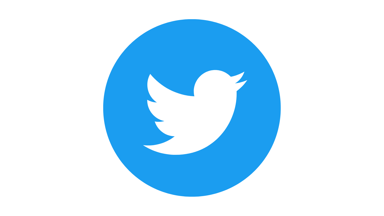
Twitter’s logo has gone through a couple redesigns since the site debuted in 2006, but the little bird we know today was designed by Douglas Bowman in 2012. It’s only appropriate that a social media site known for its brevity would evolve towards an image-only logo.
Food and Beverage Logos
Logos for food and beverage companies use a lot of yellow and red because they make an eye-catching contrast and make viewers think of hunger.
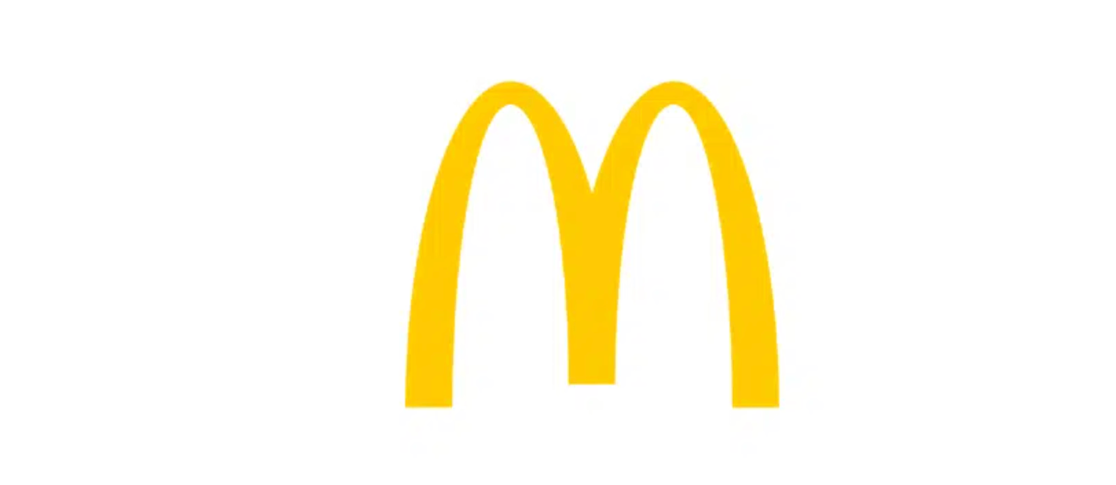
McDonald’s
Though McDonald’s was founded in 1940, the M we know and love didn’t come about until 1968. The simplicity and contrast make the logo easy to spot from a distance even if you’re driving past it on a highway.
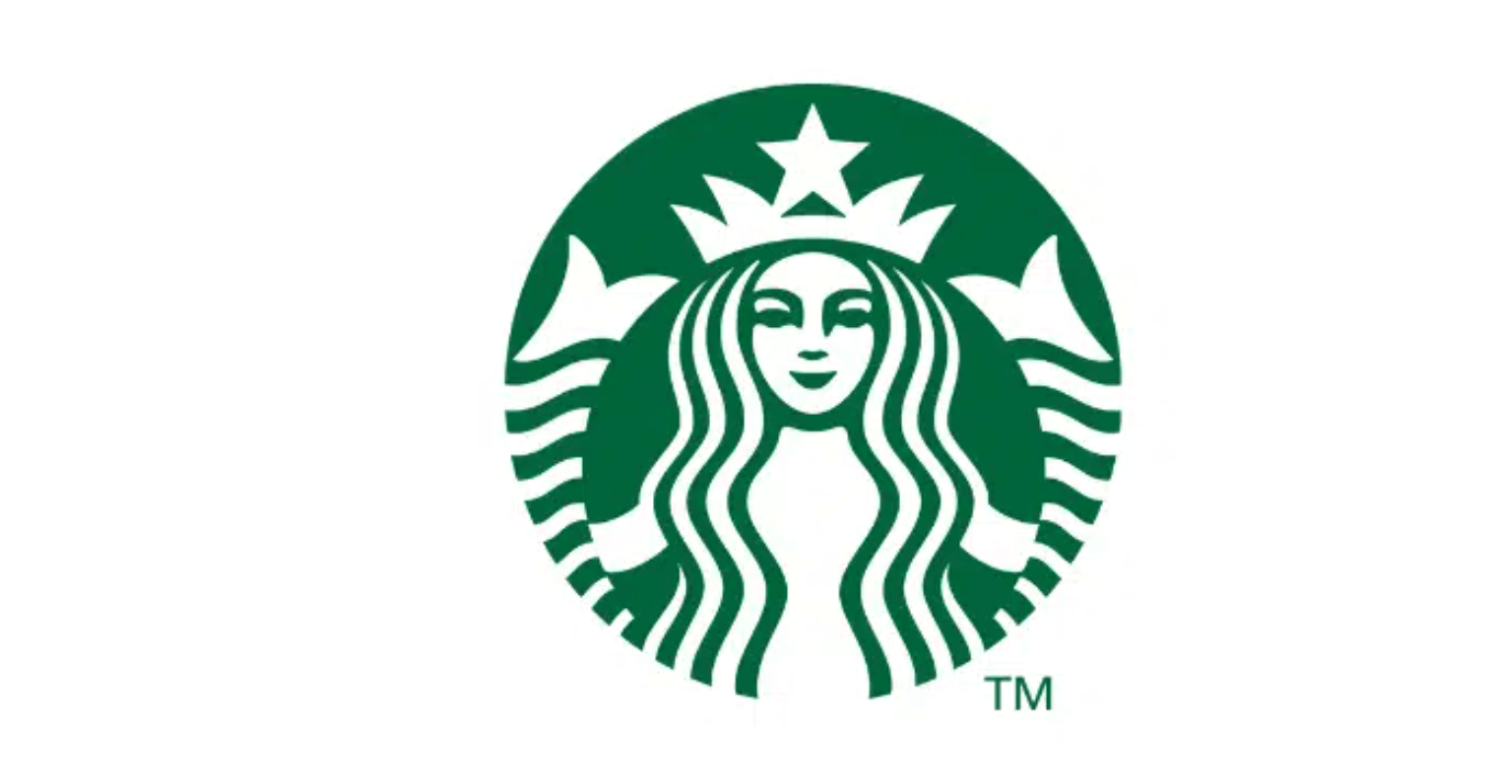
Starbucks
The Starbucks siren has become so recognizable over the years that the most recent redesign in 2011 eliminated the company name from the ring around the outside. Just as sirens from Greek mythology lured sailors into the ocean, this smiling green and white logo lures customers in for lattes.
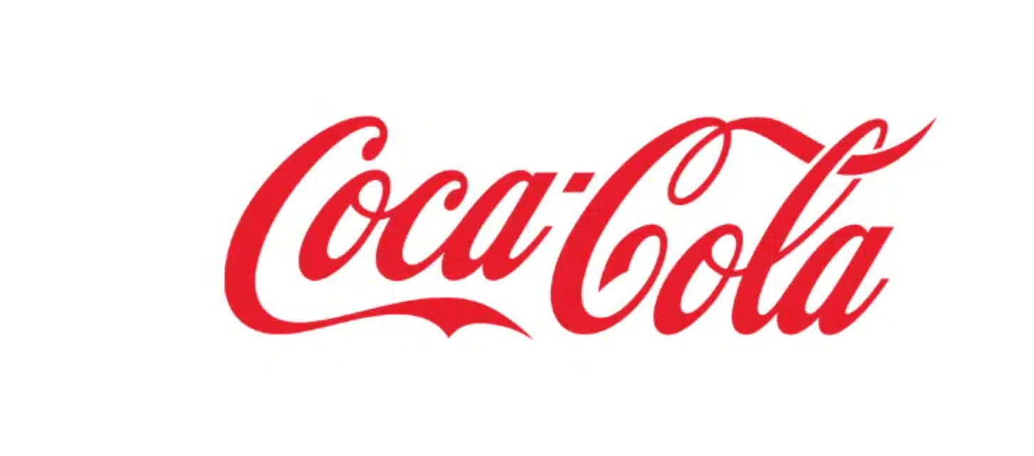
Coca-Cola
The red and white contrast and elegant script font have made Coca-Cola an iconic beverage logo since 1886. Though there have been minor tweaks over the years, the classic design has kept its general look.
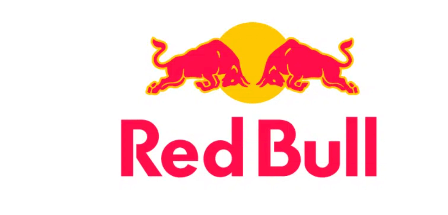
Red Bull
The titular red bulls contrasted against the yellow sun exude the energy, strength, and excitement that the drink itself aims to give its consumers.
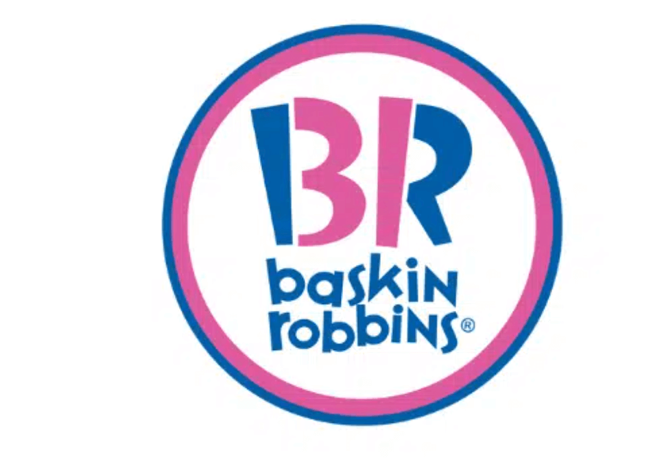
Baskin Robbins
The Baskin Robbins logo, designed in 2006 by The Carson/Roberts Advertising Agency, is all about a sense of fun. And, of course, their famous 31 flavors.
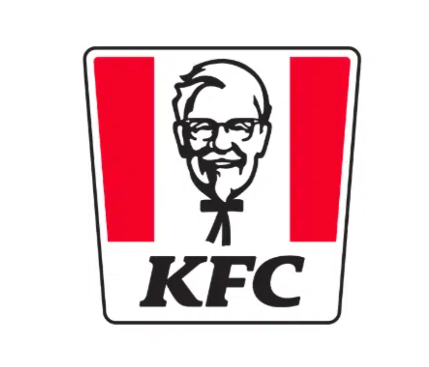
KFC
Though the company rebranded from Kentucky Fried Chicken to simply KFC in 1991, the stylized face of founder Colonel Harland David Sanders has been a constant since 1952.
Luxury Logos
Logos for luxury goods like high fashion, fine jewelry, and expensive cars use a lot of white and silver. These brands often use minimalistic logos with the initials of the brand name, especially if the brand name is also a person’s name.
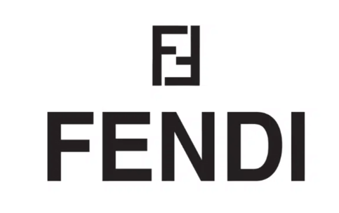
Fendi
The Fendi logo of two sans serif capital Fs in a rectangle shape is unique, sleek, and recognizable.
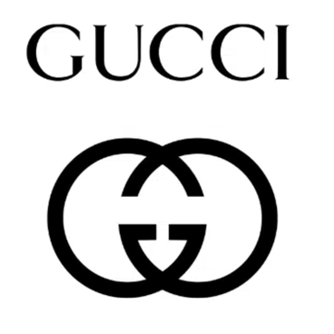
Gucci
The Double G logo designed by Aldo Gucci helped put the brand on the map in 1929. Today, it’s one of the most recognizable high fashion logos in the world.
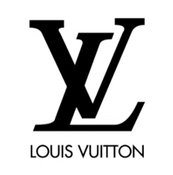
Louis Vuitton
Since its founding in 1854, Louis Vuitton has been one of the most prestigious brands in the high-end fashion world. The iconic LV monogram credited to Vuitton’s son Georges is no small part of that image.
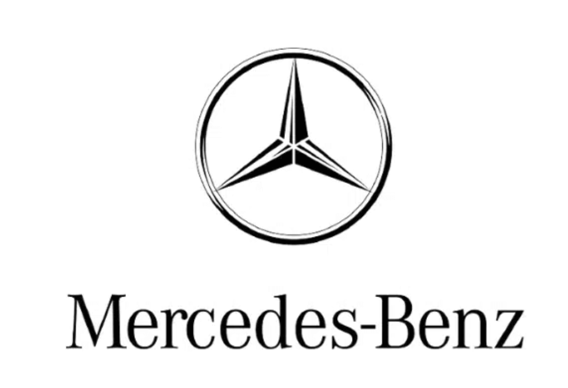
Mercedes-Benz
The three pointed star logo of Mercedes-Benz conveys luxury and class. The three points are said to represent the company’s goal of motorizing the world on land, water, and air.
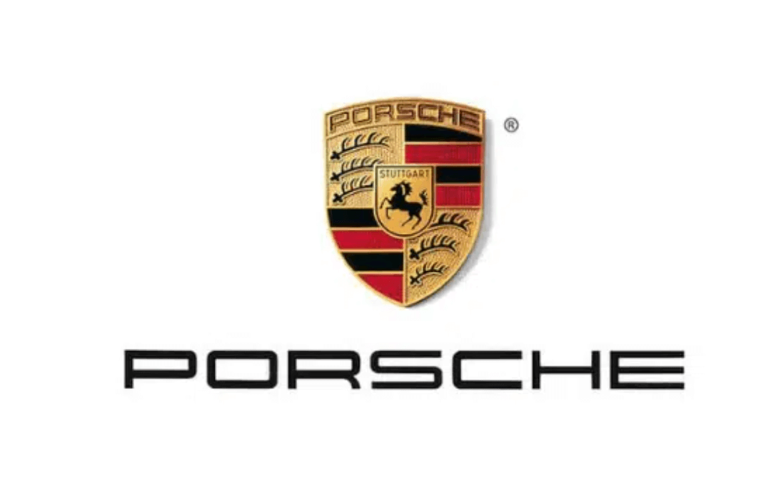
Porsche
Porsche is another German car company whose name alone conjures images of wealth and luxury. Its logo is inspired by the Free People’s State of Württemberg’s coat of arms. Porsche was headquartered in Stuttgart, which was the capital of the state at the time. So the logo doesn’t just look classy, it’s also an homage to the company’s history.
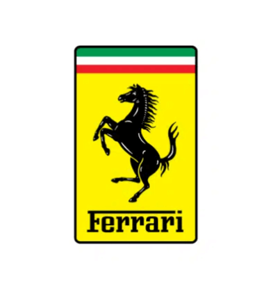
Ferrari
Ferrari is perhaps the most sought-after brand in the world of cars. Enzo Ferrari’s use of the horse symbol was inspired by Italian fighter pilot Francesco Barraca who painted a prancing horse on his plane. In 1923 Ferrari met Barraca’s parents and they told him to paint a horse on his car for good luck. The yellow background represents his hometown, Modeno, Italy. Together, they make a striking contrast and convey speed and high quality.
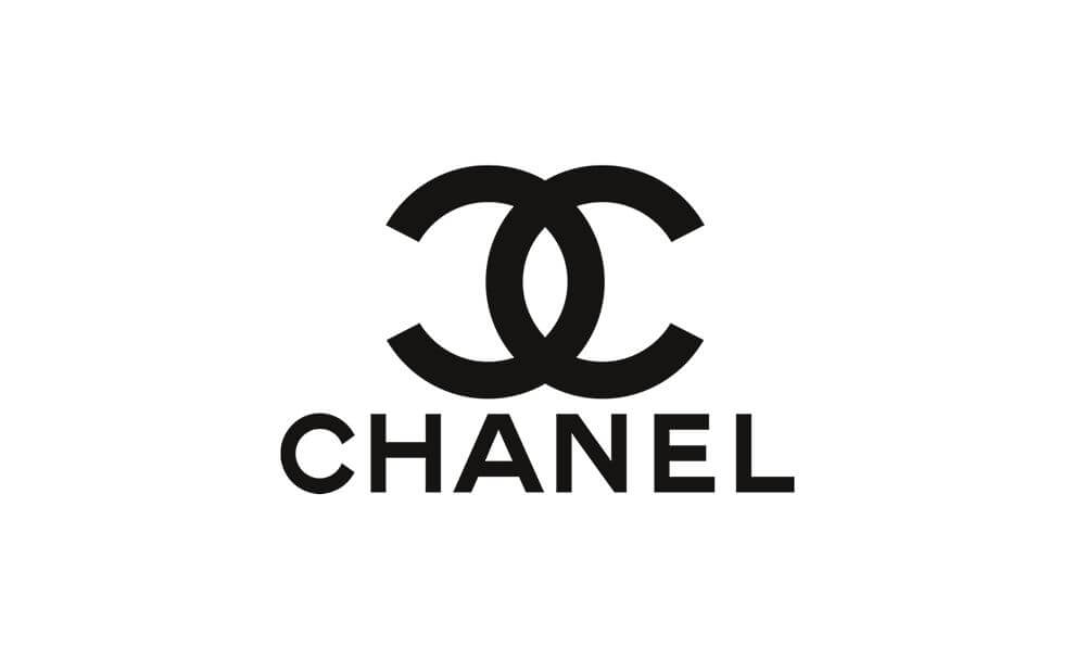
Chanel
You don’t have to know much about fashion designers to know Chanel. The logo itself is seen as a status symbol around the world. The clean, simple interlocking Cs reflect the brand’s emphasis on elegant simplicity.
Finance Logos
Logos in the Finance industry often use green for money and blue for trust. They usually stick to simple shapes and lettering.
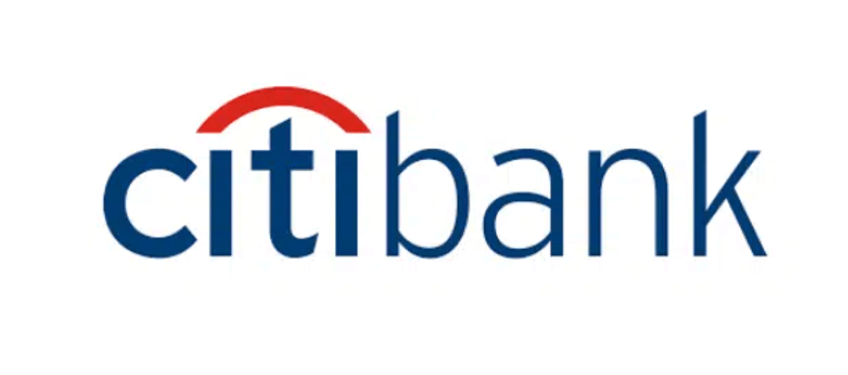
Citibank
Today’s Citibank logo was a 2000 redesign after the bank merged with Travelers Insurance. The red arch over the lowercase T is a nod to the red umbrella in the Travelers Insurance logo.
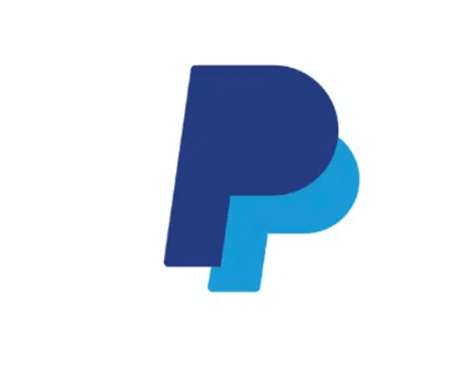
PayPal
PayPal’s minimalist blue logo with two letter Ps conveys trust and the company’s mission to connect people through an easy-to-use payment network.
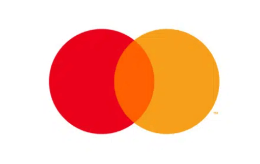
Mastercard
Mastercard’s famous overlapping circles dates back to 1969 when the first Japanese partners joined the company. The logo represents this partnership between international powers. It’s so recognizable that Mastercard’s 2020 rebrand included removing the company name from the logo.
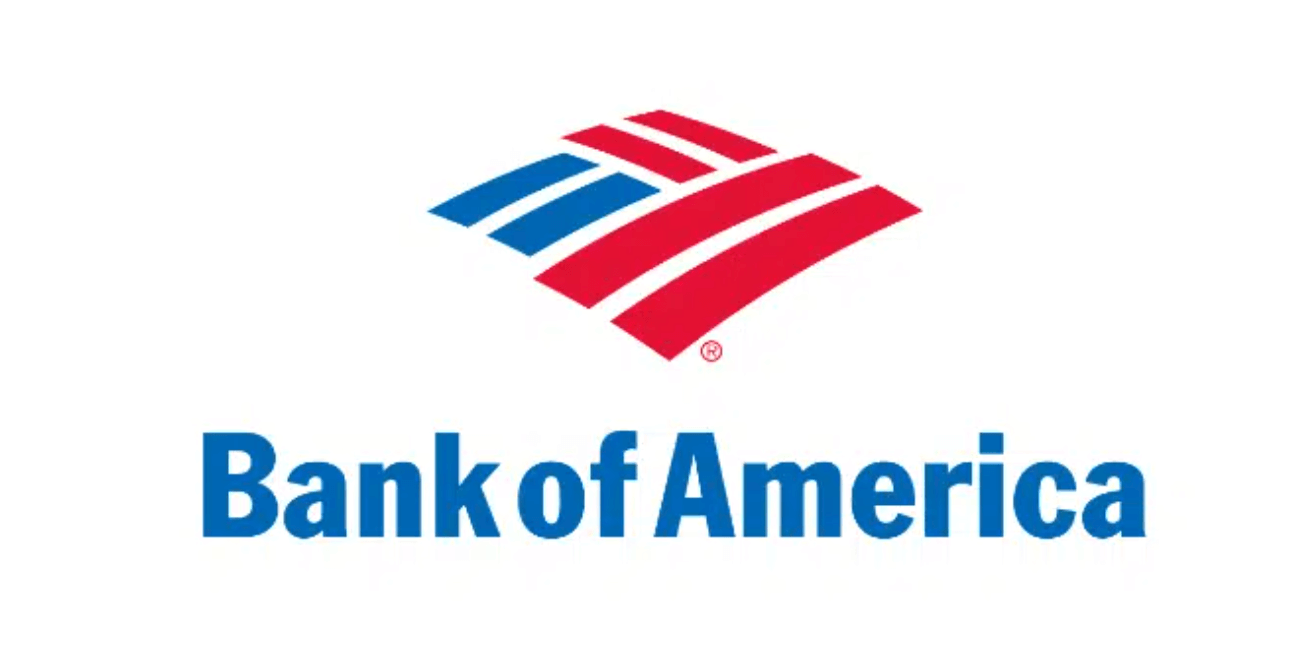
Bank of America
The Bank of America logo combines the patriotism of the American flag and the comfort and safety of a blanket in one simple image.
Fashion and Retailer Logos
The fashion and retail space is where you see the most variety in logo design.
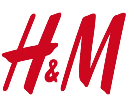
H&M
Fast fashion giant H&M expresses their carefree vibe with a handwritten script and uses red to grab shoppers’ attention and encourage impulse shopping.
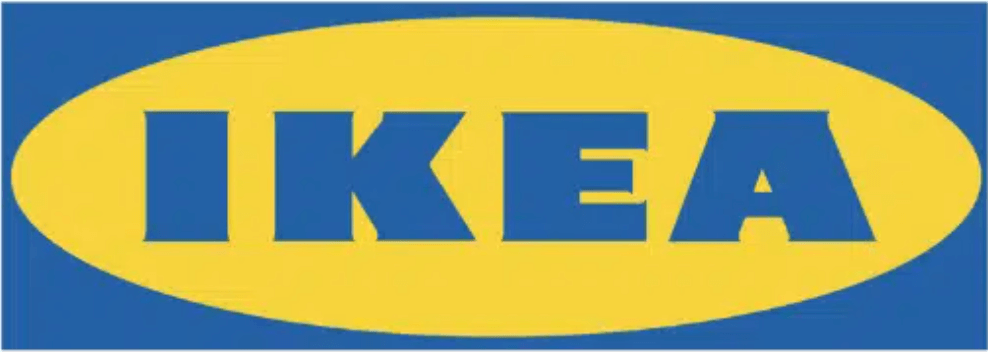
IKEA
IKEA is one of the first things many non-Swedes think of when someone mentions Sweden. Their logo colors matching their country’s flag certainly helps establish that association.
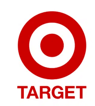
Target
Target’s logo may have been the obvious choice with their name, but that doesn’t make it any less of a winner. The red and white contrast draws the eye and the bullseye symbol reflects their objective: “Expect More. Pay Less.”
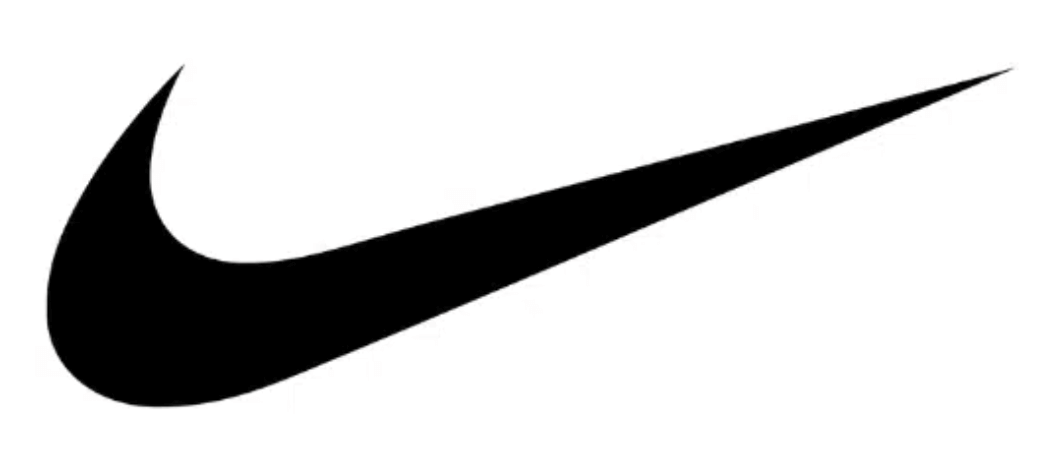
Nike
The famous Nike swoosh was designed by Carolyn Davidson, a college student in Portland at the time. The symbol conveys movement and speed with an abstract shape.
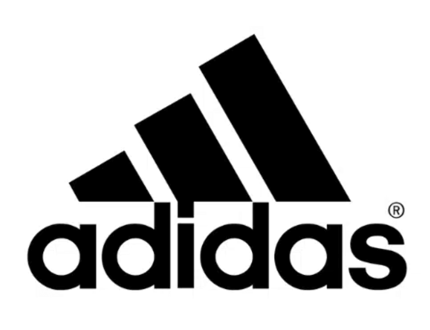
Adidas
Adidas is another iconic name in the world of sportswear. The three stripes in a jagged triangle are modeled by a mountain to represent overcoming obstacles.
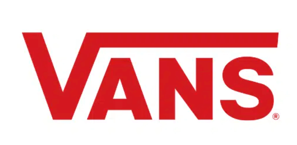
Vans
Vans, the king of skate wear, keeps it simple with their logo, but it packs a punch. The original version of the logo was designed by co-founder James Van Doren’s 13-year-old son Mark in 1966. Today, the typography is lighter and the text is red instead of black, but it’s otherwise pretty close to that original design.
Toys R Us
The Toys R Us logo is whimsical and grabs everyone’s attention, especially children’s. The famous backwards R is borrowed from the Cyrillic alphabet and is meant to evoke a playful, childlike quality.
![]()
Under Armour
Under Armour’s logo is simple, yet clever. Not only does it combine the U and A in an interesting way, but it illustrates strength and athleticism.

Other Logos
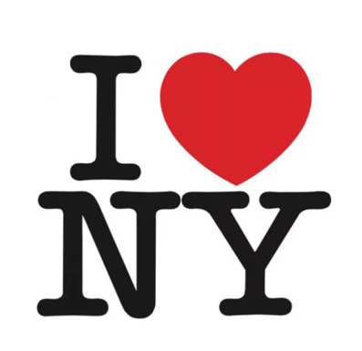
I Love New York
The famous I Love New York logo was designed by Milton Glaser in 1977 during a taxi ride. Today, not only is it instantly recognizable, but it started the practice of using a heart in place of the word “love” in popular culture and design.
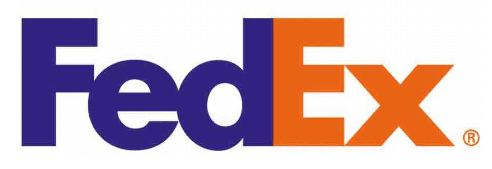
FedEx
The FedEx logo makes clever use of negative space with the little arrow between the E and the X. They combined two fonts, Univers and Futura Bold to pull it off.
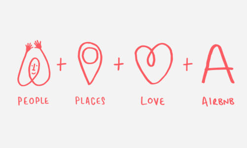
Airbnb
Airbnb has changed travel and hospitality since its founding in 2008. Its minimalist logo may look abstract, but it has a backstory. They call it the Bélo or the “universal symbol of belonging.” The design combines a person’s head, a heart, a location pin, and the letter A. It’s a great example of a logo that’s inspired by the company’s values.
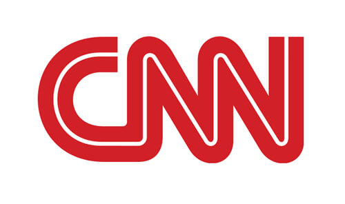
CNN
Cable News Network’s logo has remained mostly unchanged since they began operating in 1980. This consistency is intentional to reflect the network’s goal of consistency and stability in their reporting. The bold red lettermark with a custom rounded typeface designed by Anthony Guy Bost grabs attention and gives an air of authority.
Logo Maker Tools and Templates
You can design your own original logo even if you don’t have graphic design experience by using a logo maker.
How Sav Can Help
A stunning logo needs to go on a stunning website. Sav is here to make every part of setting up and managing your own website easy and affordable for all budgets. Start your free trial today to learn more!

Recommended articles
A Complete Guide to Facebook Ad Sizes
Facebook ads are an essential part of any social media marketing strategy. Facebook may not be the most popular social network for the...
Read more
How to Come up With Ecommerce Product Ideas
Whether you’re starting a new ecommerce business or expanding a pre-existing one, what products to sell online is an important decision....
Read more
The 10 Best Providers for Print on Demand Books
Always wanted to write your own book? Self-publishing with a print on demand book service can make that dream a reality more easily than...
Read more