
- A Contact Us page is one of the essential components of every website. They make it easy for visitors and customers to get in touch with you. Just because it has your phone number doesn’t mean you have to phone it in, though. Here’s everything you need to create a useful, on-brand Contact Us page.
Why Are Contact Pages Important?
In the ideal world, customers would never need to reach out to customer support. In reality, even users of the most intuitive products and services have questions. When those questions arise, a painless process for solving them can help your customers stay customers.
Displaying contact information is also a gesture of goodwill to people who aren’t your customers yet. 64% of visitors want to see the website’s contact information when they visit a new site. Seeing this information tells viewers that a website is legitimate and run by human beings.
What Should be on a Contact Us Page?
A contact page should include multiple contact options. Some people like talking on the phone, others like email, and others like filling in a contact form. If customers can contact you the way that they prefer, they’ll have an easier time reaching out and associate your company with convenience. These options should include…
|
Email Address |
Can be plain text or a clickable link |
|
Physical Address |
Including a map is a nice touch |
|
Simple Contact Form |
Facilitate easy and secure communications |
|
Phone Number |
If you make it clickable, smartphone users can call without leaving the site |
|
Live Chat Message Box |
Though a real person is preferable, a chatbot can also answer customers’ questions quickly |
|
Social Media Icons |
Link to your social media profiles with icons to encourage visitors to follow you |
Do You Need a Contact Form?
You may be asking yourself, “Do I really need a contact form? Customers can just send me an email.” Here are a few benefits of contact forms:
- Ease of communication
- Security
- Organization with email marketing
- Lead Generation
- Easy redirection between team members
A contact form may seem like more effort at first, but once you have one it will save you time and energy.
.jpg?width=4912&name=liam-truong-oeDH20DVb2A-unsplash%20(1).jpg)
What Fields Should You Include on Your Contact Form?
- First and Last Name
- Email Address
- Company Name
- Reason for Reaching Out
That’s it unless there are other questions that are absolutely necessary for conducting your business. People don’t like answering questions without clear relevance to what they’re doing, especially online. Age, phone number, city and state, or street address are particularly unpopular questions.
Make sure you clearly and concisely label each form field with headings above the input field and choose input types that make sense. Drop down menus have the worst conversion rates compared to text entry and multiple choice questions. File uploads should only be included for something like a job application that requires a resume or cover letter. You can do all of this with our contact form widget.
Contact Us Page Best Practices
.jpg?width=5472&name=dayne-topkin-XQWtAFOO7zc-unsplash%20(1).jpg)
Include Links to FAQs
FAQs save time for your customers and your support team alike. Make sure they are easily accessible from the contact us page. You can even link to the knowledge base in the contact form so customers can see if their question has already been answered before they reach out to you and have to wait for your response.
Set Expectations
Answer the following questions on your page:
- What should the contact form be used for?
- When and how will a customer hear back?
- What is the fastest way to get a response?
- What is the best way to reach a real person?
Use a Fun CTA
Leaving your call to action at a simple “contact us” can seem boring and ominous. What do you hope to achieve by this conversation? Here are some fun alternatives:
|
Drop us a line |
Get in touch |
Let’s talk |
|
Reach out |
Let’s chat |
Talk to us |
Keep Design Consistent
The contact page may not be the most engaging part of the website, but that’s no reason to skimp on the page design. The visuals should be on-brand and consistent with the rest of your website. You don’t have to be an expert in web design to make your website’s visuals pop.
Make it Easy to Find
A good contact page is easy to find so visitors can get in touch quickly. Hiding it might send the message that you don’t want people to reach out to you. “Contact Us” should be an option in the main menu in the header or footer of the website. Some websites even prominently use the contact information as the footer so visitors can find it regardless of where else they are on the site.
.jpg?width=4592&name=aaron-burden-NXt5PrOb_7U-unsplash%20(1).jpg)
Keep It Simple
Don’t make anything on your website needlessly complicated. The user experience is especially important for contact pages. When it comes to copywriting, don’t put any words on the page that don’t have a purpose and make sure anyone who isn’t an expert in your field can understand your directions.
Redirect to a Thank You Page
When visitors fill in the contact form, the next thing they should see is a landing page that thanks them for reaching out, explains when and how you’ll get back to them, and includes links to helpful resources.
.jpg?width=4812&name=priscilla-du-preez-yO12O8j3JK0-unsplash%20(1).jpg)
Get Creative
Believe it or not, a Contact Us page can be creative and interesting. Cool visuals, catchy copy, and well-placed humor can help visitors associate contacting your company with a positive experience before you’ve even responded. Some companies even include animations and videos to
Show Real People From Your Customer Service Team
Customers like to know that a real person is helping them out. If you’re including pictures of people in your Contact Us page, don’t use stock photos. Use photos of your actual team members. It’s not just randos helping customers out, it’s Becky and Raj!
25 Contact Page Examples to Inspire You
-
Accenture
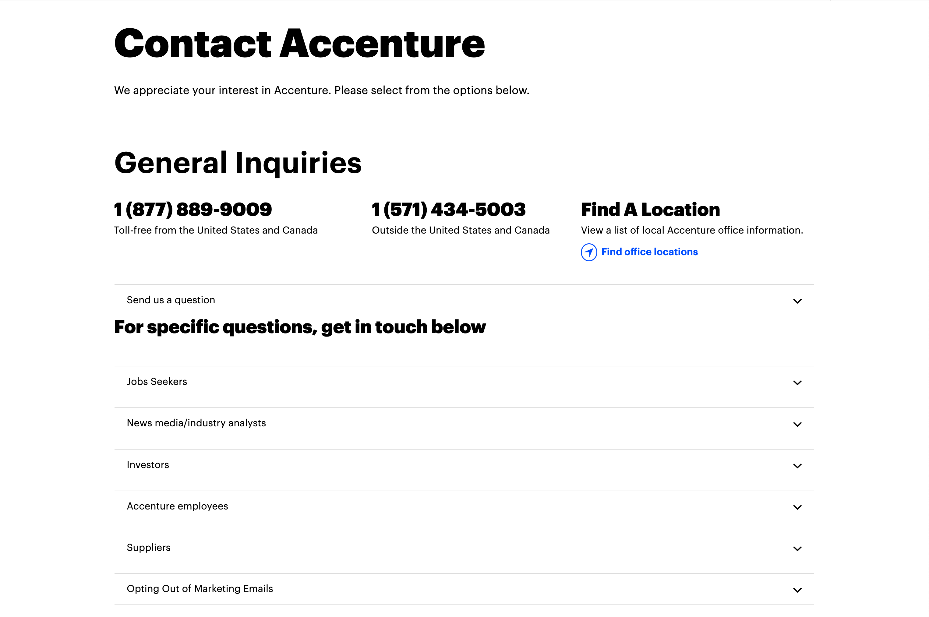
Accenture's Contact Page may not look exciting, but it's great at directing customers based on what question they have.
-
Atlassian
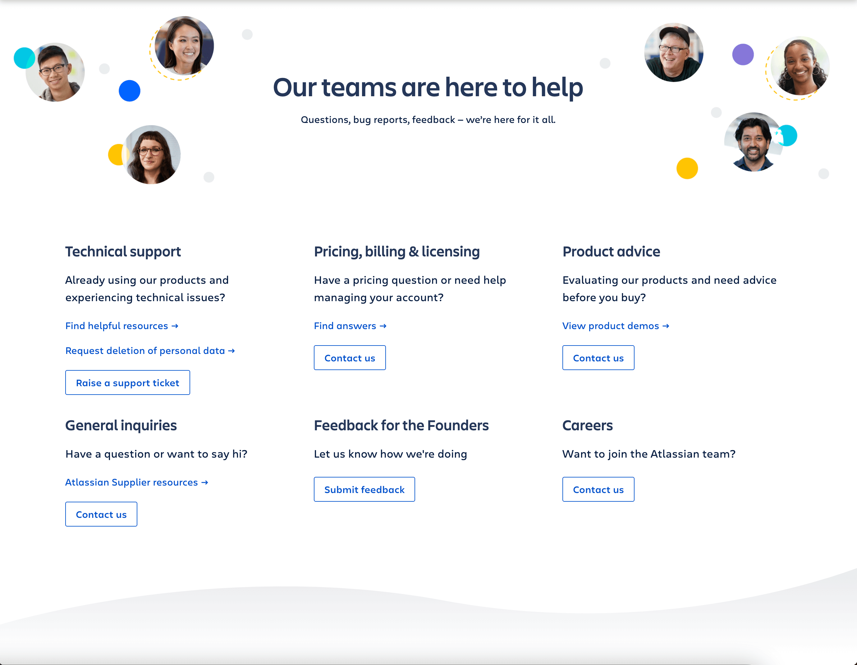
Atlassian uses pictures of their staff to remind viewers that a human being is going to answer their questions.
- The Band Agency
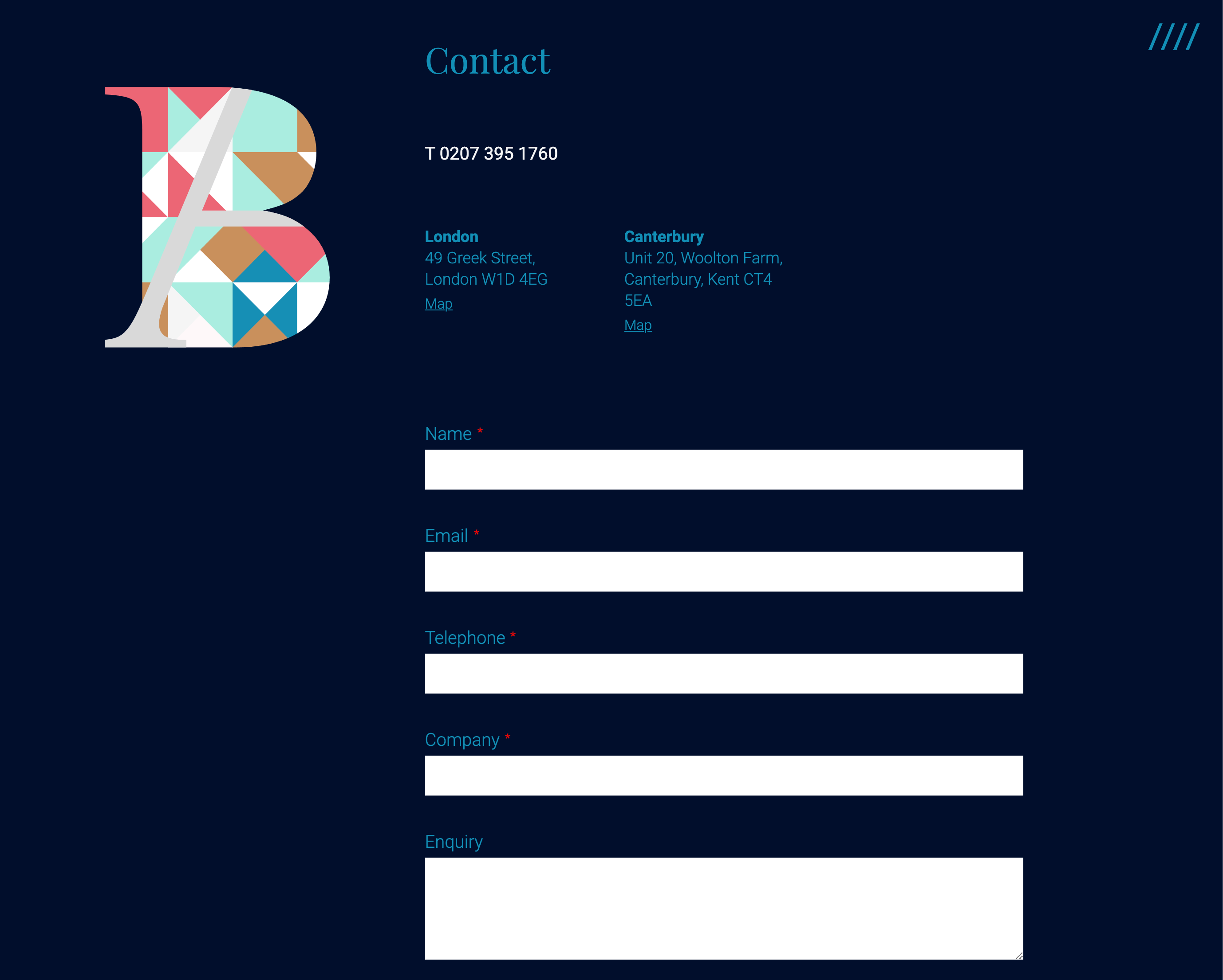
The Band Agency's contact form is front and center, but their phone number and locations are also easy to find.
-
Ban.do
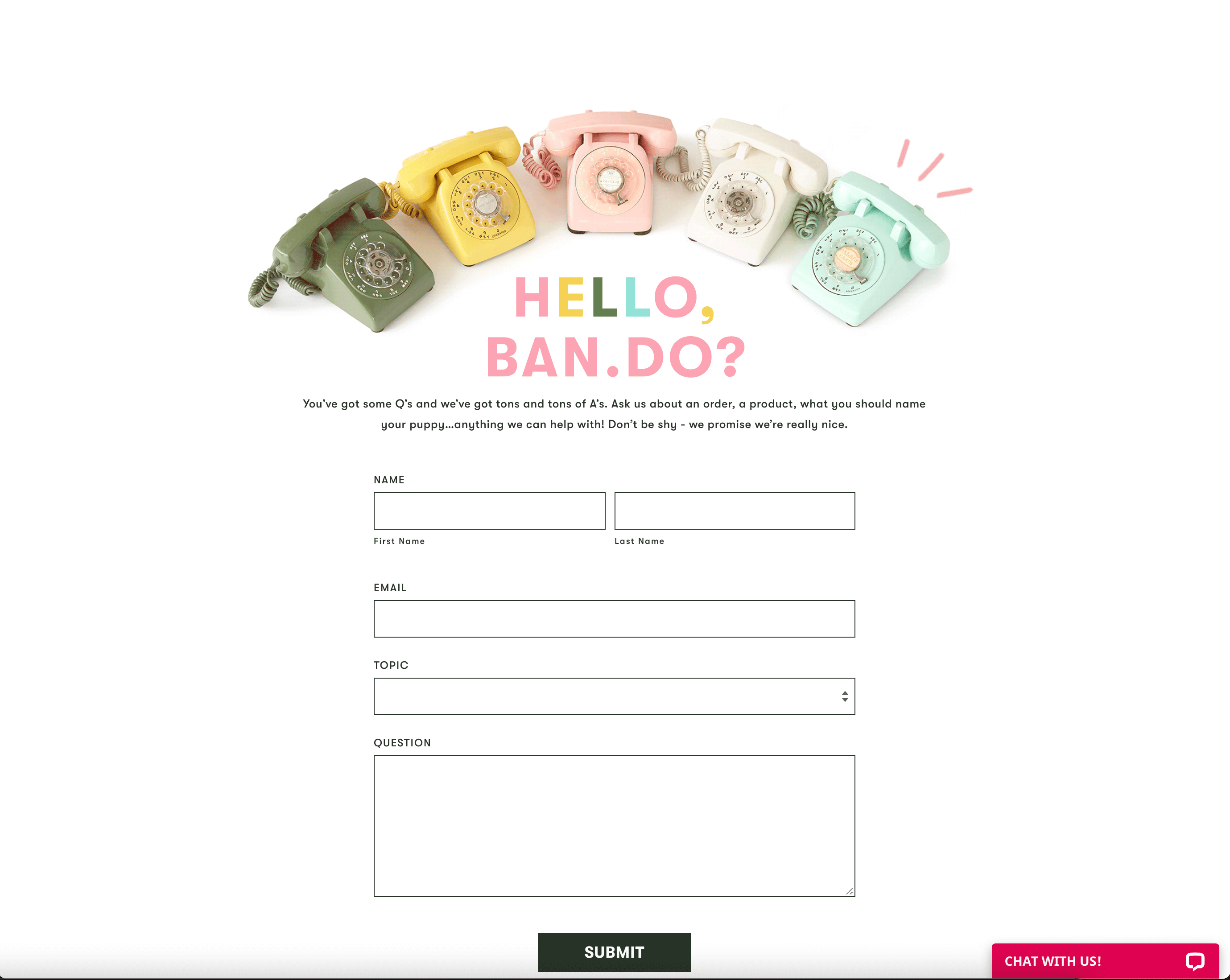
Ban.do uses cute, whimsical visuals to spice up and otherwise simple contact form.
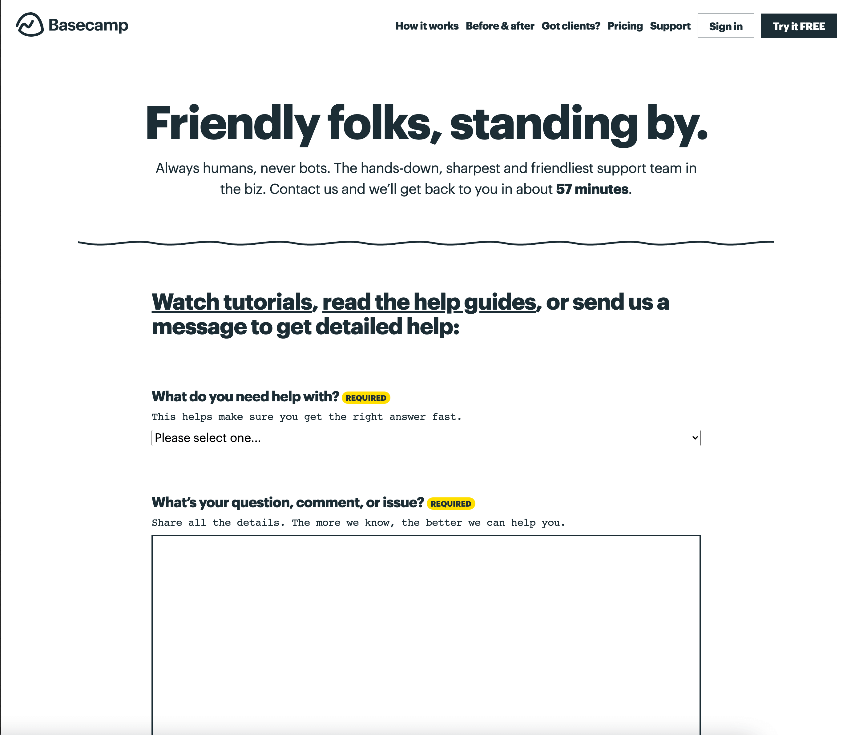
- Basecamp
The copy on Basecamp's contact page gives customers peace of mind that they care about what they have to say. - Blue Bottle Coffee
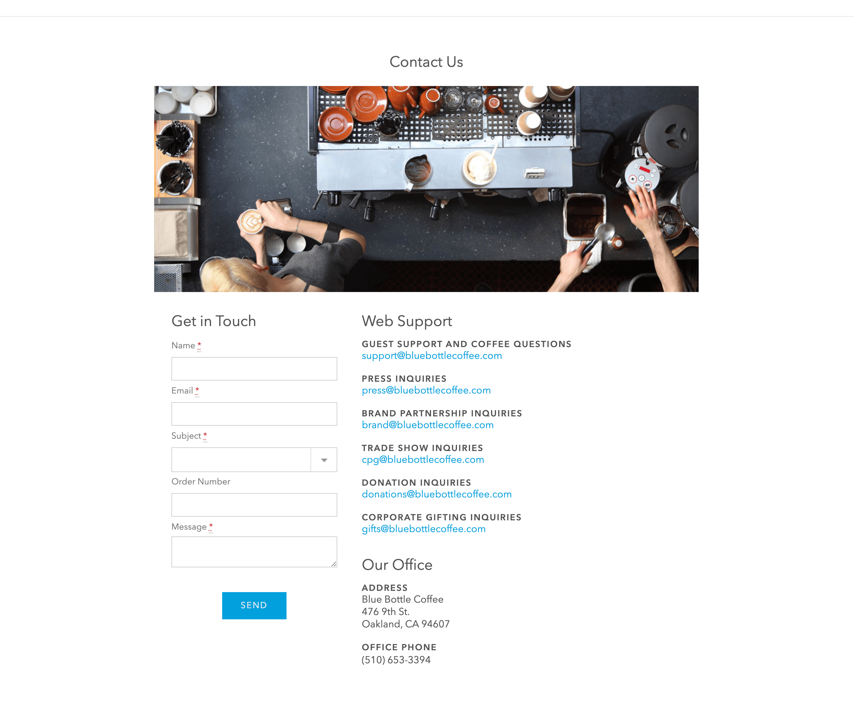
Blue Bottle Coffee's Contact Us page is visually clean, no-nonsense, and easy to follow. They have a lot of email addresses, but they display them all helpfully. -
Brightlocal
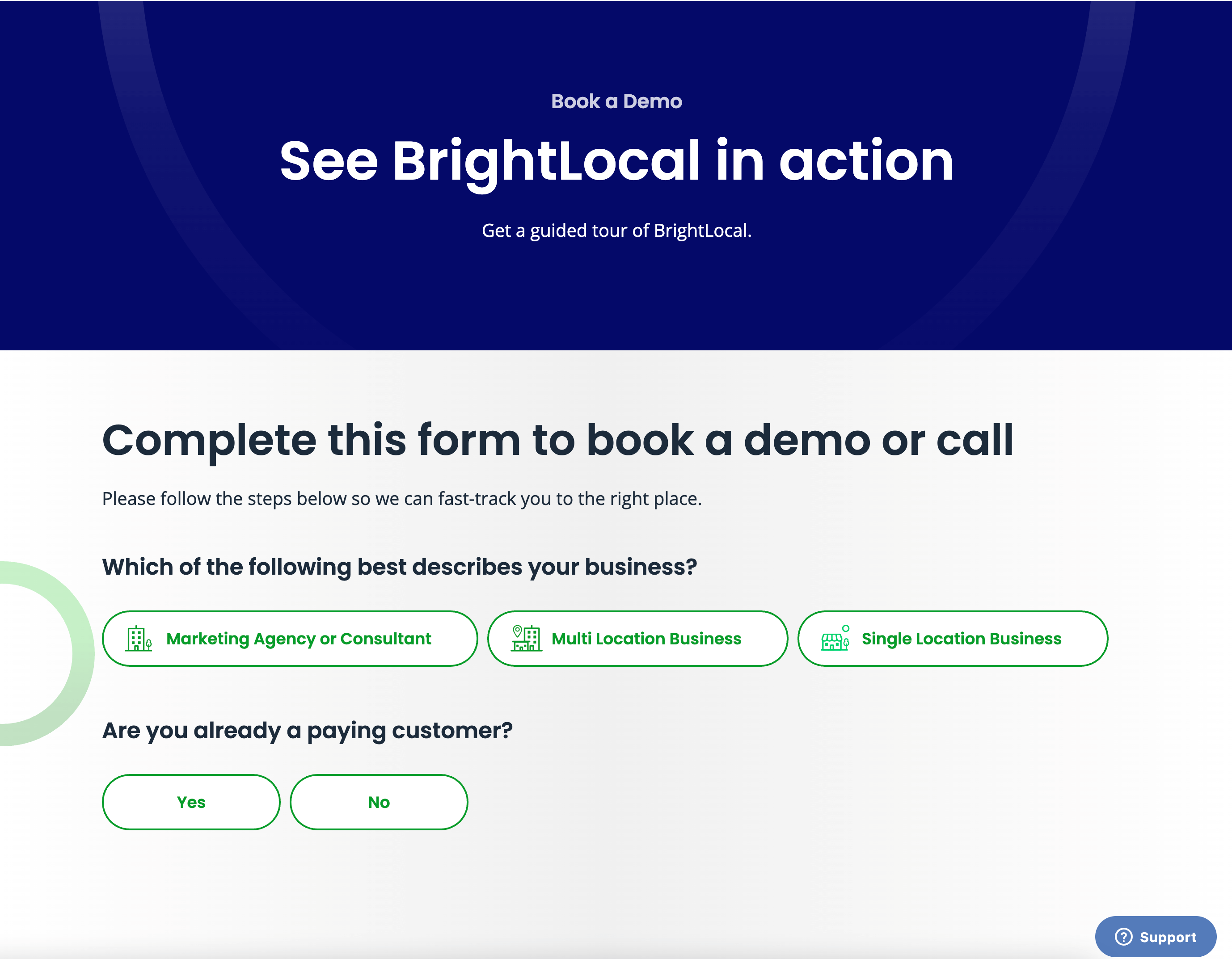
Brightlocal sorts its inquiries into categories, but it's intuitive and not too tedious.
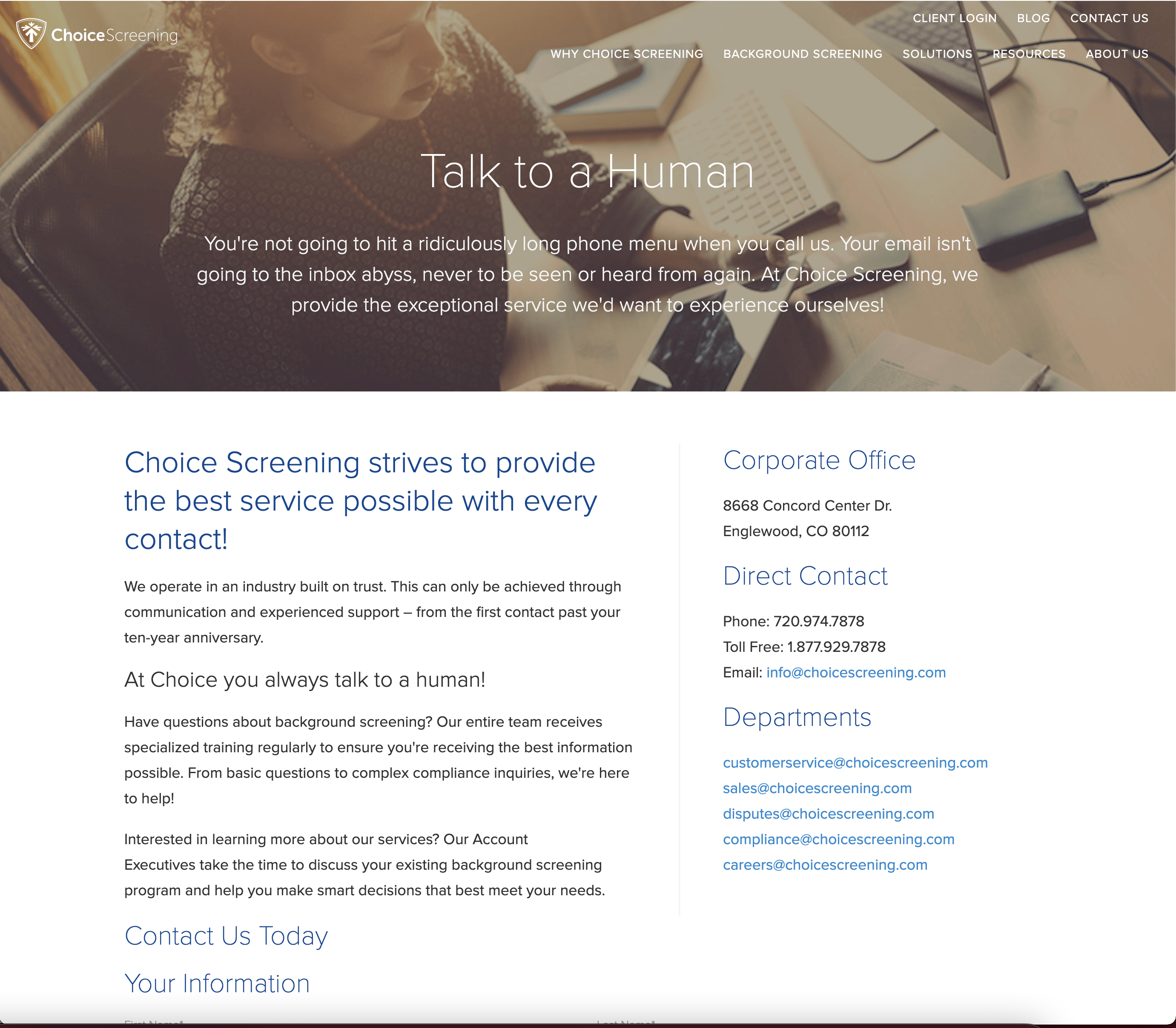
- Choice Screening
Who hasn't said "I want to talk to a human" while calling customer service? Choice Screening lets visitors know right away that they can do just that when they call them. - Copper
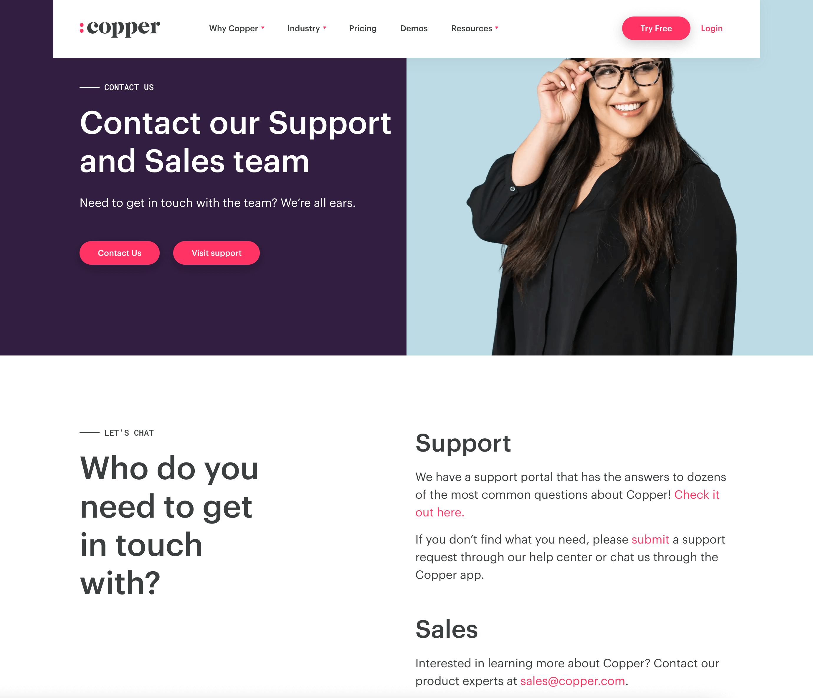
Copper does a great job of setting expectations by having separate buttons for support and sales and explaining what kinds of queries each one is for. -
Dollar Shave Club
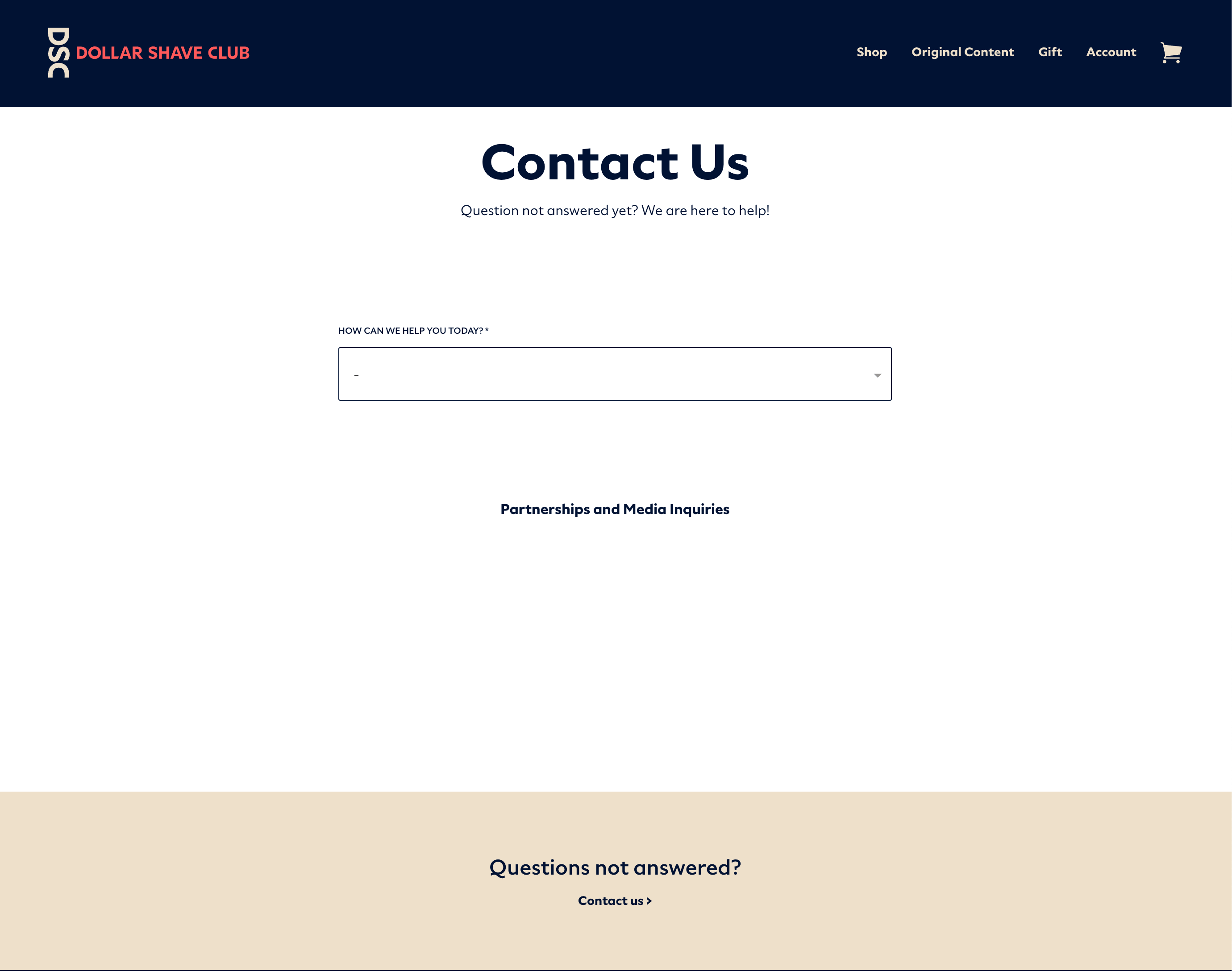
Dollar Shave Club's stripped down Contact Us page integrates FAQs from the dropdown menu. "Questions not answered? Contact us" encourages visitors to peruse them before reaching out without seeming pushy. -
FocusLab
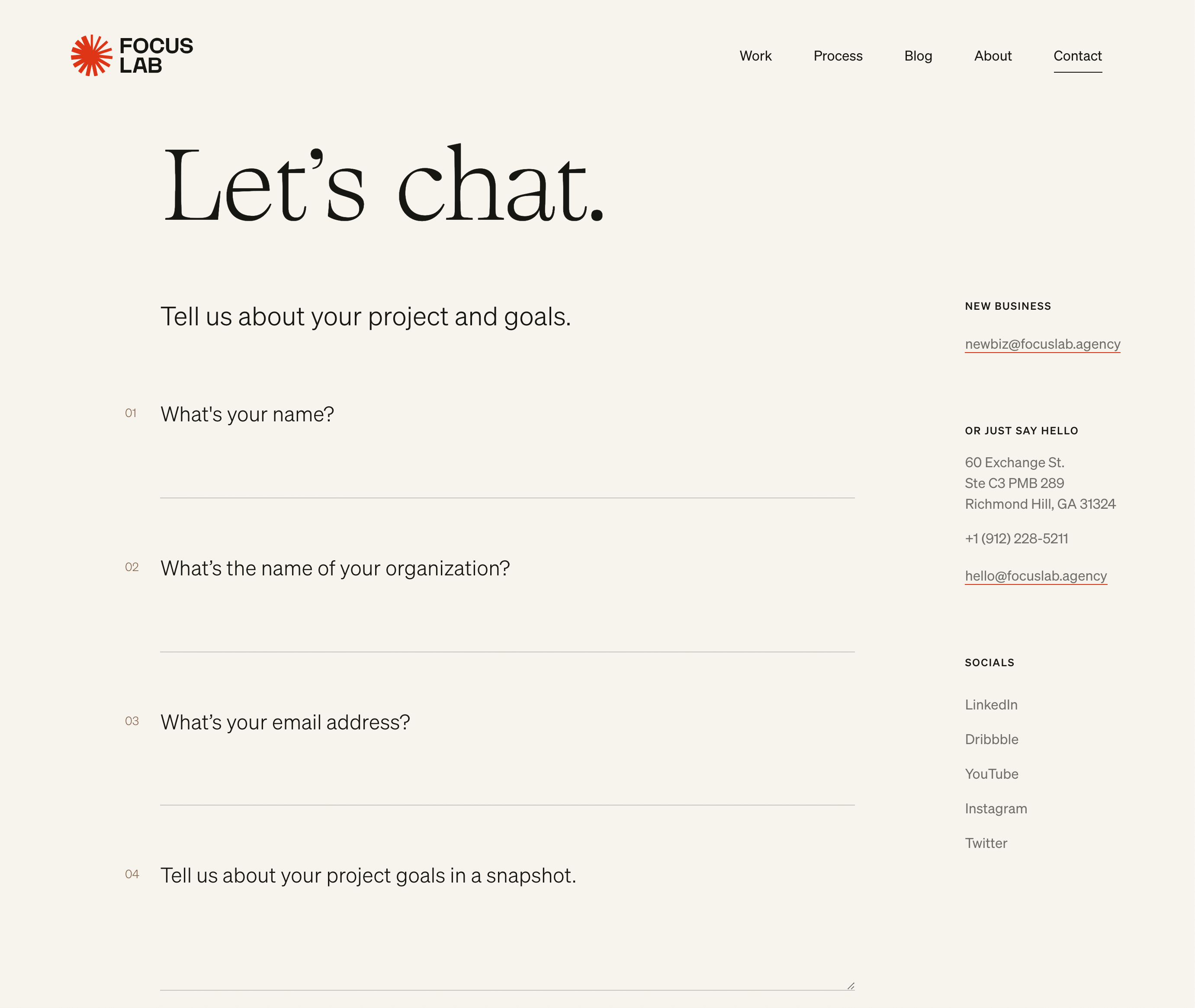
The "Let's chat," "new business" and "or just say hello" headlines are inviting and low-pressure. They communicate that different contact methods are for different purposes without telling readers what to do.
-
Glossier
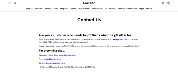
Buying makeup can lead to a lot of questions. What shade looks best on me? What's the difference between these two products? Will this make my skin break out? That's why Glossier assures their customers that they're here to help! -
Grammarly
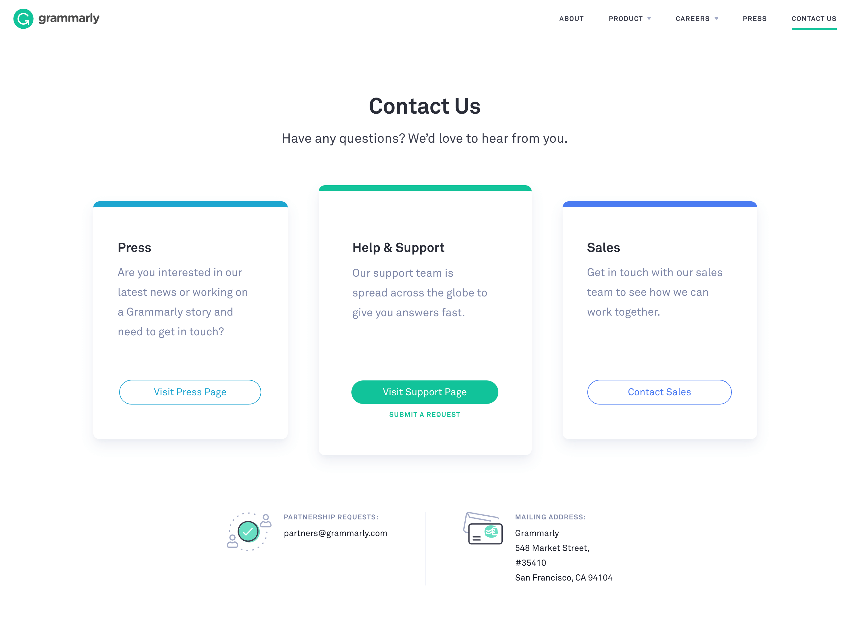
Grammarly's Contact Us page is neat, informative, and concise. Just what you'd expect from a spelling and grammar tool. -
Hootsuite
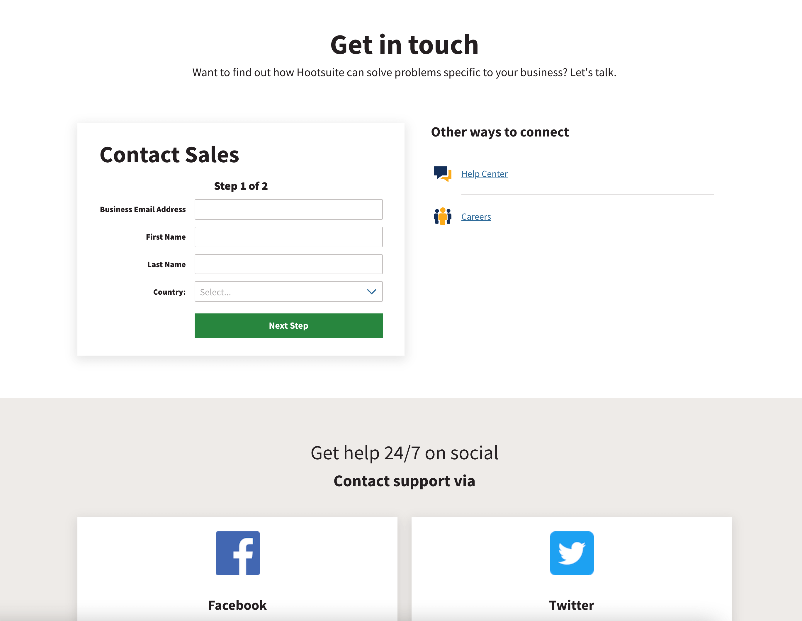
Hootsuite's contact page is great at laying out all of the options for connecting with them. -
Hubspot
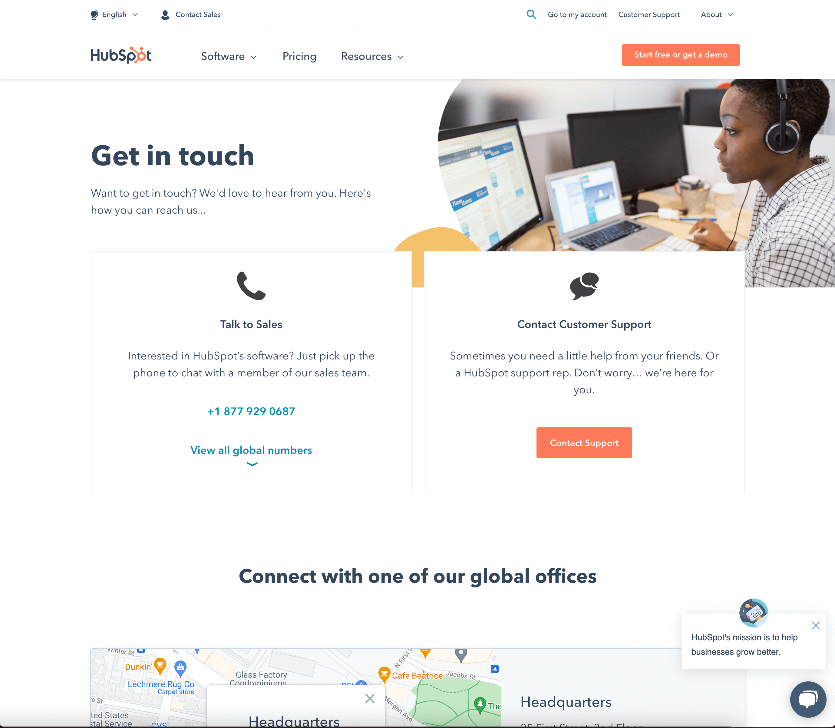
Hubspot's contact page has it all! Different categories for sales and support, a chat box, Google Maps of their locations, a CTA button for a free demo, and a picture of an employee in a headset. -
Infinum
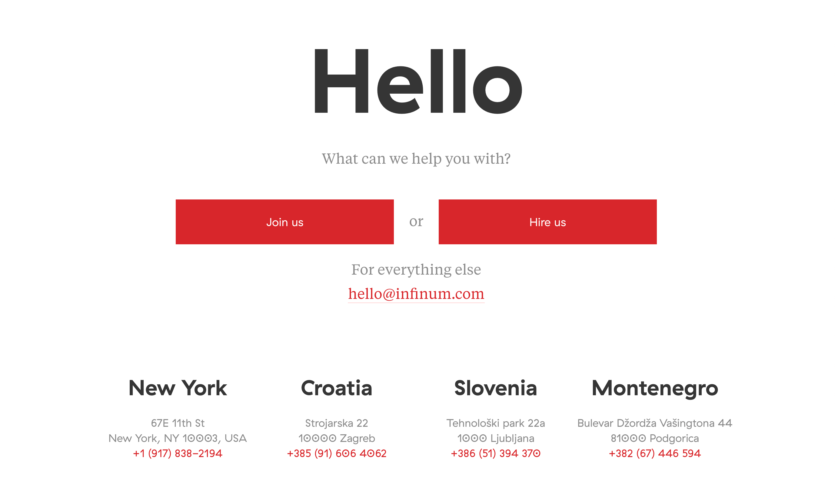
Infinum's contact page doesn't have any pictures, but the pyramid setup leads the viewer's eyes through all the information. -
Kick Point
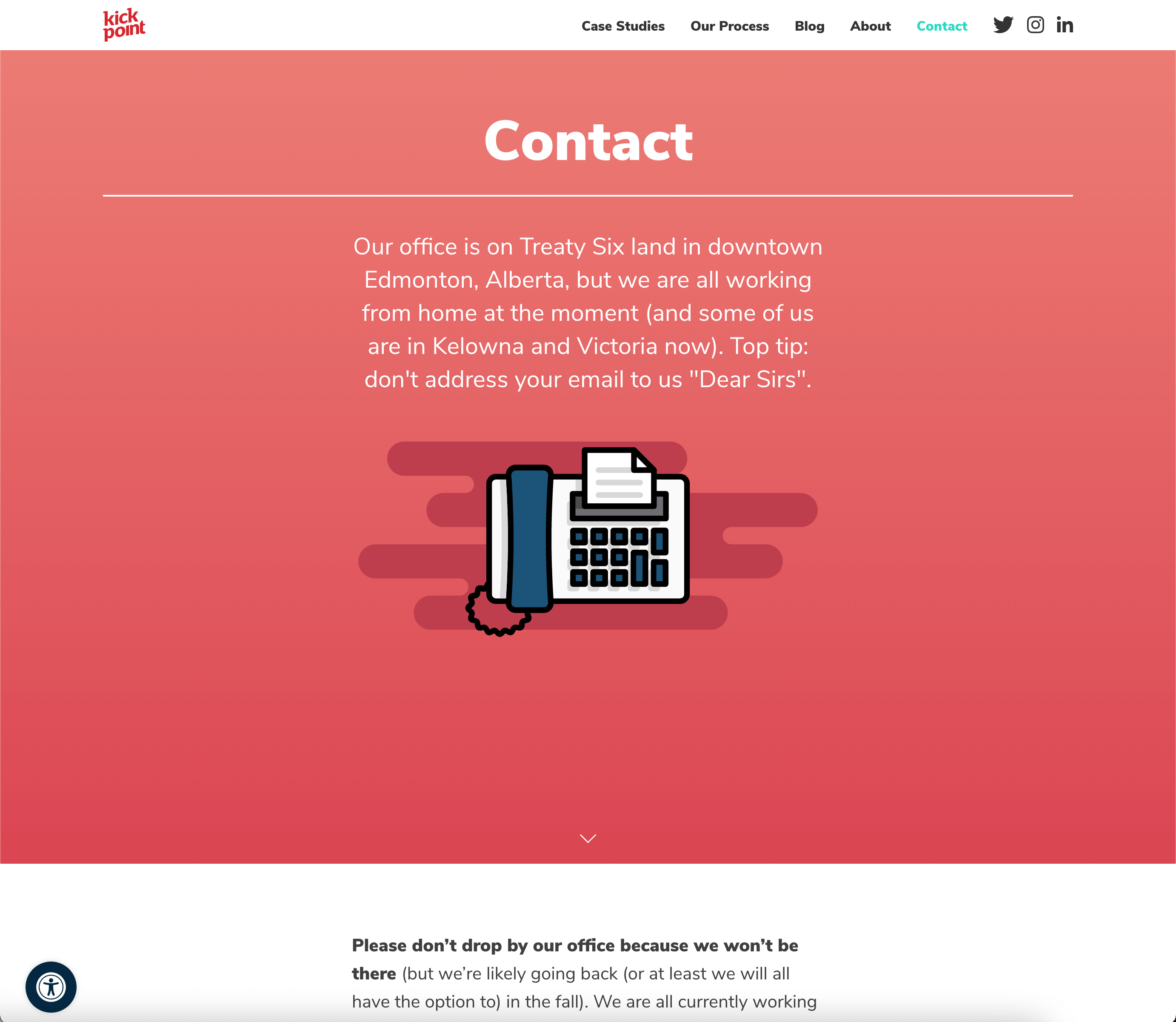
Kick Point's contact page is on-brand with its trendy visuals and cheeky copy. -
Let's Travel Somewhere
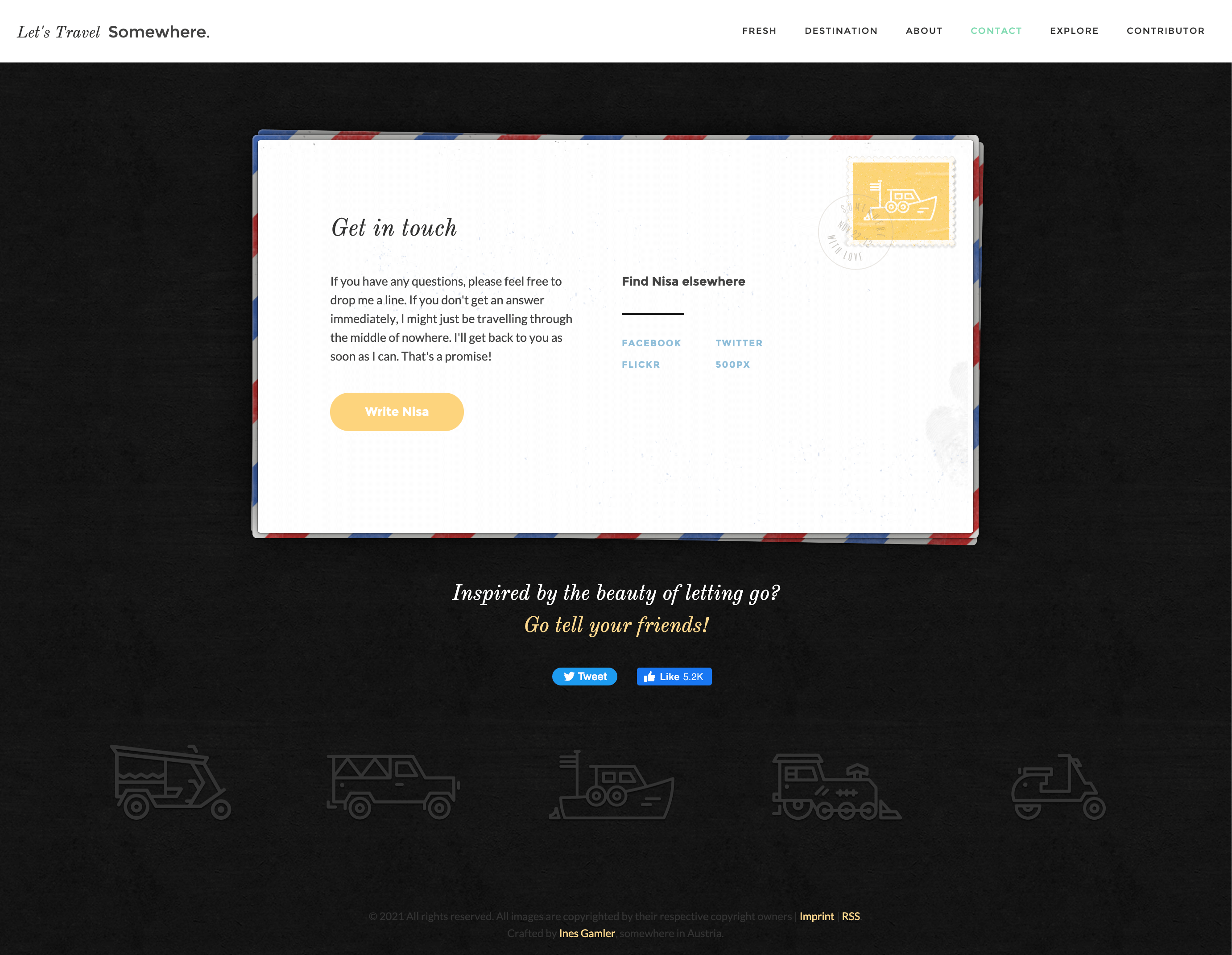
A travel blog using a postcard for their Contact Us Page design is cute, clever, and appropriate. -
Medium
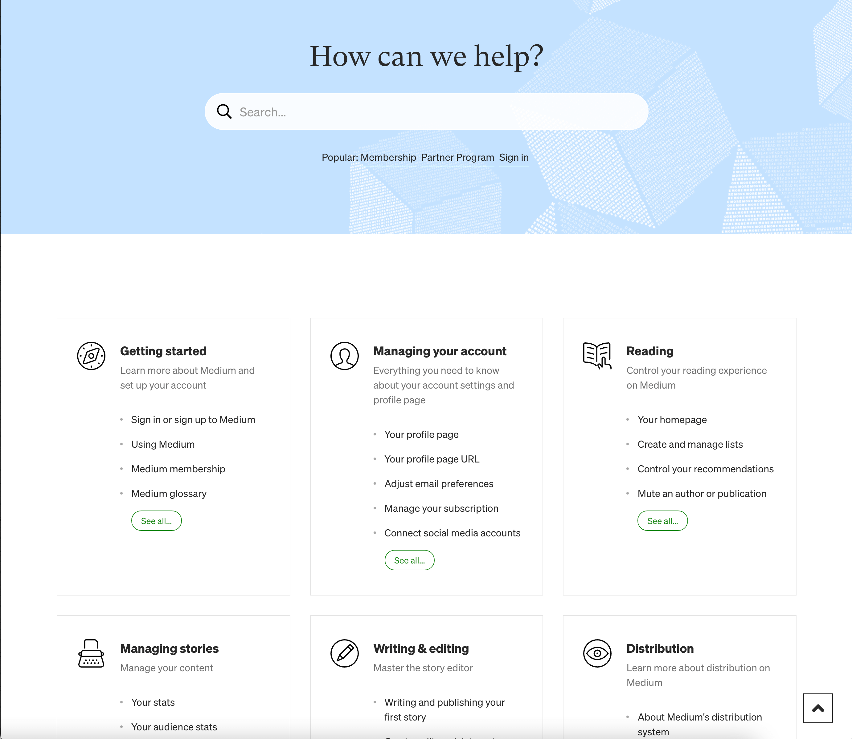
Medium also does a great job of integrating FAQs and contact information. -
The Middle Finger Project
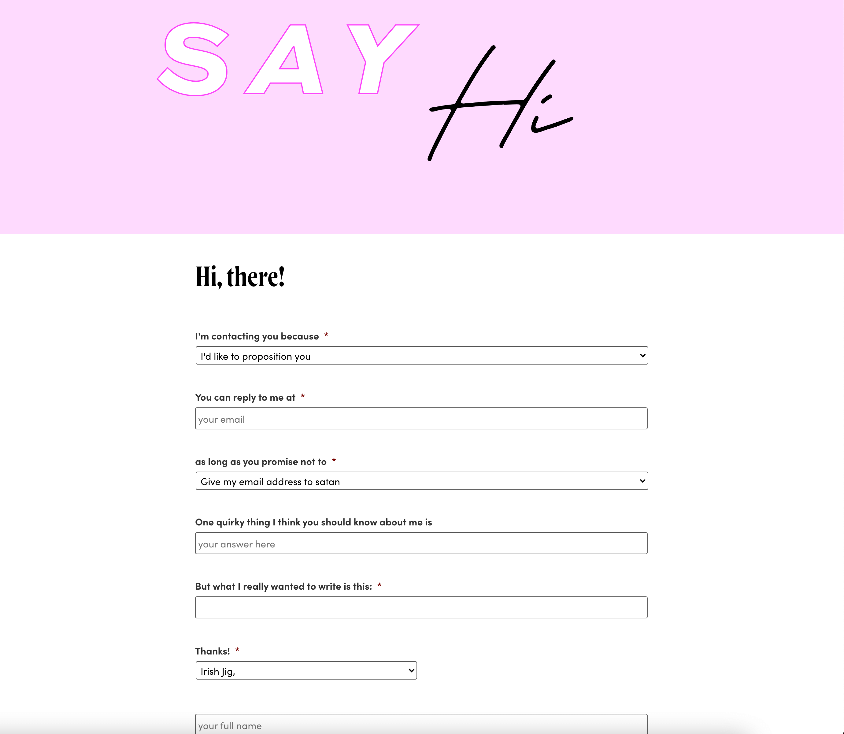
The copy on The Middle Finger Project's Contact Us page may not be appropriate for everyone, but it's perfectly on-brand for them. When even contacting you makes the visitor laugh, you know you have a strong brand voice. -
Moz
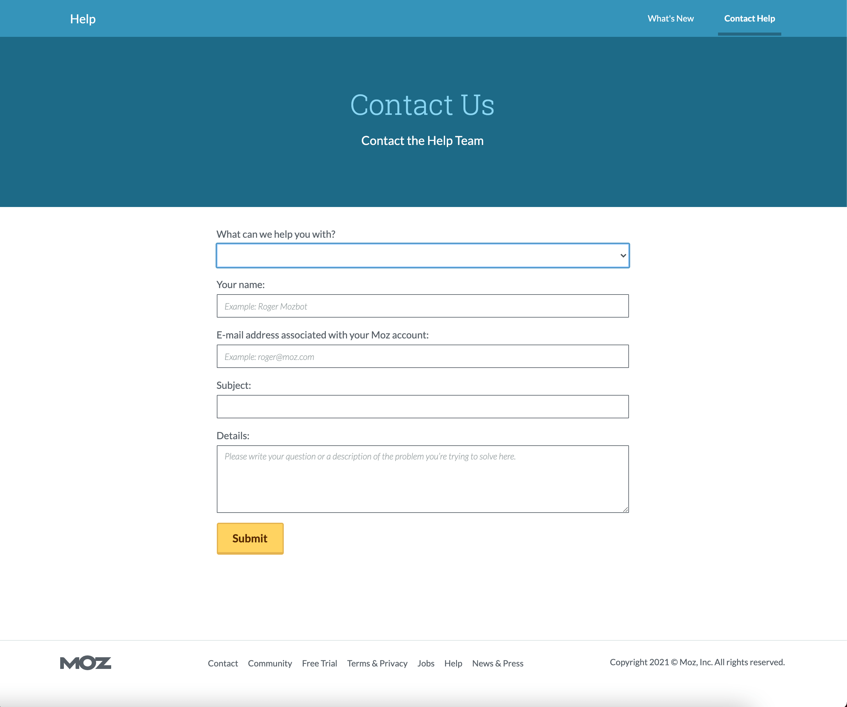
Moz uses the quintessential, textbook example of a contact form. -
Scribd
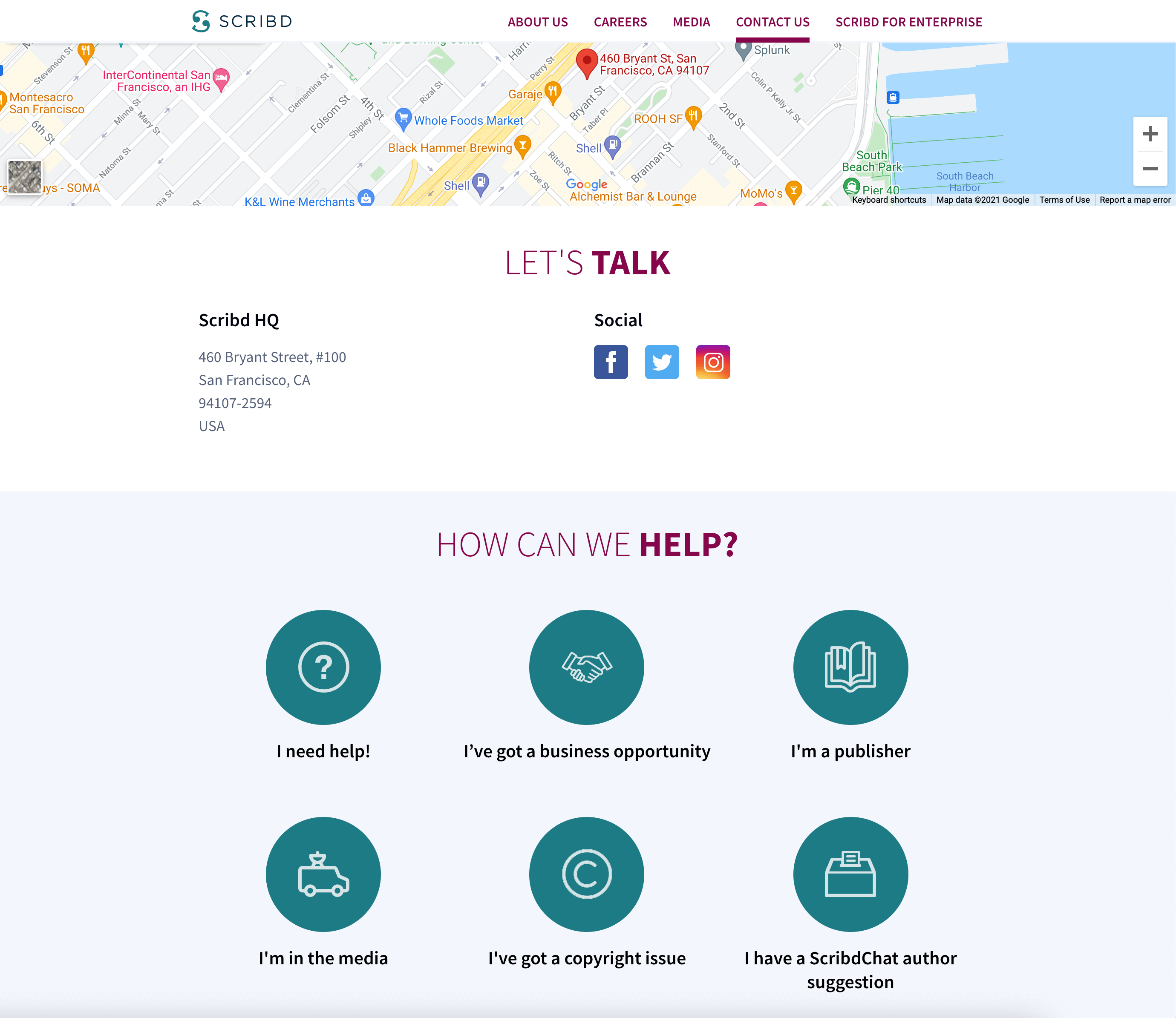
Scribd is a great example of making it intuitive for customers to know which category to contact. Placing the Google Map of their location at the top of the page is also a nice touch. -
Tune
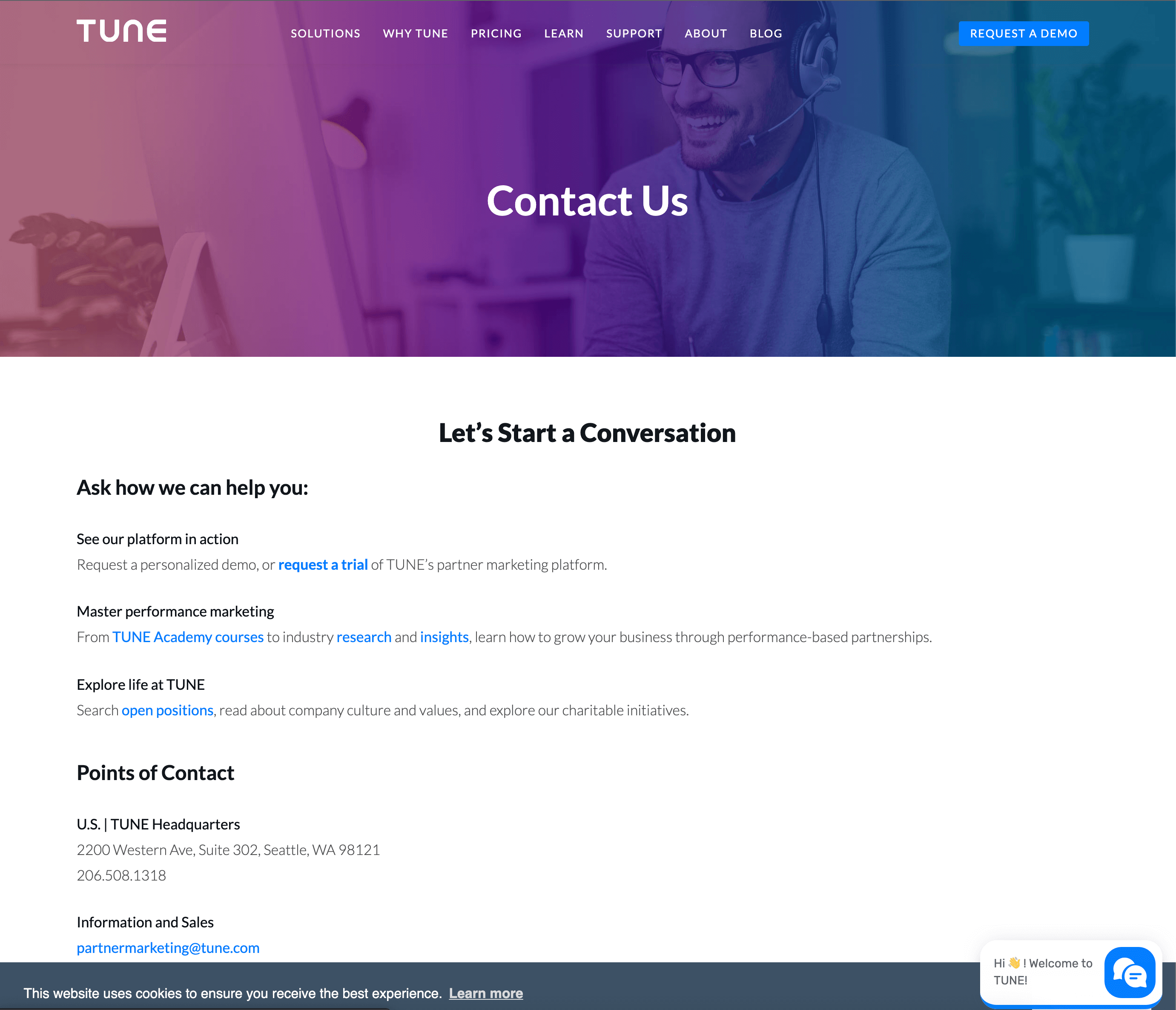
Tune's purple and blue-tinted featured image and "Let's start a conversation" headline are inviting and hip. -
Yeti
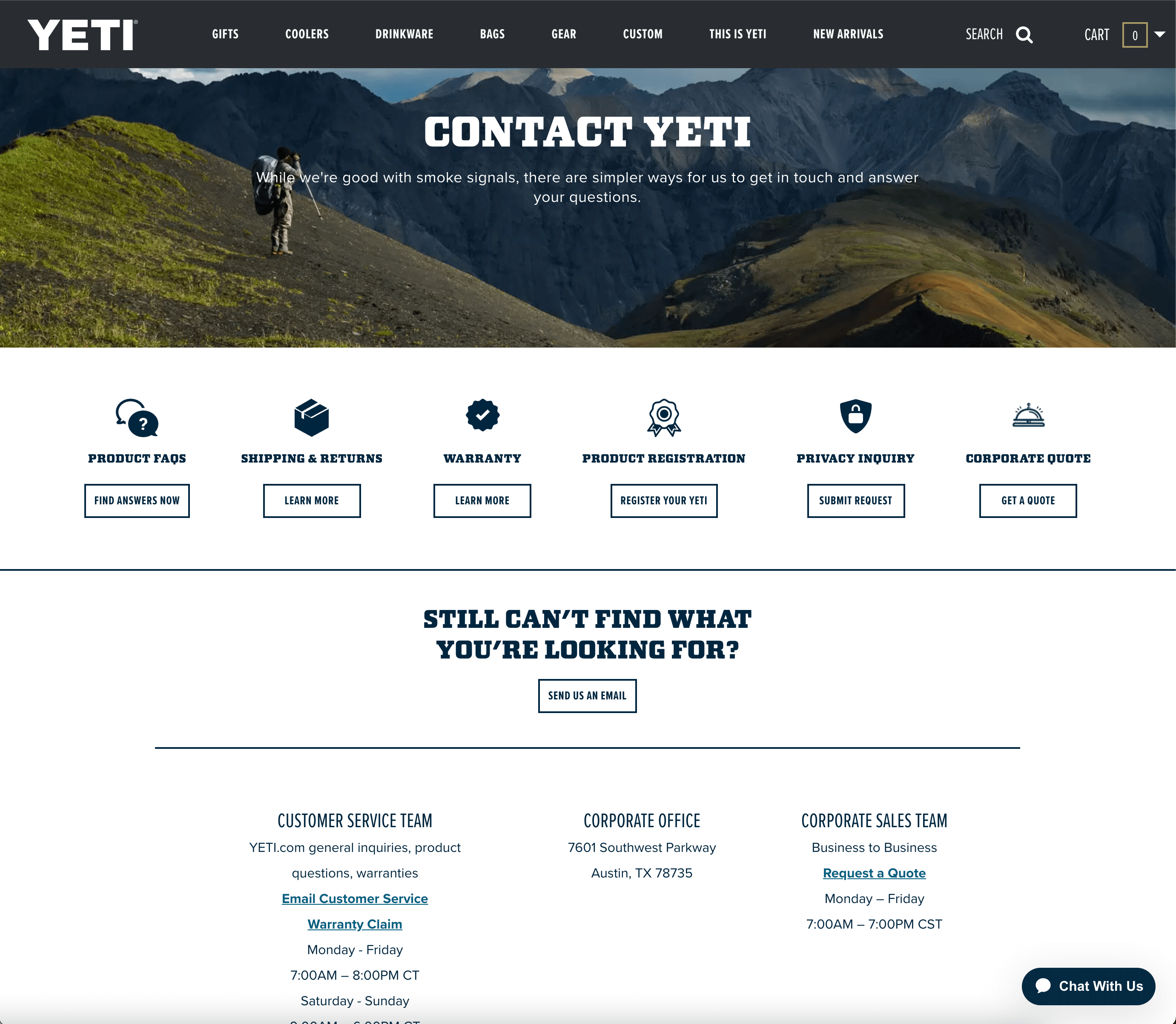
"While we're good with smoke signals, there are simpler ways for us to get in touch and answer your questions" is excellent copy for an outdoorsy company! -
Zendesk
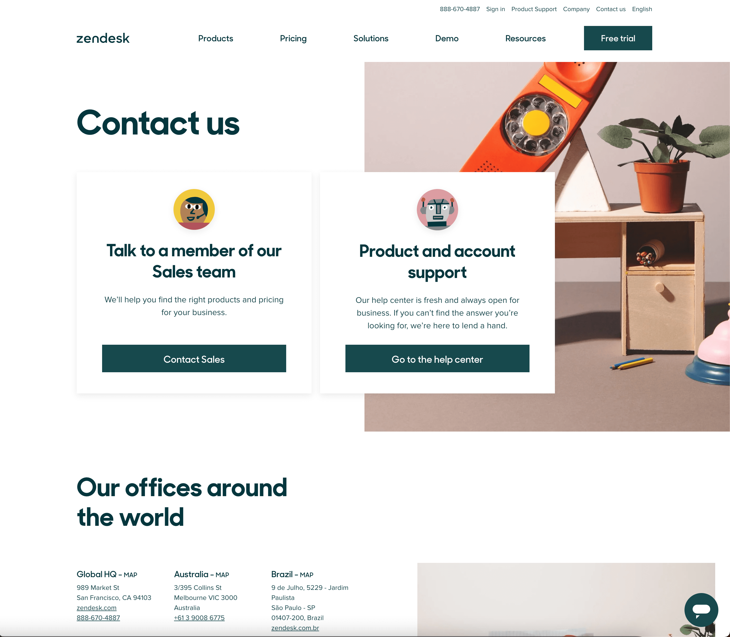
The quirky photos and drawing style of the icons make Zendesk's contact page on-brand and enjoyable.
How Can Sav Help?
From your About Us Page to your Homepage to your Ecommerce store, Sav’s website builder can help you succeed online. All Sav website builder customers can take advantage of great ecommerce features including - but not limited to - 40+ payment methods, multi-currency support, real-time order and shipment tracking, and automated advertising with Google Shopping. With a successful website, your business will grow in ways you never imagined in no time. What are you waiting for? Get started today!

Recommended articles

How to Come up With Ecommerce Product Ideas
Whether you’re starting a new ecommerce business or expanding a pre-existing one, what products to sell online is an important decision....
Read more
How to Create a Modeling Portfolio
What is a Modeling Portfolio? A modeling portfolio is a demonstration of your skills and talent you can show to potential employers and...
Read more
The Best Side Hustles From Home to Try
Why Start a Side Hustle from Home? Earn Extra Money Being alive is expensive right now. Whether your financial goals are to pay off your...
Read more