
Why Use Infographics?
Infographics capture your audience’s attention and increase engagement. That makes them a great addition to your digital marketing strategy.
Illustrate Data
Use charts, graphs, and other data visualizations to communicate data.
Simplify a Complex Subject
Use illustrations and visuals to make complicated subjects easier to understand.
Compare and Contrast
Compare two or more products, services, features, brands or concepts.
Create Brand Awareness
Make it easy to spread the word with visual content that’s easy to digest and share.
Summarize Longer Content
Repurpose long videos, blog posts and reports into shareable bites for social media.
11 Types of Infographics and When to Use Them
Not all infographics are created equal. Different types of infographics communicate different information and work better with different platforms.
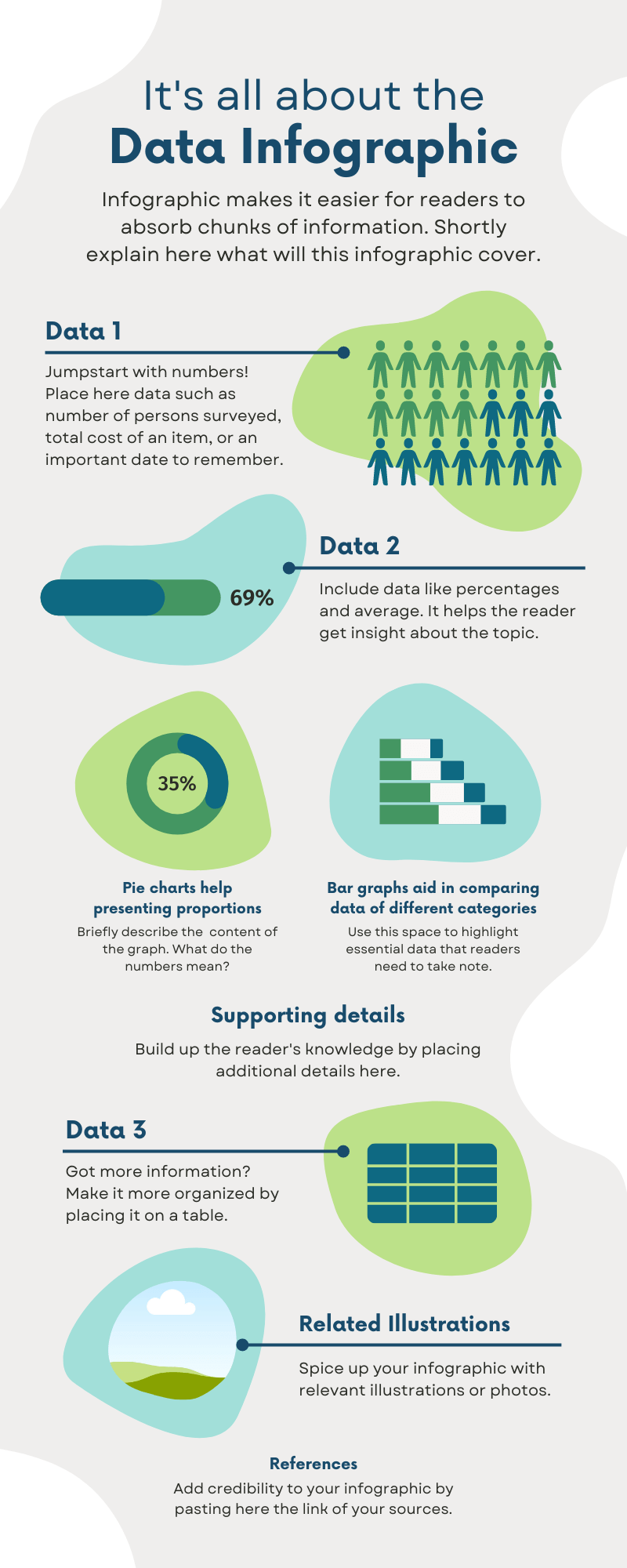
Statistical Infographics
A statistical infographic is an infographic that includes pie charts, and bar graphs. Graphic design makes it easier for readers to absorb the numbers.
Statistical infographics go great with blog posts that include survey results and research. They're also great for sharing statistics on social media platforms.
Informational Infographics
Informational infographics use both text and visual elements to simplify a topic.
Informational infographics are often used to summarize long blog posts and videos. They can also function as stand-alone content pieces.
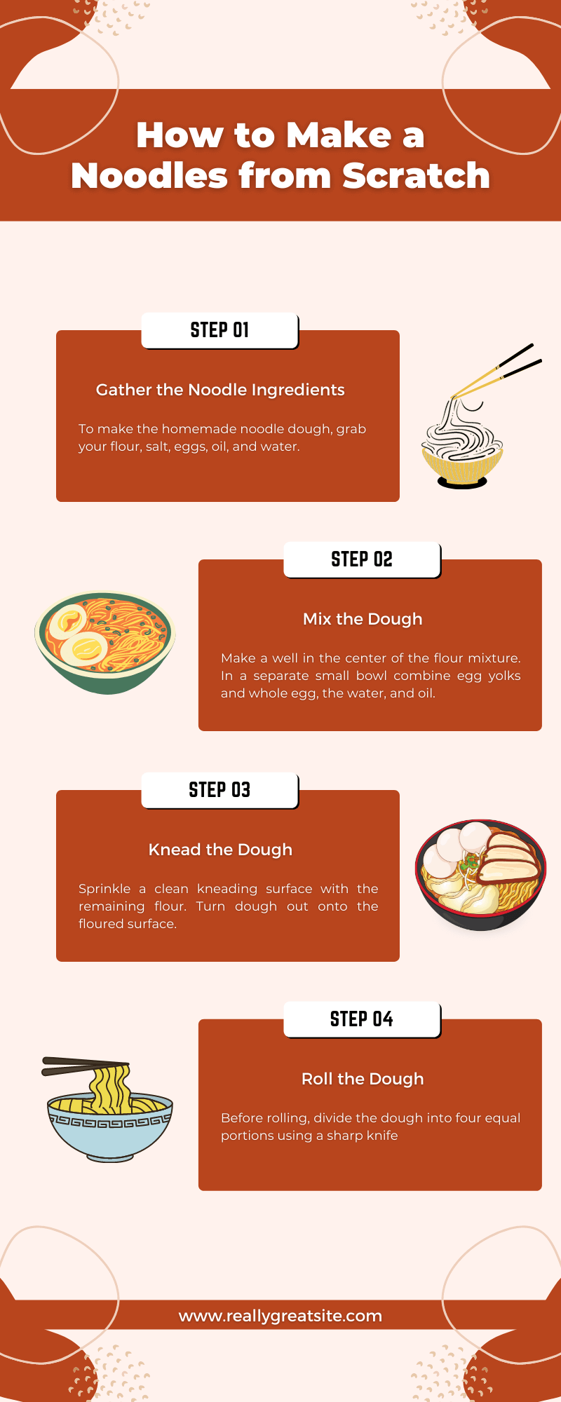
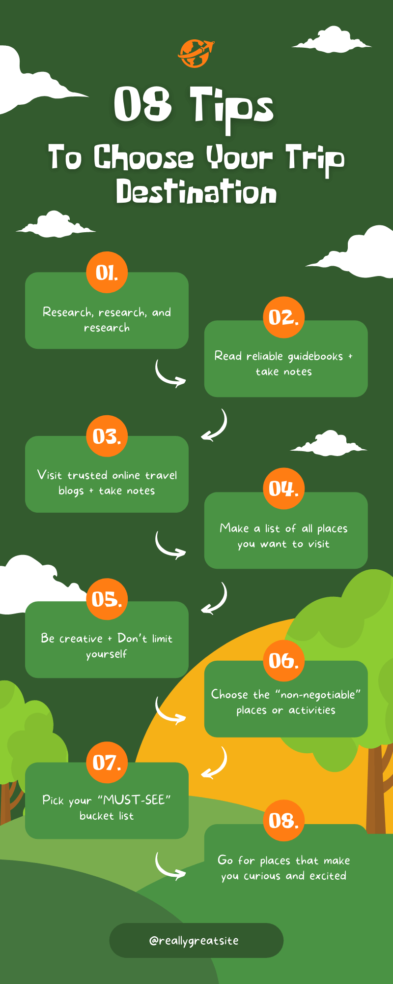
How-to or Process Infographics
A how-to infographic explains how to solve a problem or complete a task. These infographics allow you to jazz up concepts that seem dry as text alone. You can use how-to infographics to offer your product or service as a solution to your target audience’s pain points. Accompany each tip with a visual then add numbered labels to guide readers through the steps.
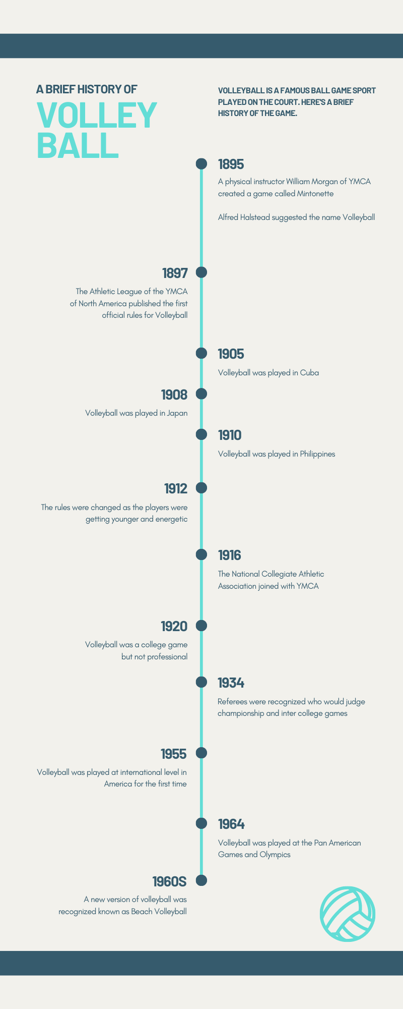
Timeline Infographics
A timeline infographic is an infographic that displays events in chronological order. Here are some ways you can use a timeline infographic:
- Show the history of a person or item
- Explain the evolution of a product or trend
- Demonstrate how a practice has evolved over time
When you create this type of infographic, use icons and illustrations at each point of the timeline to help readers understand the facts.
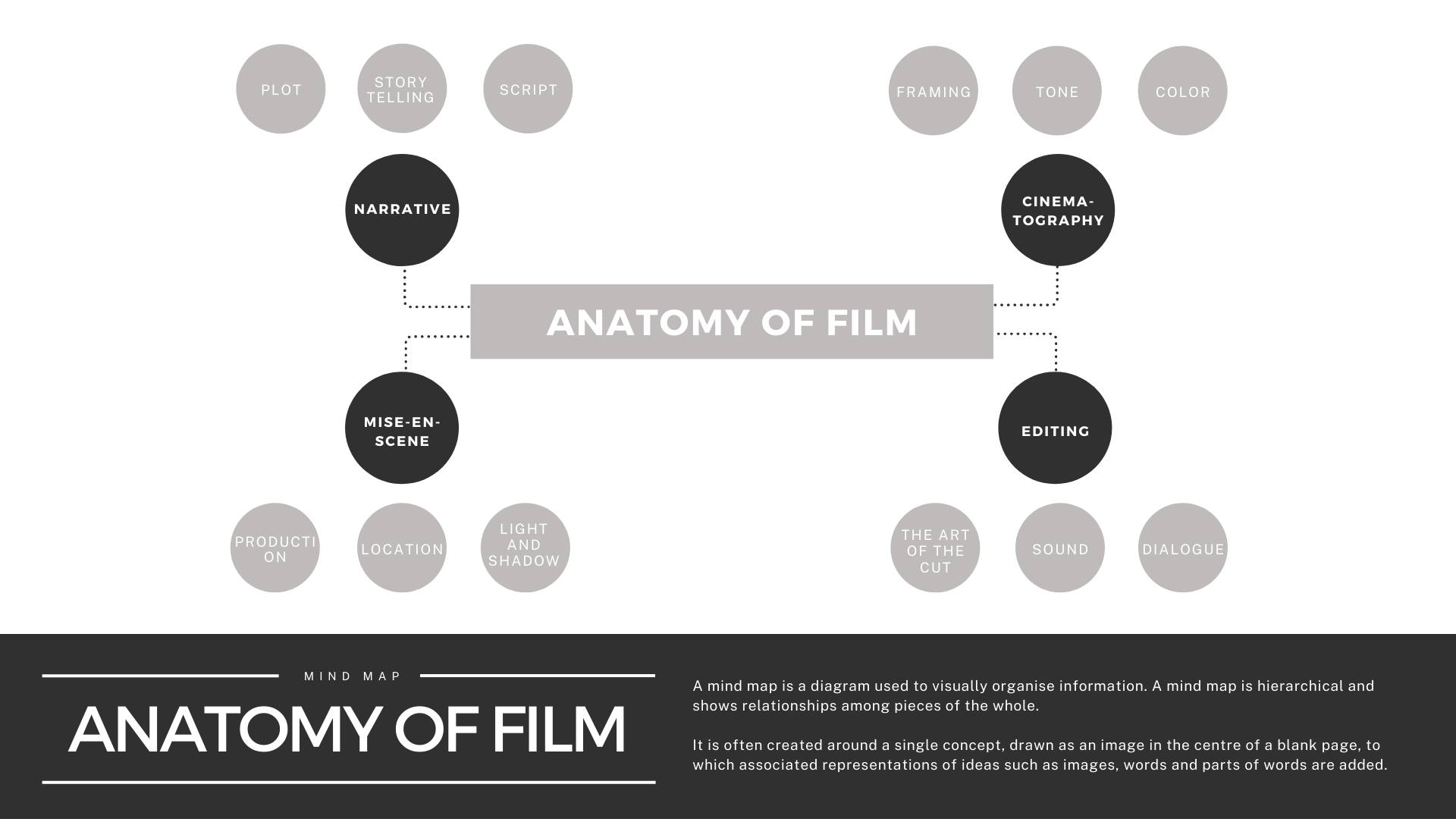
Anatomical Infographics
Anatomical infographics aren’t just for biology class. This type of infographic can visually break down the parts of just about anything. You can use it to label product parts, ingredients, and even personality traits.
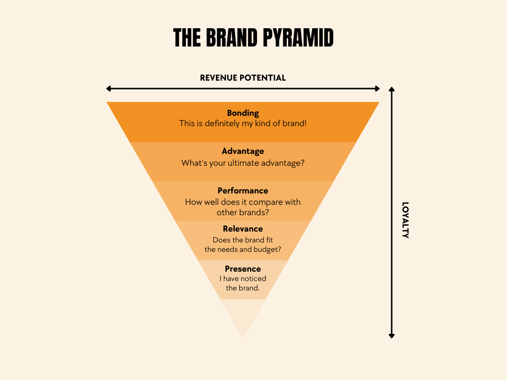
Hierarchical Infographics
Hierarchical infographics display information in order of importance or difficulty. They usually look like a pyramid.
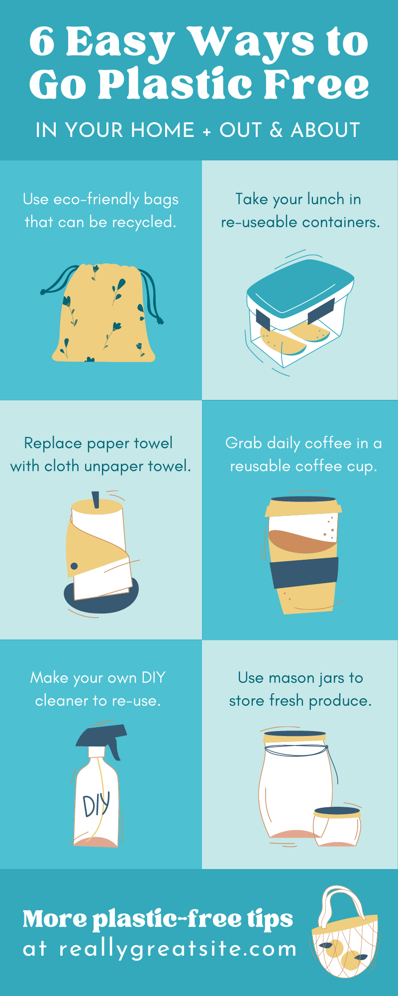
List Infographics
A list infographic is full of both written copy and eye-catching visuals. This type of infographic can break up large blocks of text in longform content. They also make the information more shareable on social media platforms. To make your list infographic visually pop, use an icon for each item and break it up with a zigzag format.
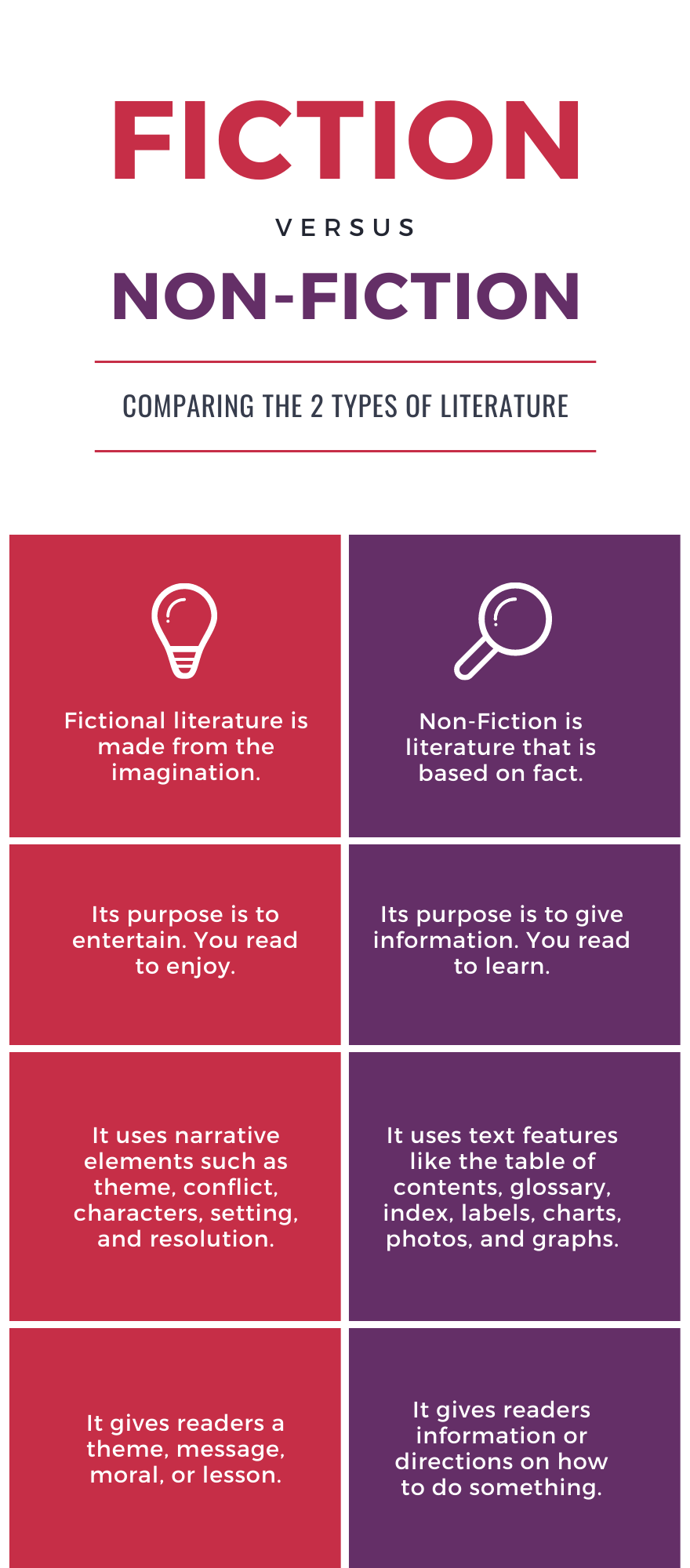
Comparison Infographics
A comparison infographic is a visual way to compare and contrast different options. This type of infographic helps readers weigh the pros and cons of different options. You can use them to compare your product or service to your competitors or to compare different products in your catalog to each other.
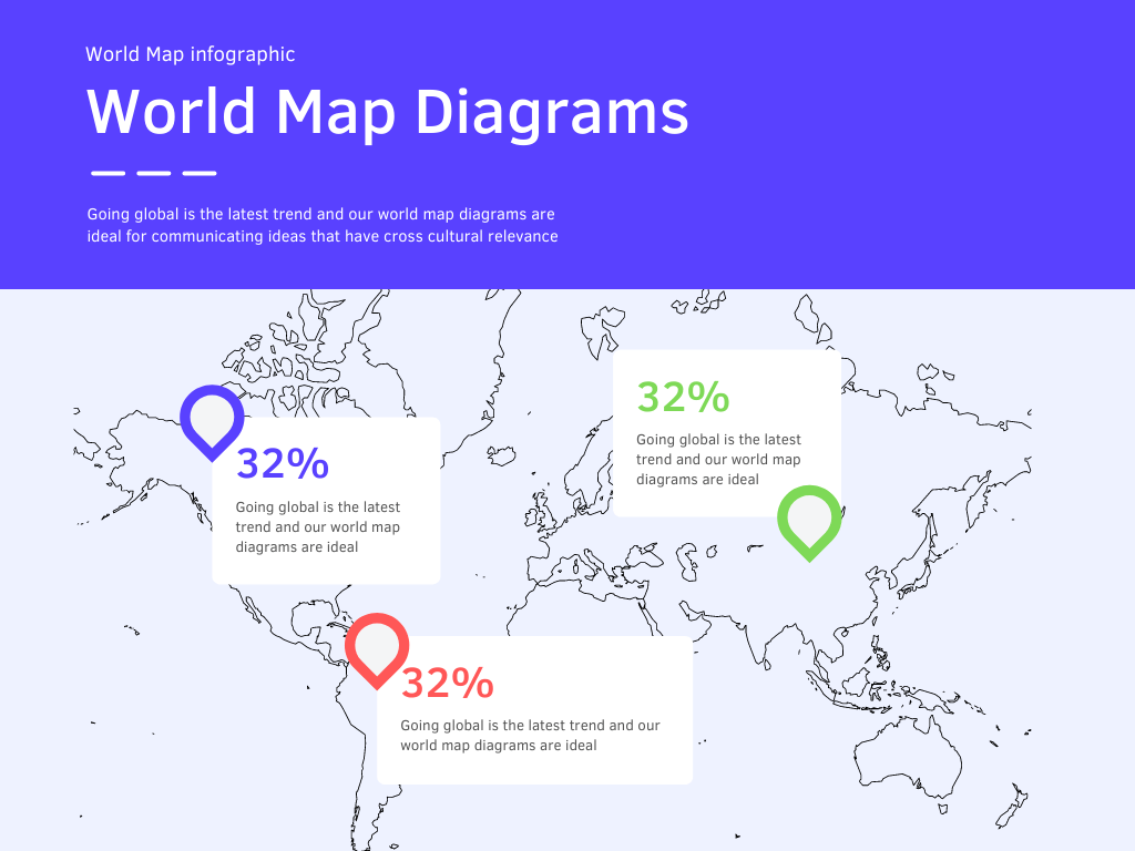
Location-Based Infographics
A location infographic is usually presented in the form of a map, whether it’s a world map or a map depicting a specific country or region. Map infographics can communicate demographic data or other location-specific information.
Visual Resume Infographics
If you want your resume to stand out against a pile of plain Word docs, a visual resume infographic just might do the trick. Infographic resumes use graphic design elements to illustrate skills, interests, experiences and more.

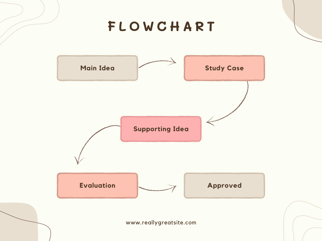
Flowchart Infographics
A flowchart often asks people yes or no questions and then points them to the next step based on their responses.
This type of infographic is great for boosting engagement because it gives users a very clear idea of the process. Individually guiding a reader through a process gives readers something to connect with. It can also lead them to the conclusion that your product or service can solve their problem. Flowchart infographics are also great for internal use. A flowchart could explain how to use company tools or troubleshoot common problems.
How to Make Your Infographics Stand Out
Be Original and Creative
Your infographics won’t get noticed and shared if they look like everyone else’s. Before you create an infographic, research topics that will appeal to your audience and relevant questions they may have. Then, see if there are comparable existing infographics. Learn from what they do well and think of ways you can differentiate yourself fro the rest of the pack.
Know Your Audience
Content marketing, and any marketing really, is all about understanding your target audience. The answers to these questions will help you create infographics that will resonate with them:
- What topics do they like?
- What type of design will appeal to them?
- Do they respond better to a formal or casual tone?
- What social media platforms do they use the most?
Use Appealing Colors and Fonts
Color schemes and fonts don’t just look pretty or ugly. They can convey brand personality and evoke emotional responses just like words alone. Be sure the ones you pick are consistent with your brand voice and the reactions you hope to inspire in your target audience.
Illustrate Text with Icons and Graphics
When it comes to infographics, you want as little text and as many graphics as possible without making them incoherent. If your infographic is too text-heavy, find some text to replace with icons and graphics.
Establish Visual Hierarchy
Organize information in your design in order of importance so the readers instinctively know what to read next. This also gives your infographic design a cleaner, more professional look.
Make it Interactive
If it works for the format you’re planning to use it for, consider making your infographics more than still images. You can add animations, clickable links, buttons, and more to your infographics with tools like Canva and Visme.
How Sav Can Help
No matter where you use your infographics, Sav makes it easy to succeed online starting with a beautiful website. Start designing today!

Recommended articles

How to Come up With Ecommerce Product Ideas
Whether you’re starting a new ecommerce business or expanding a pre-existing one, what products to sell online is an important decision....
Read more
How to Create a Modeling Portfolio
What is a Modeling Portfolio? A modeling portfolio is a demonstration of your skills and talent you can show to potential employers and...
Read more
The Best Side Hustles From Home to Try
Why Start a Side Hustle from Home? Earn Extra Money Being alive is expensive right now. Whether your financial goals are to pay off your...
Read more